Which Would You Choose – If You Could Just Use Eight Typefaces?
In the world of designing and digital marketing, choosing the right typefaces makes all the difference. And choosing appropriate typefaces, both free fonts, and premium, can be a little tricky, let me tell you. The unlimited supply of options to choose from with a variety of types can make you feel a bit dizzy. But hey, no need to sweat it out.
A little guidance and a few tips can guide you through this confusing path. Allow me to have the pleasure of escorting you through this path.
If I have felt the same situations of doubt and confusion about which typefaces to choose from as you, I would have chosen the following typefaces that you should also consider using, to have the intended impression on the audience, which is, I think, the main purpose of opting for the best and effective typefaces.
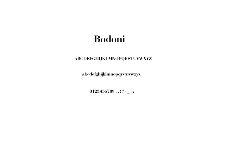
Bodoni
Thanks to the artistic styles of Giambattista Bodoni, that he invented this brilliant and artistic typeface, in the late 18th century. Bodoni created this style of his only after finding his own different artistic style.

Though, he was inspired by the works of many French type founders, like P.S. Fournier and F. Didot. This typeface can be the best choice for you if you want to give a deep impact. The extreme contrast between the stem thicknesses provides this typeface its uniqueness.
Didot
There have been several renewals and revival of this particular font family. Didot is a collection of typefaces that is named after the renowned French type producing and printing family.
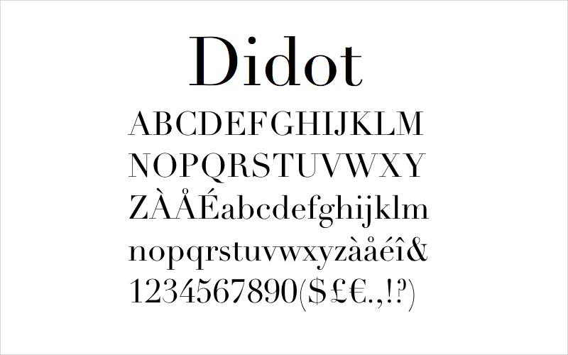
During the period of 1784- 1811, the most popular Didot styles were formed. This typeface is inspired by John Baskerville’s increasing stroke structures experiments. The best use of this particular font style is in using it at large sizes to focus on the contrast.
Baskerville
In the year of 1757, John Baskerville, formerly a wealthy industrialist designed this brilliant typeface. It is a serif typeface, created for the intention of refining the old-style typefaces of that time.
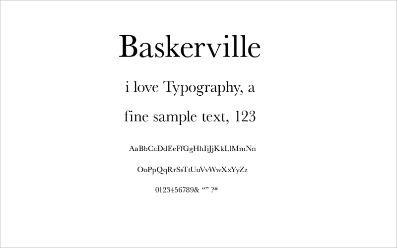
Baskerville expanded the contrast between the thick and thin strokes. It made font serifs narrower and sharper. With this style as the characters turned more regular, the curved strokes became more circular.
Helvetica
Helvetica is a free font style and widely used sans-serif typeface. This font style is designed by Max Miedinger, a Swiss typeface designer, with inputs from Eduard Hoffmann.
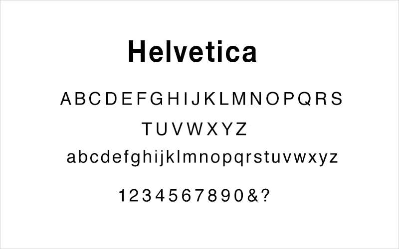
It belongs to the neo-grotesque genre of type facing. This neutral typeface has a great clarity that encourages its use in a wide variety of designing.
Gotham
This typeface is a sans-serif, digital geometric font style. Gotham is created by Tobias Frere-Jones in the year of 2000. This typeface is inspired by the architectural signs, symbols, and designs.
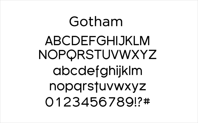
This typeface rose to its fame in the mid-twentieth century. It features various designs for screen display. The purpose of developing this typeface is mainly for professional use.
Kabel
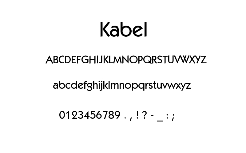
This typeface works great for the logos, art covers, and other graphic designing purposes. Rudolf Koch, a German typeface designer, is the creator of this particular font style.
Gill Sans
Another good choice for the designing purposes will be this sans-serif typeface. Eric Gill designed this typeface which was released from 1928 onwards.
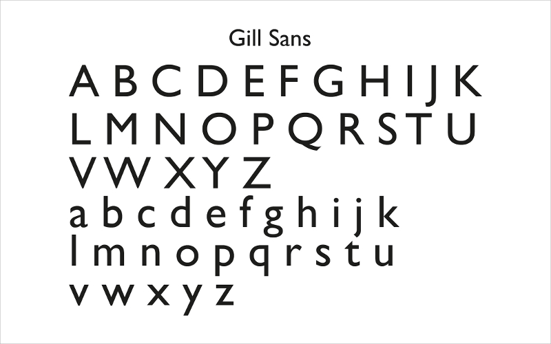
This typeface turned into an immediate success, after its release. Gil Sans is one of the most used font styles by modern designers.
Rockwell
Rockwell, a serif typeface, belongs to the slab serif classification. Here, the font serifs are in weight with the horizontal strokes of the letters. Rockwell typeface is one of the most prominent examples of slab serif genre.
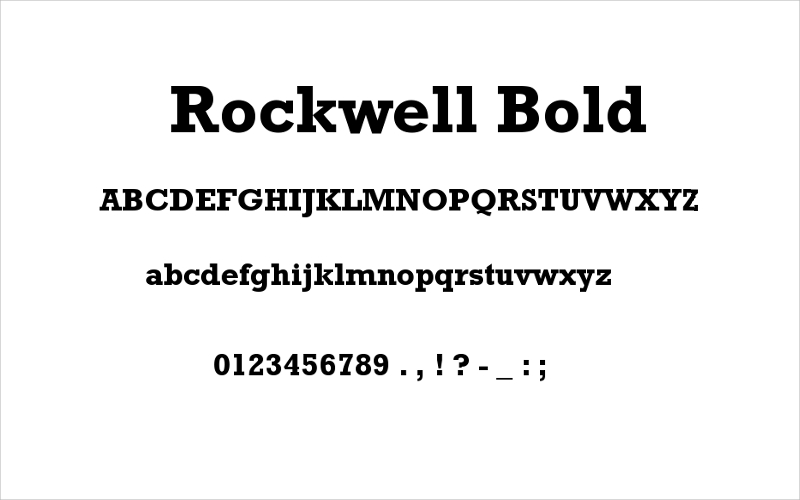
This font style is effective in capitals for the purposes of statement headlines. However, the lowercase font style of the Rockwell typeface possesses the unique style of being used in multiple designing purposes.
Though there are other prominent typefaces as well, the above-mentioned eight typefaces are the most effective and popular.
Before starting with your project of selecting typefaces, you should keep in mind that you must know and understand what kind of impression you want on the minds of your audiences.
