What Microsoft Bob Taught Web Designers
Once upon a time, in a far away land, there lived a legendary piece of software. This product was so feared by the natives at Microsoft that it caused them endless embarrassment. However, as with all fairy tales, lessons can be taken from the stories they impart. This however isn’t a tale of dragons or bravery in the face of adversity; it’s about virtual reality, the world’s most recognizable font, emoticons, and an app called Microsoft Bob.
Lessons from Microsoft Bob
Strive For Compatibility, At All Costs
Microsoft Bob was an unpopular product, selling just a few hundred copies of its shell for Windows 3.1 and 95. That’s not to say it wasn’t well built. If you’re using a 32bit version of Windows (64bit can’t run 16bit apps), as long as you open it in compatibility mode and as an administrator, the app will still work on OS’s as modern as Windows 8 without errors occurring (except in a single XP version). Quite a feat of engineering!

Web designers and developers should take an important lesson from this; if a 15-year-old piece of Visual Basic 6 abandonware can still be useful – your sites shouldn’t just be designed for today’s browsers. Design with old browsers in mind (this means compatibility is a must). Design for all current browsers (don’t ignore less obvious ones such as Opera Mini). Also be aware of future considerations like framework or technology deprecation.
Simplicity Is Ultimately More Productive
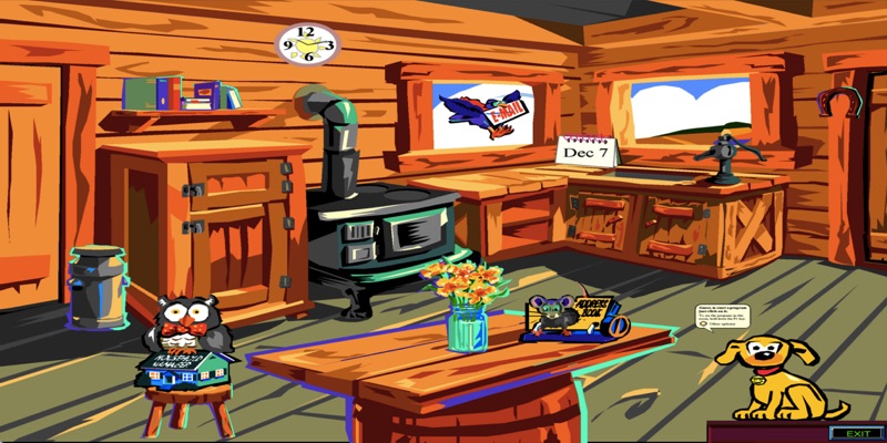
Microsoft Bob was a relatively small piece of software by today’s standards (about 35mb) – it had to be to fit on floppy disks! However, the interface was based on Skeuomorphism principles, in that the UI looked like a series of graphically rich decorated rooms with objects you click to achieve goals. This made the UI look like a Where’s Waldo? Book rather than a clear set of menus and icons – not ideal for getting things done or being productive.
Web designers in recent years have mostly ditched the fake wood backgrounds and shiny web 2.0 effects in favor of simpler and cleaner layouts that reduce the amount of visual noise on the page. While you shouldn’t lose the personality of your site – something many sites need to be reminded of! It’s true that if you remove unnecessary clutter, users will be able to find what they want quicker (and pages may see performance benefits too).
Fashion, Ideas and Tastes Will Evolve
Back when Microsoft Bob was created, virtual reality had been attempted on several occasions. The idea of social interfaces where your computer screen feels like an extension of your home felt unrealistic and in the case of Bob, was not particularly comfortable to use. For anyone already used to the Windows environment, switching to this artificial “house” just felt out of place and the attempt at a user-friendly interface failed.
What Web designers can take from this experimental failure is that it took many years for voice recognition, and the concept of virtual reality, to find it’s feet because the technology had to mature to a point where it was useful to users. Even today, it’s still not perfect. If you’re designing an app, service or site, avoid adding functionality for the sake of it, especially a half-baked implementation or simply because other people are, after all, that’s how the terrible shiny Web 2.0 “look” started!
Listen To Your Users, Or You Will Fail
Microsoft wouldn’t have become one of the most recognizable technology brands if they didn’t pick themselves up and come up with something bigger and better the next time around. Bob might not have hit all the right notes as an experiment but in many ways it was ahead of its time. Even so, when your best efforts crash and burn, it’s time to get back to basics and rethink what works, and what doesn’t. What did they end up with? Windows 98!
Designing websites is similar in many ways to designing apps or software. You need feedback and input from both the client and users at every stage (if possible). Usability and accessibility testing is mandatory, and having a flexible plan that allows you to craft your interface around the needs of customers who’ll use the site day-to-day will avoid redundancy and poor choices from being made. Beta testing from the offset can really help too.

Unlikely Things Become The Most Memorable
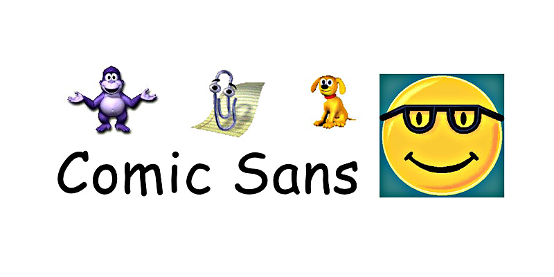
Saying that Microsoft Bob was a total disaster would be a real mistake, as many curious legacies from it still exist today. The maligned typeface Comic Sans was designed for Bob (though wasn’t included in it). The smiley faced emoticon that appeared on Bob’s box, reappeared in MSN Messenger and now emoticons/emoji’s are a part of our daily lives, Rover the Office assistant and Microsoft Agent’s text to speech started life in Bob, yet we all now have assistants like Siri on our phones.
Conclusion
Perhaps the biggest lesson Bob can teach Web designers is that if you create something that doesn’t work out, you shouldn’t feel too disgruntled. Perhaps components of your idea would be better served if refined into something different.
Maybe you should move onto another project, and samples of your visuals or code can be repurposed elsewhere. Or if the whole project is a dud, be thankful you didn’t invest millions of dollars, ending up with Comic Sans, Clippy, Bonzi Buddy and Microsoft Bob.

