UX Design Trends & Forecast for 2015/16
This article has been contributed by Sophia.
Of late, I have been attending various conversations which involve user interface (UI) and user experience (UX). Being a web designer it is incumbent on me to clear all the doubts. Due to the similarity between these terms, a lot of people are getting confused and are unable to understand their intricacies.
In fact, people believe UI and UX to be same terms with two different names. But in reality, both these terminologies vary drastically – be it in terms of their meaning or technicalities.

UX vs UI in a layman’s language
I was seriously falling short of words, ideas, energy and zest to explain them the difference, so I tried to settle them using examples. This is was the time when I crafted the pub theorem. Let us suppose you went to a pub and you saw a hot guy or girl (as per your liking), the person is good looking and well managed in their outlook. This means the user interface is perfect. Now, looking at their arresting appearance you summoned all your strength to go and have a word with him/her. You went and after talking to them you realized that the person has halitosis (bad breath). This is when you encounter that they have a bad user experience. Similarly, user interface is the basic aesthetics of the app, wherein user experience is all about how those good looking appearances function… although UI is not just all appearances but we’ll get to that.

The term “user experience” was suggested by Dr. Donald Norman, a researcher of cognitive science who has also remarkably described the need of user-centered design which implies that user interfaces must be centered to the user’s needs. The term has been unmistakably taken by people and they opine that UX is developer centric and there comes cultures like IBM, Microsoft and Sun.
“User experience isn’t even about technology”, adds Mario Bourque, manager of Trapeze Group.
“User experience design is not limited to the confines of the computer. It doesn’t even need a screen,” adds Bill DeRouchey, who is the incumbent interaction design director of Ziba Design. “User experience is any interaction with any product, any artifact, any system.”
Now that we are well aware of the acronym we can now easily figure out the most prevalent trends and adopt or ignore them as we see fit. See also how to take user experience to the next level.
1. Testers will be liberated

Companies are testing more than ever before and have adopted it on a much larger scale. Testing nullifies all the trial and error. Testing allows you to better utilize your resources and improve your websites’ quality with different iterations. According to Adobe’s digital optimization survey, 44% of companies invest about 5% in optimization. User testing websites should be the standard and will certainly grow in the years to come.
We know that there are testing tools present, which record mobile sessions and also the credentials of the tester. This is why we in-app usability testing platforms will see a surge in the future. This means, that there will be less cameras hovering over user cellphones.
2. User experience being standard

No one knew that responsive web design would become a standard for web development. With the introduction of Polymer Project, Lollipop along with Material Design, Google Web Designer and many more such tools we can expect the user experience to become a standard in web designing. You never know when will you get a news of a new algorithm which abandons websites with bad usability or design from Google’s search ranking. One such example is how Google gives preference to mobile optimized websites.
3. Intertwining the physical and digital experience

With the advent of Internet of Things, the distinction between the physical and digital experience has faded. In order to bring it into account, we need to connect it back in the context of the users. As we are advancing in technology, we aim to deliver a physical experience on a digitized platform, be it the description, configuration or administration.
Let’s for instance, take home décor manufacturing. The website must create a magical user experience as if the user is visiting the actual store. If your website fails to create this kind of experience then it fails to bind the physical and digital experience. The sole remedy for this problem is to empathize with the users and understand what they look for in a website. A good example of successful blending of physical and digital are the customization apps found online, for shoes, cars, headphones and more.
4. Artificial intelligence & automation take a front seat

In the context of UX and UI, artificial intelligence would help with design decisions based the grid, content and knowledge of predefined website layouts. Themes are starting to do this but still require a lot of user input. In the future, technology will analyze your content and ultimately pick the best design layout, color scheme, typography and additional imagery for your web project. For those note trained in design, this will ultimately yield better results than manually creating designs.
5. Integrated wearables

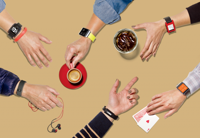
Apart from Google and Apple we can see a lot of big names such as Nike, Polo and Sony whom have jumped inside the wearable world. Wearables have not only entered the market, but are also in vogue making it the trendiest technology that we have ever seen. This gives a whole new chance for UX developers to push the envelope, so as to create magical wearable interfaces. See more on designing for wearables here.
–
Sophia is a trained WordPress developer working with WordPrax Ltd.- HTML to WordPress company with global reach. If you’re planning to convert HTML website to WordPress for a brilliant online presence, she can help you. Some stunning articles related to website markup conversions can be found under her name.
