
Unleash The Power Of Path Animations With SVGator
Unleash The Power Of Path Animations With SVGator
Mikołaj Dobrucki
(This is a sponsored article.) Last year, a comprehensive introduction to the basic use of SVGator was published here on Smashing Magazine. If you’d like to learn about the fundamentals of SVGator, setting up your first projects, and creating your first animations, we strongly recommended you read it before continuing with this article.
Today, we’ll take a second look to explore some of the new features that have been added to it over the last few months, including the brand new Path Animator.
Note: Path Animator is a premium feature of SVGator and it’s not available to trial users. During a seven-day trial, you can see how Path Animator works in the sample project you’ll find in the app, but you won’t be able to apply it to your own SVGs unless you’re opted-in for a paid plan. SVGator is a subscription-based service. Currently, you can choose between a monthly plan ($ 18USD/month) and a yearly plan ($ 144USD total, $ 12USD/month). For longer projects, we recommend you consider the yearly option.
Path Animator is just the first of the premium features that SVGator plans to release in the upcoming months. All the new features will be available to all paid users, no matter when they subscribed.
The Charm Of Path Animations
SVG path animations are by no means a new thing. In the last few years, this way of enriching vector graphics has been heavily used all across the web:

Path animations gained popularity mostly because of their relative simplicity: even though they might look impressive and complex at first glance, the underlying rule is in fact very simple.
How Do Path Animations Work?
You might think that SVG path animations require some extremely complicated drawing and transform functions. But it’s much simpler than it looks. To achieve effects similar to the example above, you don’t need to generate, draw, or animate the actual paths — you just animate their strokes. This brilliant concept allows you to create seemingly complex animations by animating a single SVG attribute: stroke-dashoffset.
Animating this one little property is responsible for the entire effect. Once you have a dashed line, you can play with the position of dashes and gaps. Combine it with the right settings and it will give you the desired effect of a self-drawing SVG path.
If this still sounds rather mysterious or you’d just like to learn about how path animations are made in more detail, you will find some useful resources on this topic at the end of the article.
No matter how simple path animations are compared with what they look like, don’t think coding them is always straightforward. As your files get more complicated, so does animating them. And this is where SVGator comes to the rescue.
Furthermore, sometimes you might prefer not to touch raw SVG files. Or maybe you’re not really fond of writing code altogether. Then SVGator has got you covered. With the new Path Animator, you can create even the most complex SVG path animations without touching a line of code. You can also combine coding with using SVGator.
To better understand the possibilities that Path Animator gives us, we will cover three separate examples presenting different use cases of path animations.
Example #1: Animated Text
In the first example, we will animate text, creating the impression of self-writing letters.

Often used for lettering, this cute effect can also be applied to other elements, such as drawings and illustrations. There’s a catch, though: the animated element must be styled with strokes rather than fills. Which means, for our text, that we can’t use any existing font.
Outlining fonts, no matter how thin, always results in closed shapes rather than open paths. There are no regular fonts based on lines and strokes.
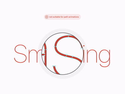
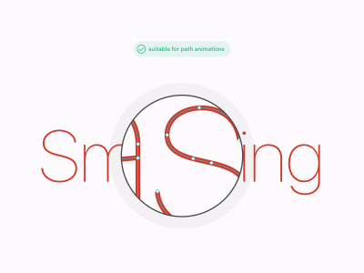
Therefore, if we want to animate text using path animations we need to draw it ourselves (or find some ready-made vector letters suitable for this purpose). When drawing your letters, feel free to use some existing font or typography as a reference — don’t violate any copyright, though! Just keep in mind it’s not possible to use fonts out of the box.
Preparing The File
Rather than starting with an existing typeface, we’ll begin with a simple hand-drawn sketch:

Now it’s time to redraw the sketch in a design tool. I used Figma, but you can use any app that supports SVG exports, such as Sketch, Adobe XD, or Adobe Illustrator.
Usually, I start with the Pen tool and roughly follow the sketch imported as a layer underneath:
Once done, I remove the sketch from the background and refine the paths until I’m happy with the result. No matter what tools you use, nor technique, the most important thing is to prepare the drawing as lines and to use just strokes, no fills.

In this example, we have four such paths. The first is the letter “H”; the second is the three middle letters “ell”; and “o” is the third. The fourth path is the line of the exclamation mark.
The dot of “!” is an exception — it’s the only layer we will style with a fill, rather than a stroke. It will be animated in a different way than the other layers, without using Path Animator.
Note that all the paths we’re going to animate with Path Animator are open, except for the “o,” which is an ellipse. Although animating closed paths (such as ellipses or polygons) with Path Animator is utterly fine and doable, it’s worth making it an open path as well, because this is the easiest way to control exactly where the animation starts. For this example, I added a tiny gap in the ellipse just by the end of the letter “l” as that’s where you’d usually start writing “o” in handwriting.

Before importing our layers to SVGator, it’s best to clean up the layers’ structure and rename them in a descriptive way. This will help you quickly find your way around your file once working in SVGator.
If you’d like to learn more about preparing your shapes for path animations, I would recommend you check out this tutorial by SVGator.
It’s worth preparing your layers carefully and thinking ahead as much as possible. At the time of writing, in SVGator you can’t reimport the file to an already existing animation. While animating, if you discover an issue that requires some change to the original file, you will have to import it into SVGator again as a new project and start working on your animation from scratch.
Creating An Animation
Once you’re happy with the structure and naming of your layers, import them to SVGator. Then add the first path to the timeline and apply Path Animator to it by choosing it from the Animators list or by pressing Shift + T.
To achieve a self-drawing effect, our goal is to turn the path’s stroke into a dashed line. The length of a dash and a gap should be equal to the length of the entire path. This allows us to cover the entire path with a gap to make it disappear. Once hidden, change stroke-dashoffset to the point where the entire path is covered by a dash.
SVGator makes it very convenient for us by automatically providing the length of the path. All we need to do is to copy it with a click, and paste it into the two parameters that SVGator requires: Dashes and Offset. Pasting the value in Dashes turns the stroke into a dashed line. You can’t see it straightaway as the first dash of the line covers the whole path. Setting the Offset will change stroke-dashoffset so the gap then covers the path.
Once done, let’s create an animation by adding a new keyframe further along the timeline. Bring Offset back to zero and… ta-da! You’ve just created a self-drawing letter animation.
There’s one little issue with our animation, though. The letter is animated — but back-to-front. That is, the animation starts at the wrong end of the path. There are, at least, a few ways to fix it. First, rather than animating the offset from a positive value to zero, we can start with a negative offset and bring it to zero. Unfortunately, this may not work as expected in some browsers (for example, Safari does not accept negative stroke offsets). While we wait for this bug to be fixed, let’s choose a different approach.
Let’s change the Dashes value so the path starts with a gap followed by a dash (by default, dashed lines always start with a dash). Then reverse the values of the Offset animation. This will animate the line in the opposite direction.
Now that we’re done with “H” we can move on to animating all the other paths in the same way. Eventually, we finish by animating the dot of the exclamation mark. As it’s a circle with a fill, not an outline, we won’t use Path Animator. Instead, we use Scale Animator to the make dot pop in at the end of the animation.
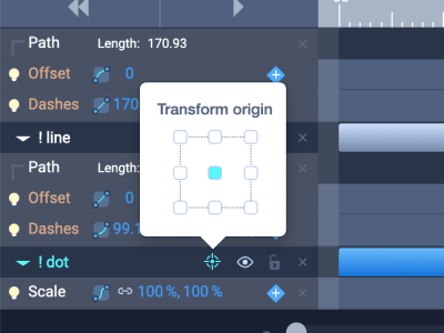
Always remember to check the position of an element’s transform origin when playing with scale animations. In SVG, all elements have their transform origin in the top-left corner of the canvas by default. This often makes coding transform functions a very hard and tedious task. Fortunately, SVGator saves us from all this hassle by calculating all the transforms in relation to the object, rather than the canvas. By default, SVGator sets the transform origin of each element in its own top-left corner. You can change its position from the timeline, using a button next to the layer’s name.
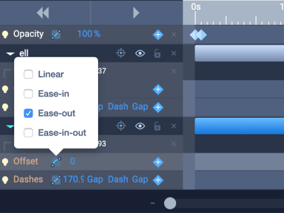
Let’s add the final touch to the animation and adjust the timing functions. Timing functions define the speed over time of objects being animated, allowing us to manipulate their dynamics and make the animation look more natural.
In this case, we want to give the impression of the text being written by a single continuous movement of a hand. Therefore, I applied an Ease-in function to the first letter and an Ease-out function to the last letter, leaving the middle letters with a default Linear function. In SVGator, timing functions can be applied from the timeline, next to the Animator’s parameters:
After applying the same logic to the exclamation mark, our animation is done and ready to be exported!
Example #2: Animated Icon
Now let’s analyze a more UI-focused example. Here, we’re going to use SVGator to replicate a popular icon animation: turning a hamburger menu into a close button.
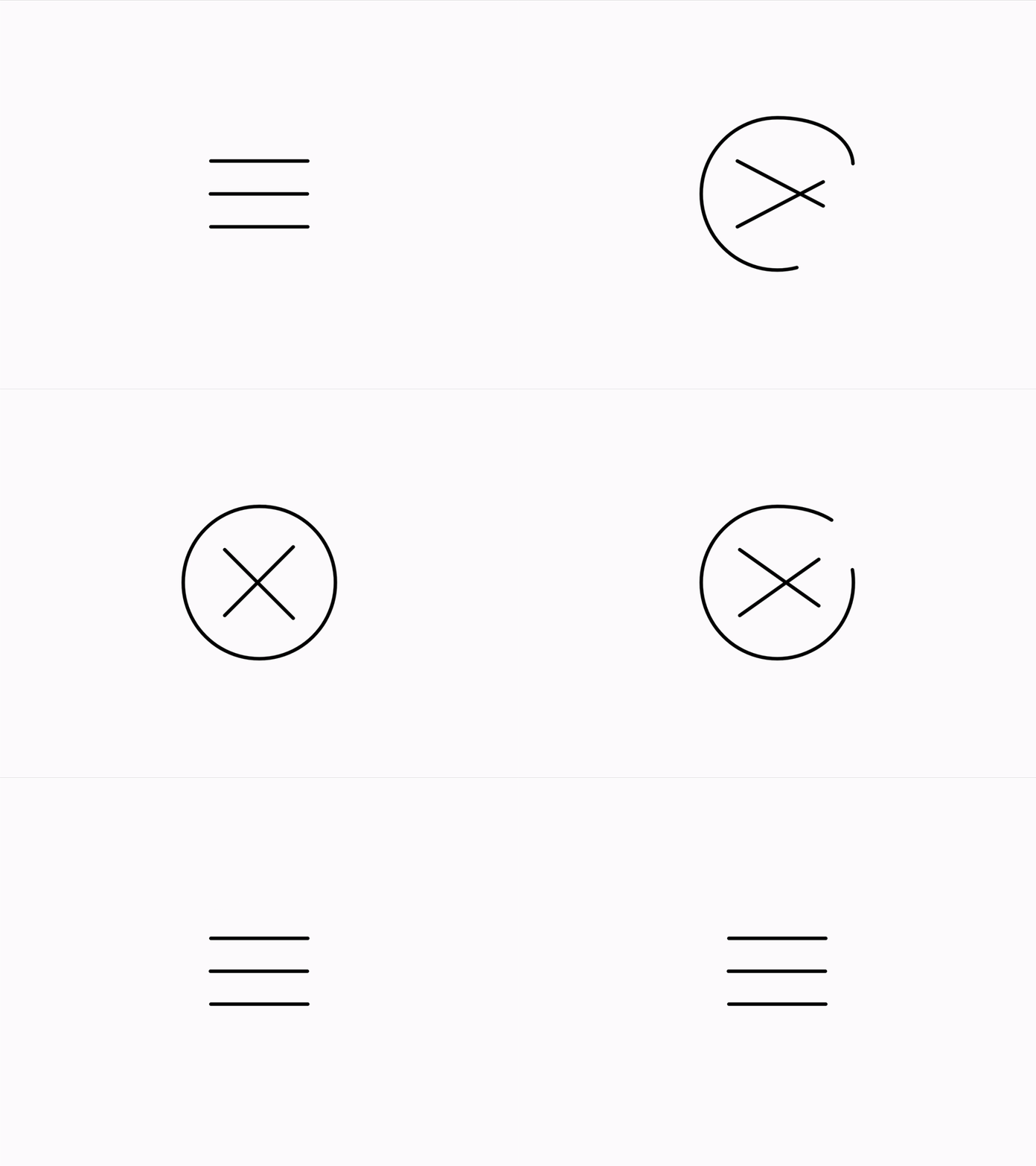
The goal of the animation is to smoothly transform the icon so the middle bar of the hamburger becomes a circle, and the surrounding bars cross each other creating a close icon.
Preparing The File
To better understand what we’re building and how to prepare a file for such an animation, it’s useful to start with a rough sketch representing the key states of the animation.

Once we have a general idea of what our animation consists of, we can draw the shapes that will allow us to create it. Let’s start with the circle. As we’re going to use path animation, we need to create a path that covers the whole journey of the line, starting as a straight bar in the middle of the hamburger menu, and finishing as a circle around it.
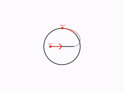
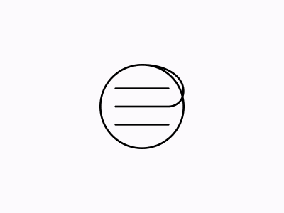
The other two bars of the menu icon have an easier task — we’re just going to rotate them and align to the centre of the circle. Once we combine all the shapes together we’re ready to export the file as SVG and import it to SVGator.
Creating An Animation
Let’s start by adding the first shape to the timeline and applying Path Animator to it. For the initial state, we want only the horizontal line in the middle to be visible, while the rest of the path stays hidden. To achieve it, set the length of the dash to be equal to the length of the hamburger’s lines. This will make our straight middle line of the menu icon. To find the correct value, you can use the length of one of the other lines of the hamburger. You can copy it from the timeline or from the Properties panel in the right sidebar of the app.
Then set the length of the following gap to a value greater than the remaining length of the path so it becomes transparent.
The initial state of our animation is now ready. What happens next is that we turn this line into a circle. To do that, two things need to happen simultaneously. First, we use Offset to move the line along the path. Second, we change the width of the dash to make the line longer and cover the entire circle.
With the circle ready, let’s take care of the close icon. Just as before, we need to add two animations at the same time. First, we want the top line to lean down (45 degrees) and the bottom line to move up (-45 degrees) until they cross each other symmetrically. Second, we need to move the lines slightly to the right so they stay aligned with the circle.
As you might remember from the previous example, in SVGator, transform origins are located in the top-left corner by default. That’s very convenient to us as, in this case, that is exactly where we want them to be. All we need to do is to apply the correct rotation angles.
When it comes to aligning the lines with the circle, note that we don’t have to move them separately. Rather than adding Animators to both of the lines, we can add a group containing both of them to the timeline, and animate them together with a single Position Animator. That’s one of those moments when a nice, clean file structure pays off.
Next thing to do is add a reverse animation that turns the close button back into a hamburger menu. To achieve that, we can basically follow the previous steps in reverse order. To speed things up a bit, copy and paste the existing keyframes on the timeline — that’s yet another improvement SVGator introduced in the past few months.
Once done, don’t forget to adjust the timing functions. Here, I’ve decided to go with an Ease-in-out effect on all elements. Our icon is ready for action.
Implementation
Even though implementing microinteractions goes far beyond the scope of this article, let me take a moment to briefly describe how such animation can be brought to life in a real project.
Illustrations and decorative animation are usually more straightforward. Quite often, you can use SVG files generated by SVGator out of the box. We can’t say that about our icon, though. We want the first part of the animation to be triggered when users click the button to open the menu drawer, and the second part of the animation to play once they click it for the second time to close the menu.
To do that, we need to slice our animation into a few separate pieces. We won’t discuss here the technical details of implementing such animation, as it depends very much on the environment and tech stack you’re working with; but let’s at least inspect the generated SVG file to extract the crucial animation states.
We’ll start by hiding the background and adjusting the size of the canvas to match the dimensions of the icon. In SVGator, we can do this at any time, and there are no restrictions to the size of our canvas. We can also edit the styles of the icon, such as color and width of the stroke, and test what your graphic will look like on a dark background using a switch in the top-right corner.
When we’re ready, we can export the icon to SVG and open it in a text editor.
Elements you see in the body of the document are the components of your graphic. You should also notice that the first line of code is exceptionally long. Straight after the opening <svg> tag, there’s a <style> element with plenty of minified CSS inside. That’s where all the animation happens.
<svg viewBox="0 0 600 450" fill="none" xmlns="http://www.w3.org/2000/svg" id="el_vNqlglrYK"><style>@-webkit-keyframes kf_el_VqluQuq4la_an_DAlSHvvzUV… </style> <!-- a very long line of code that contains all the animations --> <g id="el_SZQ_No_bd6"> <g id="el_BVAiy-eRZ3_an_biAmTPyDq" data-animator-group="true" data-animator-type="0"><g id="el_BVAiy-eRZ3"> <g id="el_Cnv4q4_Zb-_an_6WWQiIK_0" data-animator-group="true" data-animator-type="1"><path id="el_Cnv4q4_Zb-" d="M244 263H356" stroke-linecap="round"/></g> <g id="el_aGYDsRE4sf_an_xRd24ELq3" data-animator-group="true" data-animator-type="1"><path id="el_aGYDsRE4sf" d="M244 187H356" stroke-linecap="round"/></g> </g></g> <path id="el_VqluQuq4la" d="M244 225H355.5C369 225 387.5 216.4 387.5 192C387.5 161.5 352 137 300 137C251.399 137 212 176.399 212 225C212 273.601 251.399 313 300 313C348.601 313 388 273.601 388 225C388 176.399 349.601 137 301 137" stroke-linecap="round"/> </g> </svg> It’s really nice of SVGator to minify the code for us. However, we’ll have to undo it. Once the CSS code is written out in full (you can do this in your browser’s development tools, or in one of many online code formatters), you’ll see that it’s a long list of @keyframes followed by a list of id rules using the @keyframes in their animation properties.
The code may look unreadable (even when nicely formatted) but, rather, it’s very repetitive. Once you understand the underlying rule, following it is no longer that hard. First, we’ve got the @keyframes. Each animated element has its own @keyframes @-rule. They’re sorted in the same order as elements in SVGator. Therefore, in our case, the first @-rule applies to the middle bar of the hamburger icon, the second one to the top bar, and so on. The keyframes inside also match the order of keyframes created in SVGator:
@keyframes kf_el_VqluQuq4la_an_DAlSHvvzUV{ /* middle bar animation */ 0%{ stroke-dasharray: 112, 2000; /* initial state */ } 25%{ stroke-dasharray: 112, 2000; } 50%{ stroke-dasharray: 600, 2000; /* turns into a circle */ } 75%{ stroke-dasharray: 600, 2000; /* back at initial state */ } 100%{ stroke-dasharray: 112, 2000; } } All you need to do now is use these values from the keyframes to code your interaction. It’s still a lot of work up ahead, but thanks to SVGator the crucial part is already done.
What happens next is another story. However, if you’re curious to see an example of how this animation could work in practice, here’s a little CodePen for you:
See the Pen [Hamburger icon path animation](https://codepen.io/smashingmag/pen/ewNdJo) by Mikołaj.
The example is built with React and uses states to switch CSS classes and trigger transitions between the respective CSS values. Therefore, there’s no need for animation properties and @keyframes @-rules.
You can use a set of CSS custom priorities listed at the top of the SCSS code to control the styling of the icon as well as duration of the transitions.
Example #3: Animated Illustration
For the third and final example of this article, we’re going to create an animated illustration of an atom with orbiting particles.

Dashed Lines And Dotted Lines
In the two previous examples, we’ve taken advantage of dashed SVG paths. Dashed lines are cool but did you know that SVG also supports dotted lines? A dotted line in SVG is no more, no less than a dashed line with round caps, and the length of the dashes is equal to zero.
If we can have a path with lots of dots, who said we can’t have a path with a single dot? Animate the stroke’s offset and you’ve got an animation of a circle following any path you want. In this example, the path will be an ellipse, and a circle will represent an orbiting particle.
Preparing The File
As no SVG element can have two strokes at the same time, for each of the particles we need two ellipses. The first of them will be an orbit, the second will be for the particle. Multiply it by three, combine with another circle in the middle for the nucleus and here it is: a simple atom illustration, ready to be animated.

Note: At the time of writing, creating dotted lines in Figma is a hard task. Not only can’t you set a dash’s length to zero, but neither can you create a gap between the dashes long enough to cover the entire path. And when it comes to export, all your settings are gone anyway. Nonetheless, if you’re working with Figma, don’t get discouraged. We’ll fix all of these issues easily in SVGator. And if you’re working in Sketch, Illustrator, or similar, you shouldn’t experience these problems at all.
Creating An Animation
Once you have imported the SVG file into SVGator, we’ll start by fixing the dotted lines. As mentioned above, to achieve a perfect circular dot, we need a dash length set to zero. We also set the length of the gap equal to the length of the path (copied from above). This will make our dot the only one visible.
With all three particles ready, we can add new keyframes and animate the offsets by one full length of the path. Finally, we play a bit with the Offset values to make the dots’ positions feel a bit more random.
Remember that if you find your animation too fast or too slow you can always change its duration in the settings. Right now, SVGator supports animations up to 30 seconds long.
As a final touch, I’ve added a bit of a bounce to the whole graphic.
Now the animation is ready and can be used, perhaps as a loader graphic.
A Quick Word On Accessibility
As you can see, there’s hardly a limit to what can be achieved with SVG. And path animations are a very important part of its tool kit. But as a wise man once said, with great power comes great responsibility. Please refrain from overusing them. Animation can add life to your product and delight users, but too many animations can ruin the whole experience as well.
Also, consider allowing users to disable animations. People suffering from motion sickness and other related conditions will find such an option very helpful.
Conclusion
That’s it for today. I hope you enjoyed this journey through the possibilities of path animations. To try them out yourself, just visit SVGator’s website where you can also learn about its other features and pricing. If you have any remarks or questions, please don’t hesitate to add them in the comments. And stay tuned for the next updates about SVGator — there are lots of other amazing new features already on the way!
Further Reading
- “How SVG Line Animation Works,” Chris Coyer
An illustrated guide to SVG path animations that beautifully explains how they really work. - “A Practical Guide To SVG And Design Tools,” Mikołaj Dobrucki
An extensive guide to SVG basics to help you understand how SVG is generated by design tools, and how to work with it for your own advantage. - “Revisiting Prefers-Reduced-Motion, The Reduced Motion Media Query,” Eric Bailey
A great introduction to the topic of animation and accessibility. - “How To Create A Path Animation,” SVGator
A short and sweet YouTube video tutorial about Path Animator
Useful Resources
- SVGator Path Animations
Read more about Path Animator from its original landing page. - SVGator Tutorials
A series of video tutorials explaining crucial features of SVGator. - SVGator Help Centre
Answers to the most common questions about SVGator, its features, and membership plans.
 (og, yk, il)
Articles on Smashing Magazine — For Web Designers And Developers
