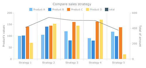
Understanding Stacked Bar Charts: The Worst Or The Best?
Data visualization has become an important part of our everyday life, allowing us to quickly assess information. And with so many chart types out there to choose from, it should be possible to effectively solve almost any task, whether it’s exploratory (i.e. researching and analyzing data to better understand it for yourself) or explanatory (i.e. reporting and communicating data to end users).

However, variety can also cause confusion, making it difficult to clearly understand the purpose of each form of data visualization. As a result, when an inappropriate type of chart is applied to data, the user not only might be confused by the information, but, more importantly, could make bad decisions based on such a presentation.
The post Understanding Stacked Bar Charts: The Worst Or The Best? appeared first on Smashing Magazine.

