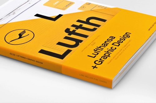
Transforming Lufthansa’s Brand Strategy: From The Online To Interactive Age, A Case Study
The first time I became aware of brand inconsistency was four, maybe five years ago. Companies were extending their appearances to apps, social media and other digital channels. And so did the bank I worked for back then. Unfortunately, no style guides were available to cover these channels.

I remember the dilemma while writing specifications: there were some older corporate identity manuals and some static UI style guides. Then, you’d look at newer web projects and none of them reflected the guidelines. So, what was I to do? Strictly obey the guidelines and produce something that looks outdated, or adapt to modern channels and risking a user experience that diverged from existing customer touch points?
The post Transforming Lufthansa’s Brand Strategy: From The Online To Interactive Age, A Case Study appeared first on Smashing Magazine.

