The User’s Perspective: Using Story Structure To Stand In Your User’s Shoes
The User’s Perspective: Using Story Structure To Stand In Your User’s Shoes
John Rhea
Every user interaction with your website is part of a story. The user—the hero—finds themselves on a journey through your website on the way to their goal. If you can see this journey from their perspective, you can better understand what they need at each step, and align your goals with theirs.
My first article on websites and story structure, Once Upon a Time: Using Story Structure for Better Engagement, goes into more depth on story structure (the frame around which we build the house of a story) and how it works. But here’s a quick refresher before we jump into implications:
The Hero’s Journey
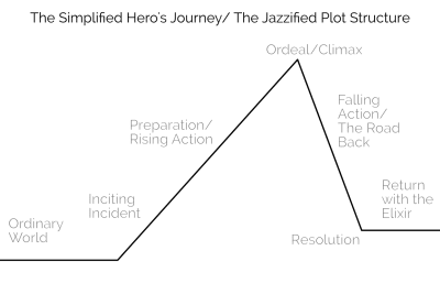
Most stories follow a simple structure that Joseph Campbell in his seminal work, Hero with a Thousand Faces, called the Hero’s Journey. We’ll simplify it to a hybrid of the plot structure you learned in high school and the Hero’s Journey. We’ll then take that and apply it to how a user interacts with a website.

| Ordinary World | The ordinary world is where the user starts (their every day) before they’ve met your website. |
| Inciting Incident/Call To Adventure | Near the beginning of any story, something will happen to the hero that will push (or pull) them into the story (the inciting incident/call to adventure). It will give them a problem they need to resolve. Similarly, a user has a problem they need to be solved, and your website might be just the thing to solve it. Sometimes though, a hero would rather stay in their safe, ordinary world. It’s too much cognitive trouble for the user to check out a new site. But their problem — their call to adventure — will not be ignored. It will drive the user into interacting with your site. |
| Preparation/Rising Action | They’ve found your website and they think it might work to solve their problem, but they need to gather information and prepare to make a final decision. |
| The Ordeal/Climax | In stories, the ordeal is usually the fight with the big monster, but here it’s the fight to decide to use your site. Whether they love the video game news you cover or need the pen you sell or believe in the graphic design prowess of your agency, they have to make the choice to engage. |
| The Road Back/Falling Action | Having made the decision to engage, the road back is about moving forward with that purchase, regular reading, or requesting the quote. |
| Resolution | Where they apply your website to their problem and their problem is *mightily* solved! |
| Return With Elixir | The user returns to the ordinary world and tells everyone about their heroic journey. |
The User’s Perspective
Seeing the website from the user’s perspective is the most important part of this. The Hero’s Journey, as I use it, is a framework for better understanding your user and their state of mind during any given interaction on your site. If you understand where they are in their story, you can get a clearer picture of where and how you fit in (or don’t) to their story. Knowing where you are or how you can change your relationship to the user will make a world of difference in how you run your website, email campaigns, and any other interaction you have with them.
Numerous unsubscribes might not be a rejection of the product, but that you sent too many emails without enough value. Great testimonials that don’t drive engagement might be too vague or focused on how great you are, not what solutions you solve. A high bounce rate on your sign up page might be because you focused more on your goals and not enough on your users’ goals. Your greatest fans might not be talking about you to their friends, not because they don’t like you, but because you haven’t given them the opportunity for or incentivized the sharing. Let’s look at a few of these problems.
Plan For The Refusal Of The Call To Adventure
Often the hero doesn’t want to engage in the story or the user doesn’t want to expend the cognitive energy to look at another new site. But your user has come to your site because of their call to adventure—the problem that has pushed them to seek a solution—even if they don’t want to. If you can plan for a user’s initial rejection of you and your site, you’ll be ready to counteract it and mollify their concerns.
Follow up or reminder emails are one way to help the user engage. This is not a license to stuff your content down someone’s throat. But if we know that one or even seven user touches aren’t enough to draw someone in and engage them with your site, you can create two or eight or thirty-seven user touches.
Sometimes these touches need to happen outside of your website; you need to reach out to users rather than wait for them to come back to you. One important thing here, though, is not to send the same email thirty-seven times. The user already refused that first touch. The story’s hero rarely gets pulled into the story by the same thing that happens again, but rather the same bare facts looked at differently.
So vary your approach. Do email, social media, advertising, reward/referral programs, and so on. Or use the same medium with a different take on the same bare facts and/or new information that builds on the previous touches. Above all, though, ensure every touch has value. If it doesn’t, each additional touch will get more annoying and the user will reject your call forever.
Nick Stephenson is an author who tries to help other authors sell more books. He has a course called Your First 10K Readers and recently launched a campaign with the overall purpose of getting people to register for the course.
Before he opened registration, though, he sent a series of emails. The first was a thanks-for-signing-up-to-the-email-list-and-here’s-a-helpful-case-study email. He also said he would send you the first video in a three-part series in about five minutes. The second email came six minutes later and had a summary of what’s covered in the video and a link to the video itself. The next day he emailed with a personal story about his own struggles and a link to an article on why authors fail (something authors are very concerned about). Day 3 saw email number four… you know what? Let’s just make a chart.
| Day | Value/Purpose | Email # |
|---|---|---|
| 1 | Case Study | 1 |
| 1 | Video 1 of 3 | 2 |
| 2 | Personal Story and Why Authors Fail Article | 3 |
| 3 | Video 2 of 3 | 4 |
| 4 | Honest discussion of his author revenue and a relevant podcast episode | 5 |
| 5 | Video 3 of 3 | 6 |
| 6 | Testimonial Video | 7 |
| 7 | Registration Opens Tomorrow | 8 |
| 8 | Registration Info and a pitch on how working for yourself is awesome | 9 |
By this point, he’s hooked a lot of users. They’ve had a week of high quality, free content related to their concerns. He’s paid it forward and now they can take it to the next level.
I’m sure some people unsubscribed, but I’m also sure a lot more people will be buying his course than with one or even two emails. He’s given you every opportunity to refuse the call and done eight different emails with resources in various formats to pull you back in and get you going on the journey.
I’ve Traveled This Road Before
It takes a lot less work to follow a path than to strike a new one. If you have testimonials, they can be signposts in the wilderness. While some of them can and should refer to the ordeal (things that might prevent a user from engaging with you), the majority of them should refer to how the product/website/thing will solve whatever problem the user set out to solve.
“This article was amazing!” says the author’s mother, or “I’m so proud of how he turned out… it was touch-and-go there for a while,” says the author’s father. While these are positive (mostly), they aren’t helpful. They tell you nothing about the article.
Testimonials should talk about the road traveled: “This article was awesome because it helped me see where we were going wrong, how to correct course, and how to blow our competitor out of the water,” says the author’s competitor. The testimonials can connect with the user where they are and show them how the story unfolded.
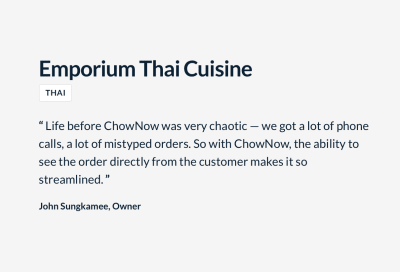
This testimonial for ChowNow talks about where they’ve been and why ChowNow worked better than their previous setup.

So often we hear a big promise in testimonials. “Five stars”, “best film of the year,” or “my son always does great.” But they don’t give us any idea of what it took to get where they are, that special world the testifier now lives in. And, even if that company isn’t selling a scam, your results will vary.
We want to trumpet our best clients, but we also want to ground those promises in unasterisked language. If we don’t, the user’s ordeal may be dealing with our broken promises, picking up the pieces and beginning their search all over again.
The Ordeal Is Not Their Goal
While you need to help users solve any problems preventing them from choosing you in their ordeal, the real goal is for them to have their problem solved. It’s easy to get these confused because your ordeal in your story is getting the user to buy in and engage with your site.
Your goal is for them to buy in/engage and your ordeal is getting them to do that. Their goal is having their problem solved and their ordeal is choosing you to solve that problem. If you conflate your goal and their goal then their problem won’t get solved and they won’t have a good experience with you.
This crops up whenever you push sales and profits over customer happiness. Andrew Mason, founder of Groupon, in his interview with Alex Bloomberg on the podcast “Without Fail”, discusses some of his regrets about his time at Groupon. The company started out with a one-deal-a-day email — something he felt was a core of the business. But under pressure to meet the growth numbers their investors wanted (their company goals), they tried things that weren’t in line with the customer’s goals.
Note: I have edited the below for length and clarity. The relevant section of the interview starts at about 29:10.
Alex: “There was one other part of this [resignation] letter that says, ‘my biggest regrets are the moments that I let a lack of data override my intuition on what’s best for our company’s customers.’ What did you mean by that?”
Andrew: “Groupon started out with these really tight principles about how the site was going to work and really being pro customer. As we expanded and as we went after growth at various points, people in the company would say, ‘hey why don’t we try running two deals a day? Why don’t we start sending two emails a day?’ And I think that sounds awful, like who wants that? Who wants to get two emails every single day from a company? And they’d be like, ‘Well sure, it sounds awful to you. But we’re a data driven company. Why don’t we let the data decide?’ …And we’d do a test and it would show that maybe people would unsubscribe at a slightly higher rate but the increase in purchasing would more than make up for it. You’d get in a situation like: ‘OK, I guess we can do this. It doesn’t feel right, but it does seem like a rational decision.’ …And of course the problem was when you’re in hypergrowth like [we were] …you don’t have time to see what is going to happen to the data in the long term. The churn caught up with [us]. And people unsubscribed at higher rates and then before [we] knew it, the service had turned into… a vestige of what it once was.”
— Without Fail, Groupon’s Andrew Mason: Pt. 2, The Fall (Oct. 8, 2018)
Tools For The Return With The Elixir
Your users have been on a journey. They’ve conquered their ordeal and done what you hoped they would, purchased your product, consumed your content or otherwise engaged with you. These are your favorite people. They’re about to go back to their ordinary world, to where they came from. Right here at this pivot is when you want to give them tools to tell how awesome their experience was. Give them the opportunity to leave a testimonial or review, offer a friends-and-family discount, or to share your content.
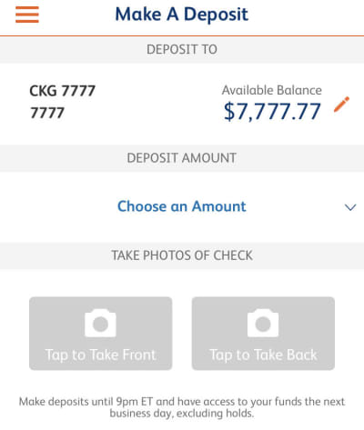
SunTrust allows electronic check deposit through their mobile app. For a long while, right after a deposit, they would ask you if you wanted to rate their app. That’s the best time to ask. The user has just put money in their account and are feeling the best they can while using the app.

The only problem was is that they asked you after every deposit. So if you had twelve checks to put in after your birthday, they’d ask you every time. By the third check number, this was rage inducing and I’m certain they got negative reviews. They asked at the right time, but pestered rather than nudged and — harkening back to the refusal of the call section — they didn’t vary their approach or provide value with each user touch.
Note: Suntrust has since, thankfully, changed this behavior and no longer requests a rating after every deposit.
Whatever issue you’re trying to solve, the Hero’s Journey helps you see through your user’s eyes. You’ll better understand their triumphs and pain and be ready to take your user interactions to the next level.
So get out there, put on some user shoes, and make your users heroic!
 (cc, il)
Articles on Smashing Magazine — For Web Designers And Developers
