The Anatomy of Great Website Design that Google Loves
Creating a website is very much like preparing a cake. How you dress it and how it ends up looking can be worlds apart. And we all want our cakes to look pretty and taste amazing, right? If you agree then the key is to pay attention to detail. Here are a few miniscule factors to keep in mind when building your very own website. Or let’s just say this is how you put the dressing on the cake.
How to Achieve Good and Functional Website Design
First Things First: The Header!
The primary point of focus that you must start off with is the way each landing page looks. And how do you come up with the best looking page?
Put up a great header!
Every single website you open is easily identifiable by its header image. This is where your logo goes, along with essential details such as tag lines, service tabs or contact number.
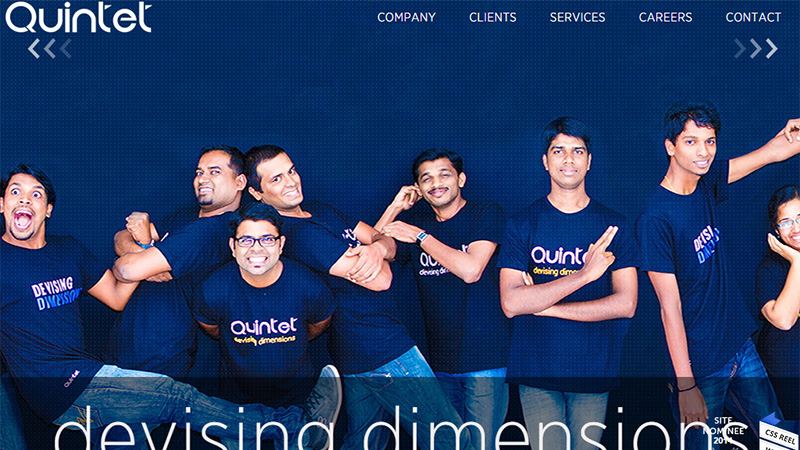
The header from Quintet has one large image that speaks out everything! The company staff, personalization and creativity.
Spark it up with the colour that represents your business and let the user get a true feel for your brand.
Headlines and Navigations
Everything that follows from the header should be displayed neatly in columns and boxes that blend in well with the overall design of the website.
The flow of the content needs to be controlled based on the underlying web layout being used. A user needs to be able to navigate freely, clearly and swiftly.
This means that the website has good user functionality, increasing the time spent on the landing page. Google is able to track your navigation system and website structure.
The overall site hierarchy will determine how the website is ranked on search engines so a great website will include easy-to-browse categories for content and products.
Body Content
Effective Content marketing is what separates a good website from a bad one. And this is not an overstatement.
No matter what you do, do not get your content wrong. After all, it’s what goes on your website that defines what it is all about. The efficient use of relevant keywords and key phrases determines how well the Google Webmaster tool responds to your website.
However, keyword stuffing is also identified by the genius tool and prolific and rambling use of certain words will have the opposite impact on user experience.
Many top SEO experts and growing web design companies are focusing on keeping a balance between the uses of keywords in the content body. Though the latest Google tips all point to making the user happy to make Google happy!
Unique, compelling and exciting copy is what really grabs attention!
Readability and Typography
Who doesn’t like a remarkable presentation of text that is both readable and interactive?
Well that’s your goal!
Once you get the text right, be wary of the way you lay it out. It is absolutely essential to make prudent use of typefaces that best suit your webpage. Choose wisely between casual and sombre fonts so that they don’t conflict with the overarching theme.
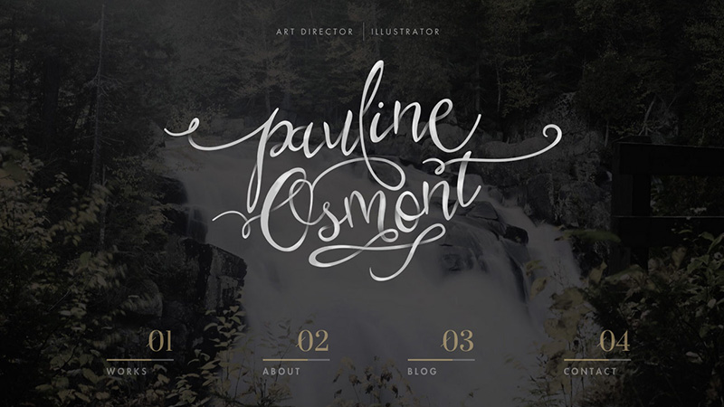
Pauline Osmont, an Art illustrator, has a self-branding website with an amazing typography that matches the website’s theme and the service that is provided. Note the font is also readable and clear without any clusters.
Remember, typography is important in polishing content.
Images and Videos
Wait up before you rack up a huge pile of text. No one has the time to read long texts (Ok I’m going to keep this briefer now)
So perk up the page with visual content with images and videos that engage the user. Your goal is to excite the visitor with what you are offering, so make it shine!
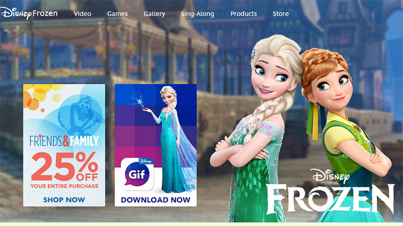
Disney’s Official pages are full of images and video trailers that have shot up user engagement on their site.
Footer
Website links at the page footer are essential elements in the website – do not miss them!
At the end of every single page, a user should be able to refer to links that take him where he wants on the website!
How Is Your Website Coded?
Well, let’s get down to baking the cake we just dressed to see how tough it really is.
Content on Each Page
Each landing page will be distinguished by the content it contains. For longer user engagement time, more (but unique) content will be helpful.
The use of sliders and videos that inform visitors about the business and related areas will bring in all the more traffic.
Load Times
A good website does not take too long to load. Optimize the amount of written and visual content that you upload and make sure your back end server is giving you the best hosting.
Once a visitor is lost due to page load failure, you are never sure he’ll be back!
Responsive Design
This is a relatively new concept, but not entirely. It’s time to jump the mobile internet bandwagon if you still haven’t.
A great website has a responsive design that adapts to different screen widths and shows up perfectly on a mobile device. For SEO purposes, this is serious business!
HTML and CSS
HTML, the standard mark-up language used to create web pages, is your website’s skeleton and gives structure to each webpage.
Anything and everything that goes on a website from text to headings and from images to links is all based on how the HTML language is written.
So be sure to choose the best HTML website design such as HTML4 and 5 for basic but proficient working of your website. Cascading Style Sheets (CSS) for the site are equally important as they format a document written in mark-up language.
CSS defines the layout of HTML documents, therefore a good design is supported by a carefully chosen CSS style.
How Does Google Read Your Website?
Time to see how the cake looks to Google!
URL Structures
A website made with HTTP is dependent on a reliable and simple URL (Uniform Resource Locator) structure. Not only should the URL be friendly to search engines but also to users by simply pointing out the unique resource that it is attached to.
URLs should be readable, memorable and easily comprehendible by the regular user. Complex URLs will lead to Googlebot being unable to index the website’s content and may create problems for crawlers.
Linking Hierarchy
A clear hierarchy is central to a site’s functionality and text links should lead to a different page.
Links on the home page should lead to relevant sub-pages which should link to further sub-category detailed pages. Build a pyramid so that the visitor knows exactly where he will be taken next.
Keywords and Anchor Texts
Keywords relevant to your business need to be in the right places: Headings, drop-down menus, pop-ups, slider menus. This will ensure that visitors find exactly what they are looking for in a matter of seconds.
Also, better keywords, better SEO!
Anchor texts should lead visitors from the front telling them that more pages related to what they are reading are available on a second click. Make sure anchor text is representative of what’s coming next instead of confusing the visitor with generic content.
Images Optimizations
A high performing website optimizes its images so that they save the maximum amount of bytes, along with valuable visual space.
Design pages in the most bot readable way to enhance SEO and ensure that the browser loads the page as quickly as possible, displaying what it necessary for increased usability.
What Are User’s Action s on Your Website?
Who likes a cake that looks good but wouldn’t taste half as good? A chef’s effort isn’t complete till someone’s tasted his dish.
Let’s dig in and get a piece of our very own cake!
Call to Actions
This is not just true for e-commerce sites which are looking for more rigorous marketing techniques every day. The Call to Action is for every website owner that wants to engage an audience.
How to do that effectively?
Invest in a newsletter that users can sign up to, or ask them to fill out a contact form so you can update them with sales and services. From Placements to colours and texts, a call to action must be aesthetically provoking and smartly engineered.
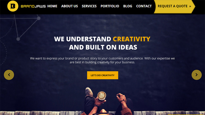
Our designers at Brandjaws have kept the consistency of the ‘yellow colour’ as a means of any action that can be taken on the website. This header is designed so the user can prominently distinguish the yellow buttons from the dark contrast of the blue/black background.
The tedious task of engaging customers can only be made easy by giving out incentives such as coupons or the chance to win a free prize. Design these so that users don’t stumble upon calls to action, but make it loud and clear through effective web design.
Your advertising billboard is your canvas. Paint a colourful one!
Social Sharing
What is the world without social sharing?
Millions of people are coming together on social media to say what they like, so why not keep tabs on popular platforms:
Facebook, Twitter, LinkedIn, Reddit, Tumblr, Pinterest, Medium; and see what people like or dislike about you.
Use active social tabs in your website design to keep social audiences intact and allow them to interact through comments and shares on all your posts.
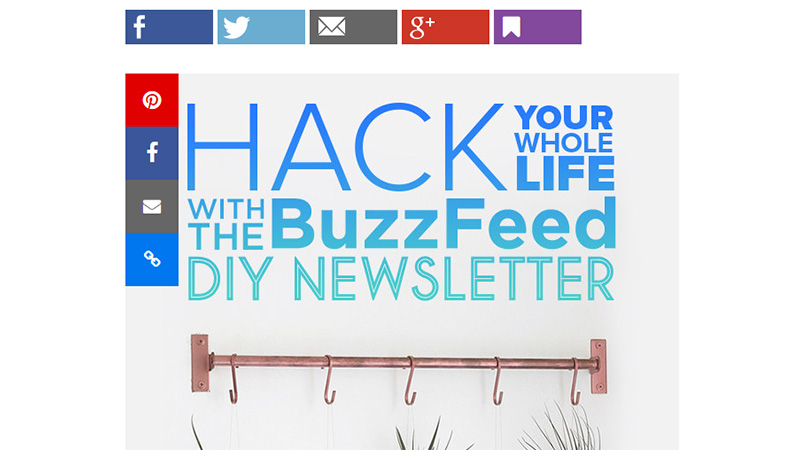
Buzzfeed, an entertainment giant, has leveraged every possibility for users to share their content across various sites.
Commenting
Is your site all about words? Well, a reader will always want to say something about what he’s read.
So if you are a blogging website, open up to your visitors and connect through a user friendly commenting section (such as the one powered by Disqus) and learn about what people have to say.
Spark intelligent conversations and let your website be the star of the show!
Conclusion
Hopefully these tips have helped you to understand what Google loves to see in a website and how to push your site high up on the Google search page.
Do you have any other tricks or tips up your sleeve that you would like to share with us? Please leave your tip in the comments section below.

