
The 101 Course on Crafting 404 Pages
The 101 Course on Crafting 404 Pages
Shelby Rogers
Why Your 404 Pages Might Be The Unexpected Hero Of Your Content Marketing Strategy
A lot of people toss around the phrase, “It’s not about the destination. It’s about the journey.” And those people are telling the truth — until they hit a roadblock.
Missed turns or poorly-given directions can cost someone hours on a trip. When you’re on a mission, those hours spent trying to find what you need could ruin the entire experience.
It doesn’t always have to end in disaster. This more optimal scenario could occur: you take a wrong turn, but after stopping at a nearby gas station, you leave with more than accurate directions to your final destination. You’ve also managed to score a free ice cream cone from the sweet old lady working behind the gas station’s register because she saw you were lost… and wanted to cheer you up.
Often, website visitors can wind up getting turned around. It’s not always their fault. They could’ve typed in the wrong URL (common) or clicked on a broken link (our mistake). Whatever the reasoning, you now have confused people who only wanted to engage with your website in some way and now can’t. You hold the reins on their navigation. You can guide them back to where you wanted them to go all along or you can leave them frustrated and in the dark. Do they need to make a U-turn? Did they get off at the wrong exit? Only you can tell them, and the best way to do so is through a 404 error page.
Your website’s 404 error page can deliver either of these scenarios with regard to getting your visitors back on their buyer’s journey. A lackluster 404 page irritates your visitors and chases them away into the hands of a competing website that better guides them to what they’re looking for. That lackluster 404 page has bland messaging with minimal visual elements. It might include a variation of the same serif text: “This page does not exist.” That’s like your web users asking you for directions and telling them nothing more than “well, what you’re looking for isn’t here. Good luck.” Nothing more.

Unfortunately, even some of the world’s best brands use these 404 pages. No navigation. No interesting text. Nothing that reflects their brand messaging. Visitors are left even more disappointed in their encounter than before.
However, there are some 404 pages that go above and beyond. Rather than the stark white of a standard 404 error page, these pages take an opportunity to speak to users in a more personal tone. Excellent 404 pages are exactly like getting an unexpected treat from a friendly face. Well-crafted 404 Pages can redirect your pages’ visitors away from being lost and confused and to a much happier mood and onto a more helpful page on your website.
Take Amazon, for instance. On Amazon Day 2018, Amazon learned firsthand the importance of a decent 404 page. Sure, buyers were still frustrated upon reaching a 404 page — even if it included a puppy. However, could you imagine how much more irritated buyers would’ve been had the 404 page looked clinical, cold, and not helpful?
Regardless of what tone you want to take or what visuals you want to use or what copy will best engage your readers, a great 404 page does one thing above all else: Makes website visitors okay with not finding what they need — if only for a moment — and directs them to where they need to go.
While 404 pages vary greatly, the best ones all seem to do two things well:
- support the company’s overall brand and messaging;
- successfully redirect website visitors elsewhere on the page through clear navigation and support.
Thematically, there are a few ways to accomplish the ‘perfect’ 404 page:
1. Nail Down The Overall Tone
If content isn’t your brand’s strong suit, this could be a struggle. However, if you have a sense of your brand’s voice and messaging, you can quickly identify where you can offer something unexpected. Visitors are already going to be disappointed when they hit your 404 page; they’re not getting what they wanted. Your 404 page is an opportunity to show that your brand has humans behind its marketing rather than robotic, cold, automated messages seen elsewhere. In short, move beyond the “this page is unavailable” and its variants.
Regardless of the tone, good 404 pages work like magicians. The best illusionists often acknowledge they’re magicians; they don’t pretend to be something they’re not. 404 pages own up to being an error page; the copy and visuals often reflect that. And then, like any good magician, 404 pages pull the attention away from the problem and put that attention elsewhere. Typically, that’s done with copy that matches the visual elements.
Here are some themes/moods that successful 404 pages have leveraged in the past used to succeed.
Crack A Joke
A joke (even a corny one) can do wonders for alleviating awkwardness or inconvenience. However, unless your brand is built on crude humor (i.e. Cards Against Humanity which ironically doesn’t have a good 404 page), it’s best to make the jokes either tongue in cheek or punny rather than too crass. This example from Modcloth makes a quick pun but keeps the mood light.

Get Clever
It might not be outright funny, but it’s something that gets a visitor’s attention shortly after arriving on your page. It can be a little sassy, snarky, even unexpected. This 404 page from Blizzard Entertainment does a great job at flipping the script both with its visual tone and its copy.

Be Friendly
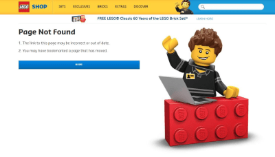
Prime example would be LEGO Shop’s 404 page with a friendly customer service rep (albeit a LEGO rep). The friendliness can come from an inviting design or warm copy. Ultimately, it’s anything that culminates in a sense of “oh hey, we’re really sorry about that. Let us try to fix it.”
“If your company’s brand excels in customer service and customer care, maybe taking a tone of genuine friendliness would be most appropriate to carry over brand messaging. If that’s the case, treat your 404 page like an extension of your guest services window.”
Integrate Interactivity
People love to click on things, especially if they’re engaging with the 404 page on desktop. And if they’re engaging with your website, all the better! One of the best examples online of interactivity on a 404 page is from Kualo. The site hosting provider gamified its 404 page into a recreation of Space Invaders, complete with the ability to earn extra lives as you level up. Even more impressive is that Kualo actually offers discounts on its hosting for certain thresholds of points that users reach.

Be Thought-provoking
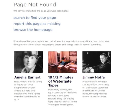
Yes, your 404 pages can even be educational! 404 pages can offer up resources and links to other helpful spots on your website. It’s an unexpected distraction that could easily keep guests entertained by more information. National Public Radio (NPR) does this exceptionally well. The media outlet provides a collection of features with one major similarity: the stories are about things which have also disappeared.
Topical/pop-culture Based
Use this one with caution, as there’s a very good chance you’ll have to change your 404 message if you’re going to be topical. Pop culture references move fast; if you’re not careful, you’ve spent too much time developing a 404 page that will be irrelevant in two weeks. (And this is a cardinal sin for any organization with a target market of Millennials or younger.) The Spotify 404 page above recently underwent a shift to keep up with trends. Prior to doing a quick play on Kanye West’s “808 and Heartbreak,” the 404 page featured lyrics from Justin Bieber’s “Sorry.”

2. Craft Visual Elements To Match That Tone
Once you have an idea of the proper tone for your 404 page, visuals are an important next step in the process. Visuals are often the first element of a 404 page people will note first — and thus, it’s the first representation of that page’s desired tone.
Static visuals help emphasize the page copy. Adding in light animation can often collaborate with the text to further a message or tone. For example, Imgur’s 404 page brings its illustrations to life by making the eyes of its characters follow a visitor’s cursor.

Interactivity among the visual elements give people an opportunity to do what frustrated internet users love to do — click on everything in an attempt at making something useful happen.
3. Nail Down The Navigation Options
You know what tone you want your business to strike. You’ve got an idea of the visuals you’ll use to present that tone. Your website visitors will think it’s great and fun — but only for a moment. Your website still has to get them to what they’re looking for. Clear navigation is the next big step in directing your lost website visitors toward their goals. A 404 page that’s cute but lacks good navigation design is like that sweet old man who is kind but he gives you the world’s worst directions.
“After making a good first impression with your 404 page, the immediate next step should be getting website visitors off it and to where they want to be. There should always be clear indications on where they should go next.”
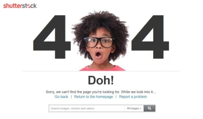
For example, Shutterstock’s 404 page offers three distinct options. Visitors can either go back to the previous page, which is helpful if they clicked on the wrong link. They can return to the homepage for more of a hard restart in their navigation, or maybe they came in from a search engine and found a broken link, but they’re not quite ready to give up on the website and want to look around. The final option is to report a problem. If someone has been scouring your website for minutes on end and they have an idea of what they’re looking for, they can report that they might have found an issue. At the very least, it gets your web visitors involved with your company and your development team gets feedback about the accessibility of your website.
In addition to clear navigation, these other navigation-based elements could help your visitors out even more:
- Chatbots / live chat: Bots are often received one of two ways. Users either find them incredibly annoying or relatively helpful. Bots that pop up within a second of landing on a page often lead visitors to click out of a site entirely as the bot seems intrusive. However, your website can use bots by simply adding a “Click to chat” option. This invites lost visitors who want your help to engage with the bot rather than the bot making a potentially annoying first move.
- Search Bars: This element can do wonders for websites with a high volume of pages and information. A search bar could also offer up answers to common questions or redirect to an FAQ.
And one final navigation note — make sure those navigation tactics are just as efficient on mobile as they are on desktop. Treat your 404 page as you would any other. In order for it to succeed, it should be easily navigable to a variety of users, especially in a mobile-first world.
While the look of your 404 page is critical, you ideally never want anyone to find it on your website. Knowing the most common 404 errors on your website could give you insights in how to reduce those issues.
How To Track 404 Events Using Google Analytics
What You Need To Start Tracking
The code provided will report 404 events within Google Analytics, so you must have an up-and-running account there to take advantage of this tutorial. You also need access to your site’s 404 template and (this is important) the 404 page must preserve the URL structure of the typed/clicked page. This means that your 404 events can’t just redirect to your 404 page. You must serve the 404 template dynamically with the exact URL that is throwing the error. Most web server services (such as Apache) allow you to do this with a variety of rewrite rules.

Tracking 404 Errors With Google Analytics
With Google Analytics, tracking explicit 404 errors is straightforward and simple. Just ensure that your main Google Analytics tracking script is in place and then add the following code to your 404 Error Page/Template:
<script> // Create Tracker - Send to GA ga('create', 'UA-11111111-11'); ga('send', { hitType: 'event', eventCategory: '404 Response', eventAction: window.location.href, eventLabel: document.referrer }); </script>You will need to swap out the ID of your specific Google Analytics account. After that, the script works by sending an “event” to Google Analytics. The category is “404 Response,” the action uses JavaScript to pass the URL that throws the error, and the label uses JavaScript to pass along the previous URL the user was on. Through all of this data, you can then see what URLs cause 404 events and where people are accessing those URLs.
Tracking 404 Errors With Google Tag Manager
More and more web managers have decided to move to Google Tag Manager. This tool gives them the capability of embedding a whole host of scripts through a single container. It’s especially useful if you have a lot of tracking scripts from several providers. To begin tracking 404s through Tag Manager, first begin by creating a “Variable” called “Page Title Variable.” This variable type is a “JavaScript” variable and the Variable Name is “document.title”:

Essentially, we’re creating a variable that checks for a page’s given title. This is how we will check if we are on a 404 page.
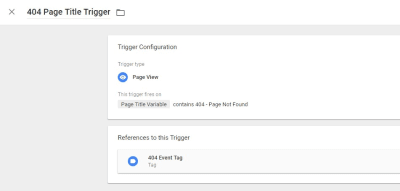
Then create a “Trigger” called “404 Page Title Trigger.” The type is “Page View” and the trigger fires when the “Page Title Variable” contains “404 — Page Not Found” or whatever it is your 404 page title displays as within the browser.
Lastly, you will need to create a “Tag” called “404 Event Tag.” The tag type is “Universal Analytics” and contains the following components:
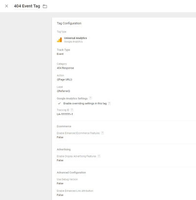
The Variable, Trigger, and Tag all work to pass along the relevant data directly to Google Analytics.
404 Event Reporting
No matter your tracking method (be it through Tag Manager or direct event beacons), your reporting should be the same within Google Analytics. Under “Behavior,” you will see an item called “Events.” Here you will see all reported 404 events. The “Event Action” and “Event Label” dimensions will give you the pertinent data of what URLs are throwing 404 errors and their referring source.
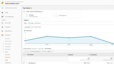
With this in place, you can now regularly monitor your 404 errors and take the necessary steps to minimize their occurrence. In doing so, you optimize your referral sources and provide the best user experience, keeping conversions and engagement on the right path.
What To Do With Your Google Analytics Results
Now that you know how to monitor those 404 errors, what’s a developer to do? The key takeaway from tracking 404 occurrences is to look for patterns that result in those errors. The data should help you determine user intent, cluing you into what your users want. Ideally, you’ll see trends in what brings people to your 404 page, and you can apply that knowledge to adjust your website accordingly.
If your website visitors are stumbling while searching for a page, take the opportunity to create content that fills in that hole. That way people get results they hadn’t previously seen from your site.
The 404 events could be avoided with a tweak in your website’s design. Make sure the navigation on your pages are clear and direct users to logical ending points. The fix could even be as simple as changing descriptions on a page to paint a clearer picture for users.
Putting It All Together
Tone, images, and navigation — these three elements can transform any 404 page from a ghost town into a pleasant serendipitous stop for your website visitors. And while you don’t want them to stay there forever, you can certainly make sure they stay with you is enjoyable before sending them on their way. By regularly monitoring your 404 errors, you can also alleviate some of the ditches, poorly-marked signage, and potholes that frequently derail users. Being proactive and reactive with 404 errors ultimately improves the journey and the destination for your website visitors.
 (yk, ra)
Articles on Smashing Magazine — For Web Designers And Developers
