Building User Trust In UX Design
Building trust is one of the central goals of user experience design. And yet trust is a concept that’s very hard to define in a precise manner. We all know it when we feel it but often fall short of putting it in words. Being able to turn the elusive and intangible into actionable and concrete steps, however, is exactly what makes UX so crucial in the modern business ecosystem.
Although a product experience that is useful and coherent is what fundamentally builds a sense of security and satisfaction, there’s a lot more nuance that goes building it. That’s what this article is about. We’ll take a deeper dive into users’ trust and how we can use UX to build a lasting relationship with your clientele.
Instilling trust goes beyond the bare visuals of a product. Ideally, a UX designer’s work starts well before the first lines are drawn and long after designs are deployed.
Being more present allows us to achieve a comprehensive view of the whole customer lifecycle, which also encourages us to borrow tools and approaches from marketers, product managers and developers. Being well-rounded in the product development activities is yet another aspect that we’ll advocate for throughout the piece. As a result of dabbling in non-design activities, we can gather an in-depth understanding of all areas where trust is vital.
Think About The Customer Journey
A central competency of UX design is a good understanding of your users’ needs, preferences, and emotions. Therefore, overtime we, designers, need to develop a wide array of skills to improve our understanding of our users and their interaction with our products.
One such way entails using qualitative data and detailed analytics, which is vital in allowing us to outline a user’s persona’s most important qualities. Analytics can be used to create hypotheses and validate or discard them. As a result, you’ll be able to create experiences that will foster customer loyalty and a sustained sense of trust.
Let’s look into the stages of a customer journey and explore how UX designers can bring value to the table. You might also notice the way we suggest to structure the customer journey map is marketing-oriented. Such marketing-orientedness speaks to the purpose of this article: to give designers a broader perspective.
Below, we can see one such example of a customer journey that’s structured around the so-called “funnel” marketers and sales-people use:
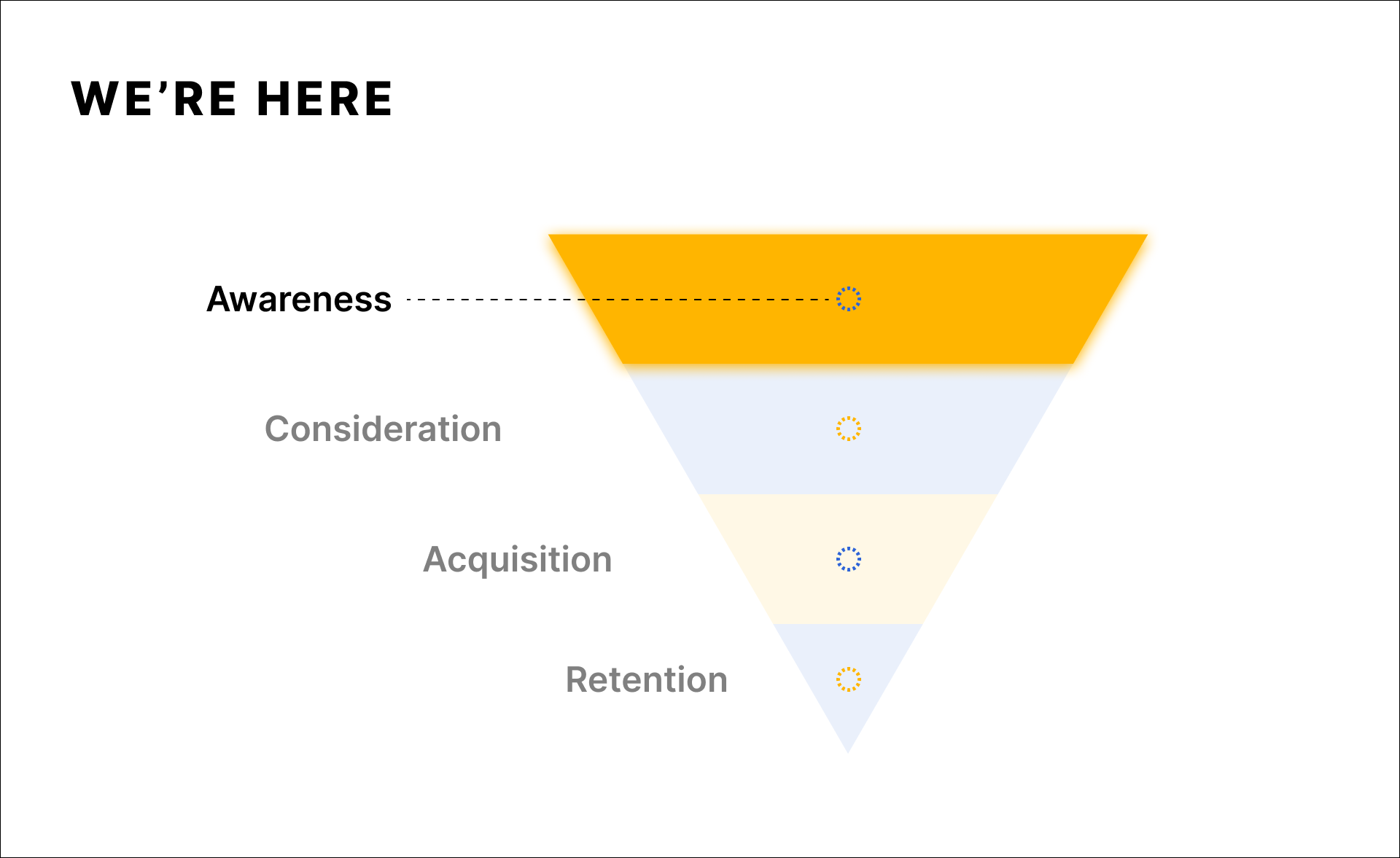
Below is the classic visualization of a sales/marketing funnel. You may have come across different wordings for the stages but this doesn’t change their essence. The reason this visualization is shaped like a funnel is simple: only a small portion of people who come across your product will end up becoming a paying customer. We’ve also combined the intent and action into one stage, since in the context of building trust through good UX they’re fairly similar.

We’ve also combined the intent and action into one stage, since in the context of building trust through good UX they’re fairly similar.
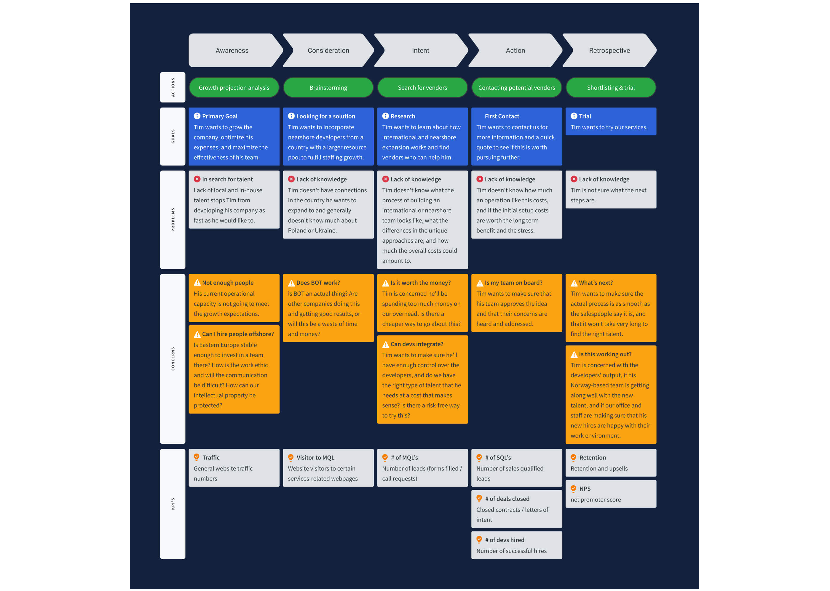
Now we need to apply this funnel thinking to a customer journey. That’s exactly what we did with the customer journey map (CJM) below. This map was created for one of our projects a while ago, and was tweaked significantly to respect the client’s privacy. By focusing on the whole funnel, we were able to go beyond the product UI, and audit the whole UX from the very first users’ interaction with the product in question.
Now that we’ve talked briefly about how we can map users’ journey to pinpoint trust-sensitive areas, let’s move on to the first stage of the funnel: Awareness.
Awareness
Awareness is the stage where we should analyze how customers learn about a product or service. When devising a strategy for this step, we need to start from our users’ problems and their most common pain points. Being user-centric enables us to think about the best ways to approach potential customers while they are trying to tackle a certain pain point. The goal here is to have a reserved and more educational tone.
Sounding too corporate or salesy can have an adverse effect on a person that isn’t familiar with the product. The way we should approach the awareness stage depends on whether your product is launched or not.
In order to map a journey that is representative of real users we need real data. The ways of collecting this data will depend on whether the product in question is launched or not. Let’s go through both of these scenarios separately.

The Approach For Launched Products
A product or service that has already hit the market can learn a lot about the people it attracts. Both qualitative and quantitative methods can provide us with a wealth of valuable insight.
There are plenty of tools and techniques in the market that will help get to know your users better. Here are the ones that are used the most often:
Let’s break down the three in more detail.
Google Analytics
Google Analytics is a popular tool that is predominantly used by marketers, but it has gradually been adopted by UX specialists as well. It’s an excellent way to learn about the types of audiences you need to design for and create hypotheses about their preferences. More importantly, Google Analytics gives us insights on how people find you. Conversely, it allows you to learn how people do not find you.
A launched product can dive into a variety of values to better their understanding of their clientele. Here are a few of them:
- Top Sources Of Traffic
This allows you to understand what are the most successful channels that drive awareness. Are you active enough on these channels? Can anything be improved in terms of your online presence?
Here’s how Google Analytics present data on where your users come from:

- User Demographics
This provides you with data on your audience’s age, gender, lifestyle, and interests. That’s one of the ways you can validate a UX persona you’ve created with data rather than your assumptions;
Here’s how Google Analytics visualizes the data on the users’ location:

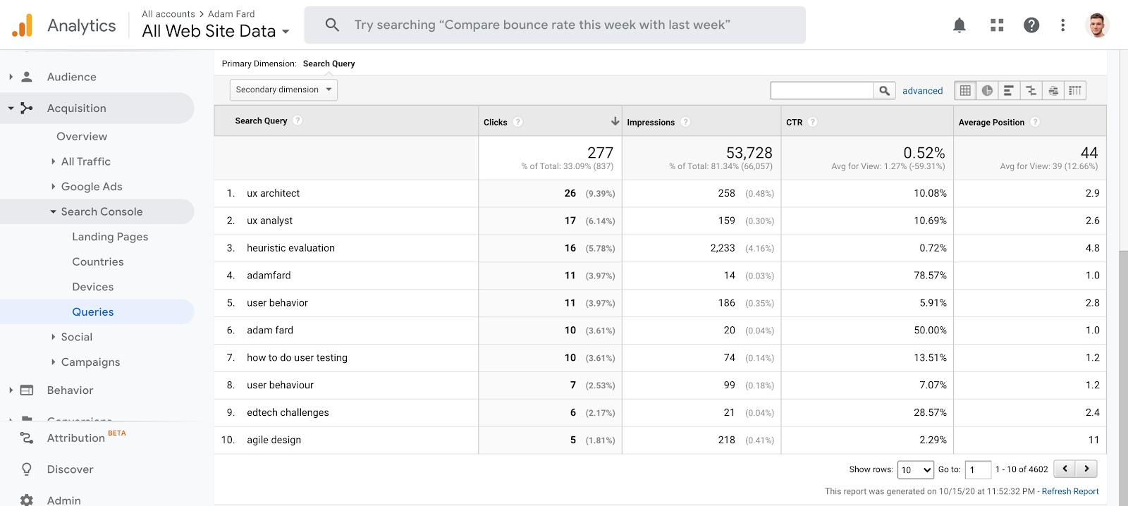
- Keyword insights — you can use two approaches here. The first one involves the usage of Google Search Console. It shows you the keywords your audience uses to locate your page. It provides you with a wealth of insight into user pain points and can inform your keyword strategy.
The second approach is gauging the data from SEO tools like ahrefs or SEMrush to see how people phrase their search query when they face a problem your product solves.
Once you have an understanding of the keywords that your potential customers use, put them in Google. What do you find there? A competitor product? An aggregator website like Capterra or Clutch? Perhaps nothing that suits the query? Answers to these questions will be invaluable in informing your decisions about optimizing the very first stages of your custom journey.
Here’s how Google Search console shows which keywords users use that end up visiting to your website:
FullStory And Its Equivalents
There is now a great variety of UX tools when it comes to analytics engines. They help translate complex data into actionable insights on how to improve your online presence. The tool that we use, and see other designers use very often is FullStory. Such tools are a great solution when you’re looking to reduce UI friction, find ways to enhance funnel completion, and so forth.
By using such tools, businesses can learn a lot about user behavior and how they can calibrate products to their needs. Do your users read the product description you write? Do they skim it? What part of the page seems to grab their attention? Does that validate or refute your initial assumptions?

User Interviews
Interviewing your user base has a broad spectrum of benefits when it comes to understanding their motivations, values, and experiences. There are many kinds of interviews, i.e. structured, unstructured, ones that feature closed or leading questions, and so on. They all have their benefits and can be tailored specifically to your service or user base to extract maximum insight.
For the purposes of creating a customer journey map that visualizes real data, consider asking questions like:
“How would you go about looking for an X service or product?”
“What information is/was the most important while making a purchasing decision?”
“What are some of the red flags for you when searching for our service/product?”

Approach For Products Pending Launch
There’s plenty of valuable insight that can be gathered without having a launched product. Designs that instill trust from day one are bound to maximize an organization’s success in the long run.
Here are the tools and techniques you should use:
Let’s go through each of those.
Keyword And Online Research
One of the most straightforward ways to establish whether a product is fit for its market is keyword research. Often, looking for keywords is associated with SEM and SEO practices, but there’s a catch. This kind of research will reveal a lot about the most prominent needs on the market as well.
There are a few methods of keyword research can be used to establish market fitness:
- Mining For Questions And Answers
Think about websites like Quora or Reddit. Are people asking about how to solve a problem your product solves? What are the ways they currently go about solving it?

- Competitor Reviews And Descriptions
Is there a trend on why competitors get bad reviews? Conversely, is there something that helps them get better reviews? Is there a gap in their features? - Social Listening
Go through twitter, facebook, LinkedIn hashtags and groups. See if there are communities that are built around the problem you solve or the demographic you target. If so, see what these people talk about, ask them questions. - Keyword Research Tools
This research method helps you learn two things. The first one is whether people have a need for your product or service. By seeing the number of queries in a given period of time you can draw conclusions about the viability of your product. The second valuable insight is seeing how people describe the problem you’re solving. Knowing how people talk about their pains, in turn, will help you speak the same language with your customers.
User Interviews
To some, conducting user interviews before product launch may seem pointless, but it’s far from being true.
By understanding who your potential customers are and learning about their needs and preferences is a valuable vehicle for building trust.
Here are a few important things you can learn from potential users:
- Whether or not they like your design.
The visual side of a product is a vital link, allowing to build trust. For someone to like your design, of course, implies that you already have some designs complete. - Whether or not they find your product idea useful.
This information will allow you to analyze how fit your product is for the market. - The features that they’d like to see in your product.
This will help you quickly adapt to the needs of your customers. - Whether or not they find it easy to use your product.
This data will inform your product’s usability, which too implies having some designs complete. A prototype would be ideal for early usability testing.
Thorough and well-planned user interviews are instrumental in making intelligent business decisions. They provide you with invaluable insight rooted in feedback directly from your potential users.
Competitor Research
Understanding your competitors’ products is vital when it comes to market differentiation. It enables us to learn what customers are lacking and fill in those gaps.
Here are a few things that’ll help you conduct a simple competitor research with trust in mind:
- Choose the right competitors to research.
By the way, these don’t have to be digital products. For example, simple notepad is a competitor to productivity apps, as they solve the same problem: being on top of your tasks and staying productive. How does that help with trust and creating a CJM? It allows you to empathize and put yourself in the shoes of your users. Also, it helps your craft authentic and relatable messaging that resonates with people. - Ensure that your analysis is consistent.
It’s important to have a clear understanding of which aspects you’re going to analyze. Come up with analysis criteria, so that your notes are structured and easy to draw conclusions from.
Considering different options is almost always a part of a customer’s journey. You have to make it easy to understand how you’re better than the alternatives. - Establish the best sources for your data.
The best source is users: either yours or someone else’s. Period. But a few google searches would certainly do no harm. - Define the best ways to incorporate your findings into your product at its inception.
Studying your competition will provide you with a wealth of quantitative and qualitative data that will guide your business decisions. As a result, you’ll create a product that fits your users’ needs and instills trust and satisfaction.
Consideration & Acquisition
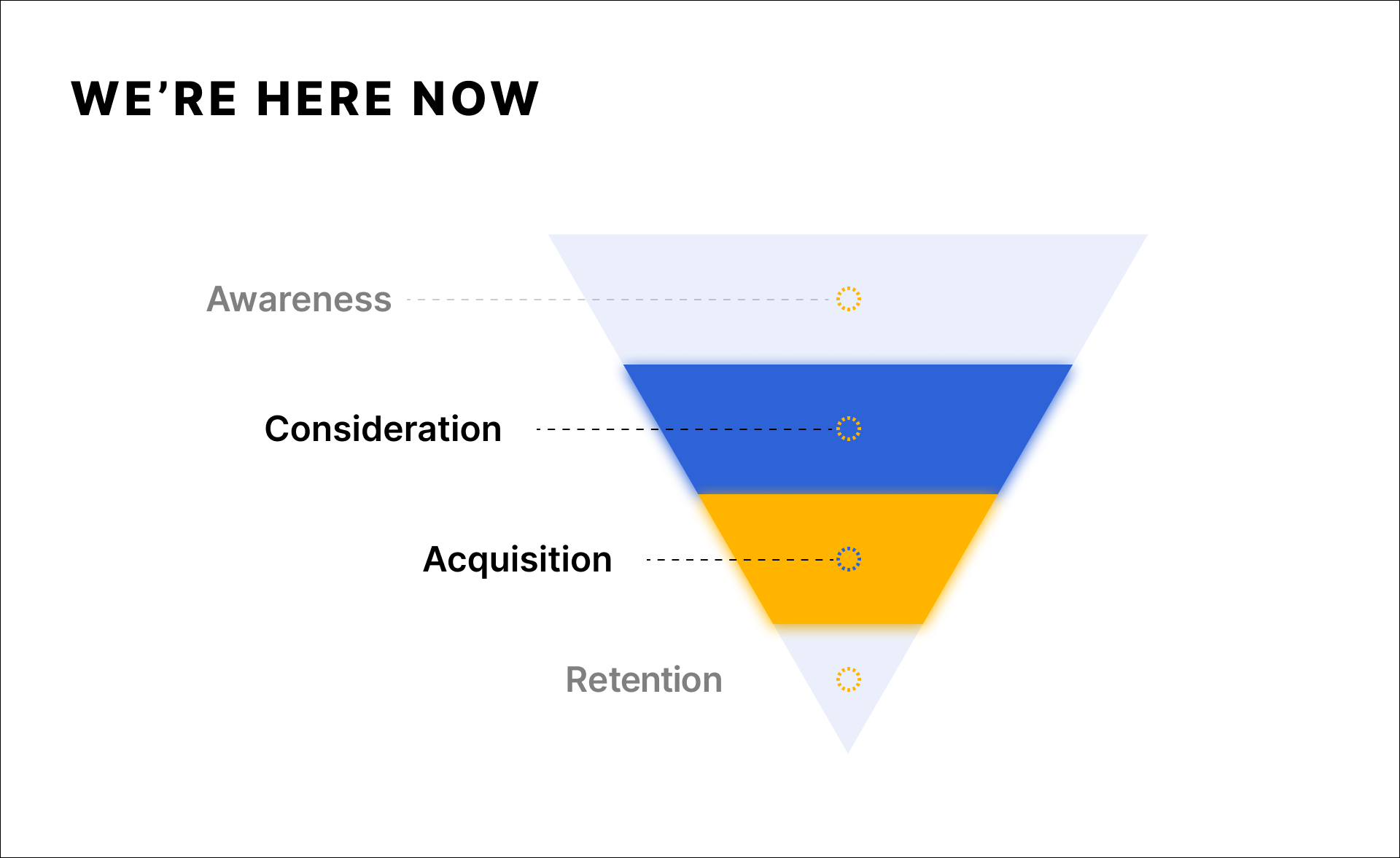
Users that have made it to the consideration stage are interested in your product but aren’t prepared to become paying customers. At this point, they’re evaluating the options offered by your competition and assessing whether they’ll get the value they’re looking for.
There is a wide array of things businesses can do to motivate users to transition into a paying relationship through building trust. Here are a few of them:
Explain How Your Algorithms Work
If your product revolves around AI/ML algorithms, to enhance customer experience, it’s important to explain how it works.
We’re typically very sensitive about our data. Respectively, there’s no reason to think that users will blindly trust a product’s AI. It’s our responsibility to counteract the distrust by explaining how it works and what kind of data it will use.
Here are a few great ways you can outline the AI’s functionality while also encouraging them to make their own informed decisions:
- Calibrate Trust
AI systems are based on stats and numbers, which means that they can’t replace rational human thought. Emphasize that your algorithm is skilled at giving suggestions, but users should make their own choices. - Display Confidence Levels
An essential aspect of the scientific approach is that there are no facts — there is only evidence. Make sure to communicate how confident your algorithm is of something to be true. - Explain Algorithm Outputs
The results of an analysis must be accompanied by a clear explanation thereof.
Good UX & UI
A well-executed UI is at the crux of user trust. Satisfying visuals, consistency, and ethical design will make your product appear trustworthy. Lacking the above will dissuade people from purchasing your product or services.
Here’s an older design example. Would you willingly use such service, especially when the competitors’ design isn’t stuck in 2003?

No offense to Gmail’s former self, by the way. There’s a reason it doesn’t look like that anymore though.
The same could also be said about your product’s UX. Confusing user flows, poor feature discoverability, and other other usability issues are a surefire way to scare away a good chunk of new users. A good remedy to such pitfall is making sure your design adheres to the usability heuristics. If you’re dealing with legacy design, conducting a heuristic evaluation would also serve you well.
Also, stuff like fake buttons, dark patterns, and a wonky interface are guaranteed to seriously hinder your growth.

Testimonials & Reviews
Customer reviews are essential when it comes to building trust. There’s a significant body of research indicating that positive feedback can boost your sales and conversions.
You don’t have to take our word for it. Here’s what researchers in Spiegel Research Center have to say about the importance of review:
Based on data from the high-end gift retailer, we found that as products begin displaying reviews, conversion rates escalate rapidly. The purchase likelihood for a product with five reviews is 270% greater than the purchase likelihood of a product with no reviews.
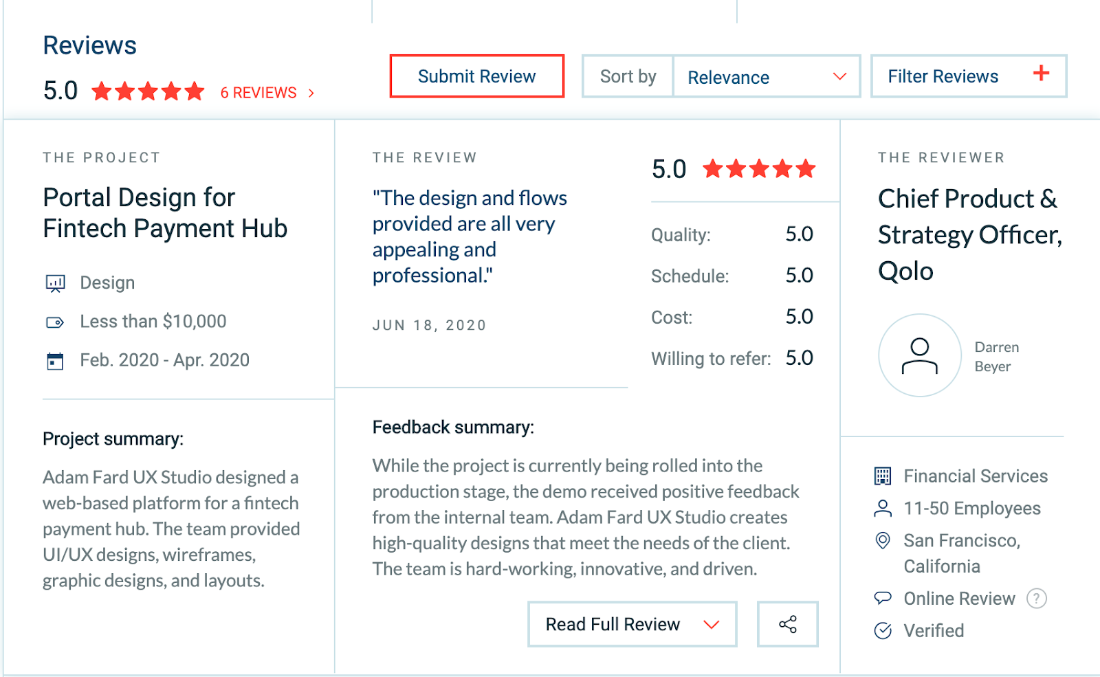
Plus, studies have shown that people use testimonials to assess how trustworthy a product is.
It’s also worth noting that people who have negative experiences are a lot more likely to write a review, rather than the ones who had a good one. That’s why you should be creative in asking people to leave reviews. Here’s how Upwork approaches soliciting feedback.
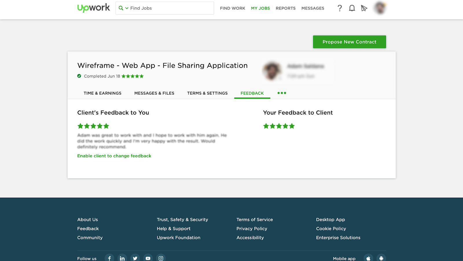
Notice that Upwork allows you to see what review a customer left only after you’ve left one. It’s fascinating how they leverage curiosity to encourage users to leave feedback.
Over 90 percent of internet users read online reviews, and almost 85 percent of them trust them as much as a recommendation from a friend. Reviews are an important part of a trustworthy online presence.
That being said, it’s important not to create fake reviews that glorify your product. Please don’t buy reviews or mislead users in any different way. People can generally sense when praise is excessive and disingenuous. Furthermore, users appreciate a few negative reviews as well.
A study conducted by the North Western University and Power Reviews concluded the following:
“As it turns out, perfect reviews aren’t the best for businesses, either. Our research with Northwestern University found that purchase probability peaks when a product’s average star rating is between 4.2 – 4.5, because a perfect 5-star rating is perceived by consumers as too good to be true.”
Badges
Trust badges are icons that inform your users about the security of your product/service. Badges are especially important if your site has a payment page.

Providing your credit card information on a website is a sign of trust. Therefore it’s essential that we not only abide by security standards but also convey the fact that we do.
Badges are also invaluable when it comes to showcasing important partnerships or rewards. For example, b2b companies often display awards from websites like Clutch or GoodFirms.

Good Spelling And Grammar
A poorly written copy is a simple way to ruin your online credibility. A few typos will certainly dissuade some people from using your product by losing their trust in it.
Think of it this way: How can you trust a service that can even get their text right? Would you trust their online security? Would you be willing to provide your card information to them?
The pitfall of poor grammar and spelling might seem obvious, but oftentimes the UX copy is written in a rush. And we designers are prone to glazing over the copy without giving it too much consideration.
You’d be surprised how many error notifications and other system messages are written in a hurry never to be reviewed again.
Blunders like on the screenshot below, in our experience, happen way too often:

Retention
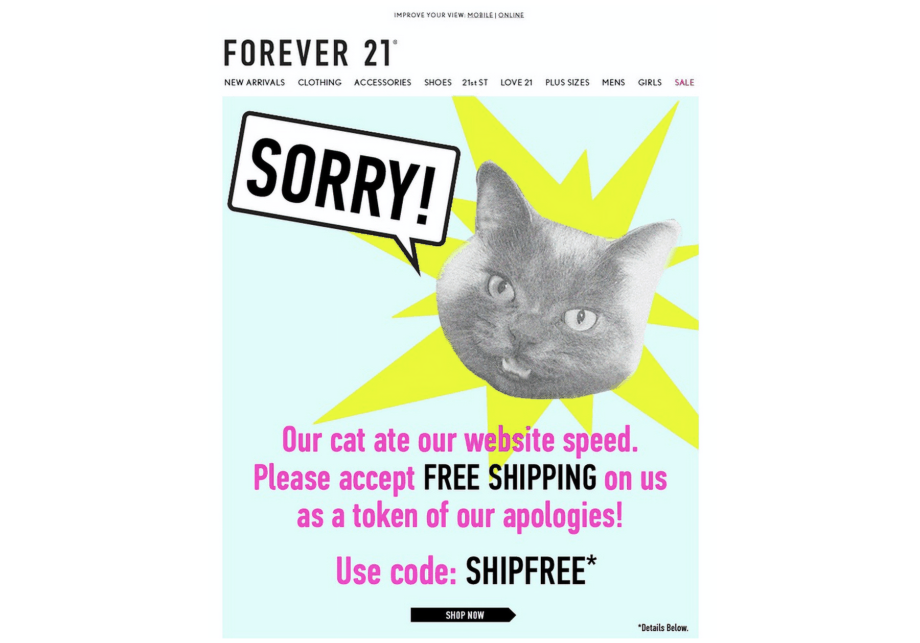
Considering that a customer has made it to the retention stage, it’s fair to say that you’ve earned their trust. However, it’s essential to mention that this trust needs to be retained, to ensure that they’ll continue using your product. Moreover, whenever there are people involved screw-ups are bound to happen. That means that you need to have a plan for fixing mistakes and getting the trust back.
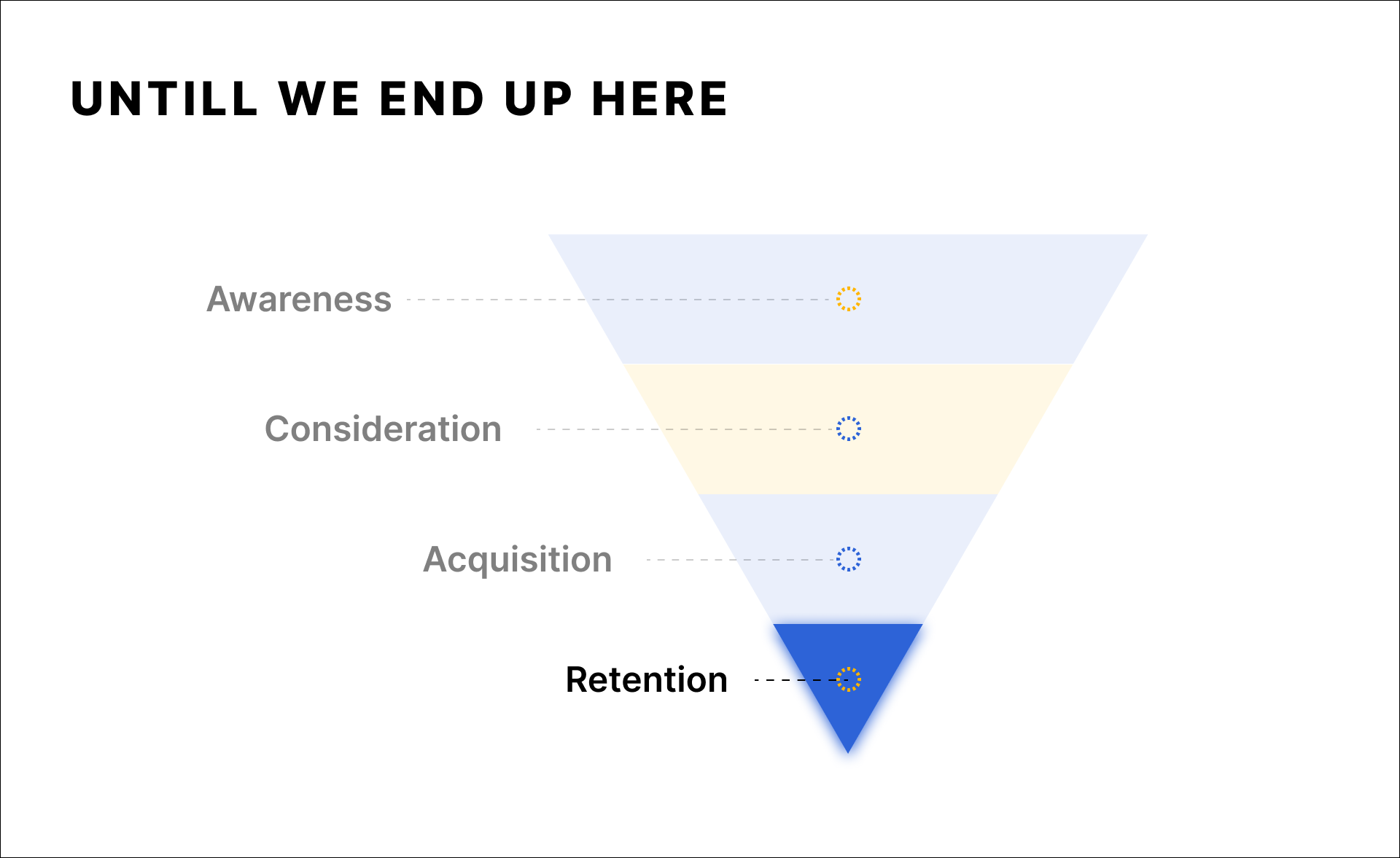
Here are a few things you can do to elevate user experience and maintain a high trust level:
Emails
Effective email communication is paramount to customer retention. A whitepaper done by Emarsys indicates that about 4/5 of the businesses they surveyed use e-mails to retain their customers.
As a communication medium, email is among the most expressive. It can convey emotions through text and media while also addressing customers’ needs.
A user-centric approach to email marketing is bound to keep your customers happy, informed, and engaged. That implies not spamming and providing actual value or entertainment. Preferably, both.
Notifications
Consistent and well-thought-out push notifications are also a great way to keep your customers intrigued.
First off, it’s always a good idea to welcome your users. They’ve just made an important step — they’ve bought your product or purchased a membership. It’s a simple and elegant way of thanking your customer for their choice.
Secondly, consider notifying them about exclusive offers. Sharing information on special deals allows you to provide them with extra value for merely being a customer of yours.
Finally, consider personalizing your notifications. Using users’ name or recent activity to notify them about relevant stuff will also skyrocket their engagement. However, it’s worth mentioning that being explicit about having users’ information too often or using sensitive data to personalize notifications can come across creepy.
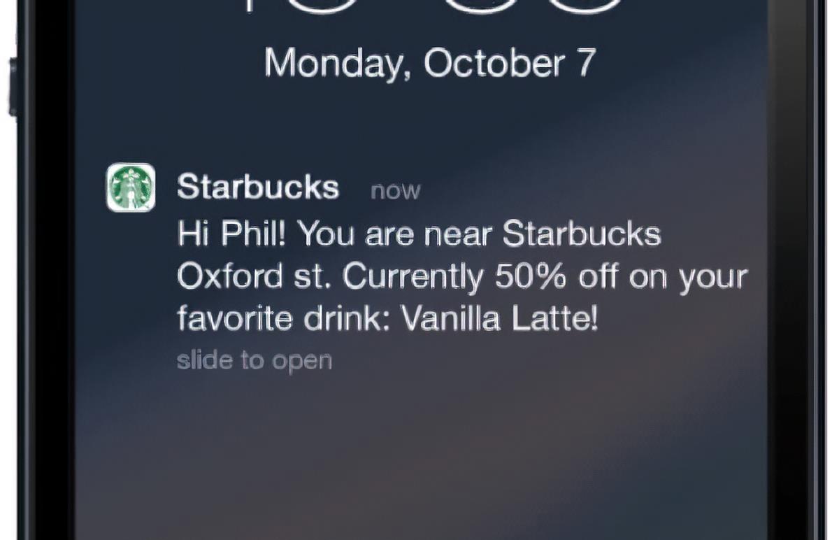
Whether the notification above is creepy is up for you to decide 🙂
In-product Perks
There are a variety of bonuses you can offer to build trust in the retention stage. They nudge our customers to use your product actively. These are especially potent in making up for any screw-ups.
Here are a few popular ones you can look into:
- Closed beta access to new features;
- Seasonal discounts;
- Loyalty programs;
- Discounts on renewals.

Conclusion
Phew, reading this article must have been quite a journey. We’ve almost reached the end. In order to help you consolidate everything in this article, let us try to recap its contents.
Creating a successful product is all about building trust. Luckily, there are so many ways to improve a product’s trustworthiness through UX. However, it’s essential to make these practices consistent. Customers seek to interact with brands that can deliver great experience throughout all interactions and touchpoints.
One of the ways to account for each touch point is reconciling two journey mapping techniques — marketing & sales funnel and customer journey map. The funnel allows us to go beyond the in-app experience that designers often are reluctant to do while a customer journey map provides empathy, structure and the depth of analysis.
Listing all of the ways to boost trustworthiness for each funnel stage would take another couple of pages, so a simple advice would do. Empathy is the key for getting in your users’ shoes and tackling their trust concerns. For a more concrete list of guidelines, scroll up and skim through the headers. That should jog your memory.
The bottom line is that we encourage you, dear reader, to shortlist the stages your users go through before actually becoming your users. Is there anything that might undermine your product’s trustworthiness? Is there anything you could improve and nudge a soon-to-be user in the right direction? Giving definitive answers to these questions and addressing them is a surefire for a better designed product.
Further Reading on SmashingMag:
- Quantitative Data Tools For UX Designers
- 5 Ways Google Analytics Helps Web Developers In UI/UX Design
- The Importance Of Macro And Micro-Moment Design
- How To Deliver A Successful UX Project In The Healthcare Sector
Articles on Smashing Magazine — For Web Designers And Developers


