Brand Illustration Systems: Drawing A Strong Visual Identity
Brand Illustration Systems: Drawing A Strong Visual Identity
Yihui Liu
In the flood of online content, companies live or die by their brand image. A brand image has to express the company’s message and connect with users, who should instantly recognize it across different media, even away from the company’s website and marketing content. A strong brand image is like an anchor, helping ensure user attachment and fix value associations.
Brand image is typically built up from different visual elements — logos, color palette, a particular font. Alongside these, illustrations are another powerful means of visual communication which are more and more in demand for online UI.
Why? Because illustrations introduce narrative elements to visual content and allow for subtler emotions or more complex situations to be expressed. Including human figures make ideas active and accessible, often in a light-hearted or whimsical way. Illustrations turn away from realism and let you build the world as the brand sees it.
This is an important piece in the larger puzzle of online campaigns. Digital design, using vectors, favors clean, bold images which translate well into distinctive branding illustrations. Rather than single-use designs, these online illustrations are being used as part of comprehensive visual systems. Images in an illustration system share a unifying mood or style, which makes them identifiable with the brand’s wider image and message, even as they represent different aspects of a product or service.
Illustration systems increase the range and depth of messages a company communicates visually about itself, from mission statements to practical product support, while strengthening brand image.
Design Process
So how should you go about designing an effective brand illustration system? I take you through my design process, with examples from the recent overhaul we undertook at Spacebase.
Research The Brand
First thing’s first — know the brand you’ll be designing for. This might sound obvious but don’t underestimate the work involved. Even if you think you already have a working knowledge, it’s worth investing time to refresh or deepen your understanding of the brand.
Dig into the culture behind the company and its products or services. What is their principal message, what forms do their existing visual identity take, and what is the direction the company wants to grow in?
Investigating this thoroughly at the beginning will save you headaches and dead-ends later on.
Understand Stakeholder Needs
As well as doing your own research, you’ll need to speak to the stakeholder. This connection is crucial to the success of your design — so involve them early and keep them updated with the process.
Get answers to key questions about the design: where will the illustrations appear and what do they need to express? What kind of situations and emotions might they play on? What are the technical parameters you need to work within?
At this stage, the stakeholder might not be very clear about what they want. Nonetheless, you should listen carefully to their input and consider their expectations in relation to the goals of the business and their wider brand image.
At Spacebase, the aim was to make the online booking platform more approachable and human. I thought deeply about the relationship between meeting rooms and the people who use them. We wanted to capture the brand message of breaking out of regular workspaces, into new and exciting ones, in a smooth, convenient, supportive way. The designs had to come across as friendly, modern, and simple.
Organize Inspiration
A moodboard is essential for getting to grips with the input you receive and organizing your ideas. Collect images from competitors or companies in the field with similar qualities to your intended goal and then compile these into a resource. Looking at what inspires you can be a guide to the overall tone you want to achieve and suggest the way to a first iteration. This is also useful material to show the stakeholders, as it gives them a sense of the direction the illustrations will take before the work of creating concepts begins.
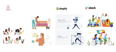
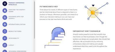
For the Spacebase design, I was particularly inspired by the Airbnb, IBM, and Shopify illustrations. The simple design of people and spaces really stood out for me, and I was interested in how the muted color palettes keep the illustrations focused, without overwhelming the pictorial elements. They produce an impression of calm, warmth and inclusivity.
Concept Creation
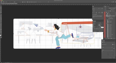
After researching and moodboarding, I start sketching on Adobe Illustrator. Sometimes I use a Wacom tablet but mainly I stick to my mouse with the Pen tool. I use shapes to create a basic structure, and use the Pen tool to add detail and enhance the basic outline.

Bear in mind that the images you design should cohere to form a uniform system, not form standalone scenes. So even if this is the first iteration — aim to give the illustrations a distinctive flavor which you will be able to replicate across different designs in the future. This might not come at first but feel your way towards an internal logic for the branding illustrations and aim to be consistent with this in your decisions.
With the Spacebase illustrations, we focused on human characters and color scheme as ways to keep the images in line with other visual branding elements.
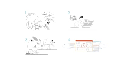
I started drawing the human characters with basic outlines, to get a feel for the emotions they would represent and how they would inhabit interior spaces. I wanted flowing lines to give them dynamic profiles and suggest movement. I also wanted to avoid anything that looked too heavy — lightweight and friendly were keywords. Diversity was also important to me, as Spacebase is an international company, and I always want viewers of illustrations to see themselves.
Alongside the human figures, I wanted the objects and environments to have a distinct style — abstract, futuristic and design-forward. We wanted to show interiors which are bright, beautiful, involving the users in the spatial dynamic, and with objects that suggest an idealized professional working environment. At the same time, these were not to distract attention. Spacebase is all about inspiring meeting rooms but their brand is more about the people who use these spaces. This took many iterations to get just right.
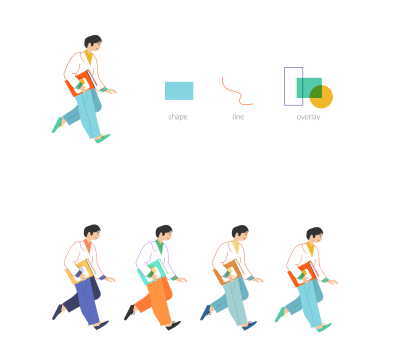
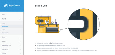
After the sketches had been refined, I thought about a color scheme. Colors are powerful and evoke instant reactions — so it was important to me not to overwhelm the illustrations. I wanted subtle shades to enhance and complement the scenes. The color scheme should also reflect the brand’s personality and match their other visual elements. For the Spacebase color scheme, it was important to break from monochrome and stay away from the drab colors normally associated with meeting rooms. Their main branding color is orange so I balanced this with cooler pastel tones: purple, sky blue, grey, and mustard yellow.
Feedback
After the first iteration, get all the feedback you can.
Clearly, you need to speak to the main stakeholder for their take on your design. But also try to seek out the opinion of users or colleagues, if you have any — especially people who don’t work in design. Their responses can guide you toward the next steps you should take to improve the illustrations. Design for real target users, rather than imagined needs.
Overall I prefer to hear about people’s frustrations overhearing their praise. Accolades are nice but not terribly useful. Getting to know the pain points of users (or something that does not make sense to them visually), indicates where to focus your attention. Even if they don’t agree with your own ideas, the stakeholders and their users must love the design. Good design is in the eye of the user.
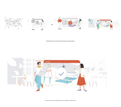
One of the illustrations I struggled with most at Spacebase was the banner for cancellation emails. Customers receive these either when they have canceled their own booking or when Spacebase has had to cancel it.
Nobody likes bad news, so I wanted the design to share their disappointment and suggest sympathy and understanding. Early versions were too heavy, though. Colleagues said it felt like the end of the world, that some drastic judgment had been passed. It took a long time (and many iterations) to move in a different direction.
In the end, we removed the human figures altogether. This was a way to avoid the illustration becoming too emotionally charged and give it a more neutral feel. The latest iteration minimizes the drama — it acknowledges an issue through semi-abstract representations of screens but also points to a future beyond the cancellation.
Reference Library
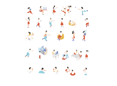
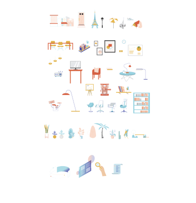
As you create your illustrations, it’s useful to build up a library of the different elements you have already used. This means you can refer back to them in the future and make sure you keep the style and feel consistent across different illustrations. Keeping your illustrations coherent is key to the overall effectiveness of your system in the long-term.
Repeat
Be prepared to go through this process many times.
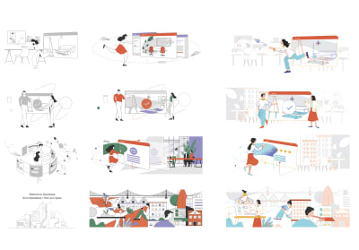
Constant iteration is the most important part of producing a successful visual identity. Keep creating new versions, obtaining feedback, and drafting new iterations. Everything is a prototype and you have to stay open to tweaks in order to make your branding as relatable to users as possible. Keep stakeholders updated and involved and be ready for unexpected turns — design is also a journey and each step gets you closer to an exceptional result.
As long as you immerse yourself in research and feedback, you’ll be heading in the right direction. That’s what I find most rewarding about design — I am motivated by the ongoing process and when I feel like I’m constantly improving upon things, I am happy to be doing what I do.
 (cc, yk, il)
Articles on Smashing Magazine — For Web Designers And Developers
