Sweet Deals: Case Study of Successful Coupon Sites
While for some people the frenzied time comes in Christmas, February and July when the big stores step into a season of massive sales, there are others who know how to force this period to last all the year round. Not only does it concern clothes, shoes or accessories but also all other kinds of stuff including services, entertainment, body and soul treatments and others. You ask me what is their secret? I reply to you: coupon sites are their weapons.
The ‘daily deals’ websites are killers of regimes established by marketplaces and savers of the family budget. They are eager to rock your World and make your day with some sweet offers.
How coupon sites can make your business thrive
Whether you are rolling in money or live on a shoestring budget, discounts always catch the eye. It is in our nature, part of our behavior, a weakness that we enjoy to have. The larger percentage of reduction in cost, the more incentivized we are to hit the ‘Buy’ button.
For us customers, it is an utter delight to find a thing or service that we demand right now with a concession in price. And thanks to such sites we do not need to go any further, everything is already here. All the relevant sales are carefully collected together in one place saving not only our money but also time and nerves.
This factor is one of the principle reasons why you as an owner of a business should use coupon sites. Add to this:
- mass exposure;
- strengthening and increasing brand awareness;
- quick and effective promotions;
- developing and extending customer database;
- hitting the targeted audience corresponding to required location;
- generation of new clients.
And you will end up with a powerful instrument.
However, before making up your mind, let’s pay attention to some vital aspects such as design and usability since the way you present the discount is increasingly important.
UI and UX are stumbling blocks or not?
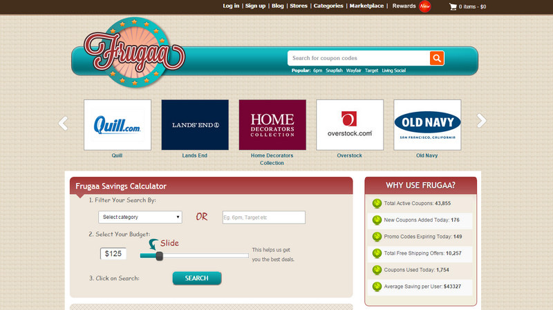
On the Internet, those two rule the roost. Marrying them together is always a challenging task especially for projects that try to cover numerous areas and spheres, offering products from different categories. Nevertheless, nothing is impossible. And as practice shows, coupon sites can boast a harmonious symbiosis of design and user experience. For example, Frugaa is a bright representative and has a strong alliance with these two aspects.
The platform specializes in all sorts of goods and services including art and entertainment, computers, dating, flowers, electronics and even medical supplies. There are a ton of categories. Nevertheless, despite the intensity of data, the front-end is pretty friendly, handy to use and intuitive even for non-English speakers. Tiny visual cues that are scattered throughout the design in collaboration with helpful navigation aids and relatively huge search fields keep users away from getting lost as well as gently guiding them along the system.
The homepage achieves equilibrium between visuals and content as well as efficiently balancing deals without overwhelming visitors. There are lots of vital widgets that make the user’s life easier such as image slider with featured brands on the header, savings calculator, block with hottest deals or filter. While the two-column layout strengthens the information hierarchy, the linear structure reveals coupon codes in a pleasant and convenient manner. The website is also optimized for tablets and mobile devices so that the majority of Internet users are taken into account. What’s more, the project has a tiny twist that engages customers even more: there is a bonus program with rewards.
As you can see, here UI and UX have overcome all the hurdles and peacefully coexist, meeting users’ demands and providing business owners with a solid base to pursue their goals.
How to ensure the success of a coupon site
The answer to this crucial question, as you may have guessed, is clear and more obvious than ever: meticulous attention to detail and maybe some sprucing up with psychological tricks. While the latter is a matter of choice, the first one is a ‘must-have’.
Starting from mundane factors such as a fast and reliable hosting provider and ending with design aspects such as alluring CTAs, the project has to be planned down to the last tiny thing, including design, usability, modern trends and current requirements. Let us also not forget about the content that should be regularly updated and surprising with diverse and rich ‘filling.’ What’s more, if you want to add some icing on the cake, give dynamic effects a try.
Best Practices of coupon sites
Although there are numerous on the wild, we want to showcase five excellent examples that much like Frugaa are made with customers and companies in mind. They have a clear information structure where the deals are treated pretty well. Each site has eye-pleasing aesthetics.
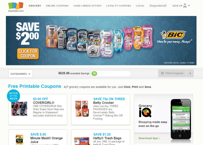
Coupons
Coupons looks fresh and organized. It is based on a clean monochrome background and a generous amount of fresh air that naturally direct the attention to the deals.
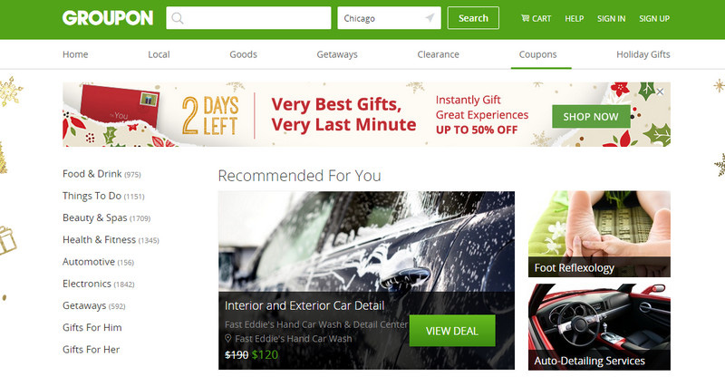
Groupon
Groupon meets the mood of the crowd by spicing up the design with decor that corresponds to holidays and various events. Huge block with ‘recommended for you’ goods strikes the eye right away.
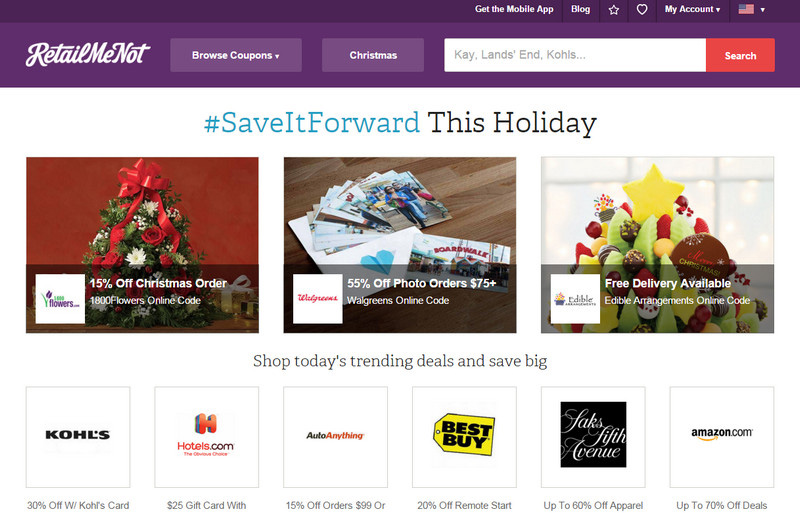
RetailMeNot
RetailMeNot is driven by a classic modular system that efficiently lays out data. The navigation block that comprises hot deals, a drop-down menu with categories and search field is smartly placed in the most viewed area of the front page.
ShopAtHome
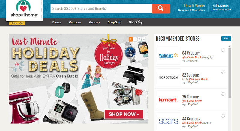
ShopAtHome gets the most out of a trendy cards design that gives each coupon code its own place. Thanks to light coloring and relatively big gutters between boxes, the website looks neat and clean.
Slickdeals
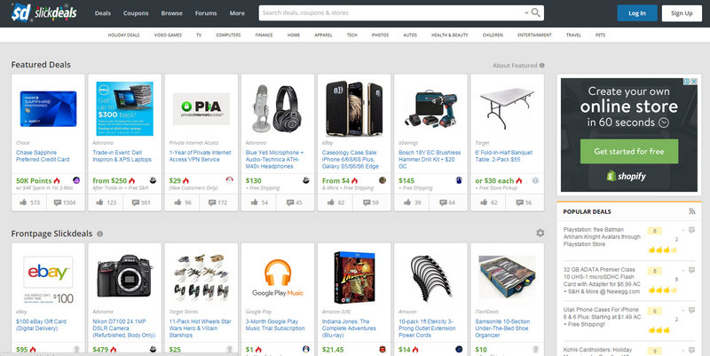
Slickdeals has a content-heavy yet not overwhelming UI. This is another smart take on cards design that greatly benefits the website. The homepage balances data and images perfectly.
Conclusion
Coupon sites are akin to huge online stores. They embrace various categories, feature a ton of deals, have their own community, please loyal customers with bonuses and much more. Given all this, they need to stay away from messy and artistic designs and opt in favor of rigid layouts, sensible and intuitive arrangements and neutral coloring.
The above listed examples adhere to these principles and as a result provide their online audience with a comfortable place to find a discount and companies with a place to realize their marketing ploys.

