Building A Static Site With Components Using Nunjucks
It’s quite popular these days, and dare I say a damn fine idea, to build sites with components. Rather than building out entire pages one by one, we build a system of components (think: a search form, an article card, a menu, a footer) and then piece together the site with those components.
JavaScript frameworks like React and Vue emphasize this idea heavily. But even if you don’t use any client-side JavaScript at all to build a site, it doesn’t mean you have to give up on the idea of building with components! By using an HTML preprocessor, we can build a static site and still get all the benefits of abstracting our site and its content into re-usable components.
Static sites are all the rage these days, and rightfully so, as they are fast, secure, and inexpensive to host. Even Smashing Magazine is a static site, believe it or not!
Let’s take a walk through a site I built recently using this technique. I used CodePen Projects to build it, which offers Nunjucks as a preprocessor, which was perfectly up for the job.
A Four-Page Site With A Consistent Header, Navigation, And Footer
This is a microsite. It doesn’t need a full-blown CMS to handle hundreds of pages. It doesn’t need JavaScript to handle interactivity. But it does need a handful of pages that all share the same layout.

HTML alone doesn’t have a good solution for this. What we need are imports. Languages like PHP make this simple with things like <?php include "header.php"; ?>, but static file hosts don’t run PHP (on purpose) and HTML alone is no help. Fortunately, we can preprocess includes with Nunjucks.
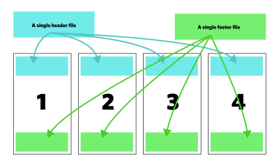
It makes perfect sense here to create a layout, including chunks of HTML representing the header, navigation, and footer. Nunjucks templating has the concept of blocks, which allow us to slot in content into that spot when we use the layout.
<head> <meta charset="UTF-8"> <meta name="viewport" content="width=device-width, initial-scale=1.0"> <title>The Power of Serverless</title> <link rel="stylesheet" href="/styles/style.processed.css"> </head> <body> {% include "./template-parts/_header.njk" %} {% include "./template-parts/_nav.njk" %} {% block content %} {% endblock %} {% include "./template-parts/_footer.njk" %} </body> Notice the files that are included are named like _file.njk. That’s not entirely necessary. It could be header.html or icons.svg, but they are named like this because 1) files that start with underscores are a bit of-of a standard way of saying they are a partial. In CodePen Projects, it means they won’t try to be compiled alone. 2) By naming it .njk, we could use more Nunjucks stuff in there if we want to.
None of these bits have anything special in them at all. They are just little bits of HTML intended to be used on each of our four pages.
<footer> <p>Just a no-surprises footer, people. Nothing to see here.<p> </footer> Done this way, we can make one change and have the change reflected on all four pages.
Using The Layout For The Four Pages
Now each of our four pages can be a file. Let’s just start with index.njk though, which in CodePen Projects, will automatically be processed and create an index.html file every time you save.
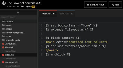
Here’s what we could put in index.njk to use the layout and drop some content in that block:
{% extends "_layout.njk" %} {% block content %} <h1>Hello, World!</h1> {% endblock %} That will buy us a fully functional home page! Nice! Each of the four pages can do the same exact thing, but putting different content in the block, and we have ourselves a little four-page site that is easy to manage.
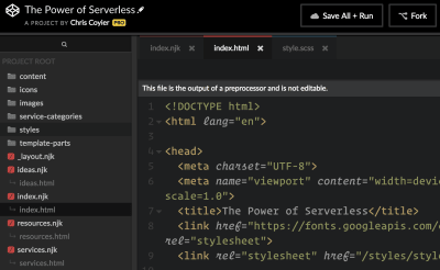
For the record, I’m not sure I’d call these little chunks we re-using components. We’re just being efficient and breaking up a layout into chunks. I think of a component more like a re-usable chunk that accepts data and outputs a unique version of itself with that data. We’ll get to that.
Making Active Navigation
Now that we’ve repeated an identical chunk of HTML on four pages, is it possible to apply unique CSS to individual navigation items to identify the current page? We could with JavaScript and looking at window.location and such, but we can do this without JavaScript. The trick is putting a class on the <body> unique to each page and using that in the CSS.
In our _layout.njk we have the body output a class name as a variable:
<body class="{{ body_class }}"> Then before we call that layout on an indivdiual page, we set that variable:
{% set body_class = "home" %} {% extends "_layout.njk" %} Let’s say our navigation was structured like
<nav class="site-nav"> <ul> <li class="nav-home"> <a href="/"> Home </a> ... Now we can target that link and apply special styling as needed by doing:
body.home .nav-home a, body.services .nav-services a { /* continue matching classes for all pages... */ /* unique active state styling */ } 
Oh and those icons? Those are just individual .svg files I put in a folder and included like
{% include "../icons/cloud.svg" %} And that allows me to style them like:
svg { fill: white; } Assuming the SVG elements inside have no fill attributes already on them.
Authoring Content In Markdown
The homepage of my microsite has a big chunk of content on it. I could certainly write and maintain that in HTML itself, but sometimes it’s nice to leave that type of thing to Markdown. Markdown feels cleaner to write and perhaps a bit easier to look at when it’s lots of copy.
This is very easy in CodePen Projects. I made a file that ends in .md, which will automatically be processed into HTML, then included that in the index.njk file.
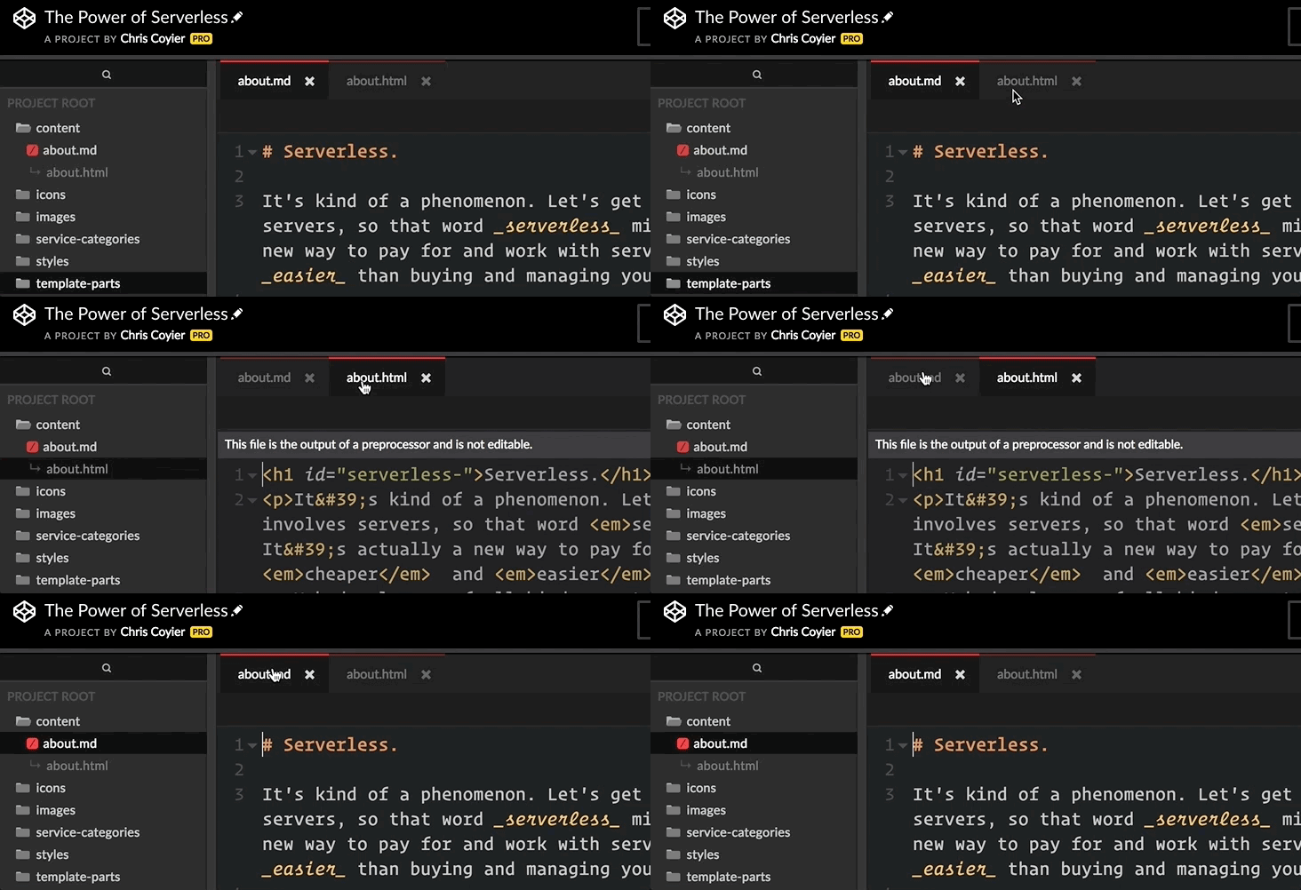
{% block content %} <main class="centered-text-column"> {% include "content/about.html" %} </main> {% endblock %} Building Actual Components
Let’s consider components to be repeatable modules that as passed in data to create themselves. In frameworks like Vue, you’d be working with single file components that are isolated bits of templated HTML, scoped CSS, and component-specific JavaScript. That’s super cool, but our microsite doesn’t need anything that fancy.
We need to create some “cards” based on a simple template, so we can build things like this:
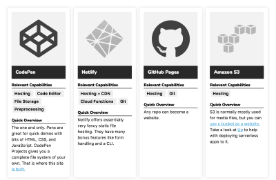
Building a repeatable component like that in Nunjucks involves using what they call Macros. Macros are deliciously simple. They are like as if HTML had functions!
{% macro card(title, content) %} <div class="card"> <h2>{{ title }}</h2> <p>{{ content }}</p> </div> {% endmacro %} Then you call it as needed:
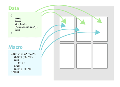
{{ card('My Module', 'Lorem ipsum whatever.') }} The whole idea here is to separate data and markup. This gives us some pretty clear, and tangible benefits:
- If we need to make a change to the HTML, we can change it in the macro and it gets changed everywhere that uses that macro.
- The data isn’t tangled up in markup
- The data could come from anywhere! We code the data right into calls to the macros as we’ve done above. Or we could reference some JSON data and loop over it. I’m sure you could even imagine a setup in which that JSON data comes from a sort of headless CMS, build process, serverless function, cron job, or whatever.
Now we have these repeatable cards that combine data and markup, just what we need:
Make As Many Components As You Like
You can take this idea and run with it. For example, imagine how Bootstrap is essentially a bunch of CSS that you follow HTML patterns in which to use. You could make each of those patterns a macro and call them as needed, essentially componentizing the framework.
You can nest components if you like, embracing a sort of atomic design philosophy. Nunjucks offers logic as well, meaning you can create conditional components and variations just by passing in different data.
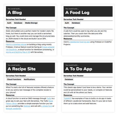
In the simple site I made, I made a different macro for the ideas section of the site because it involved slightly different data and a slightly different card design.
A Quick Case Against Static Sites
I might argue that most sites benefit from a component-based architecture, but only some sites are appropriate for being static. I work on plenty of sites in which having back-end languages is appropriate and useful.
One of my sites, CSS-Tricks, has things like a user login with a somewhat complex permissions system: forums, comments, eCommerce. While none of those things totally halt the idea of working staticly, I’m often glad I have a database and back-end languages to work with. It helps me build what I need and keeps things under one roof.
Go Forth And Embrace The Static Life!
Remember that one of the benefits of building in the way we did in this article is that the end result is just a bunch of static files. Easy to host, fast, and secure. Yet, we didn’t have to give up working in a developer-friendly way. This site will be easy to update and add to in the future.
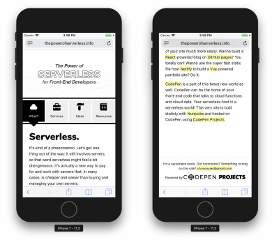
- The final project is a microsite called The Power of Serverless for Front-End Developers (https://thepowerofserverless.info/).
- Static file hosting, if you ask me, is a part of the serverless movement.
- You can see all the code (and even fork a copy for yourself) right on CodePen. It is built, maintained, and hosted entirely on CodePen using CodePen Projects.
- CodePen Projects handles all the Nunjucks stuff we talked about here, and also things like Sass processing and image hosting, which I took advantage of for the site. You could replicate the same with, say, a Gulp or Grunt-based build process locally. Here’s a boilerplate project like that you could spin up.
 (ms, ra, hj, il)
 Articles on Smashing Magazine — For Web Designers And Developers


