Automatically Art-Directed Responsive Images? Here You Go.
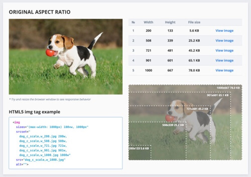
In many projects, responsive images aren’t a technical issue but a strategic concern. Delivering different images to different screens is technically possible with srcset and sizes and <picture> element and Picturefill (or a similar) polyfill; but all of those variants of images have to be created, adjusted and baked into the logic of the existing CMS. And that’s not easy.
On top of that, responsive images markup has to be generated and added into HTML as well, and if a new image variant comes into play at some point (e.g. a file format like WebP or a large landscape/portrait variant), the markup has to be updated. The amount of extra work required often causes trouble — so if you have a perfect product shot, you need to either manually create variants for mobile and portrait and landscape and larger views, or build plugins and extensions to somehow automate the process.
The post Automatically Art-Directed Responsive Images? Here You Go. appeared first on Smashing Magazine.


