Responsive Web And Desktop Development With Flutter
Responsive Web And Desktop Development With Flutter
Carmine Zaccagnino
This tutorial is not an introduction to Flutter itself. There are plenty of articles, videos and several books available online with simple introductions that will help you learn the basics of Flutter. Instead, we’ll be covering the following two objectives:
- The current state of Flutter non-mobile development and how you can run Flutter code in the browser, on a desktop or laptop computer;
- How to create responsive apps using Flutter, so that you can see its power — especially as a web framework — on full display, ending with a note about routing based on URL.
Let’s get into it!
What Is Flutter, Why It’s Important, What It Has Evolved Into, Where It’s Going
Flutter is Google’s latest app development framework. Google envisions it to be all-encompassing: It will enable the same code to be executed on smartphones of all brands, on tablets, and on desktop and laptops computer as native apps or as web pages.
It’s a very ambitious project, but Google has been incredibly successful until now particularly in two aspects: in creating a truly platform-independent framework for Android and iOS native apps that works great and is fully ready for production use, and in creating an impressive front-end web framework that can share 100% of the code with a compatible Flutter app.
In the next section, we’re going to see what makes the app compatible and what’s the state of non-mobile Flutter development as of now.
Non-Mobile Development With Flutter
Non-mobile development with Flutter was first publicized in a significant way at Google I/O 2019. This section is about how to make it work and about when it works.
How To Enable Web And Desktop Development
To enable web development, you must first be on Flutter’s beta channel. There are two ways to get to that point:
- Install Flutter directly on the beta channel by downloading the appropriate latest beta version from the SDK archive.
- If you already have Flutter installed, switch to the beta channel with
$ flutter channel beta, and then perform the switch itself by updating your Flutter version (which is actually agit pullon the Flutter installation folder) with$ flutter upgrade.
After that, you can run this:
$ flutter config --enable-webDesktop support is much more experimental, especially due to a lack of tooling for Linux and Windows, making plugin development especially a major pain, and due to the fact that the APIs used for it are intended for proof-of-concept use and not for production. This is unlike web development, which is using the tried-and-tested dart2js compiler for release builds, which are not even supported for Windows and Linux native desktop apps.
Note: Support for macOS is slightly better than support for Windows and Linux, but it still isn’t as good as support for the web and not nearly as good as the full support for mobile platforms.
To enable support for desktop development, you need to switch to the master release channel by following the same steps outlined earlier for the beta channel. Then, run the following by replacing <OS_NAME> with either linux, windows, or macos:
$ flutter config --enable-<OS_NAME>-desktopAt this point, if you have issues with any of the following steps that I’ll be describing because the Flutter tool isn’t doing what I’m saying it should do, some common troubleshooting steps are these:
- Run
flutter doctorto check for issues. A side effect of this Flutter command is that it should download any tools it needs that it doesn’t have. - Run
flutter upgrade. - Turn it off and on again. The old tier-1 technical-support answer of restarting your computer might be just what is needed for you to be able to enjoy the full riches of Flutter.
Running And Building Flutter Web Apps
Flutter web support isn’t bad at all, and this is reflected in the ease of development for the web.
Running this…
$ flutter devices… should show right away an entry for something like this:
Web Server • web-server • web-javascript • Flutter ToolsAdditionally, running the Chrome browser should cause Flutter to show an entry for it as well. Running flutter run on a compatible Flutter project (more on that later) when the only “connected device” showing up is the web server will cause Flutter to start a web server on localhost:<RANDOM_PORT>, which will allow you to access your Flutter web app from any browser.
If you have installed Chrome but it’s not showing up, you need to set the CHROME_EXECUTABLE environment variable to the path to the Chrome executable file.
Running And Building Flutter Desktop Apps
After you’ve enabled Flutter desktop support, you can run a Flutter app natively on your development workstation with flutter run -d <OS_NAME>, replacing <OS_NAME> with the same value you used when enabling desktop support. You can also build binaries in the build directory with flutter build <OS_NAME>.
Before you can do any of that, though, you need to have a directory containing what Flutter needs to build for your platform. This will be created automatically when you create a new project, but you’ll need to create it for an existing project with flutter create .. Also, the Linux and Windows APIs are unstable, so you might have to regenerate them for those platforms if the app stops working after a Flutter update.
When Is An App Compatible?
What have I meant all along when mentioning that a Flutter app has to be a “compatible project” in order for it to work on desktop or the web? Put simply, I mean that it mustn’t use any plugin that doesn’t have a platform-specific implementation for the platform on which you’re trying to build.
To make this point absolutely clear to everyone and avoid misunderstanding, please note that a Flutter plugin is a particular Flutter package that contains platform-specific code that is necessary for it to provide its features.
For example, you can use the Google-developed url_launcher package as much as you want (and you might want to, given that the web is built on hyperlinks).
An example of a Google-developed package the usage of which would preclude web development is path_provider, which is used to get the local storage path to save files to. This is an example of a package that, incidentally, isn’t of any use to a web app, so not being able to use it isn’t really a bummer, except for the fact that you need to change your code in order for it to work on the web if you’re using it.
For example, you can use the shared_preferences package, which relies on HTML localStorage on the web.
Similar caveats are valid regarding desktop platforms: Very few plugins are compatible with desktop platforms, and, as this is a recurring theme, much more work on this needs to be done on the desktop side than is really necessary on Flutter for the web.
Creating Responsive Layouts In Flutter
Because of what I’ve described above and for simplicity, I’m going to assume for the rest of this post that your target platform is the web, but the basic concepts apply to desktop development as well.
Supporting the web has benefits and responsibilities. Being pretty much forced to support different screen sizes might sound like a drawback, but consider that running the app in the web browsers enables you to see very easily how your app will look on screens of different sizes and aspect ratios, without having to run separate mobile device emulators.
Now, let’s talk code. How can you make your app responsive?
There are two perspectives from which this analysis is done:
- “What widgets am I using or can I use that can or should adapt to screens of different sizes?”
- “How can I get information about the size of the screen, and how can I use it when writing UI code?”
We’ll answer the first question later. Let’s first talk about the latter, because it can be dealt with very easily and is at the heart of the issue. There are two ways to do this:
- One way is to take the information from the
MediaQueryDataof theMediaQueryrootInheritedWidget, which has to exist in the widget tree in order for a Flutter app to work (it’s part ofMaterialApp/WidgetsApp/CupertinoApp), which you can get, just like any otherInheritedWidget, withMediaQuery.of(context), which has asizeproperty, which is of typeSize, and which therefore has twowidthandheightproperties of the typedouble. - The other way is to use a
LayoutBuilder, which is a builder widget (just like aStreamBuilderor aFutureBuilder) that passes to thebuilderfunction (along with thecontext) aBoxConstraintsobject that hasminHeight,maxHeight,minWidthandmaxWidthproperties.
Here’s an example DartPad using the MediaQuery to get constraints, the code for which is the following:
import 'package:flutter/material.dart'; void main() => runApp(MyApp()); class MyApp extends StatelessWidget { @override Widget build(context) => MaterialApp( home: MyHomePage() ); } class MyHomePage extends StatelessWidget { @override Widget build(context) => Scaffold( body: Center( child: Column( mainAxisAlignment: MainAxisAlignment.spaceEvenly, children: [ Text( "Width: $ {MediaQuery.of(context).size.width}", style: Theme.of(context).textTheme.headline4 ), Text( "Height: $ {MediaQuery.of(context).size.height}", style: Theme.of(context).textTheme.headline4 ) ] ) ) ); }And here’s one using the LayoutBuilder for the same thing:
import 'package:flutter/material.dart'; void main() => runApp(MyApp()); class MyApp extends StatelessWidget { @override Widget build(context) => MaterialApp( home: MyHomePage() ); } class MyHomePage extends StatelessWidget { @override Widget build(context) => Scaffold( body: LayoutBuilder( builder: (context, constraints) => Center( child: Column( mainAxisAlignment: MainAxisAlignment.spaceEvenly, children: [ Text( "Width: $ {constraints.maxWidth}", style: Theme.of(context).textTheme.headline4 ), Text( "Height: $ {constraints.maxHeight}", style: Theme.of(context).textTheme.headline4 ) ] ) ) ) ); }Now, let’s think about what widgets can adapt to the constraints.
Fist of all, let’s think about the different ways of laying out multiple widgets according to the size of the screen.
The widget that most easily adapts is the GridView. In fact, a GridView built using the GridView.extent constructor doesn’t even need your involvement to be made responsive, as you can see in this very simple example:
import 'package:flutter/material.dart'; void main() => runApp(MyApp()); class MyApp extends StatelessWidget { @override Widget build(context) => MaterialApp( home: MyHomePage() ); } class MyHomePage extends StatelessWidget { final List elements = [ "Zero", "One", "Two", "Three", "Four", "Five", "Six", "Seven", "Eight", "A Million Billion Trillion", "A much, much longer text that will still fit" ]; @override Widget build(context) => Scaffold( body: GridView.extent( maxCrossAxisExtent: 130.0, crossAxisSpacing: 20.0, mainAxisSpacing: 20.0, children: elements.map((el) => Card(child: Center(child: Padding(padding: EdgeInsets.all(8.0), child: Text(el))))).toList() ) ); } You can accommodate content of different sizes by changing the maxCrossAxisExtent.
That example mostly served the purpose of showing the existence of the GridView.extent GridView constructor, but a much smarter way to do that would be to use a GridView.builder with a SliverGridDelegateWithMaxCrossAxisExtent, in this case where the widgets to be shown in the grid are dynamically created from another data structure, as you can see in this example:
import 'package:flutter/material.dart'; void main() => runApp(MyApp()); class MyApp extends StatelessWidget { @override Widget build(context) => MaterialApp( home: MyHomePage() ); } class MyHomePage extends StatelessWidget { final List<String> elements = ["Zero", "One", "Two", "Three", "Four", "Five", "Six", "Seven", "Eight", "A Million Billion Trillion", "A much, much longer text that will still fit"]; @override Widget build(context) => Scaffold( body: GridView.builder( itemCount: elements.length, gridDelegate: SliverGridDelegateWithMaxCrossAxisExtent( maxCrossAxisExtent: 130.0, crossAxisSpacing: 20.0, mainAxisSpacing: 20.0, ), itemBuilder: (context, i) => Card( child: Center( child: Padding( padding: EdgeInsets.all(8.0), child: Text(elements[i]) ) ) ) ) ); }An example of GridView adapting to different screens is my personal landing page, which is a very simple Flutter web app consisting of a GridView with a bunch of Cards, just like that previous example code, except that the Cards are a little more complex and larger.
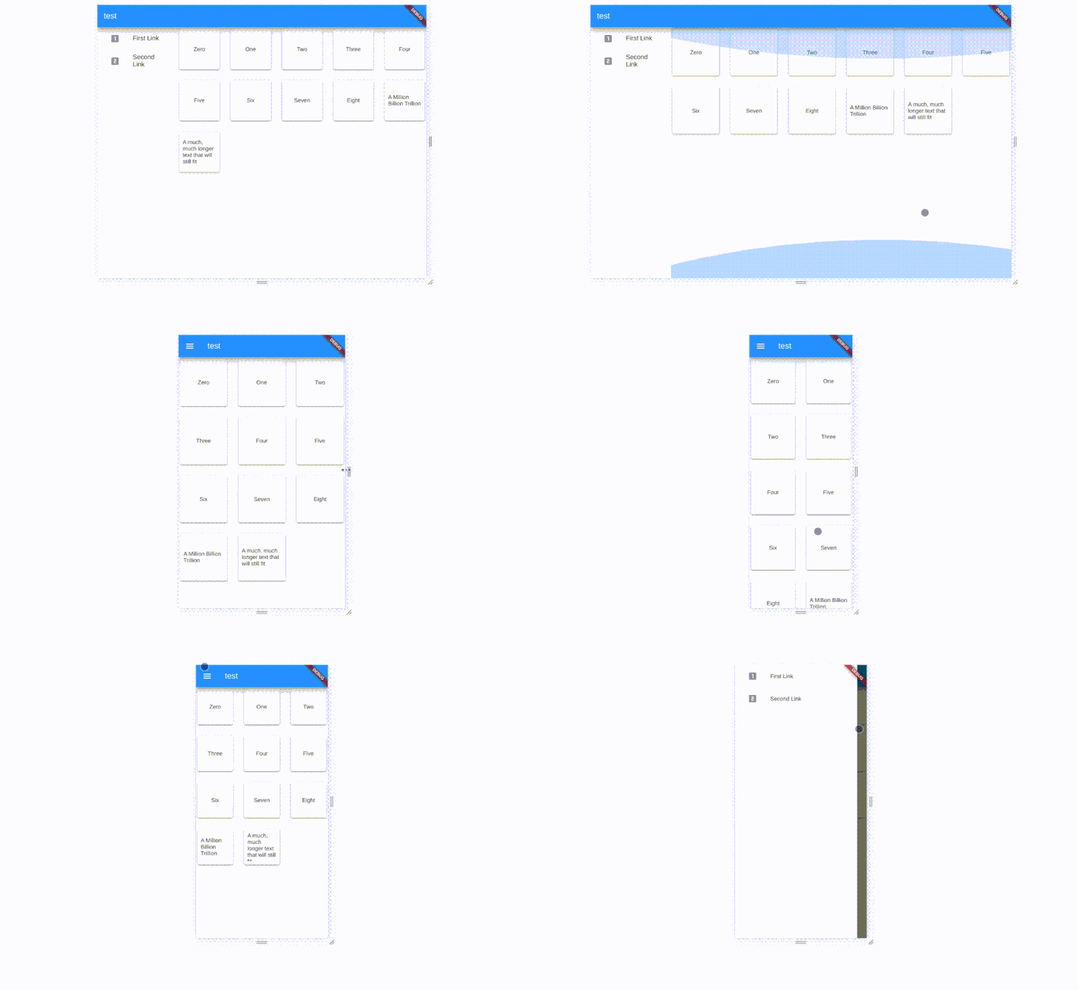
A very simple change that could be made to apps designed for phones would be to replace a Drawer with a permanent menu on the left when there is space.
For example, we could have a ListView of widgets, like the following, which is used for navigation:
class Menu extends StatelessWidget { @override Widget build(context) => ListView( children: [ FlatButton( onPressed: () {}, child: ListTile( leading: Icon(Icons.looks_one), title: Text("First Link"), ) ), FlatButton( onPressed: () {}, child: ListTile( leading: Icon(Icons.looks_two), title: Text("Second Link"), ) ) ] ); }On a smartphone, a common place to use that would be inside a Drawer (also known as a hamburger menu).
Alternatives to that would be the BottomNavigationBar or the TabBar, in combination with the TabBarView, but with both we’d have to make more changes than are required with the drawer, so we’ll stick with the drawer.
To only show the Drawer containing the Menu that we saw earlier on smaller screens, you’d write code that looks like the following snippet, checking the width using the MediaQuery.of(context) and passing a Drawer object to the Scaffold only if it’s less than some width value that we believe to be appropriate for our app:
Scaffold( appBar: AppBar(/* ... */), drawer: MediaQuery.of(context).size.width < 500 ? Drawer( child: Menu(), ) : null, body: /* ... */ )Now, let’s think about the body of the Scaffold. As the sample main content of our app, we’ll use the GridView that we built previously, which we keep in a separate widget named Content to avoid confusion:
class Content extends StatelessWidget { final List elements = ["Zero", "One", "Two", "Three", "Four", "Five", "Six", "Seven", "Eight", "A Million Billion Trillion", "A much, much longer text that will still fit"]; @override Widget build(context) => GridView.builder( itemCount: elements.length, gridDelegate: SliverGridDelegateWithMaxCrossAxisExtent( maxCrossAxisExtent: 130.0, crossAxisSpacing: 20.0, mainAxisSpacing: 20.0, ), itemBuilder: (context, i) => Card( child: Center( child: Padding( padding: EdgeInsets.all(8.0), child: Text(elements[i]) ) ) ) ); } On bigger screens, the body itself may be a Row that shows two widgets: the Menu, which is restricted to a fixed width, and the Content filling the rest of the screen.
On smaller screens, the entire body would be the Content.
We’ll wrap everything in a SafeArea and a Center widget because sometimes Flutter web app widgets, especially when using Rows and Columns, end up outside of the visible screen area, and that is fixed with SafeArea and/or Center.
This means the body of the Scaffold will be the following:
SafeArea( child:Center( child: MediaQuery.of(context).size.width < 500 ? Content() : Row( children: [ Container( width: 200.0, child: Menu() ), Container( width: MediaQuery.of(context).size.width-200.0, child: Content() ) ] ) ) )Here is all of that put together:

import 'package:flutter/material.dart'; void main() => runApp(MyApp()); class MyApp extends StatelessWidget { @override Widget build(context) => MaterialApp( home: HomePage() ); } class HomePage extends StatelessWidget { @override Widget build(context) => Scaffold( appBar: AppBar(title: Text("test")), drawer: MediaQuery.of(context).size.width < 500 ? Drawer( child: Menu(), ) : null, body: SafeArea( child:Center( child: MediaQuery.of(context).size.width < 500 ? Content() : Row( children: [ Container( width: 200.0, child: Menu() ), Container( width: MediaQuery.of(context).size.width-200.0, child: Content() ) ] ) ) ) ); } class Menu extends StatelessWidget { @override Widget build(context) => ListView( children: [ FlatButton( onPressed: () {}, child: ListTile( leading: Icon(Icons.looks_one), title: Text("First Link"), ) ), FlatButton( onPressed: () {}, child: ListTile( leading: Icon(Icons.looks_two), title: Text("Second Link"), ) ) ] ); } class Content extends StatelessWidget { final List<String> elements = ["Zero", "One", "Two", "Three", "Four", "Five", "Six", "Seven", "Eight", "A Million Billion Trillion", "A much, much longer text that will still fit"]; @override Widget build(context) => GridView.builder( itemCount: elements.length, gridDelegate: SliverGridDelegateWithMaxCrossAxisExtent( maxCrossAxisExtent: 130.0, crossAxisSpacing: 20.0, mainAxisSpacing: 20.0, ), itemBuilder: (context, i) => Card( child: Center( child: Padding( padding: EdgeInsets.all(8.0), child: Text(elements[i]) ) ) ) ); }This is most of the stuff you’ll need as a general introduction to responsive UI in Flutter. Much of its application will depend on your app’s specific UI, and it’s hard to pinpoint exactly what you can do to make your app responsive, and you can take many approaches depending on your preference. Now, though, let’s see how we can make a more complete example into a responsive app, thinking about common app elements and UI flows.
Putting It In Context: Making An App Responsive
So far, we have just a screen. Let’s expand that into a two-screen app with working URL-based navigation!
Creating A Responsive Login Page
Chances are that your app has a login page. How can we make that responsive?
Login screens on mobile devices are quite similar to each other usually. The space available isn’t much; it’s usually just a Column with some Padding around its widgets, and it contains TextFields for typing in a username and a password and a button to log in. So, a pretty standard (though not functioning, as that would require, among other things, a TextEditingController for each TextField) login page for a mobile app could be the following:
Scaffold( body: Container( padding: const EdgeInsets.symmetric( vertical: 30.0, horizontal: 25.0 ), child: Column( mainAxisAlignment: MainAxisAlignment.spaceAround, children: [ Text("Welcome to the app, please log in"), TextField( decoration: InputDecoration( labelText: "username" ) ), TextField( obscureText: true, decoration: InputDecoration( labelText: "password" ) ), RaisedButton( color: Colors.blue, child: Text("Log in", style: TextStyle(color: Colors.white)), onPressed: () {} ) ] ), ), )It looks fine on a mobile device, but those very wide TextFields start to look jarring on a tablet, let alone a bigger screen. However, we can’t just decide on a fixed width because phones have different screen sizes, and we should maintain a degree of flexibility.
For example, through experimentation, we might find that the maximum width should be 500. Well, we would set the Container’s constraints to 500 (I used a Container instead of Padding in the previous example because I knew where I was going with this) and we’re good to go, right? Not really, because that would cause the login widgets to stick to the left side of the screen, which might be even worse than stretching everything. So, we wrap in a Center widget, like this:
Center( child: Container( constraints: BoxConstraints(maxWidth: 500), padding: const EdgeInsets.symmetric( vertical: 30.0, horizontal: 25.0 ), child: Column(/* ... */) ) )That already looks fine, and we haven’t even had to use either a LayoutBuilder or the MediaQuery.of(context).size. Let’s go one step further to make this look very good, though. It would look better, in my view, if the foreground part was in some way separated from the background. We can achieve that by giving a background color to what’s behind the Container with the input widgets, and keeping the foreground Container white. To make it look a little better, let’s keep the Container from stretching to the top and bottom of the screen on large devices, give it rounded corners, and give it a nice animated transition between the two layouts.
All of that now requires a LayoutBuilder and an outer Container in order both to set a background color and to add padding all around the Container and not just on the sides only on larger screens. Also, to make the change in padding amount animated, we just need to turn that outer Container into an AnimatedContainer, which requires a duration for the animation, which we’ll set to half a second, which is Duration(milliseconds: 500) in code.
Here’s that example of a responsive login page:
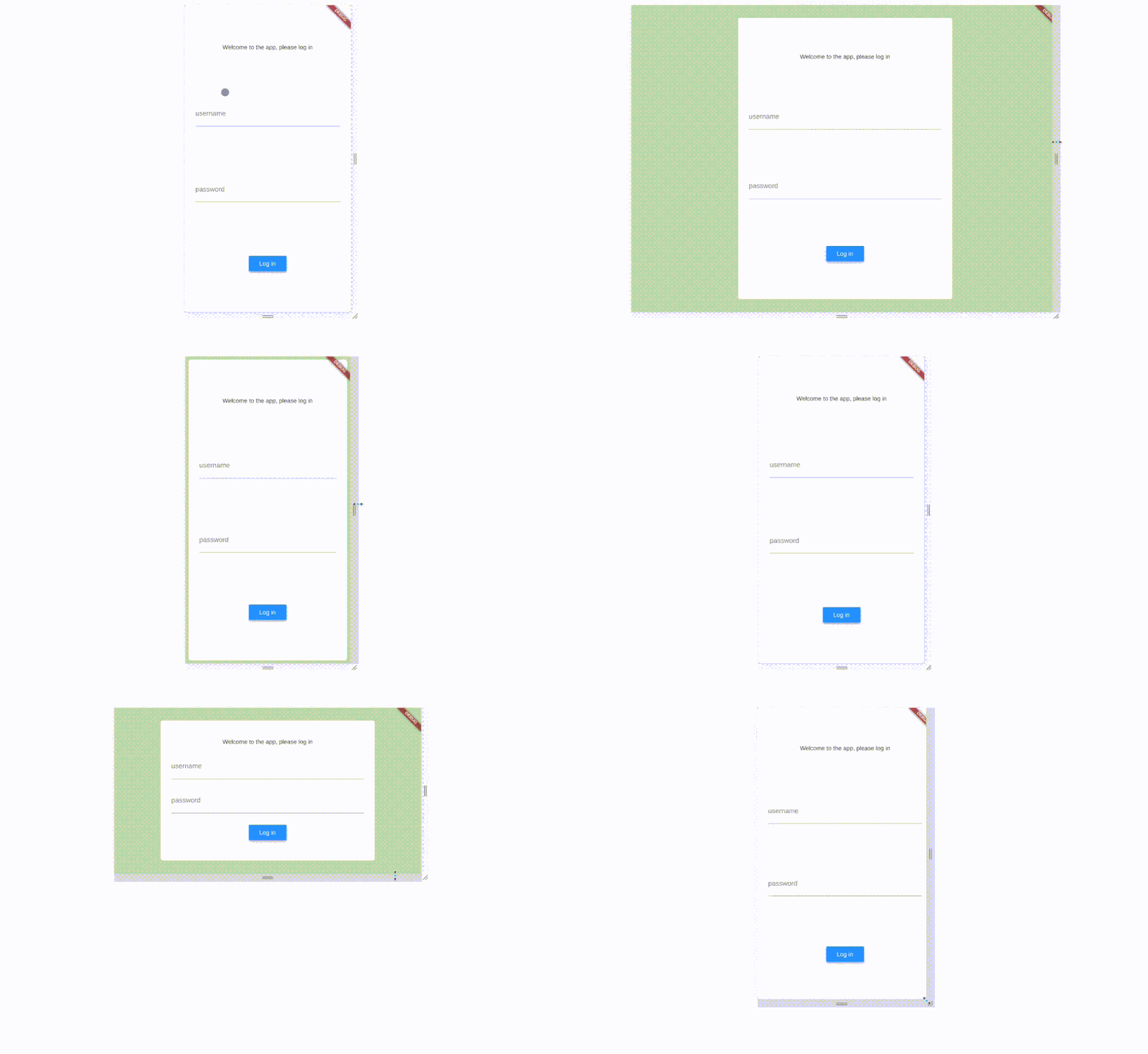
class LoginPage extends StatelessWidget { @override Widget build(context) => Scaffold( body: LayoutBuilder( builder: (context, constraints) { return AnimatedContainer( duration: Duration(milliseconds: 500), color: Colors.lightGreen[200], padding: constraints.maxWidth < 500 ? EdgeInsets.zero : EdgeInsets.all(30.0), child: Center( child: Container( padding: EdgeInsets.symmetric( vertical: 30.0, horizontal: 25.0 ), constraints: BoxConstraints( maxWidth: 500, ), decoration: BoxDecoration( color: Colors.white, borderRadius: BorderRadius.circular(5.0), ), child: Column( mainAxisAlignment: MainAxisAlignment.spaceAround, children: [ Text("Welcome to the app, please log in"), TextField( decoration: InputDecoration( labelText: "username" ) ), TextField( obscureText: true, decoration: InputDecoration( labelText: "password" ) ), RaisedButton( color: Colors.blue, child: Text("Log in", style: TextStyle(color: Colors.white)), onPressed: () { Navigator.pushReplacement( context, MaterialPageRoute( builder: (context) => HomePage() ) ); } ) ] ), ), ) ); } ) ); }As you can see, I’ve also changed the RaisedButton’s onPressed to a callback that navigates us to a screen named HomePage (which could be, for example, the view we built previously with a GridView and a menu or a drawer). Now, though, that navigation part is what we’re going to focus on.
Named Routes: Making Your App’s Navigation More Like A Proper Web App
A common thing for web apps to have is the ability to change screens based on the URL. For example going to https://appurl/login should give you something different than https://appurl/somethingelse. Flutter, in fact, supports named routes, which have two purposes:
- In a web app, they have exactly that feature that I mentioned in the previous sentence.
- In any app, they allow you to predefine routes for your app and give them names, and then be able to navigate to them just by specifying their name.
To do that, we need to change the MaterialApp constructor to one that looks like the following:
MaterialApp( initialRoute: "/login", routes: { "/login": (context) => LoginPage(), "/home": (context) => HomePage() } );And then we can switch to a different route by using Navigator.pushNamed(context, routeName) and Navigator.pushReplacementNamed(context, routeName), instead of Navigator.push(context, route) and Navigator.pushReplacement(context, route).
Here is that applied to the hypothetical app we built in the rest of this article. You can’t really see named routes in action in DartPad, so you should try this out on your own machine with flutter run, or check the example in action:
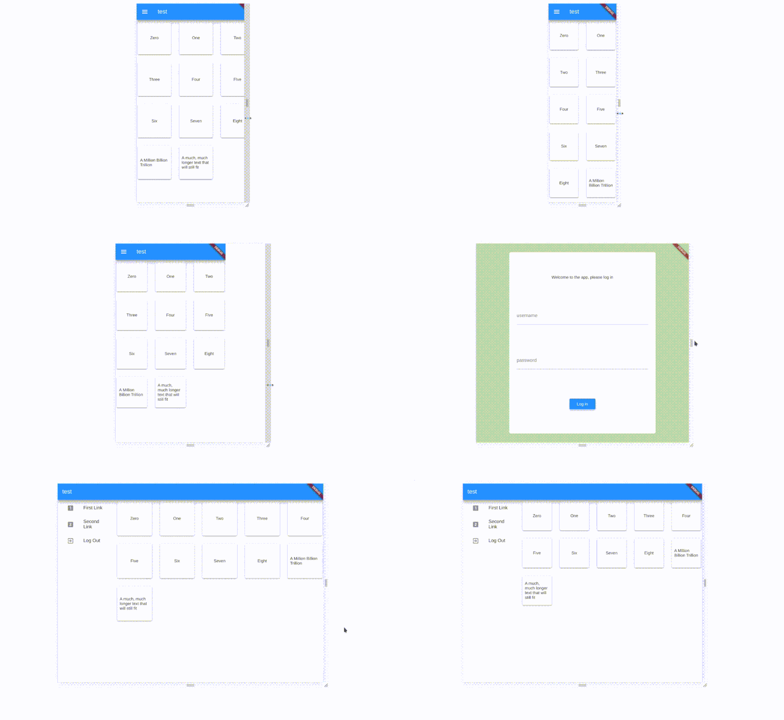
import 'package:flutter/material.dart'; void main() => runApp(MyApp()); class MyApp extends StatelessWidget { @override Widget build(context) => MaterialApp( initialRoute: "/login", routes: { "/login": (context) => LoginPage(), "/home": (context) => HomePage() } ); } class LoginPage extends StatelessWidget { @override Widget build(context) => Scaffold( body: LayoutBuilder( builder: (context, constraints) { return AnimatedContainer( duration: Duration(milliseconds: 500), color: Colors.lightGreen[200], padding: constraints.maxWidth < 500 ? EdgeInsets.zero : const EdgeInsets.all(30.0), child: Center( child: Container( padding: const EdgeInsets.symmetric( vertical: 30.0, horizontal: 25.0 ), constraints: BoxConstraints( maxWidth: 500, ), decoration: BoxDecoration( color: Colors.white, borderRadius: BorderRadius.circular(5.0), ), child: Column( mainAxisAlignment: MainAxisAlignment.spaceAround, children: [ Text("Welcome to the app, please log in"), TextField( decoration: InputDecoration( labelText: "username" ) ), TextField( obscureText: true, decoration: InputDecoration( labelText: "password" ) ), RaisedButton( color: Colors.blue, child: Text("Log in", style: TextStyle(color: Colors.white)), onPressed: () { Navigator.pushReplacementNamed( context, "/home" ); } ) ] ), ), ) ); } ) ); } class HomePage extends StatelessWidget { @override Widget build(context) => Scaffold( appBar: AppBar(title: Text("test")), drawer: MediaQuery.of(context).size.width < 500 ? Drawer( child: Menu(), ) : null, body: SafeArea( child:Center( child: MediaQuery.of(context).size.width < 500 ? Content() : Row( children: [ Container( width: 200.0, child: Menu() ), Container( width: MediaQuery.of(context).size.width-200.0, child: Content() ) ] ) ) ) ); } class Menu extends StatelessWidget { @override Widget build(context) => ListView( children: [ FlatButton( onPressed: () {}, child: ListTile( leading: Icon(Icons.looks_one), title: Text("First Link"), ) ), FlatButton( onPressed: () {}, child: ListTile( leading: Icon(Icons.looks_two), title: Text("Second Link"), ) ), FlatButton( onPressed: () {Navigator.pushReplacementNamed( context, "/login");}, child: ListTile( leading: Icon(Icons.exit_to_app), title: Text("Log Out"), ) ) ] ); } class Content extends StatelessWidget { final List<String> elements = ["Zero", "One", "Two", "Three", "Four", "Five", "Six", "Seven", "Eight", "A Million Billion Trillion", "A much, much longer text that will still fit"]; @override Widget build(context) => GridView.builder( itemCount: elements.length, gridDelegate: SliverGridDelegateWithMaxCrossAxisExtent( maxCrossAxisExtent: 130.0, crossAxisSpacing: 20.0, mainAxisSpacing: 20.0, ), itemBuilder: (context, i) => Card( child: Center( child: Padding( padding: EdgeInsets.all(8.0), child: Text(elements[i]) ) ) ) ); }Onward With Your Flutter Adventure
That should give you an idea of what you can do with Flutter on bigger screens, specifically on the web. It’s a lovely framework, very easy to use, and its extreme cross-platform support only makes it more essential to learn and start using. So, go ahead and start trusting Flutter for web apps, too!
Further Resources
- “Desktop shells”, GitHub
The current, always up-to-date state of Flutter on desktop - “Desktop support for Flutter”, Flutter
Information about the fully supported desktop platforms - “Web support for Flutter”, Flutter
Information about Flutter for the web - “All Samples”, Flutter
A curated list of Flutter samples and apps
 (ra, yk, il, al)
Articles on Smashing Magazine — For Web Designers And Developers

