Refactoring CSS: Optimizing Size And Performance (Part 3)
In previous articles from this series, we’ve covered auditing CSS codebase health and the incremental CSS refactoring strategy, testing, and maintenance. Regardless of how much the CSS codebase has been improved during the refactoring process and how much more maintainable and extendable it is, the final stylesheet needs to be optimized for the best possible performance and least possible file size.
Deploying the refactored codebase shouldn’t result in worse website performance and worse user experience. After all, users won’t wait around forever for the website to load. Also, the management will be dissatisfied with the decreased traffic and revenue caused by the unoptimized codebase, despite the code quality improvements.
In this article, we’re going to cover CSS optimization strategies that can optimize CSS file size, loading times, and render performance. That way, the refactored CSS codebase is not only more maintainable and extensible but also performant and checks all boxes that are important both to the end-user and management.
Part Of: CSS Refactoring
- Part 1: CSS Refactoring: Introduction
- Part 2: CSS Strategy, Regression Testing And Maintenance
- Part 3: Optimizing Size And Performance
- Subscribe to our email newsletter to not miss the next ones.
Optimizing Stylesheet File Size
Optimizing file size boils down to removing unnecessary characters and formatting and optimizing the CSS code to use different syntax or shorthand properties to reduce the overall number of characters in a file.
Optimization And Minification
CSS optimization and minification have been around for years and became a staple in frontend optimization. Tools like cssnano and clean-css are among my favorite tools when it comes to CSS optimization and minification. They offer a wide variety of customization options to further control how code is being optimized and which browsers are supported.
These tools work in a similar way. First, the unoptimized code is parsed and transpiled following the rules set in the config. The result is the code that uses fewer characters but still retains the formatting (line breaks and whitespaces).
/* Before - original and unoptimized code */ .container { padding: 24px 16px 24px 16px; background: #222222; } /* After - optimized code with formatting */ .container { padding: 24px 16px; background: #222; }And finally, the transpiled optimized code is minified by removing all unnecessary text formatting. Depending on the codebase and supported browsers set in the config, code with deprecated vendor prefixes can also get removed.
/* Before - optimized code with formatting */ .container { padding: 24px 16px; background: #222; } /* After - optimized and minified code */ .container{padding:24px 16px;background:#222}Even in this basic example, we’ve managed to reduce the overall file size from 76 bytes to 55 bytes, resulting in a 23% reduction. Depending on the codebase and the optimization tools and config, CSS optimization and minification can be even more effective.
CSS optimization and minification can be considered as an easy win due to the significant payoff with just a few tweaks to the CSS workflow. That is why minification should be treated as the bare minimum performance optimization and a requirement for all stylesheets on the project.
Optimizing Media Queries
When we write media queries in CSS, especially when using multiple files (PostCSS or Sass), we usually don’t nest the code under a single media query for an entire project. For improved maintainability, modularity, and code structure, we usually write the same media query expressions for multiple CSS components.
Let’s consider the following example of an unoptimized CSS codebase.
.page { display: grid; grid-gap: 16px; } @media (min-width: 768px) { .page { grid-template-columns: 268px auto; grid-gap: 24px; } } /* ... */ .products-grid { display: grid; grid-template-columns: repeat(2, 1fr); grid-gap: 16px; } @media (min-width: 768px) { .products-grid { grid-template-columns: repeat(3, 1fr); grid-gap: 20px; } }As you can see, we have a repeated @media (min-width: 768px) per component for better readability and maintenance. Let’s run the optimization and minification on this code example and see what we get.
.page{display:grid;grid-gap:16px}@media (min-width: 768px){.page{grid-template-columns:268px auto;grid-gap:24px}}.products-grid{display:grid;grid-template-columns:repeat(2,1fr);grid-gap:16px}@media (min-width: 768px){.products-grid{grid-template-columns:repeat(3,1fr);grid-gap:20px}}This might be a bit difficult to read, but all we have to notice is the repeated @media (min-width: 768px) media query. We’ve already concluded that we want to reduce the number of characters in a stylesheet and we can nest multiple selectors under a single media query, so why didn’t the minifier removed the duplicated expression? There is a simple reason for that.
Rule order matters in CSS, so to merge the duplicated media queries, code blocks need to be moved. This will result in rule orders being changed which can cause unwanted side-effects in styles.
However, combining media queries could potentially make the file size even smaller, depending on the codebase and structure. Tools and packages like postcss-sort-media-queries allow us to remove duplicated media queries and further reduce the file size.
Of course, there is the important caveat of having a well-structured CSS codebase structure that doesn’t depend on the rule order. This optimization should be taken into account when planning the CSS refactor and establishing ground rules.
I would recommend first checking if the optimization benefit outweighs the potential risks. This can be easily done by running a CSS audit and checking media query stats. If it does, I would recommend adding it later on and running automated regression testing to catch any unexpected side-effects and bugs that can happen as a result.
Removing Unused CSS
During the refactoring process, there is always a possibility that you’ll end up with some unused legacy styles that haven’t been completely removed or you’ll have some newly added styles that are not being used. These styles also add to the overall character count and the file size. Eliminating these unused styles using automated tools, however, can be somewhat risky because the tools cannot accurately predict which styles are actually used.
Tools like purgecss go through all the files in the project and use all the classes mentioned in files as selectors, just to err on the side of caution and not accidentally delete selectors for dynamic, JavaScript-injected elements, among other potential cases. However, purgecss offers flexible config options as workarounds for these potential issues and risks.
However, this improvement should be done only when the potential benefits outweigh the risks. Additionally, this optimization technique will require considerable time to set up, configure and test, and might cause unintended issues down the line, so proceed with caution and make sure that the setup is bulletproof.
Eliminating Render-Blocking CSS
By default, CSS is a render-blocking resource, meaning that the website won’t be displayed to the user until all linked stylesheets and their dependencies (fonts, for example) have been downloaded and parsed by the browser.

If the stylesheet file has a large file size or multiple dependencies which are located on third-party servers or CDNs, website rendering can be delayed significantly depending on the network speed and reliability.
Largest Contentful Paint (LCP) has become an important metric in the last few months. LCP is not only important for performance but also SEO — websites with better LCP scores will have better search results ranking. Removing render-blocking resources like CSS is one way of improving the LCP score.
However, if we would defer the stylesheet loading and processing, this would result in Flash Of Unstyled Content (FOUC) — content would be displayed to the user right away and styles would be loaded and applied a few moments later. This switch could look jarring and it may even confuse some users.
Critical CSS
With Critical CSS, we can ensure that the website loads with the minimum amount of styles which are guaranteed to be used on the page when it’s initially rendered. This way, we can make the FOUC much less noticeable or even eliminate it for most cases. For example, if the homepage features a header component with navigation and a hero component located above-the-fold, this means that the critical CSS will contain all the necessary global and component styles for these components, while styles for other components on the page will be deferred.
This CSS is inlined in HTML under a style tag, so the styles are loaded and parsed alongside the HTML file. Although this will result in a slightly larger HTML file size (which should also be minified), all other non-critical CSS will be deferred and won’t be loaded right away and the website will render faster. All in all, the benefits outweigh the increase in the HTML file size.
<head> <style type="text/css"><!-- Minified Critical CSS markup --></style> </head>There are many automated tools and NPM packages out there, depending on your setup, that can extract critical CSS and generate deferred stylesheets.
Deferring Stylesheets
How exactly do we make the CSS to be non-blocking? We know that it shouldn’t be referenced in the HTML head element when the page HTML is first downloaded. Demian Renzulli has outlined this method in his article.
There is no native HTML approach (as of yet) to optimize or defer the loading of render-blocking resources, so we need to use JavaScript to insert the non-critical stylesheet into the HTML markup after the initial render. We also need to make sure that these styles get loaded in the non-optimal (render-blocking) way if a user is visiting the page with JavaScript not enabled in the browser.
<!-- Deferred stylesheet --> <link rel="preload" as="style" href="path/to/stylesheet.css" onload="this.onload=null;this.rel='stylesheet'"> <!-- Fallback --> <noscript> <link rel="stylesheet" href="path/to/stylesheet.css"> </noscript>With link rel="preload" as="style" makes sure that the stylesheet file is requested asynchronously, while onload JavaScript handler makes sure that the file is loaded and processed by the browser after the HTML document has finished loading. Some cleanup is needed, so we need to set the onload to null to avoid this function running multiple times and causing unnecessary re-renders.
This is exactly how Smashing Magazine handles its stylesheets. Each template (homepage, article categories, article pages, etc.) has a template-specific critical CSS inlined inside HTML style tag in the head element, and a deferred main.css stylesheet which contains all non-critical styles.
However, instead of toggling the rel parameter, here we can see the media query being switched from the automatically deferred low-priority print media to the high-priority all attribute when the page has finished loading. This is an alternative, equally viable approach to defer loading of non-critical stylesheets.
<link href="/css/main.css" media="print" onload="this.media='all'" rel="stylesheet">Splitting And Conditionally Loading Stylesheets With Media Queries
For the cases when the final stylesheet file has a large file size even after the aforementioned optimizations have been applied, you could split the stylesheets into multiple files based on media queries and use media property on stylesheets referenced in the link HTML element to load them conditionally.
<link href="print.css" rel="stylesheet" media="print"> <link href="mobile.css" rel="stylesheet" media="all"> <link href="tablet.css" rel="stylesheet" media="screen and (min-width: 768px)"> <link href="desktop.css" rel="stylesheet" media="screen and (min-width: 1366px)">That way, if a mobile-first approach is used, styles for larger screen sizes won’t be downloaded or parsed on mobile devices that could be running on slower or unreliable networks.
Just to reiterate, this method should be used if the result of the previously mentioned optimization methods results in a stylesheet with suboptimal file size. For regular cases, this optimization method won’t be as effective or impactful, depending on the individual stylesheet size.
Deferring Font Files And Stylesheets
Deferring font stylesheets (Google Font files, for example) could also be beneficial for initial render performance. We’ve concluded that stylesheets are render-blocking, but so are the font files that are referenced in the stylesheet. Font files also add quite a bit of overhead to the initial render performance.
Loading font stylesheets and font files is a complex topic and diving into it would take a whole new article just to explain all viable approaches. Luckily, Zach Leatherman has outlined many viable strategies in this awesome comprehensive guide and summarized the pros and cons of each approach. If you use Google Fonts, Harry Roberts has outlined a strategy for the fastest loading of Google Fonts.
If you decide on deferring font stylesheets, you’ll end up with Flash of Unstyled Text (FOUT). The page will initially be rendered with the fallback font until the deferred font files and stylesheets have been downloaded and parsed, at which point the new styles will be applied. This change can be very noticeable and can cause layout shifts and confuse users, depending on the individual case.
Barry Pollard has outlined some strategies that can help us deal with FOUT and talked about the upcoming size-adjust CSS feature which will provide an easier, more native way of dealing with FOUT.
Server-Side Optimizations
HTTP Compression
In addition to minification and file-size optimization, static assets like HTML, CSS files, JavaScript files, etc. HTTP compression algorithms like Gzip and Brotli can be used to additionally reduce the downloaded file size.
HTTP compression needs to be configured on the server which depends on the tech stack and config. However, performance benefits may vary and may not have as much impact as standard stylesheet minification and optimization, as the browsers will still decompress the compressed files and have to parse them.
Caching Stylesheets
Caching static files is a useful optimization strategy. Browsers will still have to download the static files from the server on the first load, but once they get cached they’ll be loaded from it directly on subsequent requests, speeding up the loading process.
Caching can be controlled via Cache-Control HTTP header at the server level (for example, using the .htaccess file on an Apache server).
With max-age we can indicate how long the file should stay cached (in seconds) in the browser and with public, we are indicating that the file can be cached by the browser and any other caches.
Cache-Control: public, max-age=604800A more aggressive and effective cache strategy for static assets can be achieved with immutable config. This tells the browser that this particular file will never change and that any new updates will result in this file getting deleted and a new file with a different file name will take its place. This is known as cache-busting.
Cache-Control: public, max-age=604800, immutableWithout a proper cache-busting strategy, there is a risk of losing control over files that get cached on the user’s browser. Meaning that if the file were to change, the browser won’t be able to know that it should download the updated file and not use the outdated cached file. And from that point on, there is virtually nothing we can do to fix that and the user will be stuck with the outdated file until it expires.
For stylesheets, that could mean that if we were to update HTML files with new content and components that require new styling, these styles won’t display because the outdated stylesheet is cached without a cache-busting strategy and the browser won’t know that it has to download the new file.
Before using a caching strategy for stylesheets or any other static files, effective cache-busting mechanisms should be implemented to prevent outdated static files from getting stuck in the user’s cache. You can use one of the following versioning mechanisms for cache-busting:
- Appending a query string to the file name.
For examplestyles.css?v=1.0.1.However, some CDNs can completely ignore or strip the query string from the file name and resulting in the file getting stuck in the user’s cache and never updating. - Changing the file name or appending a hash.
For examplestyles.a1bc2.cssorstyles.v1.0.1.css.This is more reliable and effective than appending a query string to the file name.
CDN Or Self-hosting?
Content Delivery Network (CDN) is a group of geographically distributed servers that are commonly used for the reliable and fast delivery of static assets like images, videos, HTML files, CSS files, JavaScript files, etc.
Although CDNs might seem like a great alternative to self-hosting static assets, Harry Roberts has done in-depth research on the topic and concluded that self-hosting assets are more beneficial for performance.
“There really is very little reason to leave your static assets on anyone else’s infrastructure. The perceived benefits are often a myth, and even if they weren’t, the trade-offs simply aren’t worth it. Loading assets from multiple origins is demonstrably slower.”
That being said, I would recommend self-hosting the stylesheets (font stylesheets included, if possible) by default and moving to CDN only if there are viable reasons or other benefits to doing so.
Auditing CSS File Size and Performance
WebPageTest and other similar performance auditing tools can be used to get a detailed overview of the website loading process, file sizes, render-blocking resources, etc. These tools can give you an insight into how your website loads on a wide range of devices — from a desktop PC running on a high-speed network to low-end smartphones running on slow and unreliable networks.
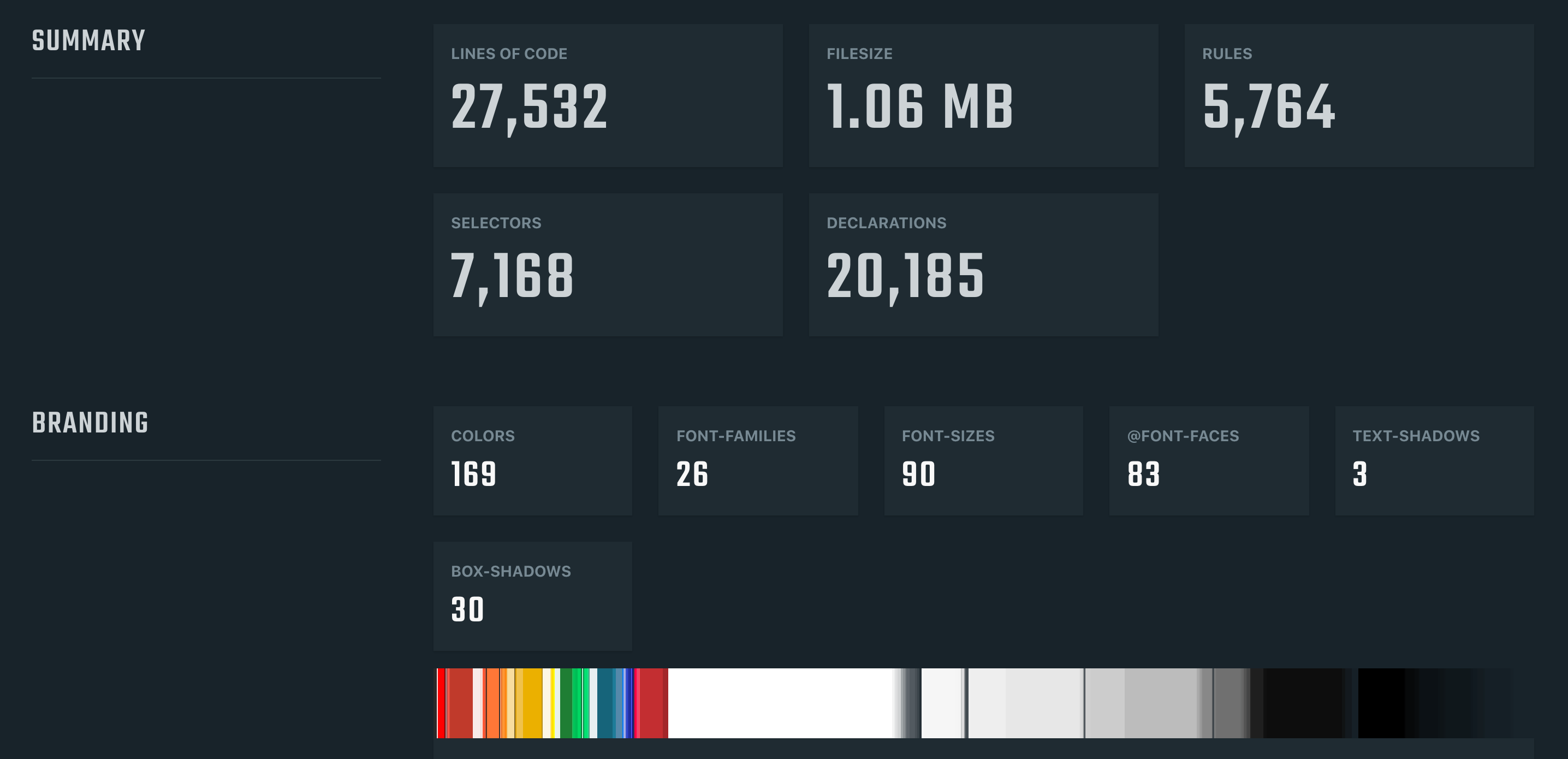
Let’s do a performance audit on a website mentioned in the first article from this series — the one with the 2MB of minified CSS.
First, we’ll take a look at the content breakdown to determine which resources take up the most bandwidth. From the following charts, we can see that the images take up most requests, meaning that they need to be lazy-loaded. From the second chart, we can see that stylesheets and JavaScript files are the largest in terms of file size. This is a good indication that these files need to either be minified and optimized, refactored, or split into multiple files and loaded asynchronously.

We can draw even more conclusions from the Web Vitals charts. By taking a look a the Largest Contentful Paint (LCP) chart, we can get a detailed overview of render-blocking resources and how much they affect the initial render.
We could already conclude that the website stylesheet will have the most impact on the LCP and loading stats. However, we can see font stylesheets, JavaScript files, and images referenced inside the stylesheets that are also render-blocking. Knowing that we can apply the aforementioned optimization methods to reduce the LCP time by eliminating render-blocking resources.

Conclusion
The refactoring process isn’t complete when the code health and quality have been improved and when codebase weaknesses and issues have been fixed. Refactored codebase should result in the same or improved performance compared to the legacy codebase.
End users shouldn’t experience performance issues or long loading times from the refactored codebase. Luckily, there are many methods out there to make sure that the codebases are both robust and performant — from the simple minification and optimization methods to the more complex methods like eliminating render-blocking resources and code-splitting.
We can use various performance auditing tools like WebPageTest to get a detailed overview of loading times, performance, render-blocking resources, and other factors so we can address these issues early and effectively.
Part Of: CSS Refactoring
- Part 1: CSS Refactoring: Introduction
- Part 2: CSS Refactoring: Strategy, Regression Testing And Maintenance
- Part 3: CSS Refactoring: Optimizing Size And Performance
- Subscribe to our email newsletter to not miss the next ones.
References
- “Render Blocking CSS,” Ilya Grigorik
- “Defer Non-Critical CSS,” Demian Renzulli
- “A Comprehensive Guide To Font Loading Strategies,” Zach Leatherman
- “A New Way To Reduce Font Loading Impact: CSS Font Descriptors,” Barry Pollard
- “Self-Host Your Static Assets,” Harry Roberts
- “Optimize WebFont Loading And Rendering,” Ilya Grigorik
Articles on Smashing Magazine — For Web Designers And Developers


