Meet “The Ethical Design Handbook”: How To Leave Dark Patterns Behind
Meet “The Ethical Design Handbook”: How To Leave Dark Patterns Behind
Vitaly Friedman
Over the past twenty years, user privacy has become merely a commodity on the web: there, but hardly ever respected — and often swiftly discarded. No wonder ad-blockers have gained traction, browsers have introduced tracking protection, and new legislation in form of GDPR and CCPA brought regulations for data collection.
We need to craft better digital products that respect customer’s choices without hurting business KPIs. And we need to do so by taming data collection and abandoning dark patterns, from hidden checkboxes to ambiguous copywriting. How do we get there?
That’s the question we wanted to answer. Meet Ethical Design Handbook, a new Smashing book full of practical techniques and blueprints on how companies ridden with shady practices can shift towards better, sustainable design. Download a free PDF excerpt (1 MB).
Print + eBook
$ 29.00$ 39.00
Quality hardcover. Free worldwide shipping, starting early March. 100 days money-back-guarantee.
When we set out to write this book, we wanted to develop a new type of working framework to empower people to practice ethical design in their business, in their teams, and with their products. The reason was simple: too many products we use today have become machines for tricking customers into decisions they never intended to make. That’s not quite the web we want to see around us.
Many business models thrive on ingeniously deceptive and manipulative digital products. Not because they have to; mostly because it has become an accepted norm as everybody else seems to be doing it as well. But what happens when the norm is shattered?
What happens if you can’t get access to personal data that’s been feeding the machine all this time?
What if you can’t track customers wandering from one website to another?
What happens when ad-blocking becomes mainstream and your advertising scripts are dismissed by crafty blockers?
How should the role and responsibilties of marketing team change with new regulations, such as GDPR and CCPA?
What if your competitors discover an alternative business model way before you do?
What competitive advantages can your business gain by focusing on privacy and transparency?
The Ethical Design Handbook explores alternative, compliant and sustainable strategies. The book explores how companies and organizations, small and large, can move towards ethical design and become more healthy and profitable along the way. It’s a practical guide for everyone who works with digital products as a designer, developer, product manager, lawyer or in management.
The book features interface design examples that take ethical design principles into the account. Large preview.
Table Of Contents
Introduction
+
The chapter describes the necessity of incorporating ethical design in the way digital businesses run. It also defines some key terms used throughout the book.
1. The need for ethics in design
+
This section outlines some core consequences of unethical design, and it also explores some of the existing ethical design frameworks and introduces the notion of ethical transformation.
We dive into dark patterns, GDPR and existing ethical solutions. You will understand the challenges we are bound to face when embarking onto an ethical transformation.
This chapter explores how a positive change can be introduced in companies, teams and processes, including how to challenge decisions, ethical team governance and bridging ethics with risk assessment.
We’ll explore how to use a risk matrix to discover ethical design opportunities and what questions to ask to challenge decisions. You will also learn about the ethical governance model and how to develop one.
#culturalchange #ethicalgovernance #decisions
3. Respect-driven design
+
This chapter discusses and challenges how to involve users in projects, and it includes guidelines on how to design for the must vulnerable. Finally, it highlights some business perspectives of human-centered design.
You will learn how to integrate human-centered approach into your workflow, and how to involve users more in your work process, as well as core accessibility techniques, and key ways to design with ethics for children.
#hcd #accessibility #children
4. The business of ethical design
+
Let’s dive into business. We establish why ethical design works as a business concept, and how we can use the traditional ways of measuring success to measure the impact of ethical design.
We’ll learn to use road-map planning, what KPIs (Key Performance Indicators) to use for ethical design, and we introduce The Ethical Design Scorecard, a tool to assessing the ethical level of products, business and practices.
#roadmap #KPI #ROIofethics
5. Ethical design best practices
+
This chapter provides a set of practical guidelines on how to design good cookie disclaimers, and terms and conditions and how to handle data collection ethically. It also provides a set of specific examples of how to design user interfaces with ethical design in mind.
You’ll learn how to move towarads trustworthy design, how to design ethical user interfaces, and the book also provides an extensive amount of blueprints as data models for digital products.
#ethicalUI #cookies #data #datamodels
6. Getting started
+
We wrap up the content of the book by offering a set of practical tips and specific blueprints to help you get started on your first ethical design project.
In the book, you’ll learn how to:
Define and explain what ethical design is,
Justify and prove a business case for ethical decisions,
Measure and track the impact of ethical design,
Grow a sustainable business on ethical principles,
Strike the balance between data collection and ethics,
Embed ethical design into your workflow,
Get started with ethical transformation.
368 pages. The eBook is already available (PDF, ePUB, Amazon Kindle). We’ll ship printed copies early March 2020. Written by Trine Falbe, Martin Michael Frederiksen and Kim Andersen.
Print + eBook
$ 29.00$ 39.00
Quality hardcover. Free worldwide shipping, starting early March. 100 days money-back-guarantee.
Trine Falbe is a human-centered UX strategist, designer and teacher who works in the intersection between people and business. Trine is deeply passionate about ethical design and designing for children, and she is also a keynote speaker at conferences and a UX advisor in strategic projects.
As a serial entrepreneur since the very first browser, Martin Michael Frederiksen was born with a practical appreciation for the crossroads between business and digital development. He has published the books Cross Channel and the CEO’s Guide to IT Projects That Cannot Fail. He works as an independent consultant for businesses that need a devil’s advocate when trying out new strategies and ideas.
After training at an international advertising agency, Kim Andersen quickly left print media for digital design. Owing to his amazing memory he always leaves design meetings with an empty notebook, only to attend the following meeting armed with drawings where nothing has been forgotten and everything is drawn in great detail. He owns the digital design studio Onkel Kim, where he can be hired to do design tasks, preferably the most difficult and complex ones where the brain is working overtime.
The book features scorecards and blueprints, applicable to your work right away. Large view.
Community Matters ❤️
With The Ethical Design Handbook, we’ve tried to create a very focused handbook with applicable, long-living solutions and strategies to introduce a positive change in companies ridden with dark patterns and questionable practices.
There is quite a bit of work to do on the web, but our hope is that with this book, you will be equipped with enough tooling to slowly move a company towards a more sustainable and healthy digital footprint.
Producing a book takes quite a bit of time, and we couldn’t pull it off without the support of our wonderful community. A huge shout-out to Smashing Members for their ongoing support in our adventures. As a result, the eBook is and always will be free for Smashing Members. Plus, Members get a friendly discount when purchasing their printed copy.
Stay smashing, and thank you for your ongoing support, everyone!
Print + eBook
$ 29.00$ 39.00
Quality hardcover. Free worldwide shipping, starting early March. 100 days money-back-guarantee.
Promoting best practices and providing you with practical tips to master your daily coding and design challenges has always been (and will be) at the core of everything we do at Smashing. In the past few years, we were very lucky to have worked together with some talented, caring people from the web community to publish their wealth of experience as printed books that stand the test of time. Alla, Adam and Heydon are some of these people. Have you checked out their books already?
Meet “The Ethical Design Handbook”: How To Leave Dark Patterns Behind
Meet “The Ethical Design Handbook”: How To Leave Dark Patterns Behind
Vitaly Friedman
Over the past twenty years, user privacy has become merely a commodity on the web: there, but hardly ever respected — and often swiftly discarded. No wonder ad-blockers have gained traction, browsers have introduced tracking protection, and new legislation in form of GDPR and CCPA brought regulations for data collection.
We need to craft better digital products that respect customer’s choices without hurting business KPIs. And we need to do so by taming data collection and abandoning dark patterns, from hidden checkboxes to ambiguous copywriting. How do we get there?
That’s the question we wanted to answer. Meet Ethical Design Handbook, a new Smashing book full of practical techniques and blueprints on how companies ridden with shady practices can shift towards better, sustainable design. Download a free PDF excerpt (1 MB).
Print + eBook
$ 29.00$ 39.00
Quality hardcover. Free worldwide shipping, starting early March. 100 days money-back-guarantee.
When we set out to write this book, we wanted to develop a new type of working framework to empower people to practice ethical design in their business, in their teams, and with their products. The reason was simple: too many products we use today have become machines for tricking customers into decisions they never intended to make. That’s not quite the web we want to see around us.
Many business models thrive on ingeniously deceptive and manipulative digital products. Not because they have to; mostly because it has become an accepted norm as everybody else seems to be doing it as well. But what happens when the norm is shattered?
What happens if you can’t get access to personal data that’s been feeding the machine all this time?
What if you can’t track customers wandering from one website to another?
What happens when ad-blocking becomes mainstream and your advertising scripts are dismissed by crafty blockers?
How should the role and responsibilties of marketing team change with new regulations, such as GDPR and CCPA?
What if your competitors discover an alternative business model way before you do?
What competitive advantages can your business gain by focusing on privacy and transparency?
The Ethical Design Handbook explores alternative, compliant and sustainable strategies. The book explores how companies and organizations, small and large, can move towards ethical design and become more healthy and profitable along the way. It’s a practical guide for everyone who works with digital products as a designer, developer, product manager, lawyer or in management.
The book features interface design examples that take ethical design principles into the account. Large preview.
Table Of Contents
Introduction
+
The chapter describes the necessity of incorporating ethical design in the way digital businesses run. It also defines some key terms used throughout the book.
1. The need for ethics in design
+
This section outlines some core consequences of unethical design, and it also explores some of the existing ethical design frameworks and introduces the notion of ethical transformation.
We dive into dark patterns, GDPR and existing ethical solutions. You will understand the challenges we are bound to face when embarking onto an ethical transformation.
This chapter explores how a positive change can be introduced in companies, teams and processes, including how to challenge decisions, ethical team governance and bridging ethics with risk assessment.
We’ll explore how to use a risk matrix to discover ethical design opportunities and what questions to ask to challenge decisions. You will also learn about the ethical governance model and how to develop one.
#culturalchange #ethicalgovernance #decisions
3. Respect-driven design
+
This chapter discusses and challenges how to involve users in projects, and it includes guidelines on how to design for the must vulnerable. Finally, it highlights some business perspectives of human-centered design.
You will learn how to integrate human-centered approach into your workflow, and how to involve users more in your work process, as well as core accessibility techniques, and key ways to design with ethics for children.
#hcd #accessibility #children
4. The business of ethical design
+
Let’s dive into business. We establish why ethical design works as a business concept, and how we can use the traditional ways of measuring success to measure the impact of ethical design.
We’ll learn to use road-map planning, what KPIs (Key Performance Indicators) to use for ethical design, and we introduce The Ethical Design Scorecard, a tool to assessing the ethical level of products, business and practices.
#roadmap #KPI #ROIofethics
5. Ethical design best practices
+
This chapter provides a set of practical guidelines on how to design good cookie disclaimers, and terms and conditions and how to handle data collection ethically. It also provides a set of specific examples of how to design user interfaces with ethical design in mind.
You’ll learn how to move towarads trustworthy design, how to design ethical user interfaces, and the book also provides an extensive amount of blueprints as data models for digital products.
#ethicalUI #cookies #data #datamodels
6. Getting started
+
We wrap up the content of the book by offering a set of practical tips and specific blueprints to help you get started on your first ethical design project.
In the book, you’ll learn how to:
Define and explain what ethical design is,
Justify and prove a business case for ethical decisions,
Measure and track the impact of ethical design,
Grow a sustainable business on ethical principles,
Strike the balance between data collection and ethics,
Embed ethical design into your workflow,
Get started with ethical transformation.
368 pages. The eBook is already available (PDF, ePUB, Amazon Kindle). We’ll ship printed copies early March 2020. Written by Trine Falbe, Martin Michael Frederiksen and Kim Andersen.
Print + eBook
$ 29.00$ 39.00
Quality hardcover. Free worldwide shipping, starting early March. 100 days money-back-guarantee.
Trine Falbe is a human-centered UX strategist, designer and teacher who works in the intersection between people and business. Trine is deeply passionate about ethical design and designing for children, and she is also a keynote speaker at conferences and a UX advisor in strategic projects.
As a serial entrepreneur since the very first browser, Martin Michael Frederiksen was born with a practical appreciation for the crossroads between business and digital development. He has published the books Cross Channel and the CEO’s Guide to IT Projects That Cannot Fail. He works as an independent consultant for businesses that need a devil’s advocate when trying out new strategies and ideas.
After training at an international advertising agency, Kim Andersen quickly left print media for digital design. Owing to his amazing memory he always leaves design meetings with an empty notebook, only to attend the following meeting armed with drawings where nothing has been forgotten and everything is drawn in great detail. He owns the digital design studio Onkel Kim, where he can be hired to do design tasks, preferably the most difficult and complex ones where the brain is working overtime.
The book features scorecards and blueprints, applicable to your work right away. Large view.
Community Matters ❤️
With The Ethical Design Handbook, we’ve tried to create a very focused handbook with applicable, long-living solutions and strategies to introduce a positive change in companies ridden with dark patterns and questionable practices.
There is quite a bit of work to do on the web, but our hope is that with this book, you will be equipped with enough tooling to slowly move a company towards a more sustainable and healthy digital footprint.
Producing a book takes quite a bit of time, and we couldn’t pull it off without the support of our wonderful community. A huge shout-out to Smashing Members for their ongoing support in our adventures. As a result, the eBook is and always will be free for Smashing Members. Plus, Members get a friendly discount when purchasing their printed copy.
Stay smashing, and thank you for your ongoing support, everyone!
Print + eBook
$ 29.00$ 39.00
Quality hardcover. Free worldwide shipping, starting early March. 100 days money-back-guarantee.
Promoting best practices and providing you with practical tips to master your daily coding and design challenges has always been (and will be) at the core of everything we do at Smashing. In the past few years, we were very lucky to have worked together with some talented, caring people from the web community to publish their wealth of experience as printed books that stand the test of time. Alla, Adam and Heydon are some of these people. Have you checked out their books already?
Front-end accessibility is still somewhat mysterious these days. How do we build accessible buttons and dropdowns? What about keyboard-friendly tooltips, tabs and notifications? Or inclusive accordions, sliders, data tables and modals? Let’s figure it out together. Meet Inclusive Components, our new handbook for building fully accessible digital products. Download a free sample PDF (1.1 MB).
At its heart, Inclusive Components is a detailed, practical handbook for building fully accessible interfaces. The book examines 12 common interface patterns — accordions, tables, modals, notifications, tabs, toggles, and everything in-between — through the lens of inclusion. The result is accessible and robust components we author, plug in, and use daily.
For years, Heydon Pickering, a seasoned front-end developer with a focus on accessibility, has been writing about accessible solutions. We’ve teamed up with Heydon to produce a book with common challenges and solutions that he’s been refining over all these years.
For each component, the in-depth explorations are meticulously illustrated and all solutions are available as bulletproof code snippets, applicable to your work right away. Bonus: you’ll learn how to build your own accessible components with inclusive design in mind — all in a single book. Jump to table of contents ↓
332 pages. Quality hardcover with a stitched binding and ribbon page marker. The eBook is available as PDF, ePUB, Amazon Kindle. Written and designed by Heydon. Download a sample PDF (1.1 MB).
Each chapter tackles a single component, addressing how different and vulnerable people might read and interact with it, and how they can be better accommodated. Download a sample PDF (1.1 MB).
1. Toggle Buttons
+
What does it take to make toggle buttons inclusive? To start off, Heydon takes a look at common pitfalls and what you need to keep in mind to do better.
2. A Todo List
+
You’ll learn how to build an integrated todo list component from the ground up. This doesn’t have to apply only to todo lists but also to making the basic creation and deletion of content inclusive.
3. Menus & Menu Buttons
+
Menus, dropdowns, subnavigation. There’s a lot of confusion happening around these terms. Why is this happening, why are WAI-ARIA semantics often misused here, how do we properly use “hamburgers” and “navicons,” and what do you need to consider to make your menus keyboard- and screen-reader-accessible?
4. Tooltips & Toggletips
+
Inclusive design is often about providing the user with the right tool for the job and the right kind of tooltip to go with that tool. In this chapter, we’ll be looking at situations which might call for a tooltip and learn how to formulate inclusive implementations for them.
5. A Theme Switcher
+
Offering alternative themes often represents a maintenance issue. This chapter explores how to make an efficient and portable React component that allows users to switch a default light theme into “dark mode”.
6. Tabbed Interfaces
+
What makes a tabbed interface a tabbed interface is in the ergonomics of its keyboard behavior. Heydon takes you step-by-step through the process of applying ARIA semantics to master the challenges that tabbed interfaces might bring along.
7. Collapsible Sections
+
Although implementing collapsible sections is rather simple, the interaction does not have a consistent native implementation across browsers. The tips in this chapter will help you turn your collapsible regions into web components that are easy to include as part of larger patterns and in content files.
8. A Content Slider
+
Carousels don’t have to be bad, but we have a culture of making them bad. This chapter explores how you can create something that fulfills a basic purpose without overloading it with features.
9. Notifications
+
When web pages undergo changes as you operate them, it’s important that users are kept abreast of changing states. This chapter looks at notification components and how they can increase confidence in the use of web applications, in an inclusive way.
10. Data Tables
+
Let’s explore what it takes to make your data tables screen reader accessible, responsive, and as ergonomic as possible for everyone. Plus a trick for fixing old layout tables that cause confusion for visually-impaired users.
11. Modal Dialogs
+
Modal dialogs are often contentious and problematic, so let’s reconsider if they really make sense for your use case and, if yes, examine them in the context of inclusive design thinking and performance.
12. Cards
+
The card component is the last component tackled in the book as it requires the most invention. So in this final chapter, we’ll look into a few permutations of a simple card component and find a balance between sound HTML structure and ergonomic interaction.
Heydon Pickering (@heydonworks) has worked with The Paciello Group, The BBC, Smashing Magazine, and Bulb Energy as a designer, engineer, writer, editor, and illustrator. He was shortlisted for Designer Of The Year in The Net Awards.
Heydon previously wrote Inclusive Design Patterns which sold over 10,000 copies. Proceeds from this title were donated to the ACLU and The Democratic Socialists Of America, to help these organizations fight fascism and create a more inclusive society.
Here’s what Heydon shared when asked why he decided to write this book:
“A few years back, I was getting bored with web design. Then responsive design came along, presenting me with fresh challenges. It made my life and my job interesting again. Then I discovered the world of web accessibility, and my enthusiasm was once again renewed. Some people seem to think I do web accessibility because I feel morally obliged, or that I would feel guilty if I didn’t.
While I believe strongly that all sorts of people should be able to access the web, I’m also grateful for the web accessibility challenges I’ve encountered, and covered in this book, for stimulating me, and giving my work new depth.
I have written this book because I want you to know how fun it can be to make your interfaces more accessible, as well as how accomplished you can feel for having done so. Thank you for reading this, and hopefully the book as well.”
Testimonials
“Inclusive Components is a very deep and thorough explanation of development of accessible components with real world examples. Heydon Pickering shows several alternative approaches and explains pros and cons of each. It’s also a pleasure to read!”
“Inclusive Components is chock-full of practical and comprehensive advice on building accessible UI. It’s my go-to resource after the official WCAG and ARIA documentation. I’ve found it extremely helpful when building our design system!”
“What Heydon achieves with his work on Inclusive Components is a pragmatic, friendly and approachable set of guides that help you to generate not just accessible components, but also resilient and progressive starting-points that will help you to build better websites and web apps in general. I often describe this work as crucial learning material for this exact reason.”
A preview of the book, with examples ranging from accordions to toggles, tables, notifications, dialogs etc. Download a sample PDF (1.1 MB). Large preview.
Why This Book Might Be For You
The devil is in the detail and often the things you do with good intentions can impose accessibility barriers unknowingly. Inclusive Components is for every front-end developer who wants to learn how to detect and address potential accessibility issues in their work. The book will teach you:
How to use <button> elements, how to apply styles to your toggle buttons, and how to label them.
How to create managed lists that allow users to create and delete content — in an inclusive way.
How to address and resolve accessibility issues with navigation menus and submenus (aka “dropdowns”).
How to create accessible and keyboard-friendly tooltips and toggletips.
How to create a “dark mode” theme that’s both accessible and maintainable long-term.
How to build an accessible content slider to prevent harm for motion-sensitive people.
How to create inclusive notifications with live regions to communicate with your users through visual and aural channels simultaneously.
How to create data tables that are semantically correct, responsive, and sortable.
How to build accessible dialogs and modal dialogs with performance and inclusive design in mind.
How to create and group inclusive cards (e.g. for teasers).
With Inclusive Components, we’ve tried to create a very focused handbook with applicable, long-living solutions and strategies to create accessible and inclusive interfaces.
Our hope is that with Heydon’s book, you will be able to make better design and coding decisions as you build your interfaces. Perhaps it will even become one of those reference books you’ll reach to every time you need to build one of those common UI components.
Producing a book takes quite a bit of time, and we couldn’t pull it off without the support of our wonderful community. A huge shout-out to Smashing Members for their ongoing support in our adventures. As a result, the eBook is and always will be free for Smashing Members. Plus, Members get a friendly discount when purchasing their printed copy.
Stay smashing, and thank you for your ongoing support, everyone!
Promoting best practices and providing you with practical tips to master your daily coding and design challenges has always been (and will be) at the core of everything we do at Smashing. In the past few years, we were very lucky to have worked together with some talented, caring people from the web community to publish their wealth of experience as books that stand the test of time. Alla, Adam and Andy are some of these people. Have you checked out their books already?
Editorial Design Patterns With CSS Grid And Named Columns
Editorial Design Patterns With CSS Grid And Named Columns
Rachel Andrew
Many websites, in particular those which display long-form content, have a fairly straightforward repeating pattern of components: a full-width area for images, a central content area, and perhaps a split view of two half-width blocks. These components repeat to display an article, images and other related content — with content editors selecting the right component as they create articles for publication.
In this article, I’m going to demonstrate an approach to this kind of editorial design, which builds on a few techniques some of which are discussed in the following articles:
In addition to this being a nice way to name sections of your layout, this technique exposes a whole bunch of interesting things about Grid Layout which you may find useful in creating your own layout patterns. It also demonstrates more of the promise of subgrid (a part of the upcoming Level 2 of the grid specification and being implemented in Firefox).
Naming Things In CSS Grid Layout
When using CSS Grid Layout, you can name lines and areas. Both of these things can make working with Grid — especially complex grids — more straightforward. Defining naming conventions for things in your layout can be useful when working with your team; it is much easier to understand where anything placed with grid-area: content will end up than having something placed from column-line: 3 / 9.
When using the grid-template-areas approach, you give the items that you want to place on the grid a name by using the grid-area property and then placing them around the grid. In the following example, the item with grid-area: content goes into the grid area defined by the grid-template-areas property:
See the Pen [Layout With Named Area](https://codepen.io/rachelandrew/pen/zYOQBba) by Rachel Andrew.
This works well for components where you have one item to go into one area; however, if you want to place multiple things into the content area (one below the other), using grid-area is the wrong approach. Instead, you might define names for the column lines and place the item from the start to end line.
See the Pen [Layout With Named Columns](https://codepen.io/rachelandrew/pen/xxKNONQ) by Rachel Andrew.
This isn’t as neat, however, when using the grid-area approach we have to know both the start and end line when placing an item using grid-column or grid-row — or do we?
Take a look at this next CodePen example. My items are placed using a single name or ident by using the grid-column property, even though some of the grid areas being targeted cross a number of columns:
See the Pen [Layout with Named Columns](https://codepen.io/rachelandrew/pen/mdbYEod) by Rachel Andrew.
My aim here is to abstract away the complexity of the grid setup when actually using the grid. I can put a lot of work into creating the initial grid, but then place things without thinking too much about it as I populate my pages. I also want to make sure that we can repeat the components as often as we need to as we build up the article. What I have in mind is a content creator using a CMS, and creating blocks of content using the different patterns whilst knowing that they will be placed correctly one below the other on the overall grid.
In order to understand how I got to this point requires an understanding of a few things about CSS Grid Layout as well as named lines and areas.
We Can Name Lines
As you’ve already seen in my second example above, we can name lines on the grid that can be pretty much anything we like — other than the word span. The name is an ident rather than a string which is why it is not quoted.
However, you will see many examples where the naming conventions name-start and name-end are used that append -start onto the name of the start line and -end on the name of the end line. This is not purely convention and for the technique I am going to show you why we need to name our lines this way. So you should pick a name for the area you are describing, and then add the -start and -end suffixes — which need to match, of course!
We name our lines inside square brackets. Lines can (and often need to) have multiple names. In this case, space separates the names. When placing the items using line-based positioning, you can pick any name for the line to do the placement.
With our named lines in place, we could place our items using grid-column by specifying the start and end line name. This pattern is just the same as using line numbers, so the name before the slash is the start line and the name after is the end line.
See the Pen [Example using start and end lines](https://codepen.io/rachelandrew/pen/VwZOPgO) by Rachel Andrew.
This places the items but isn’t the neat single name per item that I used in the example. However, we now have everything in place due to the special way that Grid handles named areas and lines.
Line Names Give Us A Named Area
Assuming you have named your lines with -start and -end as I have, Grid will give you a named area of the main name you used. Therefore, in my case, I have areas named content, start-half, end-half, full and center. Each of these areas is a single row (as I don’t have named rows), however, it will span the column tracks from the -start to the -end line.
Named Areas Give Us A Named Line Of The Main Name Used
If we want to be able to place our items as if we have a column name, we also need to make use of the fact that when we create a grid area, we get a line name of the main name used; that is, the main name being the name with -start and -end removed. This line name resolves to the start or end of the area depending on whether we are targeting grid-column-start or grid-column-end.
So, we have an area named content, because we have column lines named content-start and content-end. The area named content also gives us the ability to use grid-column-start: content which will resolve to the start line of that content area, while grid-column-end: content will resolve to the end line of the content area.
This, therefore, means that we can place an item into the content area by using the following:
.content { grid-column: content / content; }
Next, we can now tidy up this technique further due to the fact that if you use a named line for grid-column-start and omit the end line (rather than spanning one track as would be the case if you used line numbers), grid copies the name over to the end line. Therefore, grid-column: content is exactly the same as grid-column: content / content;
This is then all we need to be able to place items using grid-column with a simple, single name. This behavior is all exactly as specified and not some kind of “hack”. It demonstrates the depth of thinking that went into the creation of the Grid Layout specification, and the amount of careful work that has gone into making it so straightforward to lay items out in our designs.
Giving This Technique Superpowers With Subgrid
I think this technique is a nice one that enables a very straightforward way of declaring where elements should be placed on the grid. However, if we add subgrid support to the mix, it becomes very powerful indeed.
Currently, subgrid is being implemented in Firefox, and so these next examples require Firefox Nightly to run. You can download Nightly here.
The subgrid value of grid-template-columns and grid-template-rows means that sizing created on a parent grid can be opted into by an item which is a child of the grid (assuming it is also using grid layout) by having display: grid applied.
Line Names From The Parent Are Passed Into Subgrids
In addition to the track sizing information being passed into the child grid, any line names set on the parent will be passed in. This means that we can use our “column names” within subgridded components, making this solution very useful in a world where subgrid exists. An item placed in content — even if nested down inside subgrids — will line up with one placed as a direct child of the main grid.
In this next example, I have nested two elements directly inside the div with a class of full-2. I have also placed a ul inside .content. If we look at the items inside full-2, in order to place these on the parent grid, we need to make the selector full-2 a grid with display: grid then use the grid-template-columns property with a value of subgrid.
This causes the grid on .full-2 to use the tracks defined on the parent grid, and have access to the named lines defined there. As this is a full-width item, this really will behave just like the parent grid in terms of placing our items. We can then use any of the names we defined for the different columns to place the items. In this case, I have set both child elements to grid-column: center and they display one after the other in that center area.
The nested elements line up with the grid on the parent (Large preview)
If we take a look at our nested ul inside .content, we will need to create a subgrid on the selector .content just as with the last example; when we do this, the ul falls into the first track of the subgrid. If we want to lay out the listen items on the subgrid, we need to do two things: cause the ul to take up the same area as its parent by placing it with grid-column: content, and then making it a grid which is a subgrid.
Having done this the list items will lay out using auto-placement into the column tracks of the subgrid:
You can keep “nesting’ subgrids into your markup structure like this, and each time the line names will be passed through. This is a feature that I think will be particularly useful.
When you create a subgrid, the line numbers correspond to the lines of the subgrid and not the parent grid. Therefore, if you do want to ensure that elements in the subgrid line up with the parent grid, then using line names or named areas (as shown in this example) will make that straightforward and logical.
Wrapping Up
You now know how to use this technique for your main grid, and hopefully, it won’t take too long before we start seeing support for subgrid in all browsers. It’ll enable techniques such as this one and make it incredibly powerful for us to use.
It was inevitable that the web would support the display of data in a tabular format. HTML tables present tabular data in a semantic and structurally appropriate manner. However, the default styles on HTML tables are not exactly the most aesthetically pleasing thing you’ve ever seen. Depending on the desired visual design, some effort was required on the CSS front to prettify those tables. A decade ago, an article with the “Top 10 CSS Table Designs” was published on Smashing Magazine, and it still continues to get a lot of traffic to this day.
The web has evolved a lot over the past decade, and it’s more convenient than ever to make your site or application adapt to the viewport it is viewed in. That being said, we have to continue to make considered design choices that do not compromise on accessibility. Since tables don’t seem to be falling out of favor anytime soon, let’s see how tables can be created on the web in 2019.
CSS-Only Options
If your dataset isn’t that large, and features like pagination and sorting are not necessary, then consider a JavaScript-free option. You can get some pretty nice results that work well on a whole gamut of screen sizes without the added weight of a large library.
Unfortunately, without the help of JavaScript for some DOM manipulation on the accessibility front, we only have a handful of CSS-only options. But for small data sets, they are often sufficient.
Option 1: Do Nothing
We’re going to start off with a low-effort scenario. If your data fits in a table with only a few columns and lots of rows, then such a table is pretty much mobile-ready to begin with.
A table with a few columns and many rows displayed on narrow and wide screens (Large preview)
The issue you’d have is probably having too much room on wider screens, so it might be advisable to “cap” the maximum width of the table with a max-width while letting it shrink as necessary on a narrow screen.
This sort of a pattern works best if your data itself isn’t lines and lines of text. If they are numeric, or short phrases, you can probably get away with not doing much.
Option 2: Style The Scroll
David Bushell wrote up his technique for responsive tables back in 2012, which involved invoking overflow and allowing users to scroll to see more data. One could argue that this isn’t exactly a responsive solution, but technically, the container is responding to the width of the viewport.
When styling tables, allow users to scroll to see more data. (Large preview)
Let’s look at the “basic” overflow first. Imagine me using air-quotes around basic, because the styling for the scrolling shadows is anything but. Still, in this instance, “basic” refers to the fact that the table does not transform in any way.
This technique for doing scrolling shadows comes from Roma Komarov and Lea Verou riffing off each other’s ideas to create magic. It hinges on using multiple gradients (linear and radial) as background images on the containing element, and using background-attachment: local to position the background relative to its contents.
What’s nice about this technique is that for browsers that don’t support scrolling shadows, you can still scroll the table as per normal. It doesn’t break the layout at all.
Another scrolling option would be to flip the table headers from a row configuration to a column configuration, while applying a horizontal scroll onto the <tbody> element’s contents. This technique leverages Flexbox behavior to transform the table’s rows into columns.
By applying display: flex to the table, it makes the <thead> and <tbody> both flex children, which are by default laid out next to each other on the same flex line.
We also make the <tbody> element a flex container, thus making all the <tr> elements within it flex children laid out in a single flex line as well. Lastly, every table cell has to have their display set to block instead of the default table-cell.
The advantage of this technique is that the headers are always in view, like a fixed header effect, so users don’t lose context as they scroll through the columns of data. One thing to take note of is that this technique results in a discrepancy of the visual and source order, and this makes things slightly unintuitive.
Sprinkle On Some JavaScript
As mentioned earlier, layout options that involving morphing the table by modifying display values sometimes have negative implications for accessibility, which require some minor DOM manipulation to rectify.
In addition, there are a number of user experience tips when it comes to designing data tables from Andrew Coyle, including features like pagination, sorting, filtering, and so on (features that do require some JavaScript to enable).
If you’re working with a relatively simpler dataset, perhaps you would like to write your own functions for some of these features.
Rows To Blocks, With Accessibility Fix
As far as I know of, this responsive data table technique came about from the CSS-Tricks article “Responsive Data Tables” by Chris Coyier back in 2011. It has since been adapted and expanded upon by many others.
The gist of this technique is to make use of a media query to switch the display property of the table element and its children to block on a narrow viewport.
On a narrow screen, the table headers are visually hidden, but still exist in the accessibility tree. By applying data attributes to the table cells, we can then display labels for the data via CSS, while keeping the content of the label in the HTML. Please refer to the CodePen below for how the mark-up and styles look like:
The original method applies a width on the pseudo-element displaying the label text, but that means you’d need to know the amount of space your label needed to begin with. The above example uses a slightly different approach, whereby the label and data are each on opposite sides of their containing block.
We can achieve such an effect via auto-margins in a flex formatting context. If we set the display property for each <td> element to flex, because pseudo-elements generate boxes as if they were immediate children of their originating element, they become flex children of the <td>.
After that, it’s a matter of setting margin-right: auto on the pseudo-element to push the cell’s content to the far end edge of the cell.
Another approach doing the narrow viewport layout is using a combination of Grid and display: contents. Please note that display: contents in supporting browsers has issues with accessibility at the moment, and this method shouldn’t be used in production until those bugs are fixed.
But maybe you’re reading this after those bugs have been resolved, in that case, here’s an alternative layout option.
Each <tr> element is set to display: grid, and each <td> element is set to display: contents. Only the immediate children of a grid container participate in a grid formatting context; in this case, it’s the <td> element.
When display: contents is applied to the <td>, it gets “replaced” by its contents, in this case, the pseudo-element and the <span> within the <td> become the grid children instead.
What I like about this approach is the ability to use max-content to size the column of pseudo-elements, ensuring that the column will always be the width of the longest label, without us having to manually assign a width value for it.
In future, when the sizing values of min-content, max-content and fit-content (covered by the CSS Intrinsic & Extrinsic Sizing Module Level 3) are supported as general width and height values, we’ll have even more options for laying things out.
The downside to this approach is you do need that additional <span> or <p> around the content in your table cell if it didn’t have one already, otherwise, there’d be no way to apply styles to it.
Simple Pagination
This example shows a basic pagination implementation that was modified off this CodePen by Gjore Milevski to paginate on table rows instead of divs. It is an extension of the “style the scroll” example discussed in the previous section.
From a layout perspective, Flexbox comes in very handy for positioning the pagination elements across various viewport sizes. Different project designs will have different requirements, but the versatility of Flexbox should allow you to cater for these differences accordingly.
In this case, the pagination is centred on the page and above the table. The controls for navigating backward and forward are placed on either side of the page indicators on wider screens, but all four appear above the page indicators on narrow screens.
We can do this by levaraging the order property. Visual reordering of content should always be done with consideration because this property does not change the source order — only how it appears on screens.
Simple Sorting
This example shows a basic sorting implementation modified off this code snippet by Peter Noble to cater for both text and numerals:
It would be useful to have some sort of indicator of which column is currently being sorted and in what order. We can do that with the addition of CSS classes which can then be styled however you want. In this case, the indicator symbols are pseudo-elements that are toggled when the target header is clicked.
Simple Search
This example is a basic filtering functionality that iterates through all the textual content of each table cell and applies a CSS class to hide all rows that do not match the search input field.
Such an implementation is relatively naive, and if your use case calls for it, it might make sense to search per column instead. In that scenario, it might be a good idea to have each input field as part of the table in their respective columns.
Let A Library Handle It
The above JavaScript snippets serve to demonstrate how tables with larger amounts of data can be enhanced to make life easier for users of those tables. But with really large datasets, it might probably make sense to use an existing library to manage your large tables.
The column toggle pattern is one whereby non-essential columns are hidden on smaller screens. Normally, I’m not a fan of hiding content simply because the viewport is narrow, but this approach by Maggie Costello Wachs of Filament Group resolves that qualm of mine by providing a drop-down menu which allows users to toggle the hidden columns back into view.
The above article was published back in 2011, but Filament Group has since developed a full suite of responsive table plugins known as Tablesaw, which includes features like sorting, row selection, internationalization and so on.
The column toggle feature in TableSaw also no longer depends on jQuery, unlike the examples from the original article. Tablesaw is one of the only libraries I could find that does not have a dependency on jQuery at the moment.
Wrapping Up
There is a myriad of table design patterns out there, and which approach you pick depends heavily on the type of data you have and the target audience for that data. At the end of the day, tables are a method for the organization and presentation of data. It is important to figure out which information matters most to your users and decide on an approach that best serves their needs.
Form Design Patterns Book Excerpt: A Registration Form
Form Design Patterns Book Excerpt: A Registration Form
Adam Silver
Let’s start with a registration form. Most companies want long-term relationships with their users. To do that they need users to sign up. And to do that, they need to give users value in return. Nobody wants to sign up to your service — they just want to access whatever it is you offer, or the promise of a faster experience next time they visit.
Despite the registration form’s basic appearance, there are many things to consider: the primitive elements that make up a form (labels, buttons, and inputs), ways to reduce effort (even on small forms like this), all the way through to form validation.
In choosing such a simple form, we can zoom in on the foundational qualities found in well-designed forms.
How It Might Look
The form is made up of four fields and a submit button. Each field is made up of a control (the input) and its associated label.
Registration form with four fields: first name, last name, email address, and password.
In Accessibility For Everyone, Laura Kalbag sets out four broad parameters that improve the user experience for everyone:
Visual: make it easy to see.
Auditory: make it easy to hear.
Motor: make it easy to interact with.
Cognitive: make it easy to understand.
By looking at labels from each of these standpoints, we can see just how important labels are. Sighted users can read them, visually-impaired users can hear them by using a screen reader, and motor-impaired users can more easily set focus to the field thanks to the larger hit area. That’s because clicking a label sets focus to the associated form element.
The label increases the hit area of the field.
For these reasons, every control that accepts input should have an auxiliary <label>. Submit buttons don’t accept input, so they don’t need an auxiliary label — the value attribute, which renders the text inside the button, acts as the accessible label.
To connect an input to a label, the input’s id and label’s for attribute should match and be unique to the page. In the case of the email field, the value is “email”:
html <labelfor="email">Email address</label><inputid="email">
Failing to include a label means ignoring the needs of many users, including those with physical and cognitive impairments. By focusing on the recognized barriers to people with disabilities, we can make our forms easier and more robust for everyone.
For example, a larger hit area is crucial for motor-impaired users, but is easier to hit for those without impairments too.
Placeholders
The placeholder attribute is intended to store a hint. It gives users extra guidance when filling out a field — particularly useful for fields that have complex rules such as a password field.
As placeholder text is not a real value, it’s grayed out so that it can be differentiated from user-entered values.
The placeholder’s low-contrast, gray text is hard to read.
Unlike labels, hints are optional and shouldn’t be used as a matter of course. Just because the placeholder attribute exists doesn’t mean we have to use it. You don’t need a placeholder of “Enter your first name” when the label is “First name” — that’s needless duplication.
The label and placeholder text have similar content, making the placeholder unnecessary.
Placeholders are appealing because of their minimal, space-saving aesthetic. This is because placeholder text is placed inside the field. But this is a problematic way to give users a hint.
First, they disappear when the user types. Disappearing text is hard to remember, which can cause errors if, for example, the user forgets to satisfy one of the password rules. Users often mistake placeholder text for a value, causing the field to be skipped, which again would cause errors later on. Gray-on-white text lacks sufficient contrast, making it generally hard-to-read. And to top it off, some browsers don’t support placeholders, some screen readers don’t announce them, and long hint text may get cut off.
The placeholder text is cut off as it’s wider than the text box.
That’s a lot of problems for what is essentially just text. All content, especially a form hint, shouldn’t be considered as nice to have. So instead of using placeholders, it’s better to position hint text above the control like this:
Hint text placed above the text box instead of placeholder text inside it.
<div class="field"> <label for="password"> <span class="field-label">Password</span> <span class="field-hint">Must contain 8+ characters with at least 1 number and 1 uppercase letter.</span> </label> <input type="password" id="password" name="password"> </div>
The hint is placed within the label and inside a <span> so it can be styled differently. By placing it inside the label it will be read out by screen readers, and further enlarges the hit area.
As with most things in design, this isn’t the only way to achieve this functionality. We could use ARIA attributes to associate the hint with the input:
<div class="field"> <label for="password">Password</label> <p class="field-hint" id="passwordhint">Must contain 8+ characters with at least 1 number and 1 uppercase letter.</p> <input type="password" id="password" name="password" aria-describedby="passwordhint"> </div>
The aria-describedby attribute is used to connect the hint by its id — just like the for attribute for labels, but in reverse. It’s appended to the control’s label and read out after a short pause. In this example, “password [pause] must contain eight plus characters with at least one number and one uppercase letter.”
There are other differences too. First, clicking the hint (a <p> in this case) won’t focus the control, which reduces the hit area. Second, despite ARIA’s growing support, it’s never going to be as well supported as native elements. In this particular case, Internet Explorer 11 doesn’t support aria-describedby. This is why the first rule of ARIA is not to use ARIA:
“If you can use a native HTML element or attribute with the semantics and behaviour you require already built in, instead of re-purposing an element and adding an ARIA role, state or property to make it accessible, then do so.”
Float Labels
The float label pattern by Matt Smith is a technique that uses the label as a placeholder. The label starts inside the control, but floats above the control as the user types, hence the name. This technique is often lauded for its quirky, minimalist, and space-saving qualities.
The float label pattern. On the left, an unfocused text field shows the label inside; on the right, when the text field receives focus, the label moves above the field.
Unfortunately, there are several problems with this approach. First, there is no space for a hint because the label and hint are one and the same. Second, they’re hard to read, due to their poor contrast and small text, as they’re typically designed. (Lower contrast is necessary so that users have a chance to differentiate between a real value and a placeholder.) Third, like placeholders, they may be mistaken for a value and could get cropped.
And float labels don’t actually save space. The label needs space to move into in the first place. Even if they did save space, that’s hardly a good reason to diminish the usability of forms.
“Seems like a lot of effort when you could simply put labels above inputs & get all the benefits/none of the issues.” — Luke Wroblewski on float labels
Quirky and minimalist interfaces don’t make users feel awesome — obvious, inclusive, and robust interfaces do. Artificially reducing the height of forms like this is both uncompelling and problematic.
Instead, you should prioritize making room for an ever-present, readily available label (and hint if necessary) at the start of the design process. This way you won’t have to squeeze content into a small space.
We’ll be discussing several, less artificial techniques to reduce the size of forms shortly.
The Question Protocol
One powerful and natural way to reduce the size of a form is to use a question protocol. It helps ensure you know why you are asking every question or including a form field.
Does the registration form need to collect first name, last name, email address and password? Are there better or alternative ways to ask for this information that simplify the experience?
In all likelihood, you don’t need to ask for the user’s first and last name for them to register. If you need that information later, for whatever reason, ask for it then. By removing these fields, we can halve the size of the form. All without resorting to novel and problematic patterns.
No Password Sign-In
One way to avoid asking users for a password is to use the no password sign-in pattern. It works by making use of the security of email (which already needs a password). Users enter only their email address, and the service sends a special link to their inbox. Following it logs the user into the service immediately.
Medium’s passwordless sign-in screen.
Not only does this reduce the size of the form to just one field, but it also saves users having to remember another password. While this simplifies the form in isolation, in other ways it adds some extra complexity for the user.
First, users might be less familiar with this approach, and many people are worried about online security. Second, having to move away from the app to your email account is long-winded, especially for users who know their password, or use a password manager.
It’s not that one technique is always better than the other. It’s that a question protocol urges us to think about this as part of the design process. Otherwise, you’d mindlessly add a password field on the form and be done with it.
Passphrases
Passwords are generally short, hard to remember, and easy to crack. Users often have to create a password of more than eight characters, made up of at least one uppercase and one lowercase letter, and a number. This micro-interaction is hardly ideal.
“Sorry but your password must contain an uppercase letter, a number, a haiku, a gang sign, a hieroglyph, and the blood of a virgin.” — Anonymous internet meme
Instead of a password, we could ask users for a passphrase. A passphrase is a series of words such as “monkeysinmygarden” (sorry, that’s the first thing that comes to mind). They are generally easier to remember than passwords, and they are more secure owing to their length — passphrases must be at least 16 characters long.
The downside is that passphrases are less commonly used and, therefore, unfamiliar. This may cause anxiety for users who are already worried about online security.
Whether it’s the no password sign-in pattern or passphrases, we should only move away from convention once we’ve conducted thorough and diverse user research. You don’t want to exchange one set of problems for another unknowingly.
Field Styling
The way you style your form components will, at least in part, be determined by your product or company’s brand. Still, label position and focus styles are important considerations.
Label Position
Matteo Penzo’s eye-tracking tests showed that positioning the label above (as opposed to beside) the form control works best.
“Placing a label right over its input field permitted users to capture both elements with a single eye movement.”
But there are other reasons to put the label above the field. On small viewports there’s no room beside the control. And on large viewports, zooming in increases the chance of the text disappearing off screen.
Also, some labels contain a lot of text, which causes it to wrap onto multiple lines, which would disrupt the visual rhythm if placed next to the control.
While you should aim to keep labels terse, it’s not always possible. Using a pattern that accommodates varying content — by positioning labels above the control — is a good strategy.
Look, Size, and Space
Form fields should look like form fields. But what does that mean exactly?
It means that a text box should look like a text box. Empty boxes signify “fill me in” by virtue of being empty, like a coloring-in book. This happens to be part of the reason placeholders are unhelpful. They remove the perceived affordance an empty text box would otherwise provide.
This also means that the empty space should be boxed in (bordered). Removing the border, or having only a bottom border, for example, removes the perceived affordances. A bottom border might at first appear to be a separator. Even if you know you have to fill something in, does the value go above the line or below it?
Spatially, the label should be closest to its form control, not the previous field’s control. Things that appear close together suggest they belong together. Having equal spacing might improve aesthetics, but it would be at the cost of usability.
Finally, the label and the text box itself should be large enough to read and tap. This probably means a font size of at least 16 pixels, and ideally an overall tap target of at least 44px.
Focus Styles
Focus styles are a simpler prospect. By default, browsers put an outline around the element in focus so users, especially those who use a keyboard, know where they are. The problem with the default styling is that it is often faint and hard to see, and somewhat ugly.
While this is the case, don’t be tempted to remove it, because doing so will diminish the user experience greatly for those traversing the screen by keyboard. We can override the default styling to make it clearer and more aesthetically pleasing.
input:focus { outline: 4px solid #ffbf47; }
The Email Field
Despite its simple appearance there are some important details that have gone into the field’s construction which affect the experience.
The email field.
As noted earlier, some fields have a hint in addition to the label, which is why the label is inside a child span. The field-label class lets us style it through CSS.
The label itself is “Email address” and uses sentence case. In “Making a case for letter case,” John Saito explains that sentence case (as opposed to title case) is generally easier to read, friendlier, and makes it easier to spot nouns. Whether you heed this advice is up to you, but whatever style you choose, be sure to use it consistently.
The input’s type attribute is set to email, which triggers an email-specific onscreen keyboard on mobile devices. This gives users easy access to the @ and . (dot) symbols which every email address must contain.
Android’s onscreen keyboard for the email field.
People using a non-supporting browser will see a standard text input (<input type="text">). This is a form of progressive enhancement, which is a cornerstone of designing inclusive experiences.
Progressive Enhancement
Progressive enhancement is about users. It just happens to make our lives as designers and developers easier too. Instead of keeping up with a set of browsers and devices (which is impossible!) we can just focus on features.
First and foremost, progressive enhancement is about always giving users a reasonable experience, no matter their browser, device, or quality of connection. When things go wrong — and they will — users won’t suffer in that they can still get things done.
There are a lot of ways an experience can go wrong. Perhaps the style sheet or script fails to load. Maybe everything loads, but the user’s browser doesn’t recognize some HTML, CSS, or JavaScript. Whatever happens, using progressive enhancement when designing experiences stops users having an especially bad time.
It starts with HTML for structure and content. If CSS or JavaScript don’t load, it’s fine because the content is there.
If everything loads OK, perhaps various HTML elements aren’t recognized. For example, some browsers don’t understand <input type="email">. That’s fine, though, because users will get a text box (<input type="text">) instead. Users can still enter an email address; they just don’t get an email-specific keyboard on mobile.
Maybe the browser doesn’t understand some fancy CSS, and it will just ignore it. In most cases, this isn’t a problem. Let’s say you have a button with border-radius: 10px. Browsers that don’t recognize this rule will show a button with angled corners. Arguably, the button’s perceived affordance is reduced, but users are left unharmed. In other cases it might be helpful to use feature queries.
Then there is JavaScript, which is more complicated. When the browser tries to parse methods it doesn’t recognize, it will throw a hissy fit. This can cause your other (valid and supported) scripts to fail. If your script doesn’t first check that the methods exist (feature detection) and work (feature testing) before using them, then users may get a broken interface. For example, if a button’s click handler calls a method that’s not recognized, the button won’t work. That’s bad.
That’s how you enhance. But what’s better is not needing an enhancement at all. HTML with a little CSS can give users an excellent experience. It’s the content that counts and you don’t need JavaScript for that. The more you can rely on content (HTML) and style (CSS), the better. I can’t emphasize this enough: so often, the basic experience is the best and most performant one. There’s no point in enhancing something if it doesn’t add value (see inclusive design principle 7).
Of course, there are times when the basic experience isn’t as good as it could be — that’s when it’s time to enhance. But if we follow the approach above, when a piece of CSS or JavaScript isn’t recognized or executed, things will still work.
Progressive enhancement makes us think about what happens when things fail. It allows us to build experiences with resilience baked in. But equally, it makes us think about whether an enhancement is needed at all; and if it is, how best to go about it.
The Password Field
We’re using the same markup as the email field discussed earlier. If you’re using a template language, you’ll be able to create a component that accommodates both types of field. This helps to enforce inclusive design principle 3, be consistent.
The password field using the hint text pattern.
<div class="field"> <label for="password"> <span class="field-label">Choose password</span> <span class="field-hint">Must contain 8+ characters with at least 1 number and 1 uppercase letter.</span> </label> <input type="password" id="password" name="password"> </div>
The password field contains a hint. Without one, users won’t understand the requirements, which is likely to cause an error once they try to proceed.
The type="password" attribute masks the input’s value by replacing what the user types with small black dots. This is a security measure that stops people seeing what you typed if they happen to be close by.
A Password Reveal
Obscuring the value as the user types makes it hard to fix typos. So when one is made, it’s often easier to delete the whole entry and start again. This is frustrating as most users aren’t using a computer with a person looking over their shoulder.
Owing to the increased risk of typos, some registration forms include an additional “Confirm password” field. This is a precautionary measure that requires the user to type the same password twice, doubling the effort and degrading the user experience. Instead, it’s better to let users reveal their password, which speaks to principles 4 and 5, give control and offer choice respectively. This way users can choose to reveal their password when they know nobody is looking, reducing the risk of typos.
Recent versions of Internet Explorer and Microsoft Edge provide this behavior natively. As we’ll be creating our own solution, we should suppress this feature using CSS like this:
The password field with a “Show password” button beside it.
First, we need to inject a button next to the input. The <button> element should be your go-to element for changing anything with JavaScript — except, that is, for changing location, which is what links are for. When clicked, it should toggle the type attribute between password and text; and the button’s label between “Show” and “Hide.”
function PasswordReveal(input) { // store input as a property of the instance // so that it can be referenced in methods // on the prototype this.input = input; this.createButton(); }; PasswordReveal.prototype.createButton = function() { // create a button this.button = $ ('<button type="button">Show password</button>'); // inject button $ (this.input).parent().append(this.button); // listen to the button’s click event this.button.on('click', $ .proxy(this, 'onButtonClick')); }; PasswordReveal.prototype.onButtonClick = function(e) { // Toggle input type and button text if(this.input.type === 'password') { this.input.type = 'text'; this.button.text('Hide password'); } else { this.input.type = 'password'; this.button.text('Show password'); } };
JavaScript Syntax and Architectural Notes
As there are many flavors of JavaScript, and different ways in which to architect components, we’re going to walk through the choices used to construct the password reveal component, and all the upcoming components in the book.
First, we’re using a constructor. A constructor is a function conventionally written in upper camel case — PasswordReveal, not passwordReveal. It’s initialized using the new keyword, which lets us use the same code to create several instances of the component:
var passwordReveal1 = new PasswordReveal(document.getElementById('input1')); var passwordReveal2 = new PasswordReveal(document.getElementById('input2'));
Second, the component’s methods are defined on the prototype — for example, PasswordReveal.prototype.onButtonClick. The prototype is the most performant way to share methods across multiple instances of the same component.
Third, jQuery is being used to create and retrieve elements, and listen to events. While jQuery may not be necessary or preferred, using it means that this book can focus on forms and not on the complexities of cross-browser components.
If you’re a designer who codes a little bit, then jQuery’s ubiquity and low-barrier to entry should be helpful. By the same token, if you prefer not to use jQuery, you’ll have no trouble refactoring the components to suit your preference.
You may have also noticed the use of the $ .proxy function. This is jQuery’s implementation of Function.prototype.bind. If we didn’t use this function to listen to events, then the event handler would be called in the element’s context (this). In the example above, this.button would be undefined. But we want this to be the password reveal object instead, so that we can access its properties and methods.
Alternative Interface Options
The password reveal interface we constructed above toggles the button’s label between “Show password” and “Hide password.” Some screen reader users can get confused when the button’s label is changed; once a user encounters a button, they expect that button to persist. Even though the button is persistent, changing the label makes it appear not to be.
If your research shows this to be a problem, you could try two alternative approaches.
First, use a checkbox with a persistent label of “Show password.” The state will be signaled by the checked attribute. Screen reader users will hear “Show password, checkbox, checked” (or similar). Sighted users will see the checkbox tick mark. The problem with this approach is that checkboxes are for inputting data, not controlling the interface. Some users might think their password will be revealed to the system.
Or, second, change the button’s state — not the label. To convey the state to screen reader users, you can switch the aria-pressed attribute between true (pressed) and false (unpressed).
<button type="button" aria-pressed="true"> Show password </button>
When focusing the button, screen readers will announce, “Show password, toggle button, pressed” (or similar). For sighted users, you can style the button to look pressed or unpressed accordingly using the attribute selector like this:
Just be sure that the unpressed and pressed styles are obvious and differentiated, otherwise sighted users may struggle to tell the difference between them.
Microcopy
The label is set to “Choose password” rather than “Password.” The latter is somewhat confusing and could prompt the user to type a password they already possess, which could be a security issue. More subtly, it might suggest the user is already registered, causing users with cognitive impairments to think they are logging in instead.
Where “Password” is ambiguous, “Choose password” provides clarity.
Button Styles
What’s a button? We refer to many different types of components on a web page as a button. In fact, I’ve already covered two different types of button without calling them out. Let’s do that now.
Buttons that submit forms are “submit buttons” and they are coded typically as either <input type="submit"> or <button type="submit">. The <button> element is more malleable in that you can nest other elements inside it. But there’s rarely a need for that. Most submit buttons contain just text.
Note: In older versions of Internet Explorer, if you have multiple <button type="submit">s, the form will submit the value of all the buttons to the server, regardless of which was clicked. You’ll need to know which button was clicked so you can determine the right course of action to take, which is why this element should be avoided.
Other buttons are injected into the interface to enhance the experience with JavaScript — much like we did with the password reveal component discussed earlier. That was also a <button> but its type was set to button (not submit).
In both cases, the first thing to know about buttons is that they aren’t links. Links are typically underlined (by user agent styles) or specially positioned (in a navigation bar) so they are distinguishable among regular text. When hovering over a link, the cursor will change to a pointer. This is because, unlike buttons, links have weak perceived affordance.
In Resilient Web Design, Jeremy Keith discusses the idea of material honesty. He says: “One material should not be used as a substitute for another. Otherwise the end result is deceptive.” Making a link look like a button is materially dishonest. It tells users that links and buttons are the same when they’re not.
Links can do things buttons can’t do. Links can be opened in a new tab or bookmarked for later, for example. Therefore, buttons shouldn’t look like links, nor should they have a pointer cursor. Instead, we should make buttons look like buttons, which have naturally strong perceived affordance. Whether they have rounded corners, drop shadows, and borders is up to you, but they should look like buttons regardless.
Buttons can still give feedback on hover (and on focus) by changing the background colour, for example.
Placement
Submit buttons are typically placed at the bottom of the form: with most forms, users fill out the fields from top to bottom, and then submit. But should the button be aligned left, right or center? To answer this question, we need to think about where users will naturally look for it.
Field labels and form controls are aligned left (in left-to-right reading languages) and run from top to bottom. Users are going to look for the next field below the last one. Naturally, then, the submit button should also be positioned in that location: to the left and directly below the last field. This also helps users who zoom in, as a right-aligned button could more easily disappear off-screen.
Text
The button’s text is just as important as its styling. The text should explicitly describe the action being taken. And because it’s an action, it should be a verb. We should aim to use as few words as possible because it’s quicker to read. But we shouldn’t remove words at the cost of clarity.
The exact words can match your brand’s tone of voice, but don’t exchange clarity for quirkiness.
Simple and plain language is easy for everyone to understand. The exact words will depend on the type of service. For our registration form “Register” is fine, but depending on your service “Join” or “Sign up” might be more appropriate.
Validation
Despite our efforts to create an inclusive, simple, and friction-free registration experience, we can’t eliminate human error. People make mistakes and when they do, we should make fixing them as easy as possible.
When it comes to form validation, there are a number of important details to consider. From choosing when to give feedback, through to how to display that feedback, down to the formulation of a good error message — all of these things need to be taken into account.
HTML5 Validation
HTML5 validation has been around for a while now. By adding just a few HTML attributes, supporting browsers will mark erroneous fields when the form is submitted. Non-supporting browsers fall back to server-side validation.
Normally I would recommend using functionality that the browser provides for free because it’s often more performant, robust, and accessible. Not to mention, it becomes more familiar to users as more sites start to use the standard functionality.
While HTML5 validation support is quite good, it’s not implemented uniformly. For example, the required attribute can mark fields as invalid from the outset, which isn’t desirable. Some browsers, such as Firefox 45.7, will show an error of “Please enter an email address” even if the user entered something in the box, whereas Chrome, for example, says “Please include an ‘@’ in the email address,” which is more helpful.
We also want to give users the same interface whether errors are caught on the server or the client. For these reasons we’ll design our own solution. The first thing to do is turn off HTML5 validation: <form novalidate>
Handling Submission
When the user submits the form, we need to check if there are errors. If there are, we need to prevent the form from submitting the details to the server.
function FormValidator(form) { form.on('submit', $ .proxy(this, 'onSubmit')); } FormValidator.prototype.onSubmit = function(e) { if(!this.validate()) { e.preventDefault(); // show errors } };
Note that we are listening to the form’s submit event, not the button’s click event. The latter will stop users being able to submit the form by pressing Enter when focus is within one of the fields. This is also known as implicit form submission.
Displaying Feedback
It’s all very well detecting the presence of errors, but at this point users are none the wiser. There are three disparate parts of the interface that need to be updated. We’ll talk about each of those now.
Document Title
The document’s <title> is the first part of a web page to be read out by screen readers. As such, we can use it to quickly inform users that something has gone wrong with their submission. This is especially useful when the page reloads after a server request.
Even though we’re enhancing the user experience by catching errors on the client with JavaScript, not all errors can be caught this way. For example, checking that an email address hasn’t already been taken can only be checked on the server. And in any case, JavaScript is prone to failure so we can’t solely rely on its availability.
Where the original page title might read “Register for [service],” on error it should read “(2 errors) Register for [service]” (or similar). The exact wording is somewhat down to opinion.
As noted above, this is primarily for screen reader users, but as is often the case with inclusive design, what helps one set of users helps everyone else too. This time, the updated title acts as a notification in the tab.
The browser tab title prefixed with “(2 errors)” acting as a quasi notification.
Error Summary
In comparison with the title element, the error summary is more prominent, which tells sighted users that something has gone wrong. But it’s also responsible for letting users understand what’s gone wrong and how to fix it.
It’s positioned at the top of the page so users don’t have to scroll down to see it after a page refresh (should an error get caught on the server). Conventionally, errors are colored red. However, relying on color alone could exclude colorblind users. To draw attention to the summary, consider also using position, size, text, and iconography.
Error summary panel positioned toward the top of the screen.
The panel includes a heading, “There’s a problem,” to indicate the issue. Notice it doesn’t say the word “Error,” which isn’t very friendly. Imagine you were filling out your details to purchase a car in a showroom and made a mistake. The salesperson wouldn’t say “Error” — in fact it would be odd if they did say that.
<div class="errorSummary" role="group" tabindex="-1" aria-labelledby="errorSummary-heading"> <h2 id="errorSummary-heading">There’s a problem</h2> <ul> <li><a href="#emailaddress">Enter an email address</a></li> <li><a href="#password">The password must contain an uppercase letter</a></li> </ul> </div>
The container has a role of group, which is used to group a set of interface elements: in this case, the heading and the error links. The tabindex attribute is set to -1, so it can be focused programmatically with JavaScript (when the form is submitted with mistakes). This ensures the error summary panel is scrolled into view. Otherwise, the interface would appear unresponsive and broken when submitted.
Note: Using tabindex="0" means it will be permanently focusable by way of the Tab key, which is a 2.4.3 Focus Order WCAG fail. If users can tab to something, they expect it will actually do something.
FormValidator.prototype.showSummary = function () { // ... this.summary.focus(); };
Underneath, there’s a list of error links. Clicking a link will set focus to the erroneous field, which lets users jump into the form quickly. The link’s href attribute is set to the control’s id, which in some browsers is enough to set focus to it. However, in other browsers, clicking the link will just scroll the input into view, without focusing it. To fix this we can focus the input explicitly.
FormValidator.prototype.onErrorClick = function(e) { e.preventDefault(); var href = e.target.href; var id = href.substring(href.indexOf("#"), href.length); $ (id).focus(); };
When there aren’t any errors, the summary panel should be hidden. This ensures that there is only ever one summary panel on the page, and that it appears consistently in the same location whether errors are rendered by the client or the server. To hide the panel we need to add a class of hidden.
<div class="errorSummary hidden" ...></div>
.hidden { display: none; }
Note: You could use the hidden attribute/property to toggle an element’s visibility, but there’s less support for it. Inclusive design is about making decisions that you know are unlikely to exclude people. Using a class aligns with this philosophy.
Inline Errors
We need to put the relevant error message just above the field. This saves users scrolling up and down the page to check the error message, and keeps them moving down the form. If the message was placed below the field, we’d increase the chance of it being obscured by the browser autocomplete panel or by the onscreen keyboard.
Inline error pattern with red error text and warning icon just above the field.
<div class="field"> <label for="blah"> <span class="field-error"> <svg width="1.5em" height="1.5em"><use xmlns:xlink="http://www.w3.org/1999/xlink" xlink:href="#warning-icon"></use></svg> Enter your email address. </span> <span class="field-error">Enter an email address</span> </label> </div>
Like the hint pattern mentioned earlier, the error message is injected inside the label. When the field is focused, screen reader users will hear the message in context, so they can freely move through the form without having to refer to the summary.
The error message is red and uses an SVG warning icon to draw users’ attention. If we’d used only a color change to denote an error, this would exclude color-blind users. So this works really well for sighted users — but what about screen reader users?
To give both sighted and non-sighted users an equivalent experience, we can use the well-supported aria-invalid attribute. When the user focuses the input, it will now announce “Invalid” (or similar) in screen readers.
<input aria-invalid="false">
Note: The registration form only consists of text inputs. In chapter 3, “A Flight Booking Form,” we’ll look at how to inject errors accessibly for groups of fields such as radio buttons.
Submitting the Form Again
When submitting the form for a second time, we need to clear the existing errors from view. Otherwise, users may see duplicate errors.
Having finished defining the FormValidator component, we’re now ready to initialize it. To create an instance of FormValidator, you need to pass the form element as the first parameter.
var validator = new FormValidator(document.getElementById('registration'));
To validate the email field, for example, call the addValidator() method:
validator.addValidator('email', [{ method: function(field) { return field.value.trim().length > 0; }, message: 'Enter your email address.' },{ method: function(field) { return (field.value.indexOf('@') > -1); }, message: 'Enter the ‘at’ symbol in the email address.' }]);
The first parameter is the control’s name, and the second is an array of rule objects. Each rule contains two properties: method and message. The method is a function that tests various conditions to return either true or false. False puts the field into an error state, which is used to populate the interface with errors as discussed earlier.
Forgiving Trivial Mistakes
In The Design of Everyday Things, Don Norman talks about designing for error. He talks about the way people converse:
“If a person says something that we believe to be false, we question and debate. We don’t issue a warning signal. We don’t beep. We don’t give error messages. […] In normal conversations between two friends, misstatements are taken as normal, as approximations to what was really meant.”
Unlike humans, machines are not intelligent enough to determine the meaning of most actions, but they are often far less forgiving of mistakes than they need to be. Jared Spool makes a joke about this in “Is Design Metrically Opposed?” (about 42 minutes in):
“It takes one line of code to take a phone number and strip out all the dashes and parentheses and spaces, and it takes ten lines of code to write an error message that you left them in.”
The addValidator method (shown above) demonstrates how to design validation rules so they forgive trivial mistakes. The first rule, for example, trims the value before checking its length, reducing the burden on the user.
Live Inline Validation
Live inline validation gives users feedback as they type or when they leave the field (onblur). There’s some evidence to show that live inline validation improves accuracy and decreases completion times in long forms. This is partially to do with giving users feedback when the field’s requirements are fresh in users’ minds. But live inline validation (or live validation for short) poses several problems.
For entries that require a certain number of characters, the first keystroke will always constitute an invalid entry. This means users will be interrupted early, which can cause them to switch mental contexts, from entering information to fixing it.
Alternatively, we could wait until the user enters enough characters before showing an error. But this means users only get feedback after they have entered a correct value, which is somewhat pointless.
We could wait until the user leaves the field (onblur), but this is too late as the user has mentally prepared for (and often started to type in) the next field. Moreover, some users switch windows or use a password manager when using a form. Doing so will trigger the blur event, causing an error to show before the user is finished. All very frustrating.
Remember, there’s no problem with giving users feedback without a page refresh. Nor is there a problem with putting the error messages inline (next to fields) — we’ve done this already. The problem with live feedback is that it interrupts users either too early or too late, which often results in a jarring experience.
If users are seeing errors often, there’s probably something wrong elsewhere. Focus on shortening your form and providing better guidance (good labeling and hint text). This way users shouldn’t see more than the odd error. We’ll look at longer forms in the next chapter.
Checklist Affirmation Pattern
A variation of live validation involves ticking off rules (marking them as complete) as the user types. This is less invasive than live validation but isn’t suited to every type of field. Here’s an example of MailChimp’s sign-up form, which employs this technique for the password field.
MailChimp’s password field with instructions that get marked as the user meets the requirements.
You should put the rules above the field. Otherwise the onscreen keyboard could obscure the feedback. As a result, users may stop typing and hide the keyboard to then check the feedback.
A Note on Disabling Submit Buttons
Some forms are designed to disable the submit button until all the fields become valid. There are several problems with this.
First, users are left wondering what’s actually wrong with their entries. Second, disabled buttons are not focusable, which makes it hard for the button to be discovered by blind users navigating using the Tab key. Third, disabled buttons are hard to read as they are grayed out.
As we’re providing users with clear feedback, when the user expects it, there’s no good reason to take control away from the user by disabling the button anyway.
Crafting a Good Error Message
There’s nothing more important than content. Users don’t come to your website to enjoy the design. They come to enjoy the content or the outcome of using a service.
Even the most thought out, inclusive and beautifully designed experience counts for nothing if we ignore the words used to craft error messages. One study showed that showing custom error messages increased conversions by 0.5% which equated to more than £250,000 in yearly revenue.
“Content is the user experience.” — Ginny Redish
Like labels, hints, and any other content, a good error message provides clarity in as few words as possible. Normally, we should drive the design of an interface based on the content — not the other way around. But in this case, understanding how and why you show error messages influences the design of the words. This is why Jared Spool says “content and design are inseparable work partners.”
We’re showing messages in the summary at the top of the screen and next to the fields. Maintaining two versions of the same message is a hard sell for an unconvincing gain. Instead, design an error message that works in both places. “Enter an ‘at’ symbol” needs context from the field label to make sense. “Your email address needs an ‘at’ symbol” works well in both places.
Avoid pleasantries, like starting each error message with “Please.” On the one hand, this seems polite; on the other, it gets in the way and implies a choice.
Whatever approach you take, there’s going to be some repetition due to the nature of the content. And testing usually involves submitting the form without entering any information at all. This makes the repetition glaringly obvious, which may cause us to flip out. But how often is this the case? Most users aren’t trying to break the interface.
An error summary containing a wall of error messages makes the beginning of the words seem too repetitive.
Different errors require different formatting. Instructions like “Enter your first name” are natural. But “Enter a first name that is 35 characters or less” is longer, wordier, and less natural than a description like “First name must be 35 characters or less.”
Here’s a checklist:
Be concise. Don’t use more words than are necessary, but don’t omit words at the cost of clarity.
Be consistent. Use the same tone, the same words, and the same punctuation throughout.
Be specific. If you know why something has gone wrong, say so. “The email is invalid.” is ambiguous and puts the burden on the user. “The email needs an ‘at’ symbol” is clear.
Be human, avoid jargon. Don’t use words like invalid, forbidden, and mandatory.
Use plain language. Error messages are not an opportunity to promote your brand’s humorous tone of voice.
Use the active voice. When an error is an instruction and you tell the user what to do. For example, “Enter your name,” not “First name must be entered.”
Don’t blame the user. Let them know what’s gone wrong and how to fix it.
Summary
In this chapter we solved several fundamental form design challenges that are applicable well beyond a simple registration form. In many respects, this chapter has been as much about what not to do, as it has about what we should. By avoiding novel and artificial space-saving patterns to focus on reducing the number of fields we include, we avoid several usability failures while simultaneously making forms more pleasant.
Things to Avoid
Using the placeholder attribute as a mechanism for storing label and hint text.
Using incorrect input types.
Styling buttons and links the same.
Validating fields as users type.
Disabling submit buttons.
Using complex jargon and brand-influenced microcopy.
And that’s it. If you liked this first chapter of the Form Design Patterns, you can get the book right away. Happy reading!
Meet “Form Design Patterns,” Our New Book On Accessible Web Forms — Now Shipping!
Meet “Form Design Patterns,” Our New Book On Accessible Web Forms — Now Shipping!
Markus Seyfferth
Forms. It’s no coincidence that the word rhymes with “yawns” — web forms are dull to code and even duller for your visitors to fill in. But without forms, the web would just be a library. They let us comment, collect, book, buy, share, and a host of other verbs. And mostly they enable us to do these things in an awkward, opaque, confusing, odd, frustrating, alarming, or alienating way. Forms are such an important part of the web, but we design them poorly all the time. When they’re not over-engineered they’re usually not engineered at all.
With the new Form Design Patterns book we want to tackle this problem. By going through common real-world problems step by step, you’ll learn how to design simple, robust, lightweight, responsive, accessible, progressively enhanced, interoperable and intuitive forms that let users get stuff done no matter what. And by the end of the book you’ll have a close-to exhaustive list of components delivered as a design system that you can use immediately in your own projects. (Jump to table of contents.)
Each chapter revolves around a specific problem — after all, that’s how we solve problems in real life. But don’t be concerned, many of the styles, components and patterns born out of each chapter are reusable and applicable well beyond the specifics and you’ll see examples of this as we move through the book.
A Registration Form We’ll start looking at the foundational qualities of a well-designed form and how to think about them. By applying something called a question protocol, we’ll look at how to reduce friction without even touching the interface. Then we’ll look at some crucial patterns, including validation, that we’ll want to use for every form.
A Checkout Form We’ll consider checkout flows and look at several input types and how they affect the user experience on mobile and desktop browsers, all the while looking at ways to help both first-time and returning customers order quickly and simply.
A Flight Booking Form We’ll dive into the world of progressively enhanced, custom form components using ARIA. We’ll do this by exploring the best way to let users select destinations, pick dates, add passengers, and choose seats. We’ll analyze native form controls, and look at breaking away from convention when it becomes necessary.
A Login Form We’ll look at the ubiquitous login form. Despite its simple appearance, there’s a bunch of usability failures that so many sites suffer from.
An Inbox We’ll design ways to manage email in bulk, our first look at administrative interfaces. As such, this comes with its own set of challenges and patterns, including a responsive ARIA-described action menu, multiple selection, and same-page messaging.
A Search Form We’ll create a responsive search form that is readily available to users on all pages, and we’ll also consider the importance of the search mechanism that powers it.
A Filter Form Users often need to filter a large set of unwieldy search results. Without a well-designed filter, users are bound to give up. Filters pose a number of interesting and unique design problems that may force us to challenge best practice to give users a better experience.
An Upload Form Many services, like photo sharing, messaging, and many back-office applications, let users upload images and documents. We’ll study the file input and how we can use it to upload multiple files at once. Then we’ll look at the intricacies of a drag-and-drop, Ajax-enhanced interface that is inclusive of keyboard and screen reader users.
An Expense Form We’ll investigate the special problem of needing to create and add lots of expenses (or anything else) into a system. This is really an excuse to cover the add another pattern, which is often useful in administrative interfaces.
A Really Long and Complicated Form Some forms are very long and take hours to complete. We’ll look at some of the patterns we can use to make long forms easier to manage.
He’s particularly interested in inclusive design and design systems and writes about this on his blog and popular design publications such as A List Apart. This isn’t his first book either: he previously wrote Maintainable CSS, a book about crafting maintainable UIs with CSS.
Technical Details
384 pages, 14 × 21 cm (5.5 × 8.25 inches),
ISBN: 978-3-945749-73-9 (print),
Quality hardcover with stitched binding and a ribbon page marker,
The eBook is available in PDF, EPUB, and Amazon Kindle.
Free worldwide airmail shipping from Germany. Delivery times.
It has been our goal to make the book as practical and useful as possible. We’ve been honored to receive very positive reviews from people making websites on small and large scale.
“I have been writing forms in HTML for over 20 years. This book captures the essence of what it is to embrace standards, progressively enhance and deliver simple, accessible forms. By formalising design patterns we can all use and implement, developers and designers can focus on their website and product. I wish this was available 20 years ago!” — Paul Duncan, Design Technologists and Accessibility Teacher
“Forms. It’s no coincidence that the word rhymes with “yawns” – forms are dull to code and even duller for your visitors to fill in. So make them work better for everyone, using the concrete tips, code and microcopy in this book. And take away your own yawns, as Adam Silver has done all the research and coding for you.” — Bruce Lawson, Web standards Advocate
“Form Design Patterns is setting out common sense and inclusive solutions for forms both simple and potentially complex. It’s your companion as you strive to create a simpler and easier interactive web.” — Heydon Pickering, UX and accessibility consultant
Why This Book Is For You
This book is a practical guide for anyone who needs to design, prototype and build all sorts of forms for digital services, products and websites. You’ll learn:
Available native form elements and their powers, limitations and constraints.
When and how to create accessible custom form components that can give users a better experience in comparison to their native equivalents.
How to significantly reduce friction in forms with careful use of language, flow and order.
Ways (and ways not) to help users fix form errors easily.
How to deal with complex interfaces that let users upload files and add multiple items of any sort.
Ways to let users search and filter a large set of results according to their own mental model.
How to help customers fill out especially long and complex forms that may take weeks to fill out.
Form Design Patterns is a practical guide for anyone who needs to design, prototype and build all sorts of forms for digital services, products and websites. (View large image)
We can’t wait to hear your thoughts about the book! Happy reading, and we hope that you’ll find the book as useful as we do. Just have a cup of coffee (or tea) ready before you start reading, of course. Stay smashing and… meow!
When it comes to making money, some companies will do whatever it takes to get people inside their establishment. But does that kind of business tactic even work?
In my opinion, if you have to lie or trick your consumers into a sale, well then, that won’t obviously work! You might be able to attract a good amount of foot traffic (and even make some sales from the deceitful strategy), but let’s look at the big picture. If traffic levels won’t sustain and you’re handling more refunds than sales, the approach was a total failure. I’d suspect that to happen with a lot of people who attempt to use trickery to boost business both in the real world and digital space.
That’s why, today, I’m dedicating this post to dark patterns. We’re going to talk about what a dark pattern is, look at some well-known examples and then talk about why they’re always a bad idea — even if your client tries to convince you otherwise.
Designing Friction For A Better User Experience
In experience design, friction is usually the opposite of being intuitive or effortless. However, that doesn’t mean that it’s always bad for the users. Read related article →
What Are Dark Patterns?
The phrase was coined by Harry Brignull, a UX research specialist. According to Brignull:
“Dark Patterns are tricks used in websites and apps that make you buy or sign up for things that you didn’t mean to.”
He has since developed a website dedicated to the worst of the worst Dark Patterns:
As you can see here, Brignull has defined one of the types of dark patterns used on the web. This specific example comes from Microsoft’s usage of a bait-and-switch pop-up that doesn’t behave as it should. I’m going to explain why this was such a huge problem for Microsoft’s users down below.
How Are Dark Patterns Used In Web Design?
In total, Brignull classifies dark patterns into 12 categories. I’m going to include each of them — as well as some of my own — in the following guide:
1. Bait and Switch
This happens when a user assumes that a specific reaction will take place upon engagement with a website. Typically, this is based on expectations set by the rest of the web. In the case of a bait-and-switch, however, an undesired response is the result.
Microsoft used this tactic a couple years back when it was trying to get users to make the recommended update to Windows 10. (That’s the image above from Brignull’s website.) Users claimed that, when X’ing out of the pop-up, their systems automatically updated without consent. The “X” should have indicated that the user did not want to proceed, but it did the opposite.
Now, here’s the thing. Software does need to be updated in order to keep systems running quickly and securely. However, if you’re tricking users into initiating an update they don’t want or aren’t prepared for, you could face serious consequences if it goes wrong. For instance, this woman won $ 10,000 as a result of the damage the Windows update caused her system.
These kinds of dark patterns don’t always lead to destructive consequences though. Sometimes they’re just really disruptive to the user experience.
For example, I was looking at the join.me website as I researched solutions for screen sharing with my clients. While looking over the pricing options, the contact widget from the bottom of the screen opened into this pop-up:
Join.me asks if I want to talk to someone through live chat. (Source: join.me) (Large preview)
I wasn’t in need of assistance at the time, so I clicked the “X” in the right corner of the pop-up. However, upon doing so, this is what I saw:
Join.me initiates live chat when the “X” is clicked. (Source: join.me) (Large preview)
I was surprised to see this page as I most definitely had not asked to “Start Chat”. Then, once I realized what this full-page pop-up was attempting to do, I immediately wanted to exit out. But the way to do that is in the top-left corner, which threw me for a bit of a loop as the “X” from the original pop-up was in the top-right.
The entire experience with the live chat probably consumed no more than five seconds of my time, but it still was a jarring one. I tried to take an action that said, “No, thank you,” but I was forced to engage. It’s like being in a restaurant and having the server bring you a dessert menu or tray even though you explicitly told them you weren’t interested.
If you want to annoy your visitors and prove to them that you’re not listening, use this dark pattern.
Confirmshaming was pretty popular in pop-ups about a year or two ago. Users would see the pop-up and have two options:
The positive option would encourage them to move towards conversion;
The negative option would shame them for making a seemingly bad choice by not doing so.
There are still a number of websites that you’ll see do this, though there’s far fewer of them these days what with many designers steering clear of pop-ups on mobile.
Personally, I don’t think the shaming in this pop-up is that bad compared to others I’ve seen. You know the ones I’m talking about. The positive CTA says something like, “Yes, I want to double my revenue this year!” The other says something like, “No, I want my business to crash and burn!”
The intention in using confirmshaming CTAs is to use the consumers’ fears to talk some sense into them. But is that really what’s happening here? While I’m sure this strategy does work on some users, I don’t know if most people would fall for it.
My suggestion here would be to stay away from shaming visitors altogether. If you want to use the double-CTA method, however, opt for something like ghost buttons. This strategy aims to give you the same outcome: get visitors to click through and/or convert. However, it does it with subtle design persuasion. In other words:
This button that’s big and colorful is deserving of your attention;
This button that’s devoid of life is here (if you want it) but we’re happy if you want to ignore it altogether, too.
3. Disguised Ads
Generally, it’s pretty clear when an ad — even a native one placed mid-content — is there for promotional purposes. However, when an ad cannot clearly be distinguished as such, this can be an issue for visitors.
If you follow what happens in the world of influencer marketing on social media, you might recognize this problem with deception from Instagram. Basically, here’s what was (and still is) happening:
Users who promote products or content as a form of advertisement or sponsorship are supposed to explicitly declare the promotion as such. That’s because they’re getting paid for their efforts and it’s not a genuine recommendation on their part.
When influencers fail to announce that such endorsements are paid placements from brands, users may be deceived into buying something because they believed it to be a valid recommendation. And that’s a major problem.
“If there is a ‘material connection’ between an endorser and an advertiser — in other words, a connection that might affect the weight or credibility that consumers give the endorsement — that connection should be clearly and conspicuously disclosed, unless it is already clear from the context of the communication.”
The same should hold true when it comes to on-site advertisements, but there’s been no real regulation of this thus far. That said, we do recognize certain disguised advertisements for what they are: dark patterns.
As I was reading an article about the best places to experience changing autumn colors in the United States, I became quite enraptured by the images included.
As I skimmed further down, I encountered this image — or what I thought was an image.
Travel & Leisure injects advertisement that looks just like article into the post (Source: Travel & Leisure) (Large preview)
Once the page fully loaded (which took more than a few seconds), I realized this was a video. At this point, a couple of thoughts ran through my mind:
Did I scroll too far? Were the rest of the fall foliage trip recommendations in a slider above?
Why is a Bermuda summer vacation included on a list about fall foliage?
I decided to keep scrolling through the identically-formatted text for Bermuda to see what came next, and then I noticed a note beneath it that read “From Bermuda Tourism Authority”:
Once I got past the native video ad that looked exactly like the rest of the page, I was able to read the rest of the post. But it left a bad taste in my mouth.
I had set out to see some cool imagery and pick up some tips for fall travel, but was tricked. Albeit, the dark pattern only got me temporarily, but it still disrupted the experience and made me wonder what other deceptions would abound. What if all the ideas in this post or anywhere on the site solely came from sponsors and not from actual trips worth taking?
If you leave your visitors wondering whether or not they can trust your website, then you’ve gone down a bad path, m’friends.
4. Forced Continuity
This type of dark pattern occurs when someone signs up for a “free” trial, but is required to share credit card information during the intake process. Then, when the trial period ends, their credit card is charged without warning.
For users that don’t pay attention to these kinds of things and assume that brands won’t take advantage of them, this form of deception will definitely not go over well. In addition to losing the trust and business of these users, your business could be penalized if a credit card company or local business bureau gets involved.
Although this kind of dark pattern usually doesn’t have anything to do with design, it’s still one worth knowing about as a designer. That’s because you can use various design strategies and layouts to point potential customers to those revealing details about automated payments and what-not.
I’m going to use join.me once again for my next example.
On join.me’s pricing page, you’ll encounter three plans — each with an associated cost. It’s actually not until you locate the much smaller and non-highlighted CTA that you can explore more about what comes with each plan:
Join.me hides details about its plans with a hard-to-find CTA. (Source: join.me) (Large preview)
For users that discover this CTA, they’ll be able to explore the features of each plan within this detailed pop-up:
Join.me only mentions the free plan once users ask for more information. (Source: join.me) (Large preview)
I was quite happy to discover that join.me has a free plan. However, in order to gain access to it, you have to sign up for the PRO plan. This is what’s included in the trial:
Join.me requires credit card information for a PRO plan trial. (Source: join.me) (Large preview)
Once you’ve submitted your user and purchase details, you’re then granted access to a free, 14-day trial. If you choose not to proceed with PRO, only then can you gain access to the free plan that join.me doesn’t readily advertise.
Now, this example deviates slightly from the above-mentioned point. Or at least I hope it does. Since I haven’t purchased a trial of join.me, I can’t tell you if this site auto-charges after the trial without warning. That said, the way in which the free plan is mentioned and the way in which users are able to get it, leads me to believe that it’ll be difficult to cancel the PRO plan before the trial ends.
5. Friend Spam
Logging into websites and apps with social media accounts or Google is a common thing nowadays. Nevertheless, the companies that are using your list of friends to spam your contacts, however, is (hopefully) not.
That said, one major brand was found guilty of this and is now having to pay $ 13 million as a result: LinkedIn.
It appears that LinkedIn used its users’ contact lists for personal gain. Basically, it offered an “add connection” feature on its website in the early 2010s. This enabled users to quickly connect with people they knew or, rather, to send them a message and ask them to connect on LinkedIn.
While the service seems fair enough (after all, it can be difficult to track down previous acquaintances and workers on your own), LinkedIn still took it too far.
What should have been a simple email that said, “Hey, so-and-so wants to connect with you on LinkedIn,” turned into a number of follow-up emails to those contacts. The unwarranted harassment wasn’t necessarily the problem. The biggest problem was that LinkedIn crafted these emails in a way that made it seem as though it was coming directly from the known acquaintance.
This just goes to show you that it doesn’t matter how popular or well-revered your platform is. If you abuse your users’ trust for your own personal gain, there’s going to be a major backlash. A $ 13 million lawsuit is definitely a severe consequence, but even just the loss of customers should be enough to deter you from this dark pattern.
6. Hidden Costs
This one is self-explanatory. You do some shopping online, you’re satisfied with the items you’ve added to your cart, and so you decide to finally go to checkout where you discover costs you were unaware of.
While you might not believe this is a matter that you as a designer have a hand in, I’d urge you to take a look at this dark pattern example from Southwest Airlines:
The total price from Southwest Airlines appears independent of the individual flight prices. (Source: Southwest Airlines) (Large preview)
As I looked for a roundtrip flight between Albany, NY and Atlanta, GA, I was presented with various pricing options. Time of day, number of layovers and so on affected how much I would have to pay on each leg of my journey. That’s to be expected.
However, what I hadn’t expected was that the total price displayed before checkout would be off from what I thought it to be. As you can see here, this final page doesn’t even show the prices of the individual legs of the trip anymore. It just shows the total cost and then asks me to continue on.
That’s when I realized there were tiny “Includes taxes and fees” and “Show fare breakdown” messages beneath the Total line. When I expanded them, I encountered this:
When it comes to travel and hospitality, it’s normal to expect charges for things like carry-on bags, resort fees, and so on. Still, this wasn’t what I expected to show up and there was no real mention of it made as I selected my flights earlier on. What’s worse, many of these charges aren’t even explained.
Now, there are some travel sites that handle this sort of thing in a reputable manner. However, I assume that many of them prefer to go the Southwest Airlines route of manipulating design and typography in a way that keeps extra charges hidden from plain view.
Misdirection on a website is really no different than a magician’s trick. The website draws your attention to one thing while doing something deceitful somewhere else.
A good example of this is subscription forms for online publications. You usually see this when a magazine belongs to a much larger brand. Other magazines from the publisher are then promoted during the sign-up process. And it’s typically nothing more than a pre-checked checkbox at the bottom of the form that asks if you also want to subscribe to their newsletters or subscriptions.
For example, here is the Eater newsletter subscription form:
A seemingly tradition newsletter subscription form from Eater. (Source: Eater) (Large preview)
It’s not all that strange that the form sits at the top of the page. Or, at least, it wouldn’t be if it were the only subscription offered.
But as you scroll down, you can see that the Today newsletter is automatically checked:
Eater automatically signs me up for a daily email. (Source: Eater) (Large preview)
That would be okay, except that I was on the Eater Philly website. I didn’t want generic Eater news. I wanted news related specifically to the area of the U.S. that I live in. I also don’t know if I was too crazy about a daily newsletter.
If I were to scroll down even further on the page, I’d discover more newsletter options:
Thankfully, none of these were checked on my behalf, but it’s still strange that all these options are placed below the form, including the city selection:
Eater also includes city-specific newsletter subscriptions. (Source: Eater) (Large preview)
By “hiding” checkboxes and pre-selecting one for your users, you’re putting them in a position to receive messages that they’re not likely to be happy to receive. When they unsubscribe from those emails and state the reason such as “I never signed up for these communications.” That’s no good.
8. Price Comparison Prevention
For many users, mobile websites are visited for the purposes of doing research. Having access to multiple devices to simultaneously search with or having one device to take on the go to complement the on-site shopping experience, is a benefit many shoppers greatly enjoy.
However, if you prevent users from being able to easily compare prices within your website, it’s probably because you’re hiding something.
With the Southwest Airlines example I mentioned above, the website prevented me from tracking the individual prices of each leg of my trip. That was a pain since it required me to write them down somewhere so I could make sure I wasn’t exceeding my budget in the end.
Then, there’s this airline that just won’t reveal prices at all: British Airways.
British Airways forces you to compare flight times before showing prices. (Source: British Airways) (Large preview)
As you can see here, you can skim through flight times and stopover options on British Airways. While you can compare the times and number of stops against one another, prices aren’t actually revealed until you select a trip.
This makes the experience of booking a flight through British Airways incredibly annoying — to say the least. While prices can be compared, it requires a number of back-and-forths to gather that information. And, chances are good that if you hit the browser “Back” button, it’ll reset the data and you’ll have to re-enter all your trip information from the beginning.
While it’s nice that the designers of this mobile site inform visitors that prices aren’t revealed at this stage, the call to do so is a bad choice on British Airways’ part.
9. Privacy Zuckering
Here’s the basic premise of this dark pattern: When a design or piece of content does not make it clear that the sharing of data is optional or doesn’t present an easy way out of it, this would be a case of Zuckering.
I’m sure Mark Zuckerberg wouldn’t be too happy to know that Brignull named this one after him, but Facebook is known for luring users into giving more information than they have to — which is why this one is aptly named.
One example of this I run into often doesn’t actually occur on Facebook. Instead, it’s one I encounter on BuzzFeed when I’m taking a break from writing. Here’s what happens:
My brain starts to hurt and I find myself needing a quick distraction. I go to the living room, sit on my couch and pull out my phone. I immediately go to BuzzFeed’s quiz section. They’re entertaining and I know I can get through them quickly. Like this one about movies:
I start the quiz and quickly get into a groove of reading the question, looking at the entertaining graphics and choosing my answer. It’s a great mind-numbing activity that helps me reset.
This is an unrelated question that BuzzFeed has snuck into my quiz. It usually occurs two or three paces down the page. This example happens to be completely unrelated to the quiz I was taking, so I was able to spot it right away. But sometimes they do a very good job of blending the topics so that I’m fooled into providing them with a revealing answer.
When your design incorporates additional interactive elements that don’t actually need to be engaged with, you should let users know that’s the case. Not only is it a waste of time — especially for mobile users — but it distracts from the rest of the experience.
10. Roach Motel
The trademarked product “Roach Motel” from Black Flag is one that lures cockroaches and other pests into a sticky situation that is then very difficult to get out of. This is exactly what some websites do.
In some instances, a roach motel occurs when a website or app makes it incredibly difficult to delete an account or unsubscribe from a list. You’ll most commonly see this with free trials of SaaS products.
In other cases, it might be a landing page a visitor has fallen into, but is unable to back out of using the website’s navigation (since it’s gone). Instead, users have to rely on the browser’s Back button, which can be a pain if it resets any work that had been inputted prior to that landing page.
The first page of the ticket purchase form is fine. You indicate what price range you want your tickets to fall within and then you choose how many you need. Seems pretty straightforward.
What’s odd, though, is that it now says “Add to Cart.” It’s my assumption that I’ll be able to choose my specific seats at that point.
What happens instead is that the Wells Fargo Center automatically chooses my tickets and adds them to the cart. I had no say in which seats I wanted. Instead, the most expensive tickets for $ 1,250 were added to my cart.
At this point, I decide that I want to back out and try to find better seats. When I click on “change seats”, it takes me back to the original page where I get to make only vague choices about where I want to sit and how much I want to pay. The trash icon below does the same thing except that it completely clears out the tickets in my cart. Either way, I’m left feeling helpless as I have no control over the experience.
In a last ditch effort, I thought I’d move on to the next step to see if I had any more control there. I clicked on “cost details”, saw the associated charges and upgrades (which I hadn’t expected) and realized I could only “Checkout” at that point:
I eventually decided not to buy these tickets because I had no control over the process and because of how stuck I felt once I got deep inside it.
As you design journeys for your own users, don’t do this to them. Give them an easy way to reverse their tracks and to back out of a process if they’re unhappy with it. And, if it can be helped, give them more control over the choices and customizations they make. It’s hard enough to convert mobile users, don’t turn them off from your mobile website altogether because of this.
11. Sneak into Basket
There are typically two ways users will find an unexpected item in their shopping cart. The first is by the website automatically adding it on. The second is by the website tricking the user into adding it themselves by placing a checkbox or other add-on option in a spot where something else should be.
For mobile users that are in a hurry, they might not even think to read the button that appears. It’s big, bold and appears directly beneath the form. Why not click it?
However, upon closer inspection, you’ll see that “Yes, Add $ 5 to My Order” is what this CTA button calls for. Now, someone reading that quickly might read that as “Yes, Add to My Order” thinking it’s referring to the tickets.
It’s not until the mobile user makes one more swipe on their phone that they see the actual checkout button:
The real checkout button requires three full swipes of the Central Park Zoo page. (Source: Central Park Zoo) (Large preview)
As users, we are trained to understand how common web elements act. A contact form follows a simple formula:
Fill out the pertinent details.
Click the button to complete the purchase.
It’s an easy 1-2 punch to execute as a web designer. However, when you throw something in your users’ pathway that resembles a button, you’re very likely to trip them up in the process. Or you’ll find a lot of angry visitors who unknowingly added and paid extra money because of the confusing way the form was designed.
12. Trick Questions
This one happens a lot with things like exit-intent pop-ups. By using language that is confusing or incorrectly written (like a double negative), the site is able to keep visitors put until they realize their mistake in understanding the question.
Tricky messaging can also be used to drive up costs. Here is what I experienced when trying to order flowers from 1-800-Flowers:
I was pretty happy with this floral arrangement and thought the large would be nice for my friend’s table. As I scrolled down, I saw this checkbox for “FREE Shipping.” I didn’t bother to click on the “i” icon since I figured, “What more do I need to know about free shipping and no service charges? Sounds like a good deal to me.”
The free shipping promise from 1-800-Flowers isn’t what it seems to be. (Source: 1-800-Flowers) (Large preview)
After clicking the box, this message about the Celebrations Passport appeared, but I didn’t bother to pay attention to it. Once the box was checked, I quickly moved on to enter my zip code; I wanted those flowers delivered ASAP.
As I continued to select a delivery date, this upsell screen appeared on my phone. I considered it briefly and decided I don’t need any of these add-ons. I couldn’t find an “X” button, so I clicked “Continue” and hoped that none of these items had been added to my purchase.
I finally arrived at my shopping cart and discovered that ‘12 Months of Passport’ had also been added to my cart. Thankfully, I screenshotted the process for the purpose of this article. Otherwise, I would’ve had no idea where the add-on came from. Granted, it ended up here because I didn’t read the details closely.
That said, when you lead with something like “FREE shipping”, how many customers do you think will take time to read any further? We all understand what that phrase means in most contexts. By not clearly stating that this was a 1-800-Flowers upgrade, many users are likely to select that box and end up with an unintended item at checkout.
In addition to Brignull’s list, I want to add a couple more dark patterns that I find especially perturbing on the mobile web and in mobile apps.
This reference to navigation doesn’t really pertain to the hamburger menu mobile visitors use on websites. Instead, I’m referring more to those websites that have blog posts and quizzes that span multiple pages.
In some cases, I’m sure this is done for the purposes of keeping load times on individual pages fast. However, a properly optimized server and a website with a solid caching mechanism shouldn’t have those sorts of problems, even with a page loaded with images. My guess? These websites create multiple pages for a single post for the purposes of superficially bolstering the number of page views they get.
The image above shows what a typical quiz looks like from the MagiQuiz website. Engaging imagery, question and answers to choose from.
However, the image below is what the typical quiz interface looks like when you actually scroll through it. It’s littered with advertisements, distractingly breaking up the experience of the quiz on the page:
As if those in-line ads weren’t enough, users finally get to the bottom of the page to find this:
The “Continue” button is hidden among ads and indicates it’s not the end of the quiz. (Source: MagiQuiz) (Large preview)
It’s not actually the bottom of the quiz at all. All of that scrolling and skipping past unrelated ads made the quiz take so long, and now there’s still more to do in order to reach the payoff. That sucks — if you ask me!
Unfortunately, quiz sites such as MagiQuiz aren’t the only ones that do this. Major publishers like Forbes are guilty of this as well, breaking up otherwise short stories (no more than 800 or 1,000 words) into multiple pages. If this were a way to conserve server bandwidth, that would make sense, but I’m guessing this dark pattern is used for mainly selfish reasons.
14. Made-You-Look Notifications
One final dark pattern I want to call out is the made-you-look notification. I usually see this sort of thing on mobile apps that claim that I have activity or communications to look at. Since I’m already active on those apps, it’s usually not a big deal to open them and see what all the fuss is about. Sure, it’s annoying to discover the notification was just to remind me to respond to someone, but it’s not a problem if I was going to be in there anyway.
Mobile websites, on the other hand, shouldn’t be making use of this dark pattern. If there’s no history of engagement, then visitors’ attention should not be drawn to something that won’t improve the experience.
1-800-Flowers, again, is guilty of using this particular dark pattern:
See how my inbox has a green number “1” hovering over it? It looks just like email reminders you’d get from Gmail or Outlook, right?
Here’s the problem with this: Before today, I’d never been to the 1-800-Flowers website nor do I have an account with them. Yet, my eye was drawn to that message sitting in my inbox. It’s just a gut reaction I have. When I see that someone has messaged me, it’s usually from a client that I want to get back to ASAP. It’s that sense of urgency that compels me to instantly click to find out what action is needed.
I knew the message that appeared wouldn’t be of relevance to me even before I clicked it, but I needed to see what it said.
As you can imagine, I wasn’t too happy to see an unhelpful promotion like this waiting for me. It’s not even like 1-800-Flowers went to the trouble of promoting flowers for an upcoming occasion (like homecoming events or the approaching holiday season). They just wanted to distract me from what I set out to do in the first place.
Honestly, I’m not sure what 1-800-Flowers (and other brands that do this) hoped to gain from this dark pattern. When people come to a flower delivery site, they typically know what they’re there for. Let them take the user journey you’ve already so carefully planned it out for them and leave those urgent notifications for websites or apps that can share personalized content and messages with their users.
Wrapping Up
Okay, so what have we learned here? To begin with, dark patterns are a way to use design and content to trick users into taking an unintended action. Still, are they effective?
In all honesty, I’m going to guess that — initially — dark patterns work on many visitors. For companies that are only concerned with the superficial success of a website (i.e. visits, page views, and sales), then that may be a good thing.
For companies that understand that short-term gains in these areas can easily be outweighed by losses from refunds, low customer retention rates and lawsuits, dark patterns will ultimately prove not to be worth it.
Deceitful design tactics won’t get you anywhere good with your visitors. Not only does this deception hurt your ability to gain customer loyalty, but it hurts the overall user experience online.
Think about it: enough users get burned by a certain type of website (say, a SaaS tool that makes it difficult to cancel). So, now they comb through every field in the sign-up or check-out process because they’re nervous about being overcharged or sucked into a bad deal. Or they spend so much time digging through your site trying to find some hint that gives the jig away. At the end of the day, users just give up or avoid making those kinds of purchases online altogether.
The user experience should be fast and easy and take visitors on a straight and narrow path to conversion — not make them second-guess their decision to be there in the first place.


 Trine Falbe is a human-centered UX strategist, designer and teacher who works in the intersection between people and business. Trine is deeply passionate about ethical design and designing for children, and she is also a keynote speaker at conferences and a UX advisor in strategic projects.
 As a serial entrepreneur since the very first browser, Martin Michael Frederiksen was born with a practical appreciation for the crossroads between business and digital development. He has published the books Cross Channel and the CEO’s Guide to IT Projects That Cannot Fail. He works as an independent consultant for businesses that need a devil’s advocate when trying out new strategies and ideas.
 After training at an international advertising agency, Kim Andersen quickly left print media for digital design. Owing to his amazing memory he always leaves design meetings with an empty notebook, only to attend the following meeting armed with drawings where nothing has been forgotten and everything is drawn in great detail. He owns the digital design studio Onkel Kim, where he can be hired to do design tasks, preferably the most difficult and complex ones where the brain is working overtime.


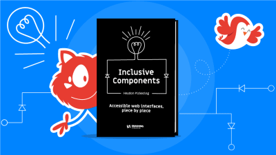


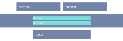


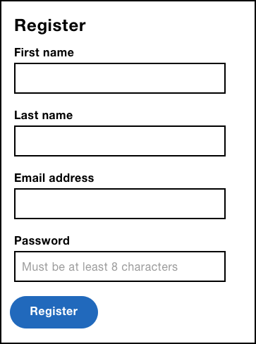

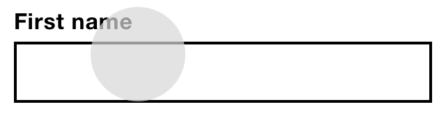
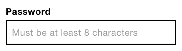
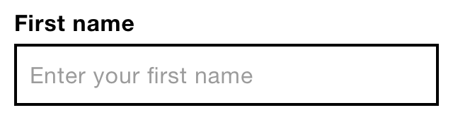
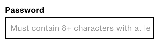
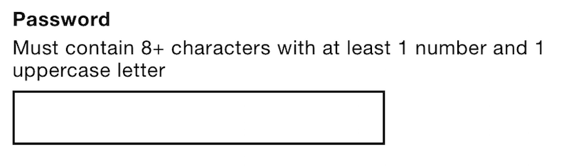
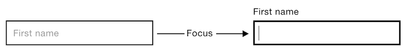
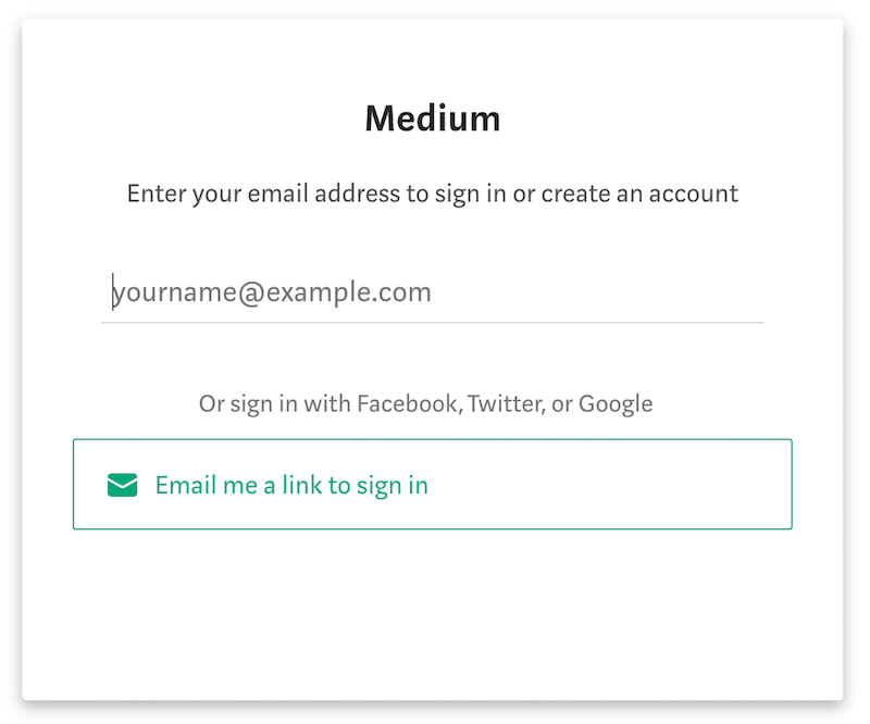
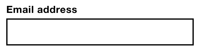
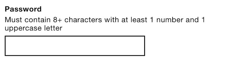
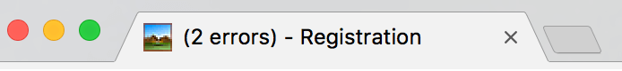
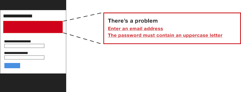
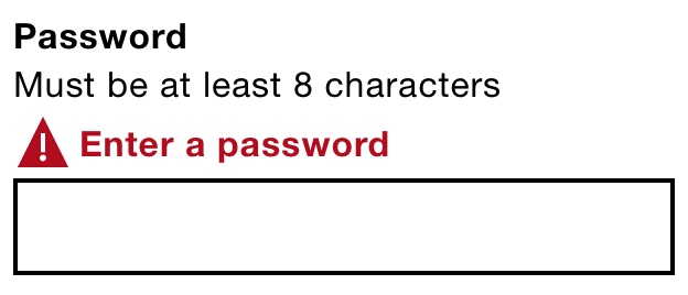
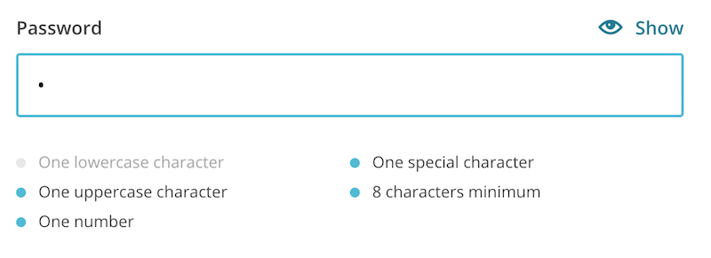
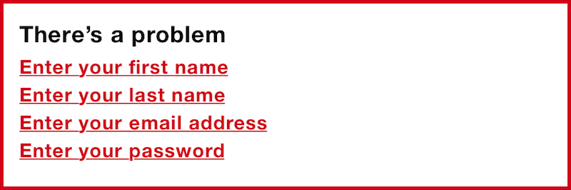

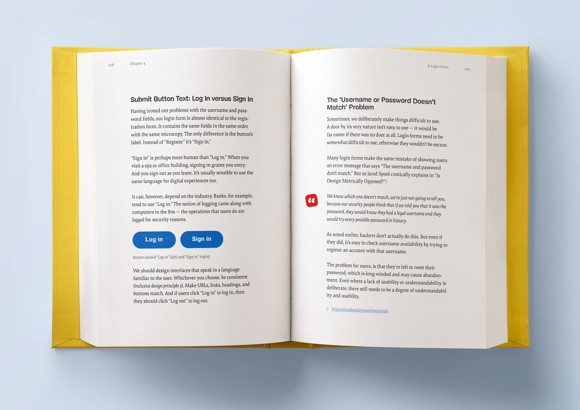
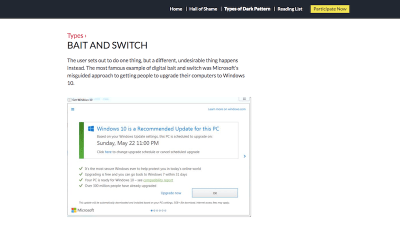


