How To Create A Particle Trail Animation In JavaScript
How To Create A Particle Trail Animation In JavaScript
Anna Prenzel
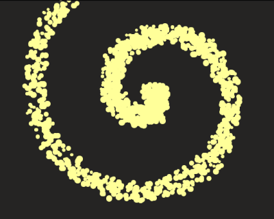
Have you ever thought about distracting visitors of your website with a fancy, glittering particle animation for a few moments, while some data is loaded in the background? Fortunately, it’s not necessary to go very deep into graphics programming with 3D libraries like three.js. All you need instead is some basic knowledge of CSS and JavaScript and a lightweight animation library such as anime.js. In the end, we should have the following result:

Download And Integration Of Anime.js
You can download the anime.js library from the official GitHub site. Download the file anime.js or anime.min.js from the lib/ folder.
In my example, the HTML part looks like this:
<!DOCTYPE html> <html lang="en" > <head> <meta charset="UTF-8"> <title>Anime.js Particles</title> <!--or use anime.min.js--> <script src="anime.js"></script> <link rel="stylesheet" href="style.css"> </head> <body> <div class="anime-container"> </div> <script src="script.js"></script> </body> </html>The CSS file styles.css defines the background color for the page and for the individual particles. The position settings are necessary so that we can later position the particles freely on the page using the CSS properties left and top.
body { background-color: hsl(30, 3%, 14%); } .anime-container { position: relative; } .anime-container .dot{ position: absolute; /*draw particles as circles:*/ border-radius: 50%; background-color: hsl(60, 100%, 80%); }The content of the file script.js is covered in the following section.
Generating The Particles
As the name suggests, a particle animation consists of many small particles moving in space while following a certain pattern. All particles are generated simultaneously before the animation starts.
For the following explanation, the official documentation of anime.js will be useful.
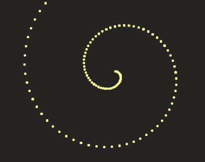
In my example, the particles are located on an Archimedean spiral. The x and y position of a particle on the screen (aka left and top in CSS) is calculated from its position angle on the spiral:
x=a*angle*cos(angle) y=a*angle*sin(angle) The number of angles and thus the length of the spiral is determined by the parameter l. With the parameter a, you can control the density of the spiral.
var container = document.querySelector(".anime-container"); var n = 15; var a = 20; var l = 110; for (var i = 0; i <= l; i += 1) { var angle = 0.1 * i; //shift the particles to the center of the window //by adding half of the screen width and screen height var x = (a*angle) * Math.cos(angle) + window.innerWidth / 2; var y = (a*angle) * Math.sin(angle) + window.innerHeight / 2; var dot = document.createElement("div"); dot.classList.add("dot"); container.appendChild(dot); var size = 5; dot.style.width = size + "px"; dot.style.height = size + "px"; dot.style.left = x + "px"; dot.style.top = y + "px"; dot.style.backgroundColor = "hsl(60, 100%, 80%)"; } }
This way, we get a spiral with exactly one particle per position, but a real trail effect can only be achieved if more than one particle is generated at each position. For the trail to look bushy, the positions of the individual particles must be slightly different. The anime-library provides a practical helper function for this:
anime.random(minValue, maxValue); The size of the particles also varies randomly:
for (var i = 0; i <= l; i += 1) { var angle = 0.1 * i; //shift particles to the center of the window //by adding half of the screen width and screen height var x = (a*angle) * Math.cos(angle) + window.innerWidth / 2; var y = (a*angle) * Math.sin(angle) + window.innerHeight / 2; var n = 15; //create n particles for each angle for (var j = 0; j < n; j++) { var dot = document.createElement("div"); dot.classList.add("dot"); container.appendChild(dot); var size = anime.random(5, 10); dot.style.width = size + "px"; dot.style.height = size + "px"; dot.style.left = x + anime.random(-15, 15) + "px"; dot.style.top = y + anime.random(-15, 15) + "px"; dot.style.backgroundColor = "hsl(60, 100%, 80%)"; } }
Here you can play around with the intermediate result:
See the Pen [anime js particles wip](https://codepen.io/smashingmag/pen/JjdqBve) by Anna Prenzel.
Before the animation starts, all particles have to be invisible. So I will add:
dot.style.opacity = "0";Animation Of The Particles
Basic Settings Of The Animation
The basic settings of my animation are made up as follows:
- The animation is to be repeated continuously (loop: true),
- The easing is linear (but you can try different values),
- The targets are all elements with the class "dot".
anime({ loop: true, easing: "linear", targets: document.querySelectorAll(".dot"), });In the next step I will animate various CSS properties of my targets. The basic steps for CSS animation can be found in the properties chapter of the anime.js documentation.
Animation Of Opacity
This is what our first property animation looks like, in which all particles are slowly made visible within 50ms:
anime({ loop: true, easing: "linear", targets: document.querySelectorAll(".dot"), opacity: { value: 1, duration: 50} });And now I will finally reveal the trick that creates a spiral movement of the particles! The idea is to make the particles visible with a certain time delay (e.g. in an interval of 2ms). The particles in the middle of the spiral are made visible at first, followed by all the other particles from inside to outside. The stagger function of anime.js is perfectly suited for this. In my opinion, staggering is one of the biggest strengths of the library that allows you to achieve great effects.
opacity: { value: 1, duration: 50, delay: anime.stagger(2) } To create the illusion of a flying trail, the particles must start disappearing slowly as soon as they have appeared. Fortunately anime.js provides a keyframe notation for properties:
opacity: [ { value: 1, duration: 50, delay: anime.stagger(2) }, { value: 0, duration: 1200} ], Here you can see the intermediate result:
See the Pen [anime js particles wip 2](https://codepen.io/smashingmag/pen/ZEGNjjv) by Anna Prenzel.
Animation Of Size
My comet trail should appear larger at the front end than at the back end. For this purpose, I let the particles shrink within 500ms to a diameter of 2px. It is important to choose the same time delay as for the opacity animation, so that each particle starts to shrink only after it has appeared:
width: { value: 2, duration: 500, delay: anime.stagger(2) }, height: { value: 2, duration: 500, delay: anime.stagger(2) },Individual Movement Of The Particles
The typical thing about a particle animation is the individual, unpredictable behavior of the particles. I finally bring the particles to life with an individual movement in the x and y direction:
translateX: { value: function() { return anime.random(-30, 30); }, duration: 1500, delay: anime.stagger(2) }, translateY: { value: function() { return anime.random(-30, 30); }, duration: 1500, delay: anime.stagger(2) }Again, it is important that the movement starts with the same time delay as the appearance of the particles.
Furthermore, it is absolutely necessary in this case to have functions calculating the values for translateX and translateY. Here we are using the parameters as function-based parameters whose values are determined for each target individually. Otherwise all targets would be shifted by the same (albeit randomly determined) amount.
Final Thoughts
You can see the final result over here:
See the Pen [anime js particles](https://codepen.io/smashingmag/pen/yLNWqRP) by Anna Prenzel.
You can modify the animation to your own taste by simply tweaking all the values. I have a little tip for the final touches: Now that we are familiar with function-based parameters, the opacity animation can be improved a bit:
opacity: [ { value: 1, duration: 50, delay: anime.stagger(2) }, { value: 0, duration: function(){return anime.random(500,1500);}} ],The duration before a particle disappears is now set for each particle individually. This makes our animation visually even more sophisticated.
I hope you are now as excited as I am about the possibilities that anime.js offers for particle animations! I recommend a visit to CodePen where you can see many more impressive examples.
Further Reading on SmashingMag:
- Including Animation In Your Design System
- HTML5 SVG Fill Animation With CSS3 And Vanilla JavaScript
- Introduction To Animation And The iMessage App Store With Shruggie
- Exploring Animation And Interaction Techniques With WebGL (A Case Study)
 (ra, yk, il)
Articles on Smashing Magazine — For Web Designers And Developers
