How To Convince Others Not To Use Dark Patterns
How To Convince Others Not To Use Dark Patterns
Paul Boag
You are a smart, well-informed person. After all, you are reading Smashing Magazine so you must be. That means you are probably already convinced that you should avoid dark patterns. Maybe you have even read the new Smashing book on Ethical Design that drives the point home.
However, just because we understand that we should avoid dark patterns, doesn’t mean our clients and colleagues do. No doubt you have been asked more than once to implement these questionable techniques by an ill-informed stakeholder.
Unfortunately, it can be hard to convince them that dark patterns are a terrible idea. Talking about ethics often isn’t enough.
The problem is that a lot of our colleagues and clients are under tremendous pressure to deliver. Business owners need to pay the bills, while many marketing executives in larger organizations are under immense pressure to deliver results.
In that kind of environment, people can convince themselves of anything. The ethical argument becomes muddied as people persuade themselves that they aren’t forcing anybody to do anything.
So in this post, we will put together a compelling argument you can present to stakeholders to help them understand why dark patterns are a bad idea.
However, before we do that, let’s agree on a definition of dark patterns.
How Do We Define A Dark Pattern
Suzanne Scacca has written an excellent post showing examples of dark patterns and you probably already have a clear idea in your mind of what they are.
However, for this article, I am going use the definition from my article on dark patterns:
“User interface elements that have been carefully crafted to trick users into doing things they might not otherwise do, often utilizing psychological manipulation.”
We need to be clear on our definition because increasingly, I am seeing people refer to anything that is annoying on the web as a dark pattern. For example, an overlay may be very annoying, but it does not necessarily trick users into doing something they might not otherwise do.

I point this out, not to say those people are wrong in their definition, but rather because the arguments I lay out here would not all apply to a broader definition of what a dark pattern is.
So what exactly is that argument?
The Business Case Against Dark Patterns
If you want to convince stakeholders that dark patterns are a terrible idea, there is little point talking about their negative impact on the user experience. That is typically too abstract for most people. Instead, we need to frame things in terms they will understand — the negative impact of dark patterns for them personally and for the entire business.
Aside from the ethical considerations of using dark patterns, three factors make them a wrong choice for any business concerned about long-term revenue, and by extension, anybody in that business considering adopting them. These are:
- The fact that consumers are cynical, savvy and spoilt for choice.
- That the web has empowered consumers.
- The hidden costs of dark patterns.
These are the arguments that you can bring to clients and management so let’s explore them in more depth.
Consumers Are Cynical, Savvy And Spoilt For Choice
You only need to watch an episode of Mad Men to know that manipulation in sales and marketing has been around much longer than the web.
Brands always used to be able to get away with manipulation because consumers were mostly unaware of being manipulated. Even if they did realize, the choice was limited, and so there was very little they could do. That is no longer true. The web has changed that.
We need to help management realize the fact that consumers have changed. That in every consumer’s pocket is instant access to every other company on the planet that offers the same thing as you. It is so easy to find your competitors and so simple to swap that one small annoyance is enough to make people switch.
Of course, management might take the cynical attitude that if people are unaware that they are manipulating them, then they won’t be annoyed and so won’t swap to a competitor.
In truth, the assumption that people are unaware of manipulation is incorrect.
There is a tendency to think that because dark patterns work (and let’s be clear they do) that people are unaware of them. However, that isn’t necessarily so.
A case in point is a usability test I ran on a hotel booking site which employed dark patterns. As the user was looking at hotel rooms, he commented on how he hated all the manipulative techniques the website used. I asked him why he used the site, and he said: “I just ignore all of that stuff.”
In reality, he probably didn’t. It would still impact his buying decision on a sub-conscious level. Yes, he was unaware the manipulation was working. However, he was aware the site was employing it, and so it created that adverse reaction in him.
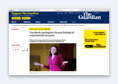
Users are much savvier than we give them credit for. Don’t forget they have the whole of human knowledge in their pockets, and they read articles about Facebook’s psychological manipulations or BBC stories about Government intervention over the techniques hotel booking sites were employing. They know that websites are attempting to manipulate them, and that makes it likely they will at least consider going elsewhere.
However, there is an even more significant danger in them knowing that a site is attempting to manipulate them.
The Power Of The Consumer
The web hasn’t just made consumers savvier and given them more access to choice. It has also provided them with a platform to complain, and companies continue to underestimate that.
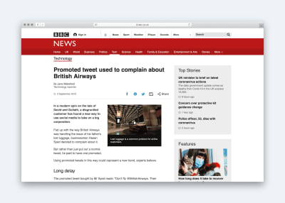
Even one disgruntled customer can have a significant negative impact on a brand. I often talk to clients about the story of Hasan Syed, who was unhappy with British Airways. He decided to take out a promoted tweet that read:
“Don’t fly @BritishAirways. Their customer service is horrendous.”
The fallout of this one action was enormous for British Airways with the story featuring on the BBC, Guardian, Fox News, the Express and Telegraph, to name just a few.
Things get even more dangerous when users start coming together to express their dissatisfaction, such as when Facebook was found to have carried out psychological experiments on their users.
The voice of users has become so powerful now that it motivates government into action such as with the Competition and Markets Authority (CMA) here in the UK. They recently announced:
“The CMA has taken enforcement action to bring to an end misleading sales tactics, hidden charges and other practices in the online hotel booking market. These have been wholly unacceptable.”
Worst of all, the web means these negative comments from users never go away. They are always only a search away and easily accessible thanks to sites like Check a Trade or Trip Advisor.
In business terms, this leads to lost long-term revenue, less repeat orders, and harder customer acquisition. However, these are not the only costs of manipulation.
The Hidden Cost Of Manipulation
At face value, dark patterns work. If you use them on your website, you will see an increase in users taking action. However, that does not tell the whole story because for every dollar of additional revenue earned; dark patterns could well be costing you more. The problem is that you cannot easily see the costs.
Take, for example, a company I worked with who sold kettles. They decided to automatically add their kettle filters to people’s carts when they went to buy a kettle. That is a classic dark pattern people don’t always notice that the company has added the filter.
Sure enough, the sales of filters skyrocketed, and the e-commerce team was pleased because they were one step closer to meeting their targets.
Unfortunately what they were not aware of was what was happening elsewhere in the company.
The marketing team who ran the companies social media channels found themselves having to spend time addressing complaints on Twitter and Facebook.
The customer support team received an increase in calls asking for refunds or complaining. Each call was costing the company £3.21, more than the profit margin on the filters.
Then there was the cost of processing the returns. Filters had to be assessed and then restocked, costing yet more money.
In short, dark patterns are rarely as profitable as they first appear and could be costing the company money, even outside of the online backlash.
Without a doubt, there is a solid business case against the use of dark patterns. However, an academic argument may not be enough to sway clients or colleagues. You might need something more tangible.
Gather Your Evidence
If your company has yet to start using dark patterns, the above argument should help. However, if they are already using them, getting people to change their minds will be tougher. You will probably need some evidence to support your case.
Gathering this evidence will need a bit of detective work on your part, but it could make all of the difference in making your case. With that in mind, where are some places to look?
Search Out Negative Comments
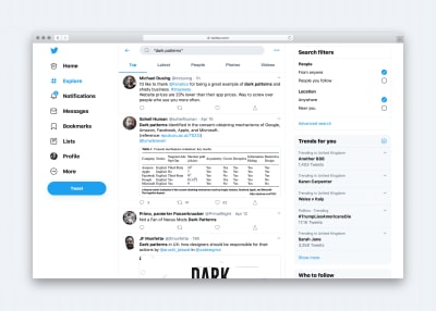
The first place to look is online. Search out every negative comment you can find about dark patterns and your website. If you don’t see any that doesn’t mean people are unhappy, it just means they haven’t shared it publicly yet. However, if you do find comments, they probably represent the feelings of many, many other people.
Talk To Other Teams In Your Company
Speak to those in customer services, returns, marketing or any other department that might have been impacted by the use of dark patterns. Ask them if they have noticed any changes since the company has implemented them. As with the kettle company, you might find some hidden costs.
Run Usability Testing
Ask some people to use your site and see how they react to the dark patterns. I would advise against leading the testers by asking directly about the dark patterns. However, you can ask whether there is anything about the website they dislike or find annoying.
Make sure you record these sessions too, as nothing is more potent than seeing just how frustrated and irritated people get with these kinds of techniques.
Run A Survey
Another approach is to run a survey asking people about their impressions of the website. Did they find it trustworthy? Do they feel the company is putting their interests first?
One particular survey I favor is one that shows on exit-intent if the user decides not to take action. The one question survey asks them why they chose not to take action and offers them a list of alternatives.
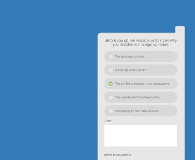
One of the options could be that the site felt manipulative or untrustworthy. That would give you an indication of if users are aware of the dark patterns and whether they are influencing the buying decision negatively.
That works even better if you can compare answers between users who have seen the dark patterns and those who haven’t.
Of course, the best evidence of all is where you can tie dark patterns to financial loss for the company. That is not always easy to do, but with some educated guessing, we can often estimate.
Let’s imagine one in ten people who completed the exit-intent survey said that they didn’t act because the site felt manipulative. That would mean that by dropping dark patterns, the site could see 10% more people taking action. If you know the number of visitors to the website, you can work out how many extra orders that would be. You can then also work out the average value of each order, and that provides a financial cost of dark patterns.
Would that number be 100% accurate? Absolutely not. However, it would be enough to make stakeholders stop and think. At least it will if you present it in the right way.
Pick Your Moment And Method
In my experience, one of the significant reasons that our appeals to drop dark patterns fall on deaf ears is that we approach it in a confrontational manner. We argue passionately for the removal of dark patterns in a meeting, often with the person who introduced them in the first place. That is never going to end well.
When we confront people in this way, they become defensive, especially when you are criticizing them in front of colleagues.
My recommendation is that once you have formed your argument and gathered your evidence that you speak to each of the critical stakeholders individually.
Not only does this approach avoid people feeling attacked in a public forum, but it also allows you to tailor the argument you present for whoever you are talking to.
For example, if you are talking to a marketing person, you could talk about the damage dark patterns have on a brand. However, if you are talking to a finance person, you can discuss the hidden costs of dark patterns.
Most of all, we need to make these arguments with sensitivity. We should not imply that stakeholders were wrong to suggest or try dark patterns. That is simply too confrontational.
You will see better results if you talk about the evidence that you have uncovered and the research into the subject that you have done online. Talk about it being a nuanced issue and a delicate balance to achieve. In short, be conciliatory, rather than confrontational.
I am not claiming that if you adopt the approach outlined in this article, you will see success every time. However, I do believe you will see more progress than lecturing colleagues about ethics and applying that they are unethical in their approach.
 (ra, il)
Articles on Smashing Magazine — For Web Designers And Developers
