Design Meets Production: Why Two Minds are Always Better than One
This article has been contributed by Shelagh Hammer.
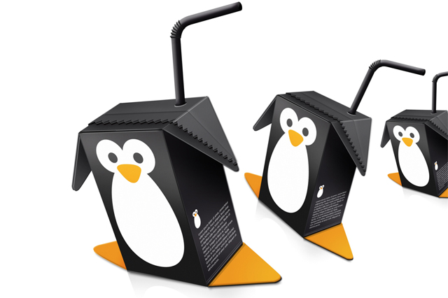
The design and production worlds seem to come from opposite ends of the spectrum. While designers tend to be creative and highly visual, converters are concerned with structural integrity.
Yet, despite their different approaches, they need one another in order to come up with the total package–that perfect combination of ingenuity and stand-out visuals that make a product useful.
In fact, while the main essence of many products’ packaging may center around functionality, and structure, great design can take these features one step further through the incorporation of design components that make them even more useful for your brand.
Versatility is key
A key element in successful packaging is making proper use of color, pattern, and texture in order to grab one’s attention. This automatically draws the eye in and engages people’s interest in your product. Therefore, as a brand, it is critical to find converters, trade finishers and designers that understand this and have the means necessary to accomplish these goals.
Before starting to work on the visual design of a product’s packaging, first and foremost it is essential to understand your target market. While design my fall under the banner of creativity, the business marketing component is an incredibly important feeder that will determine the final design. Understanding the demographic of the potential consumer will ultimately inform the final decisions of design.
Once the target audience is determined, the designer can begin with, what could be likened to, creating the composition. Taking the design elements of space, unity and color into consideration will make your products packaging an influential factor for the consumer. Unity exists when all the elements work together in a cohesive design, visually, conceptually or both. While Unity suggests order, this can also result in a static design. The key to a successful design is to find balance and variety, resulting in a well ordered design that is visually appealing without being perceived as a sensory overload. Conceptual unity can be reflected through the use of similar objects/images about the same subject.
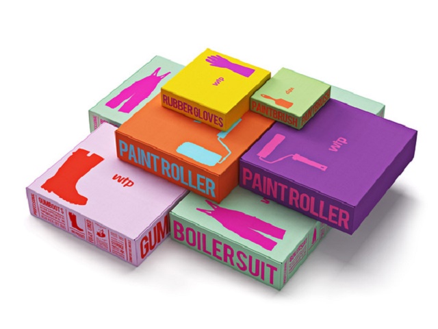
Space as a design element, is in essence, the context within which your message or design is viewed. In order to effectively communicate your product to the consumer, space ( both positive and negative) needs to be used. Your potential consumer doesn’t want to think about where to look, his/her eyeline should be guided towards the focal point in the design.
Color is often defined as the most important design element; it aids in evoking emotions in the viewer. These emotional responses often stem from cultural backgrounds and understandings, which is another important factor to consider when analyzing the target market of your product. Other important elements that brand managers and designers should remember when plotting marketing and brand strategy for packaging is that darker colors are seen before lighter colors and that a good, clear use of color will help your consumers understanding of your product.
When designing packaging for your products, you need to communicate not only the product and its benefits, but also the vision of your company and what it represents. For designers, this means incorporating quintessential colors, patterns, and images into the packaging’s design. For manufacturers, this means being able to pull it off in a reasonably timely manner.
It is also important to make sure you have enough room on your package to show its benefits. If your product is large, then the chances are you will have plenty of space to display additional information on things like product features and benefits. But if your product packaging is small, You need to consider space to add selling copy and/or photos
This is where it gets complicated. In order to create custom designs that truly incorporates your company’s identity, your finishers need to have the tools to be versatile. For example, if you need cut-outs, specific textures, or to use a unique shape for the package, converters or trade finishers must be able to adapt to those specifications. Modern finishing solutions can give your converters and trade finishers the flexibility they need to let your creativity come into fruition.
Designing for ease of use (Practicality)
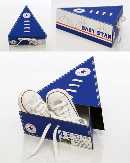
Remember, design is meant to be visually stimulating, but that doesn’t mean it can’t be functional too. When design and production come together, the end product isn’t just more attractive, but it can also be more useful. And this is certainly the ideal combo.
In order to design useful products for your brand, think of the end-goal of the product and the steps a person would take from first seeing it to actually using it. For example, if you are designing a lamp, think about the way somebody would switch it on, how the light would reflect through the colors and materials, and what type of room it would fit into. Obviously, make sure it’s stable, and goes well with other furniture–but don’t forget to be creative with material use. After all, the textures, patterns, and materials will make the design stand out and give people the initial draw to purchase.
As a discipline, brand packaging should be considered an industry in and of itself.
When looking for a product, consumers will decide which product is right for them within 4 seconds of seeing the product packaging. It is therefore essential to adhere to simple packaging design criteria. Simple design principles such as having your brand name immediately visible with a clear explanation of what the product is/does. The design elements need to match the brand otherwise your potential customer will wind up confused and opt for a different brand with packaging that clearly exemplifies the product. In essence be clear about the product, be clear about the brand.
When regarding packaging design the two key elements to take into consideration are honesty and practicality. Instilling faith in your customer is in essential component of brand management and marketing. It is vitally important that whatever image or slogan your present on your packaging and in your advertising is true for the product they are purchasing. If an image on the box of your product is untrue for it’s content you will have lost the trust of your customer and the chances are they will not buy your product again.
Practicality on the other hand refers specifically to the product packaging – cardboard or plastic, the shape size, material and functionality of the container. It would be logical to assume that the more practical the packaging the higher the recorded sales would be. A clear example of this would be the increase in Heinz ketchup sales when they changed their packaging from a glass screw top bottle to a plastic, upside down squeeze bottle. Practically is basically about the consideration as to how you can make the product easier to use, carry or store.
An intrinsic part of the package design process is to remember that the container is in essence the last message the consumer is left with and the first and last opportunity the brand has to make an impact and therefore get him/her to purchase the product.
To make things easier, get the entire team involved in creating functional design from the get-go. This helps you to better strategize utilizing concurrent engineering, a process which enables you to begin designing all elements at the same time in order to reduce time and money.
The basic ideas behind concurrent engineering revolve around a product life cycle including functionality, producibility, assembly and maintenance issues as well as the product’s environmental impact and recycling.
The second is that the design activities should all occur simultaneously. This practise suggests that the concurrent production raises productivity and product quality. This way, errors in the brand can still be fixed earlier on in the process avoiding the high costs later on in the process.
Don’t be afraid to look for outside inspiration
Chances are if something draws you in visually, it will draw others in as well. Investigate current trends, the connotations of using specific colors, and use nature as a source to gain some great design inspiration.
Just like most commodities influenced by popular culture, packaging follows specific trends. In 2015, a host of different design and stylistic inclinations came to the fore. At the top of the list, we find design elements that reflect a raw element and a move away from the computer generated typography and standardised as well as clear cut design of a few years before. Instead the design appears natural as though drawn free-hand, almost vintage inspired making use of neutral colour palettes. It is a complete break away from corporate design and have been defined as an attempt to re-establish a human connection through design.
The adage of ‘less is more’ bears testament to the package design trends of today. The subtle and organic colour palettes mixed with the hand drawn design and logos demonstrate a very clear break away from the loud, exuberant and very bright packaging of yesteryear.
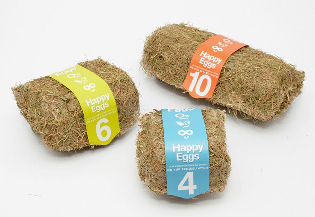
Design cures are also taking inspiration from nature, creating packaging that adds value to the product experience. The material is carefully selected to add to a tactile experience. An innovative experience in the packaging arena is the use of material inspired by Biology and Ecology and the new age push towards ‘earthy’ sustainability. A key consideration for packaging would be if the material is recyclable, and at time even edible. Environmental responsibility reflect a pure and socially conscious brand which speaks to a large portion of society, those who will opt for the ecologically friendly over a product that isn’t.
Finding inspiration and using resources from a host of different places gives your design an added edge. Consumers are automatically drawn to products that are relatable as well as those that suit their particular lifestyles.
Branding and package design form an integral part of the marketing strategy and having a clear understanding of what appeals to consumers generally comes from outside sources, and therefore using outside sources for inspiration is key.
Incorporating these essential visual tools into your packaging means that the product being built will better resonate with potential customers and make a much bigger impression.
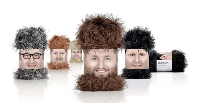
Using packaging in a creative way can also add to the marketing value of the brand. Unique and ingenious packaging designs prove that a well-designed package can complement or even enhance the product it was designed to carry.
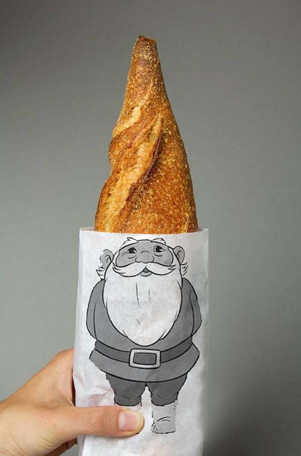
Some packaging, instead of being functional may serve an associative or aesthetic purpose.The package design can be used to enhance the product or brand, so while it may not be functional, it could definitely add to the brand marketing of the product. The Note headphones’ packaging, for example, serves to give them a strong association to music
The beauty of production design is that your brand can combine expertise from both a structural and visual perspective. This gives you greater flexibility when it comes to material usage as well as overall construction since manufacturers will ensure your design’s feasibility, while designers will make the creative vision come to life. In the end, this partnership will enable all parties to win by having smarter and more attractive product designs for all.
–
Shelagh Hammer, Marketing Manager, Highcon, the experts in digital finishing solutions. Their Euclid printer is the first of its kind to digitally cut and crease paper, labels, cardboard and microflute easily and efficiently–making designing high quality, customizable packaging easier, quicker, and more cost-effective than ever before.
