The State Of Mobile And Why Mobile Web Testing Matters
Things have changed quite a bit over the last decade when we just started exploring what we could do on a tiny, shiny mobile screen. These days, with mobile traffic accounting for over 50% of web traffic, it’s fair to assume that the very first encounter of your prospect customers with your brand will happen on a mobile device.
Depending on the nature of your product, the share of your mobile traffic will vary significantly, but you will certainly have some mobile traffic — and being prepared for it can make or break the deal. This requires your website or application to be heavily optimized for mobile. This optimization is quite complex in nature though. Obviously, our experiences will be responsive — and we’ve learned how to do so well over the years — but it also has to be accessible and fast.
This goes way beyond basic optimizations such as color contrast and server response times. In the fragmented mobile landscape, our experiences have to be adjusted for low data mode, low memory, battery and CPU, reduced motion, dark and light mode and so many other conditions.
Leaving these conditions out of the equation means abandoning prospect customers for good, and so we seek compromises to deliver a great experience within tight deadlines. And to ensure the quality of a product, we always need to test — on a number of devices, and in a number of conditions.
State Of Mobile 2021
While many of us, designers and developers, are likely to have a relatively new mobile phone in our pockets, a vast majority of our customers isn’t quite like us. That might come a little bit unexpected. After all, when we look at our analytics, we will hardly find any customers browsing our sites or apps with a mid-range device on a flaky 3G connection.
The gotcha here is that, if your mobile experience isn’t optimized for various devices and network conditions, these customers will never appear in your analytics — just because your website or app will be barely usable on their devices, and so they are unlikely to return.
In the US and the UK, Comscore’s Global State of Mobile 2020 report discovered in August 2020, that mobile usage accounted to 79% and 81% of total digital minutes respectively. Also, there was a 65% increase in video consumption on mobile devices in 2020. While a vast majority of the time is spent in just a few mobile apps, social media platforms provide a gateway to the web and your services — especially in education.


On the other hand, while devices do get better over time in terms of their capabilities and battery life, older devices don’t really get abandoned or disappear into the void. It’s not uncommon to see customers using devices that are 5-6 years old as these devices often get passed through the generations, serving as slightly older but “good enough” devices for simple, day-to-day tasks. In fact, an average consumer upgrades their phone every 2 years, and in the US phone replacement cycle is 33 months.

Globally in 2020, 84.8% of all shipped mobile phones are Android devices, according to the International Data Corporation (IDC). Average bestselling phones around the world cost just under $ 200. A representative device, then, is an Android device that is at least 24 months old, costing $ 200 or less, running on slow 3G, 400ms RTT and 400kbps transfer, just to be slightly more pessimistic.
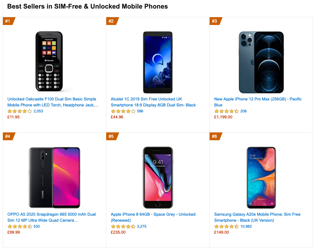
This might be very different for your company, of course, but that’s a close enough approximation of a majority of customers out there. In fact, it might be a good idea to look into current Amazon Best Sellers for your target market.

Mobile is a spectrum, and a quite entrenched one. While the mobile landscape is very fragmented already, the gap between the experience on various devices will be widening much further with the growing adoption of 5G.
According to Ericsson Mobility Visualizer, we should be expecting a 15× increase in mobile 5G subscribers, from 212 million in 2020, to 3.3 billion by 2026.

If you’d like to dive deeper into the performance of Android and iOS devices, you can check Geekbench Android Benchmarks for Android smartphones and tablets, and iOS Benchmarks for iPhones and iPads.
It goes without saying that testing thoroughly on a variety of devices — rather just on a shiny new Android or iOS device — is critical for understanding and improving the experience of your prospect customers, and how well your website or app performs on a large scale.
Making A Case For Business
While it might sound valuable to test on mobile devices, it might not be convincing enough to drive the management and entire organization towards mobile testing. However, there are quite a few high-profile case studies exploring the impact of mobile optimization on key business metrics.
WPO stats collects literally hundreds of them — case studies and experiments demonstrating the impact of web performance optimization (WPO) across verticals and goals.
Driving Business Metrics
One of the famous examples is Flipkart, India’s largest e-commerce website. For a while, Flipkart adopted an app-only strategy and temporarily shut down its mobile website altogether. The company found it more and more difficult to provide a user experience that was as fast and engaging as that of their mobile app.
A few years ago, they’ve decided to unify their web presence and a native app into a mobile-optimized progressive web app, resulting in a 70% increase in conversion rate. They discovered that customers were spending three times more time on the mobile website, and the re-engagement rate increased by 40%.
Improving Search Engine Visibility
It’s not big news that search engines have been considering mobile friendliness as a part of search engine ranking. With Core Web Vitals, Google has been pushing the experience factors on mobile further to the forefront.
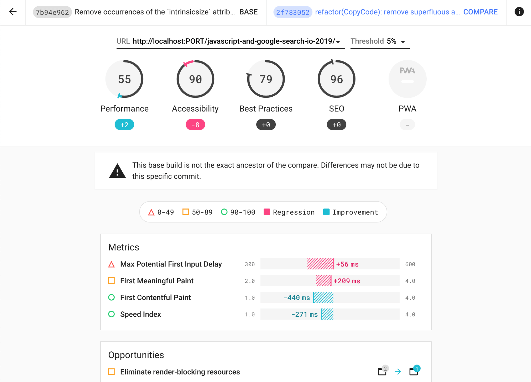
In his article on Core Web Vitals and SEO, Simon Hearne discovered that Google’s index update on 31st of May 2021 will result in a positive ranking signal for page experience in mobile search only, for groups of similar URLs, which meet all three Core Web Vital targets. The impact of the signal is expected to be small, similar to HTTPS ranking boost.

One thing is certain though: your websites will rank better if they are better optimized for mobile, both in terms of speed and mobile-friendliness — it goes for accessibility as well.
Improving Accessibility
Building accessible pages and applications isn’t easy. The challenges start with tiny hit targets, poor contrast and small font size, but it quickly gets much more complicated when we deal with complex single-page-applications. To ensure that we cater well for our customers in various situations — with permanent, temporary and situational disabilities — we need to test for accessibility.
That means considering keyboard navigation, how navigation landmarks are properly assigned, how updates are announced by a screen reader, focus traps, and whether we avoid any inaccessible libraries or third-party scripts. And then, for every component we are building, we need to ensure that we keep them accessible over time.
It shouldn’t be surprising that if a website isn’t accessible to a customer, they are unlikely to access your product either. The earlier you invest in accessibility testing, the more you’ll save down the road on expensive consultancy, expensive third-party services, or expensive lawyers.
Mobile Web Testing
So, with all the challenges in the mobile space, how, then, do we test on mobile? Fortunately, there is no shortage of mobile testing tools out there. However, most times, when performing mobile testing, the focus is mostly on consistency and functionality but for a more thorough mobile test, we need to go a layer deeper into some not-so-obvious specifics of testing.
Screen sizes
Screen sizes are one of the many things that are always changing in the realm of mobile devices. Year after year new screen sizes and pixel densities appear with new device releases. This poses a problem in testing websites and apps on these devices, making debugging more difficult and time-consuming.
OS Version fragmentation
With iOS having a high adoption rate on its latest OS releases (a rate of 57% on its latest iOS 14), and the plethora of versions still being used by Android devices going as far back as Ice Cream Sandwich, one must make sure to account to this fragmentation when doing mobile testing.
Browser fragmentation
With Chrome and Safari having a global usage of 62.63% and 24.55% on mobile respectively, one might be tempted to focus on just these browsers when performing mobile tests. However, depending on the region of the world, you are more likely to test in other, less-known browsers, or proxy browsers, such as Opera Mini. Even though their percentage usage might be small, it might run into hundreds of thousands of usage globally.
Performing Mobile Web Testing
To perform mobile web testing, one option is to set up a device lab, and run tests locally. In times of remote work, it’s quite challenging as you usually need a number of devices at your disposal. Acquiring these devices doesn’t have to be expensive, and experiencing the loading on your own is extremely valuable.
However, if you want to check how consistent the experience is, or conduct automated tests, it’s probably not going to be enough.
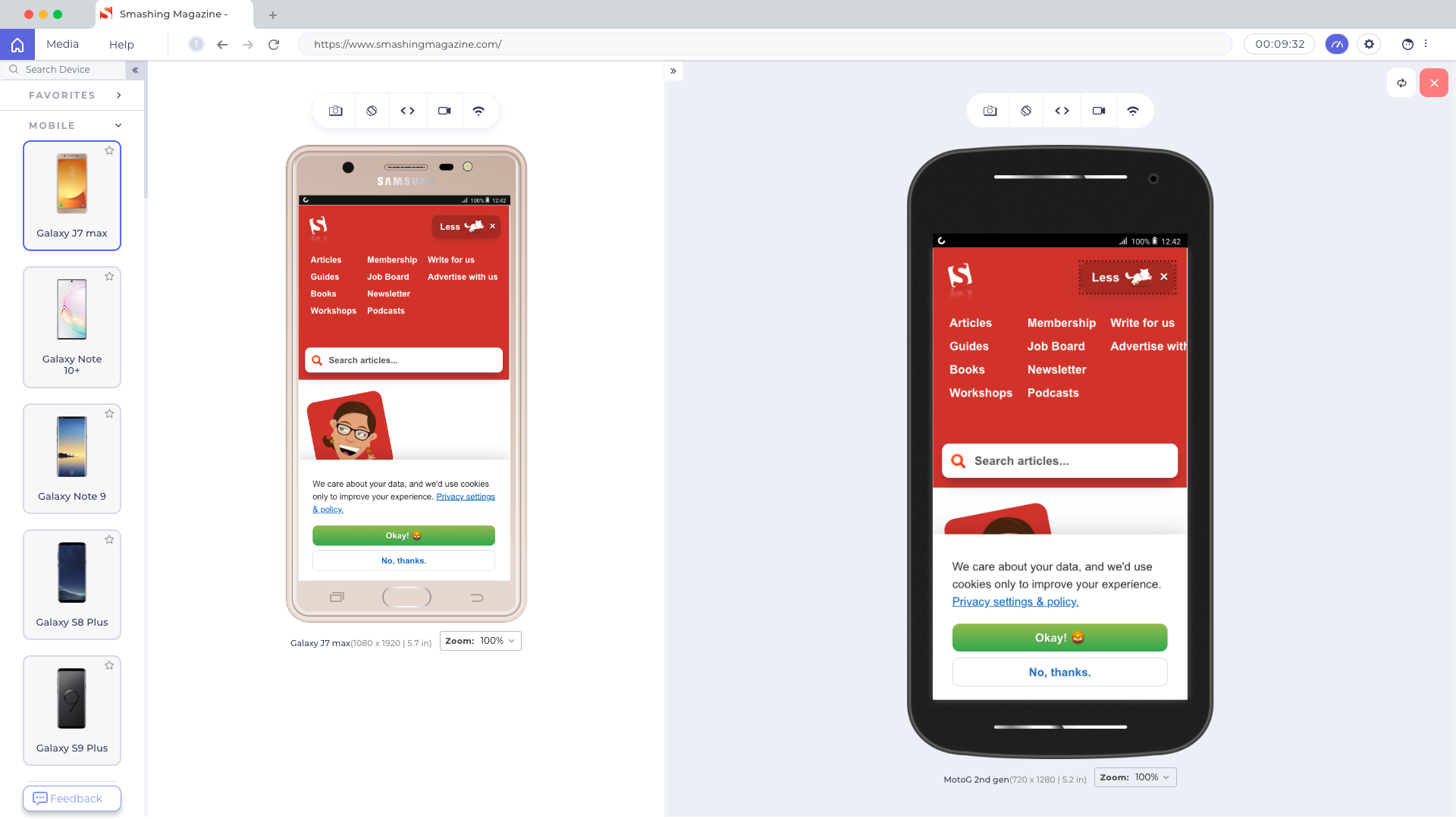
In such cases, a good starting point is Responsively, a free open-source tool with mirrored interactions, customizable layout, 30+ built-in device profiles, hot reloading and screenshot tools.
There are also other helpful tools that you may want to look into:
- LT Browser LT Browser is a free-to-use desktop application that helps you build well-performing, responsive websites or web apps. It has 50+ built-in device resolutions — for mobile, tablet and desktop. You can check the mobile view of your website in a side by side comparison view with mirrored interactions and touch support.

Once you have downloaded the browser and registered, you can build, test, and debug your website, as well as take screenshots and videos of bugs, assign them to specific devices, run a performance profiling and observe multiple devices side by side. By default, a free version provides 30 mins per day.
If you need something slightly more advanced, LambdaTest allows you to run a cross-browser test on 2000+ devices on different operating systems with which you can even perform both manual and automated browser testing. (Full disclosure and reminder: LambdaTest is a friendly sponsor of this article.)
- Sizzy
This tool supports sync scrolling, clicking and navigation across devices, as well as takes screenshots of all devices at once, with and without a device frame. Plus, it includes a Universal Inspect Element to inspect all devices at once. - Blisk
Another little helpful tool that supports over 50 devices out of the box, along with sync scrolling. You can test touch support and preview devices side-by-side, working with the same piece of code across all opened devices. Hot-reloading is supported as well, as well as video recording and screenshots. - Polypane
The tool also allows you to preview your website on 27 devices, along with sync scrolling, clicks, touch, keyboard and hovers. It provides a comprehensive support of media queries (e.g.prefers-reduced-data) and a suite of debugging tools like accessibility review, CSS layout and link testing. - BrowserStack
The service provides an option to automate testing as well as testing for low battery, abrupt power off, and interruptions such as calls or SMS. - Also, if you wish to stick with device labs to automate testing then you can set up an in-house Selenium Grid with open-source solutions i.e. Zalenium, Aerokube.
Conclusion
In this article, we have looked into the state of mobile in 2021. We’ve seen the growing usage of mobile devices as the primary means to access the web, and we’ve looked into some challenges related to that. We’ve also looked into mobile testing, and how some tools can help us find and fix bugs on mobile.
Keep in mind that your website is the face of your business and more and more users are going to access it via their mobile phones. It’s important to make sure that your users can access the services you provide on your website and have an accessible and fast experience on their devices as they do on the desktop version. This will ensure that the benefits of brand visibility get the attention they deserve.
Articles on Smashing Magazine — For Web Designers And Developers


