Why and How to Liven Up Your Site: Animation in Web Design
Have you ever thought why animation movies are in vogue the same as the well-known movie franchises and blockbusters? The latest cartoons are the top box-office earners and this definitely meets the expectations of major film producers to the full extent. For example, the premiere of the “Minions” presented by Universal Pictures earned more than $ 1.1 billion all over the world. Pretty exciting, isn’t it?
Is this the most peachy global conspiracy, some worldwide parents consolidation created, in order to please their little ones altogether? Of course, it’s not. But it seems like kids are not the only passionate cartoon aficionados. Growing up, we keep this passion. Today’s technologies have evolved to the point, where computer animation wakens the child inside an adult, opening up another amazing source of entertainment and inspiration.
Liven Up Your Site With Animation
But why are human beings partial to graphic representations of the world around us? The answer lies somewhere around the notion that we call “soul”. This is some kind of explanation of how we live, move, feel and think.
Visual art became not just a form of self-expression, but as it turned out later, it is the way for our species to cheat death by sharing information throughout generations. Our natural craving for creating the illusion of motion reflexively led us to such an incredible outcome. From cave drawings and ancient civilizations’ writing to the invention of photography, television and, finally, internet there was a long path, within which illustration has been transformed into animation.
Animation in Web Design
The first steps of animation development in web design were made unknowingly. Everything began at the end of the 1980s with the advent of the .gif epoch. At the start, it was something funny, just “alive pics”, boding no boom. Afterwards, it was the first sign, showing that animation would bring a power of good to a website. It’s been almost 30 years, but the format is still relevant.
Flash animation arouses mixed feelings. Nobody can deny that this technology made a revolution in web design. With Flash it became possible to crank out animations, using manifold software. It was innovative, cheap and lightweight. Also, I forgot to mention mini games, built on Flash. Great stuff!
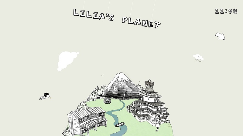
Lilia’s Planet
But time flies… With the emergence of responsive design and more powerful mobile devices like touch smartphones, tried-and-true Flash rendered its moot due to poor optimization and functionality.
Today Flash technology has been successfully supplanted by a few better approaches like CSS and JavaScript coding. In addition, web designers have much more work to do than before, taking into account different issues during the development process like the look of animation on different screen resolutions, how it works on various browsers etc.
Pros and Cons
If you are a website owner, think twice before using animation. Yes, this is definitely the great move to improve user experience, but there are some peculiararities you should not forget about.
First of all, always look at your website from a user’s perspective. Not yours. Forget about your own opinion. Examine your website potential audience. Learn what platforms are the most popular among the users. In the age of mobile devices prevailing animation must be responsive. Otherwise, say goodbye to smartphone and tablet users. They won’t forgive you bad animation performance for sure and will leave your website right off the bat.
One more important fact about performance is that the animation you apply has to be fast without affecting the website. In your haste for a stunning design you can simply overload your online business operability. Calculate your site loading time, preventing any troubles with CPU functioning. Animation slathers won’t benefit your website, and will merely aggravate its work. Don’t sacrifice the website work speed to make it cool looking. As a result, you will get neither of these.
Animated Illustrations
Illustration is undoubtedly the fundamental ingredient of a “tasty” web design make-up, regardless of its purpose. At the same time, this is the “must-have” content for those who are engaged in creative work. Artists, designers and photographers have no right to error. After all, a website as an “objet d’arti” is another battlefield for them.
The benefits of pictures in website building are obvious. This is the perfect means for:
- online business owners to represent a project, service and/or product;
- web designers to prove professional skills and demonstrate their artwork first hand.
But what if a web designer combines illustration with animation? Being a much-loved trend in web design, the illusion of motion takes the fancy of many web artists. And the results can be really astonishing. The well made and applied animated pics double the chances of a web designer to lure visitors. Previously mentioned “creative minds” should implement such a gimmick to their design agency, photography portfolio, online gallery websites by all means.
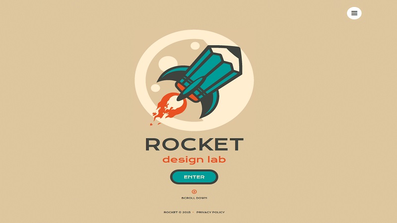
Single-page Theme for Web Design Agency
Do Your Own Animations
There is a way, allowing every unskilled website owner to animate a website without extra assistance, using appropriate software.
Do you know something about so-called website builders? They are appreciated among people, who don’t have much time or resources to hire coders, programmers, web designers and managers to create a solid website, equal to an analogue made by a professional web design studio. Believe it or not, most website building platforms (e.g. Squarespace, Wix, MotoCMS) offer a pretty good tool set, providing an online business startup from square one. Using a website builder is like playing a game. Most of them are user-friendly and developed exactly for the website editing process simplification.
But that’s another story… Let’s go back to animation and its application by means of MotoCMSwebsite builder in particular. This web editor has the functionality similar to its alternatives. There is only a slight difference in the use of other builders for animation.
In the MotoCMS admin panel it is possible to animate almost every website element like: menu, text blocks, pictures, buttons etc. There are up to 40 animation types with preview windows. Just click on the necessary element and find Animation subsection among Properties or Settings.
More Examples
Look at a few more websites below. Maybe, there is the one that will inspire you.
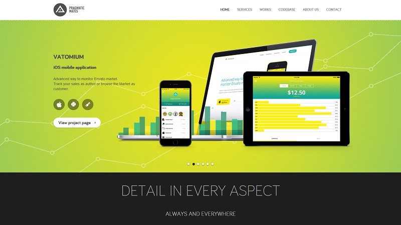
Pragmatic Mates
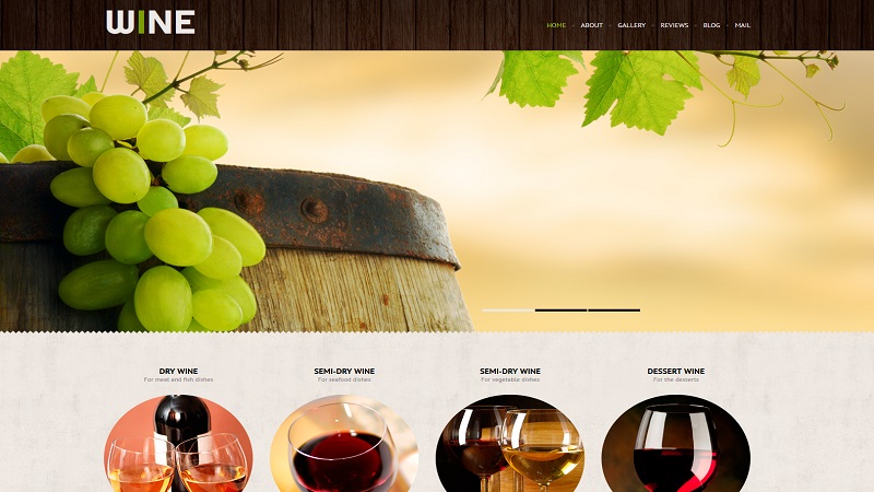
Wine Industry Website Design
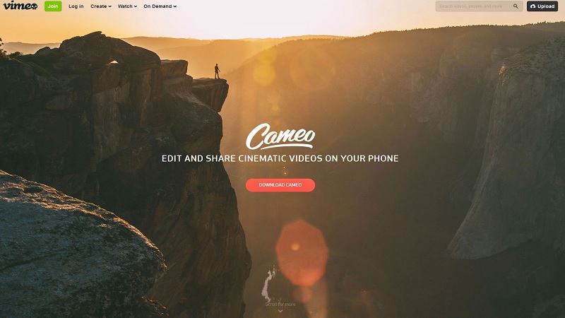
Cameo by Vimeo
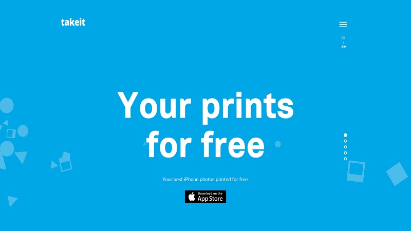
Take It
Ice and Sky: The History of Climate Change
Conclusion
It’s a safe bet that animation practice in web design will gather speed in the future. These days the illusion of motion becomes more and more popular among website owners, as well as web designers. This is an excellent means that will take any website’s user experience to a higher level. The only condition is the wise usage of such an advantage.

