Building Robust Layouts With Container Units
Building Robust Layouts With Container Units
Russell Bishop
Container units are a specialized set of CSS variables that allow you to build grids, layouts, and components using columns and gutters. They mirror the layout functionality found in UI design software where configuring just three values provides your document with a global set of columns and gutters to measure and calculate from.
They also provide consistent widths everywhere in your document — regardless of their nesting depth, their parent’s width, or their sibling elements. So instead of requiring a repeated set of .grid and .row parent elements, container units measure from the :root of your document — just like using a rem unit.

What Makes Container Units Different?
Grids from popular frameworks (such as Bootstrap or Bulma) share the same fundamental limitation: they rely on relative units such as ‘percentages’ to build columns and gutters.
This approach ties developers to using a specific HTML structure whenever they want to use those measurements and requires parent > child nesting for widths to calculate correctly.
Not convinced? Try for yourself:
- Open any CSS framework’s grid demo;
- Inspect a column and note the width;
- Using DevTools, drag that element somewhere else in the document;
- Note that the column’s width has changed in transit.
Freedom Of Movement (…Not Brexit)
Container units allow you more freedom to size elements using a set of global units. If you want to build a sidebar the width of three columns, all you need is the following:
.sidebar { width: calc(3 * var(--column-unit)); /* or columns(3) */ } Your ...class="sidebar">... element can live anywhere inside of your document — without specific parent elements or nesting.

Sharing Tools With Designers
Designers and developers have an excellent middle-ground that helps translate from design software to frontend templates: numbers.
Modular scales are exceptional not just because they help designers bring harmony to their typography, but also because developers can replicate them as a simple system. The same goes for Baseline Grids: superb, self-documenting systems with tiny configuration (one root number) and massive consistency.
Container units are set up in the same way that designers use Sketch to configure Layout Settings:
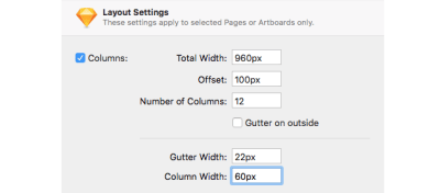
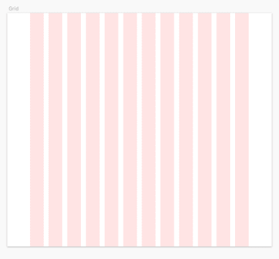
Any opportunity for designers and developers to build with the same tools is a huge efficiency boost and fosters new thinking in both specialisms.
Start Building With Container Units
Define your grid proportions with three values:
:root { --grid-width: 960; --grid-column-width: 60; --grid-columns: 12; } These three values define how wide a column is in proportion to your grid. In the example above, a column’s width is 60 / 960. Gutters are calculated automatically from the remaining space.
Finally, set a width for your container:
:root { --container-width: 84vw; } Note: --container-width should be set as an absolute unit. I recommend using viewport units or rems.
You can update your --container-width at any breakpoint (all of your container units will update accordingly):
@media (min-width: 800px) { --container-width: 90vw; } @media (min-width: 1200px) { --container-width: 85vw; } /* what about max-width? */ @media (min-width: 1400px) { --container-width: 1200px; } 
You’ve now unlocked two very robust units to build from:
--column-unit--gutter-unit
Column Spans: The Third And Final Weapon
More common than building with either columns or gutters is to span across both of them:

Column spans are easy to calculate, but not very pretty to write. For spanning across columns, I would recommend using a pre-processor:
.panel { /* vanilla css */ width: calc(6 * var(--column-and-gutter-unit) - var(--gutter-unit)); /* pre-processor shortcut */ width: column-spans(6); } Of course, you can use pre-processor shortcuts for every container unit I’ve mentioned so far. Let’s put them to the test with a design example.
Building Components With Container Units
Let’s take a design example and break it down:

This example uses columns, gutters and column spans. Since we’re just storing a value, container units can be used for other CSS properties, like defining a height or providing padding:
.background-image { width: column-spans(9); padding-bottom: gutters(6); /* 6 gutters taller than the foreground banner */ } .foreground-banner { width: column-spans(8); padding: gutters(2); } .button { height: gutters(3); padding: gutters(1); } Grab The Code
- CSS: container-units-css.css
- SCSS Functions: container-units-css-fuctions.scss
- Demos and Documentation: Container Units
:root { /* Grid proportions */ --grid-width: 960; --grid-column-width: 60; --grid-columns: 12; /* Grid logic */ --grid-gutters: calc(var(--grid-columns) - 1); /* Grid proportion logic */ --column-proportion: calc(var(--grid-column-width) / var(--grid-width)); --gutter-proportion: calc((1 - (var(--grid-columns) * var(--column-proportion))) / var(--grid-gutters)); /* Container Units */ --column-unit: calc(var(--column-proportion) * var(--container-width)); --gutter-unit: calc(var(--gutter-proportion) * var(--container-width)); --column-and-gutter-unit: calc(var(--column-unit) + var(--gutter-unit)); /* Container Width */ --container-width: 80vw; } @media (min-width: 1000px) { :root { --container-width: 90vw; } } @media (min-width: 1400px) { :root { --container-width: 1300px; } } Why Use CSS Variables?
“Pre-processors have been able to do that for years with
$ variables— why do you need CSS variables?”
Not… quite. Although you can use variables to run calculations, you cannot avoid compiling unnecessary code when one of the variables updates it’s value.
Let’s take the following condensed example of a grid:
.grid { $ columns: 2; $ gutter: $ columns * 1rem; display: grid; grid-template-columns: repeat($ columns, 1fr); grid-gap: $ gutter; @media (min-width: $ medium) { $ columns: 3; grid-template-columns: repeat($ columns, 1fr); grid-gap: $ gutter; } @media (min-width: $ large) { $ columns: 4; grid-template-columns: repeat($ columns, 1fr); grid-gap: $ gutter; } } This example shows how every reference to a SASS/LESS variable has to be re-compiled if the variable changes — duplicating code over and over for each instance.
But CSS Variables share their logic with the browser, so browsers can do the updating for you.
.grid { --columns: 2; --gutter: calc(var(--columns) * 1rem); display: grid; grid-template-columns: repeat(var(--columns), 1fr); grid-gap: var(--gutter); @media (min-width: $ medium) { --columns: 3; } @media (min-width: $ large) { --columns: 4; } } This concept helps form the logic of container units; by storing logic once at the root, every element in your document watches those values as they update, and responds accordingly.
Give it a try!
Recommended Reading
- “What Is The Difference Between CSS Variables And Preprocessor Variables?” by Chris Coyier
- “When And How To Use CSS Multi-Column Layout,” by Rachel Andrew
- “Common CSS Issues For Front-End Projects,” by Ahmad Shadeed
- “Table Design Patterns On The Web,” by Chen Hui Jing
 (dm, ra, il)
Articles on Smashing Magazine — For Web Designers And Developers


