Improve Your Landing Page with These Design Tips
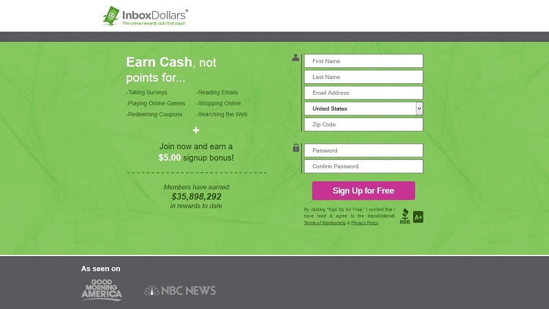
So you took the time to learn how to code made yourself a website, put it up on the world wide web and now expect to make some money. But the money is not coming in. Even if you are getting visitors, there is no guarantee that you will make any money. There is a disconnect between whatever ad or link they clicked on and the page they land on.
There could be a number of things wrong with the landing page: the design, content, message, page load speed, etc..
Here are some tips for improving the landing page:
Think like a user – This should always be your first step in anything related to internet marketing and web design. Even when you learn to code, you should have the end-user in the back of your mind. When working on the landing page, ask questions such as “Who is my audience?” and “What is the best way to communicate my message?” What would YOU expect to find on your page if you were a visitor? What would turn you away from the page?
Keep the language simple – Once again, place yourself in the shoes of the types of visitors you expect to visit the landing page. Never underestimate the importance of written content on the web. In an article from Smashing Magazine, webmasters should “strive for simplicity”. If people want to read essays written in formal language, they would visit an .edu site. Otherwise, they would prefer to read content written in a conversational tone.
Provide security and assurance – With so many get-rich-quick schemes and spammy ideas found online, it’s hard to find a legitimate offer. Your landing page should consist of information that can give visitors assurance that you are legitimate. This can be done by including a phone number, physical address (even a map), email, and other contact details. You can also add a few reviews of the products or services you are offering.
Professional design – If your site looks cheap, people will think that it is. There are many generic “free templates”” on the internet, but you want something more than generic. It’s best that you have a custom design that is created just for your company. If you can’t make it yourself, hire professional designers and programmers. You want people to get a good first impression when they end up on your landing page. This will not be possible if you just use the same ole’ free template as many, many others out there.
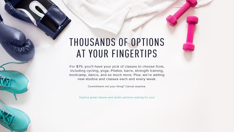
Use the right visuals to go with the content – As Neil Patel puts it, humans respond to visual content “faster” than we can imagine. Go with a particular theme and make sure the images and logos you use are consistent with the message you are trying to convey. Every image, no matter how small, should have a purpose and match the rest of the page.
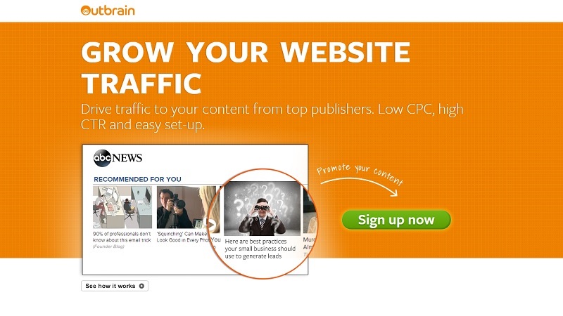
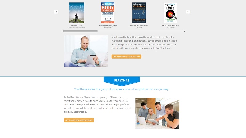
Create the most powerful CTA possible – The call-to-action on a landing page should state the message in the most appealing way, both functionally and aesthetically speaking. Do plenty of testing with various colors, shapes, sizes, fonts, effects, etc…The CTA should be clear to see and understand. Give visitors a reason to take that action. What is in it for them?
There are countless other landing pages on the internet. If you want yours to stand out, you will have to put a lot of thought and energy into every single aspect, from the font color to the design of the CTA elements.


