Venture Capital Websites Design: Making a Great First Impression
Venture capital companies are looking for small existing businesses or start-ups to invest in. If you are looking to have investors in your business, you would surely want the landing page of such a site to make you want to investigate further, so it is extremely important that venture capital sites make a great first impression on startups and founders who are looking for funding.
Most of these sites do just that, and here we have selected some of the best landing pages of venture capital websites.
Stand Out Venture Capital Site Landing Pages
DFJ
DFJ use a slideshow on their landing page, and they have worked with companies such as Tesla, Skype and Tumblr.
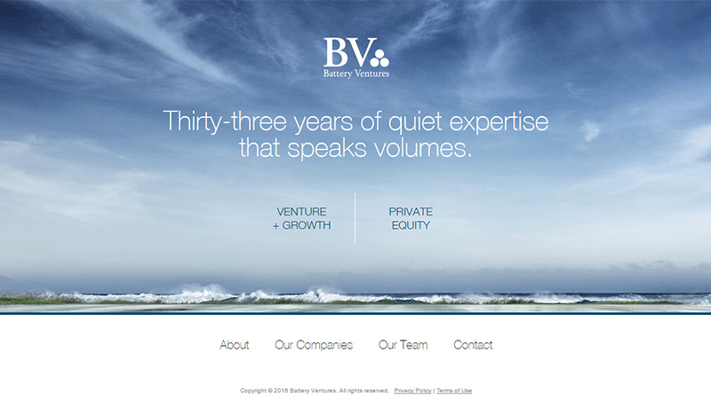
Battery Ventures
This company uses a static hero image on their landing page of a vast expanse of sky. They have been financing companies for 33 years in both venture capital and private equity.
Khosla Ventures
If you are attracted by minimalism, you will definitely appreciate this landing page. A slideshow of statements: We believe change depends on unreasonable people / Don’t assume – analyze / Brutal honesty trumps hypocritical politeness / Have courage ignore conventional wisdom / Thrive on technological risk / People matter work on what’s truly important / Aim for revolutionary success but be willing to fail. The whole site is presented in monochrome with little touches of purple here and there.
ff Venture Capital
This is a relatively small company who support founders at the seed- and early-stages of company formation and growth. Their landing page is presented as a static black and white image of balloons floating over the sea – another example of an expansive image. They use a hamburger menu icon, although they obviously place great importance on their About Us and News sections as they are available directly from the landing page.
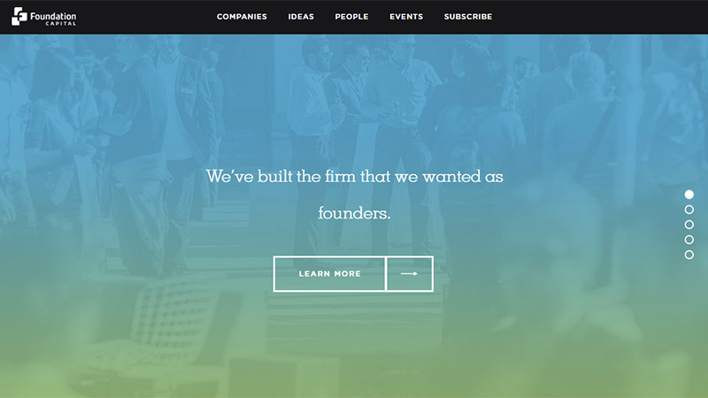
Foundation Capital
This site uses a set of items in a slideshow with a background of images with a graduated blue to green transparency over each. The items (at the time of writing) are: We’ve built a firm that we wanted as founders / Still paying of student loans? Start-ups are trying to solve the millennial debt crisis / To unlock the Decade of the CMO, it’s necessary to understand the digital video revolution / Reflections on a historic few months for online video / Skycure protects enterprises from mobile security threats.
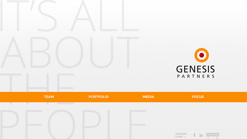
Genesis Partners
Genesis Partners have a fantastic statement on their landing page – presented in a very minimal style, with stand-out orange for the background of the navigation bar, their ‘It’s all about the people’ understated statement is in large, pale gray lettering.
Lux Capital
Lux Capital use a simple red and black color scheme, but the eye-catching detail on their landing page is the video playing behind the X at the right side of the screen. You can choose to view this video full screen by clicking the Play button.
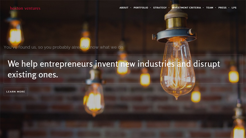
Hoxton Ventures
Personally, I am attracted by the assumption of this company that ‘You’ve found us, so you probably already know what we do.’ The static image of vintage lightbulbs with white text helps to fuel the inquiring mind to want to explore the site further.
Maveron
Maveron use an accordion style menu on the left side of the screen, with a slideshow showcasing some of their investments.
Frontier Tech Ventures
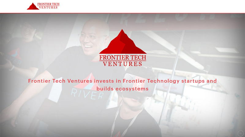
This company specializes in investing in technology start-ups. The landing page is very minimal, showing a static image with a heavy white transparency, with the only color on the page being bright red. If you are attracted by this landing page and would like to know more, you will have to scroll down the page to find their links.
Scale Venture Partners
This company presents its website in a minimal style, but this time the predominant color is black. A series of short video clips make up the slideshow using a black transparency. The Portfolio and Team icons are pretty nifty white outline designs.
Social Capital
Did someone mention minimalism? There is not much to say about how minimal Social Capital have made their landing page – see for yourself!
Spark Capital
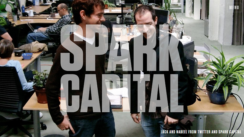
Spark Capital use a slideshow of fullscreen images portraying some of the people and businesses they have invested in. Their name appears over each image in huge semi-transparent white text. This effect does not work on all the images, and a black transparency could have made things more readable in places – however, after watching through the slideshow, there is some sort of character about the text not always being clear.
First Round Capital
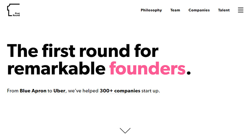
Another minimal site presented in mainly black and white with splashes of color in places. This gives the impression of being a no-nonsense company, everything about it is heavy and solid – no messing about here!
Polaris Partners
Polaris Partners use a split screen slideshow with testimonials on the right and the company’s tagline remains static on the left.
Canaan Partners
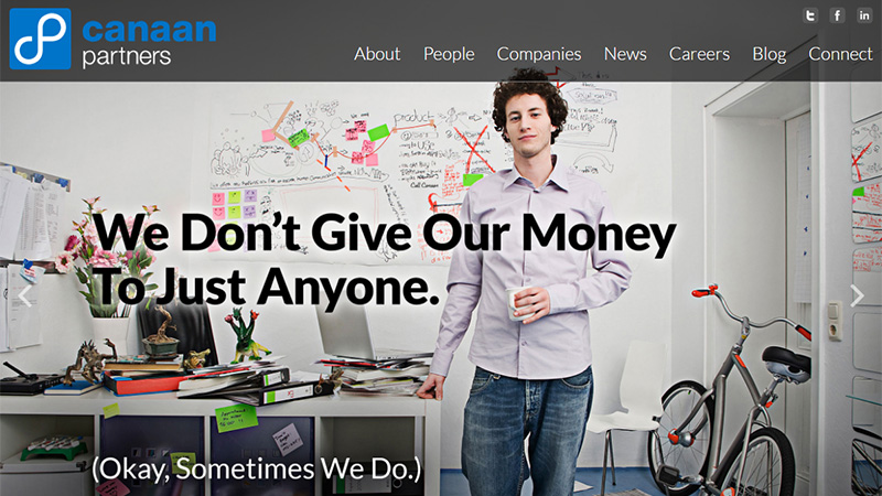
This site has an intriguing tagline: We don’t give our money to just anyone. (Okay, sometimes we do) – which could be enough to make you investigate the site further.
Sequoia
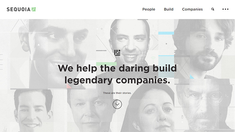
This site has a very professional looking landing page, with the tagline We help the daring build legendary companies. Anyone looking for investors can expect a professional attitude if they apply to and are accepted by this company.
Morgen Thaler
Morgen Thaler has a very different presentation on their landing pages to all other venture capital sites. The accordion-style menu sits beside a slideshow of images of people – possibly the Morgen Thaler team, or maybe happy partners.
DAG Ventures
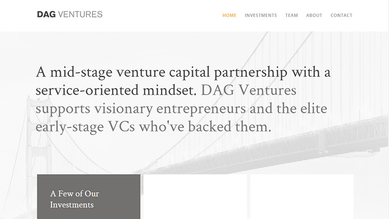
DAG Ventures use a halftone image of the Golden Gate Bridge on their landing page, with a short bio about their company in a couple of shades of gray. A tiny touch of orange is the only other color on the page.
Index Ventures
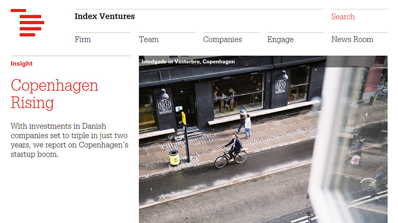
Here, you land on the company’s blog with their recent articles scrolling through the slideshow. This is a very unusual approach for a venture capital site, and quite refreshingly different.
Conclusion
If you were looking for a company to invest in a start-up or young business, would the landing page of their site make a difference to you? Have you ever designed a site for a venture capital company? What do you think are the most important things that should be included on the landing page of such a site? Please share your thoughts with us in the comments below.


