Generic First CSS: New Thinking On Mobile First
Generic First CSS: New Thinking On Mobile First
Alastair Hodgson
I think it’s safe to say that Ethan Marcotte’s Responsive Web Design was a welcome revelation for web developers the world over. It triggered a whole new wave of design thinking and wonderful new front-end techniques. The reign of the oft-despised m dot websites was also over. In the same era and almost as influential was Luke Wroblewski’s Mobile First methodology — a solid improvement that built upon Marcotte’s impressive foundations.
These techniques are at the bedrock of most web developers lives, and they’ve served us well, but alas, times change, and developers constantly iterate. As we increase the efficiency of our methods and the project requirements become more complex, new frustrations emerge.
The Journey To Generic First
I can’t pinpoint exactly what made me change the way I write my CSS because it was really a natural progression for me that happened almost subconsciously. Looking back, I think it was more of a by-product of the development environment I was working in. The team I worked with had a nice SCSS workflow going on with a “>nifty little mixin for easily adding breakpoints within our CSS declarations. You probably use a similar technique.
This wonderful little SCSS mixin suddenly made it easy to write super granular media queries. Take a hypothetical biography block that looks a little something like this:
.bio { display: block; width: 100%; background-color: #ece9e9; padding: 20px; margin: 20px 0; @include media('>=small') { max-width: 400px; background-color: white; margin: 20px auto; } @include media('>=medium') { max-width: 600px; padding: 30px; margin: 30px auto; } @include media('>=large') { max-width: 800px; padding: 40px; margin: 40px auto; } @include media('>=huge') { max-width: 1000px; padding: 50px; margin: 50px auto; } } Fig.1. Typical mobile first with cascading media queries
This works nicely — I’ve written a lot of CSS like this in the past. However, one day it dawned upon me that overwriting CSS declarations as the device width increased just didn’t make sense. Why declare a CSS property for it only to be overwritten in the following declaration?
This is what lead me to begin writing compartmentalized media queries as opposed to the more common approach of media queries that cascade upwards (or downwards) like the example in Fig.1.
Instead of writing media queries that cascade upwards with increases in screen size, I began creating targeted media queries that would encapsulate styles at desired screen widths. The media query mixin would really come into its own here. Now my SCSS media queries are starting to look like this:
.bio { display: block; width: 100%; padding: 20px; margin: 20px 0; @include media('>=small', '<medium') { max-width: 400px; margin: 20px auto; } @include media('>=medium', '<large') { max-width: 600px; padding: 30px; margin: 30px auto; } @include media('>=large', '<huge') { max-width: 800px; padding: 40px; margin: 40px auto; } @include media('>=huge') { max-width: 1000px; padding: 50px; margin: 50px auto; } } Fig.2. An example of compartmentalized media queries
This new approach just felt more intuitive to me, it cut down on having to reset styles from the previous breakpoint, and it was making the CSS easier to read. More importantly, it was making the media queries self-documenting in a more significant way.
I still wasn’t 100% happy with the above though, It seemed like there was still a major issue to overcome.
The Problem With Mobile First
The issue with mobile first is that by definition you will most likely have to override mobile-first styles in subsequent media-queries. This feels like a bit of an anti-pattern.
So — to me — the answer was obvious: let’s take the idea of media query compartmentalization to its logical conclusion — we will also compartmentalize the mobile specific styles into their very own media queries. I know, I know, this goes against the common convention we’ve learned over the years. “Mobile First” is so ubiquitous that it’s usually one of the “skills” questions a hiring manager will ask. So surely any alternative must be wrong, shouldn’t it? This is usually the part where people shake their heads at me whilst uttering mobile first over and over.
Okay, so we’re going to break through the mobile first dogma and compartmentalize all our styles into the relevant media queries. What we’re now left with is pure generic styles declared on a CSS selector, with all other device specific styles encapsulated in media queries that only apply to the relevant screen dimensions. We now have Generic First CSS:
.bio { display: block; width: 100%; @include media('>=0', '<small') { padding: 20px; margin: 20px 0; } @include media('>=small', '<medium') { max-width: 400px; margin: 20px auto; } @include media('>=medium', '<large') { max-width: 600px; padding: 30px; margin: 30px auto; } @include media('>=large', '<huge') { max-width: 800px; padding: 40px; margin: 40px auto; } @include media('>=huge') { max-width: 1000px; padding: 50px; margin: 50px auto; } } Fig.3. An example of Generic First CSS
Yes, there are slightly more media queries, however, I see this as a benefit, any developer can now looks at this CSS and see exactly what styles are applied at each and every screen size without the cognitive overhead of having to pick apart media-query specificity.
This can be great for people unfamiliar with the code base or even the future you!
When Not To Compartmentalize
There are still times when media query compartmentalization is a burden, and in some cases a good old >= media query is fine. Remember, all we’re trying to do is avoid property overwrites.
Dev Tool Bliss
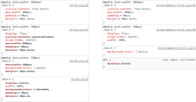
One major unintended consequence of writing compartmentalized Generic First CSS is the experience you will get from your developer tools style panel. Without the media query cascade, you will now have a clearer overview of which styles are applied — You won’t have a style panel full of struck-out declarations from overwritten media query rules — The noise is gone! This — for me — is one of the biggest benefits of the Generic First CSS technique. It brings a little extra sanity to the CSS debugging experience, and this is worth its weight in gold. Thank me later.

Performance Implications
So all these Generic First CSS benefits are starting to sound pretty good, but I think there is one last key question that I think needs to be addressed. It’s on the subject of performance optimization. Now I don’t know for certain yet, but I have an inkling that fully compartmentalized media queries may have a slight performance benefit.
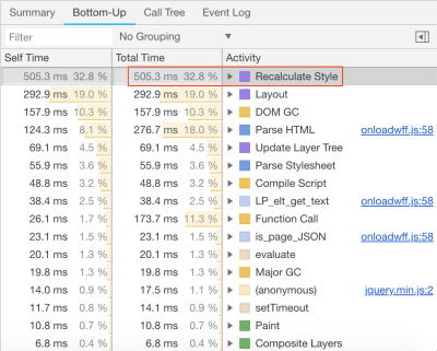
Browsers perform a rendering task called computed style calculation. It’s the browsers way of calculating which styles need to be applied to an element at any given moment. This task is always performed on initial page load, but it can also be performed if page content changes or if other browser actions take place. Any boost you can give to the speed of the process is going to be great for initial page load, and it could have a compound effect on the lifecycle of your websites pages.
So going back to generic first CSS: Are there any performance issues related to the browser having to work out the CSS specificity of a multitude of cascading media queries?
To answer that, I’ve devised a test case that can be used to measure any speed benefits or indeed drawbacks.
The Test Case
The test case is comprised of a basic HTML page that outputs a “bio” block 5000 times, the markup is the same for each block, but the classes are slightly different (numeric differentiator), the CSS for this block is also outputted 5000 times, with class names being the only thing to differ. The outputted CSS is piped through a tool called CSS MQPacker, this helps dramatically reduce file size of CSS that uses a lot of inline media queries by combining all the separate instances of a specific media query into one — It’s a great tool that will probably benefit most modern CSS codebases — I’ve used it as a standalone cli tool via a npm task in the test projects package.json, you can also use it as a postcss plugin, which is nice and convenient!
The first test case is a mobile-first cascading media queries example, the second test case is a generic first compartmentalized variant of the CSS. The CSS for these cases is a little verbose and could probably be written in much more concise terms, but it really just serves as a rough example to test the argument.
The test was run 20 times for each CSS variation in desktop Google Chrome v70, not a massive set of data, but enough to give me a rough idea of a performance gain/loss.
The test metrics I have chosen to use are:
- Overall page load time
A basic metric to check page load time using the Performance API markers in the the start of the <head> and very end of <body> - The Recalculate Style
Time from within the dev tools performance pane. - The Overall Page Rendering
Time from within the dev tools performance pane.

Results Table (all times in milliseconds)
| Mobile First | Generic First | ||||||
|---|---|---|---|---|---|---|---|
| Load time | Calculate styles | Total render time | Load time | Calculate styles | Total render time | ||
| 1135 | 565.7 | 1953 | 1196 | 536.9 | 2012 | ||
| 1176 | 563.5 | 1936 | 1116 | 506.9 | 1929 | ||
| 1118 | 563.1 | 1863 | 1148 | 514.4 | 1853 | ||
| 1174 | 568.3 | 1929 | 1124 | 507.1 | 1868 | ||
| 1204 | 577.2 | 1924 | 1115 | 518.4 | 1854 | ||
| 1155 | 554.7 | 1991 | 1177 | 540.8 | 1905 | ||
| 1112 | 554.5 | 1912 | 1111 | 504.3 | 1886 | ||
| 1110 | 557.9 | 1854 | 1104 | 505.3 | 1954 | ||
| 1106 | 544.5 | 1895 | 1148 | 525.4 | 1881 | ||
| 1162 | 559.8 | 1920 | 1095 | 508.9 | 1941 | ||
| 1146 | 545.9 | 1897 | 1115 | 504.4 | 1968 | ||
| 1168 | 566.3 | 1882 | 1112 | 519.8 | 1861 | ||
| 1105 | 542.7 | 1978 | 1121 | 515.7 | 1905 | ||
| 1123 | 566.6 | 1970 | 1090 | 510.7 | 1820 | ||
| 1106 | 514.5 | 1956 | 1127 | 515.2 | 1986 | ||
| 1135 | 575.7 | 1869 | 1130 | 504.2 | 1882 | ||
| 1164 | 545.6 | 2450 | 1169 | 525.6 | 1934 | ||
| 1144 | 565 | 1894 | 1092 | 516 | 1822 | ||
| 1115 | 554.5 | 1955 | 1091 | 508.9 | 1986 | ||
| 1133 | 554.8 | 2572 | 1001 | 504.5 | 1812 | ||
| AVG | 1139.55 | 557.04 | 1980 | 1119.1 | 514.67 | 1903.15 |
| Mobile First | ||
|---|---|---|
| Load time | Calculate styles | Total render time |
| 1135 | 565.7 | 1953 |
| 1118 | 563.1 | 1863 |
| 1174 | 568.3 | 1929 |
| 1112 | 554.5 | 1912 |
| 1105 | 542.7 | 1978 |
| 1106 | 514.5 | 1956 |
| 1164 | 545.6 | 2450 |
| 1115 | 554.5 | 1955 |
| Generic First | ||
|---|---|---|
| Load time | Calculate styles | Total render time |
| 1196 | 536.9 | 2012 |
| 1148 | 514.4 | 1853 |
| 1124 | 507.1 | 1868 |
| 1111 | 504.3 | 1886 |
| 1121 | 515.7 | 1905 |
| 1127 | 515.2 | 1986 |
| 1169 | 525.6 | 1934 |
| 1091 | 508.9 | 1986 |
Fig.6. 20 test runs measuring key load/render metrics of mobile first vs generic first CSS.
From my admittedly small dataset, it does seem like my initial suspicion may be correct. On average, I see the Style Recalculation task take 42ms less time which is a 7.6% speed increase, and therefore the overall rendering time also decreases. The difference isn’t mind-blowing, but it is an improvement. I don’t think the dataset is big enough to be 100% conclusive and the test case is a little unrealistic, but I’m very glad not to be seeing a performance degradation.
I would be very interested to see the generic first methodology applied to a real-world existing codebase that has been written in the mobile-first way — the before after metrics would be much more realistic to everyday practice.
And if anyone has suggestions on how to automate this test over a broader set of iterations, please let me know in the comments! I’d imagine there must be a tool that can do this.
Conclusion
To recap on the benefits of this new development methodology…
- CSS that does exactly as intended, no second guessing;
- Self-documenting media-queries;
- A better dev tools experience;
- Pages that render faster.
I’d like to think I’m not the only person espousing the writing of CSS in this style. If you have already adopted the generic first mindset, hurray! But if not, I think you’ll really like the benefits it brings. I’ve personally benefited greatly from the uncluttered dev tools experience, which in itself will be a huge positive to a lot of devs. the self-documenting nature of this way of writing your media-queries will also have benefits to yourself and the wider team (if you have one). And finally, these benefits won’t cost you anything in performance terms, and in fact have been shown to have marginal speed gains!
Final Word
Like all development methodologies, it may not be for everyone, but I’ve fallen into Generic First CSS quite naturally, I now see it as a valuable way of working that gives me all the benefits of mobile first with some positive new additions that make the tough job of front-end development that little be easier.
Resources
Test Case Repo
If you’d like to fire up the test case and give it a go yourself, you can find it on GitHub, I’d love to see some reports from others.
Tools
 (dm, ra, yk, il)
Articles on Smashing Magazine — For Web Designers And Developers
