

How To Build An Accessible Front-End Application With Chakra UI And Nuxt.js
How To Build An Accessible Front-End Application With Chakra UI And Nuxt.js
Kelvin Omereshone
For many people, the web is an essential part of their daily lives. They use it at work, home, and even on the road. Web accessibility means people with disabilities can use the web equally. So it’s crucial for developers and organizations building on the web to build inclusivity and accessibility into their applications.
In order to make the web more accessible, there are a couple of best practices and standards that you will have to implement in your applications, such as adhering to the following:
- Section 508;
- Assistive Technology Act;
- Americans with Disabilities Act(ADA);
- WCAG 2.0 (A & AA Guidelines);
- BBC Mobile Accessibility Guidelines;
- WAI-ARIA (Web Accessibility Initiative–Accessible Rich Internet Applications) practices.
Learning to implement these standards can seem like a daunting task when you factor in project deadlines and other constraints that you have to work with as a developer. In that light, let me introduce you to a UI design system that was built to help you make your web applications accessible.
Chakra UI
Chakra UI is a design system and UI framework created by Segun Adebayo. It was created with simplicity, modularity, composability, and accessibility in mind. Chakra UI gives you all the building blocks needed to create accessible front-end applications.
Note: While Chakra UI depends on CSS-in-JS under the hood, you don’t need to know it in order to use the library.
Though the framework was originally created for React, Jonathan Bakebwa spear-headed the porting to Vue. So Vuejs/NuxtJS developers can now utilize Chakra UI to create accessible web applications.
Features Of Chakra UI
Chakra UI was created with the following principles in mind:
- Style props
Chakra UI makes it possible to style components or override their styles by using props. This reduces the need for stylesheet or inline styles. Chakra UI achieves this level of flexibility by using Styled Systems under the hood. - Composition
Components in Chakra UI have been broken down into smaller parts with minimal props to keep complexity low, and compose them together. This will ensure that the styles and functionality are flexible and extensible. For example, you can use theCBoxandCPseudoBoxcomponents to create new components. - Accessible
Chakra UI components follow the WAI-ARIA guidelines specifications and have the right aria-* attributes. You can also find the accessibility report of each authored component in a file calledaccessibility.md. See the accessibility report for theCAccordioncomponent. - Themeable
Chakra UI affords you the ability to easily reference values from your theme throughout your entire application, on any component. - Dark mode support
Most components in Chakra UI are dark mode compatible right out of the box.
How Chakra UI Supports Accessibility
One of the core principles behind the creation of Chakra UI is accessibility. With that in mind, all components in Chakra UI comes out of the box with support for accessibility by providing:
- Keyboard Navigation — useful for users with motor skills disabilities,
- Focus Management,
- aria-* attributes which are needed by screen readers,
- Focus trapping and restoration for modal dialogs.
Getting Started With Chakra UI And Nuxt
Note: To use Chakra UI with Vue.js see the Getting Started guide.
For our demo project, we will be building Chakra-ui explorer — an accessible single-page web application to search Chakra UI components.
Getting Started With Chakra-ui Explorer
Assuming you already have NPM installed, create a new Nuxt application by running:
$ npx create-nuxt-app chakra-ui-explorer Or if you prefer in yarn, then run:
$ yarn create nuxt-app chakra-ui-explorer Follow the installation prompt to finish creating your Nuxt application.
Setting Up Chakra UI
Chakra UI uses Emotion for handling component styles. So to get started with Chakra UI, you will need to install Chakra UI alongside Emotion as a peer dependency. For this project, we will be using the official Nuxt modules for both Chakra UI and Emotion which will reduce the friction in getting started with Chakra UI. Let’s add them to our project by running the following command:
npm i @chakra-ui/nuxt @nuxtjs/emotion Note: @nuxtjs/emotion allows your component styles to be generated and injected in the server build.
After installing both modules, you will need to register them in the nuxt.config.js file under the modules array option:
// nuxt.config.js modules: ['@chakra-ui/nuxt', '@nuxtjs/emotion'], To complete our setup process of Chakra UI, we need to touch our default layout component in layouts/ and add CThemeProvider, CColorModeProvider, and CReset components from Chakra UI.
It is recommended thatyou use the CReset component to ensure all components provided by Chakra UI work correctly.
The CThemeProvider component will make your theme available to every part of your application, while the CColorModeProvider component is responsible for handling our application’s color mode which can be in one of two states: light or dark. Finally, the CReset component will remove all browser default styles.
Let’s add the aforementioned components in layouts/default.vue. In our template section, let’s add this:
<!-- layouts/default.vue --> <template> <div class="container"> <c-theme-provider> <c-color-mode-provider> <c-box as="section"> <c-reset /> <nuxt /> </c-box> </c-color-mode-provider> </c-theme-provider> </div> </template> Then in our script section, we will import and register the components like so:
<script> import { CThemeProvider, CColorModeProvider, CReset, CBox } from '@chakra-ui/vue' export default { name: 'DefaultLayout', components: { CThemeProvider, CColorModeProvider, CReset, CBox } } </script> Your default.vue layout component should look like this:
<template> <div class="container"> <c-theme-provider> <c-color-mode-provider> <c-box as="section"> <c-reset /> <nuxt /> </c-box> </c-color-mode-provider> </c-theme-provider> </div> </template> <script> import { CThemeProvider, CColorModeProvider, CReset, CBox } from '@chakra-ui/vue' export default { name: 'DefaultLayout', components: { CThemeProvider, CColorModeProvider, CReset, CBox } } </script> Note: Notice I am wrapping both <c-reset /> and <nuxt /> components in a c-box component.
Setting Your Application Theme
Chakra UI allows you the ability to set a theme for your application. By ‘theme’, I mean the setting of your application’s color palette, type scale, font stacks, breakpoints, border-radius values, and so on. Since colors and contrast are vital components of accessibility, it’s important to use colors that are easily perceived.
Out of the box Chakra UI ships with a default theme object that affords for most of your application needs in terms of colors, fonts, and so on. The default theme is set up with contrast in mind which allows for the easily toggling of color modes (more on this later).
Chakra UI, however, allows you to extend or completely replaced the default theme. This is possible by accepting a theme object based on the Styled System Theme Specification.
The values in the theme object are automatically available for use in your application. For example, the colors specified in theme.colors can be referenced by the color, borderColor, backgroundColor, fill, stroke, and style props in your components.
To personalize your application, you can override the default theme provided by Chakra UI or set new values in it. To do that, the Chakra UI Nuxt module exposes a chakra object which will take in an extendTheme property which takes an object. The object given to extendTheme will be recursively merged to the Chakra UI default theme object. Let’s add our brand color palette to Chakra so we can use it in our application.
Note: Chakra UI recommends adding color palette into the colors object of your theme using keys from 50 — 900. You can use web tools like coolors and palx to generate these palettes.
For our demo homepage, I will be using a brand color of lime. To make Chakra UI aware of this color, I’ll create a customeTheme object in a folder called chakra(you can call it whatever you want) in the root of my project’s directory. In this object, I will define our brand color palette.
Create a file called theme.js in the folder you created and then add the following snippet:
// ./chakra/theme.js const customTheme = { colors: { brand: { 50: '#f6fcee', 100: '#e2f4c8', 200: '#cbec9e', 300: '#b2e26e', 400: '#94d736', 500: '#75c800', 600: '#68b300', 700: '#599900', 800: '#477900', 900: '#294700' } } } module.exports = customTheme Now let’s merge our custom theme to Chakra UI. We do that in nuxt.config.js. First, we need our custom theme object:
import customTheme from './chakra/theme' Next, we have to specify the chakra key provided by the Chakra UI Nuxt module and pass in customTheme to the extendTheme property:
chakra: { extendTheme: customTheme }, Your nuxt.config.js file should look like this:
// nuxt.config.js import customTheme from './chakra/theme' export default { mode: 'spa', /* * Headers of the page */ head: { title: process.env.npm_package_name || '', meta: [ { charset: 'utf-8' }, { name: 'viewport', content: 'width=device-width, initial-scale=1' }, { hid: 'description', name: 'description', content: process.env.npm_package_description || '' } ], link: [{ rel: 'icon', type: 'image/x-icon', href: '/favicon.ico' }] }, /* * Customize the progress-bar color */ loading: { color: '#fff' }, /* * Global CSS */ css: [], /* * Plugins to load before mounting the App */ plugins: [], /* * Nuxt.js dev-modules */ buildModules: [ // Doc: https://github.com/nuxt-community/eslint-module '@nuxtjs/eslint-module' ], /* * Nuxt.js modules */ modules: [ '@chakra-ui/nuxt', '@nuxtjs/emotion' ], chakra: { extendTheme: customTheme }, /* * Build configuration */ build: { /* * You can extend webpack config here */ extend (config, ctx) {} } } When you run your application with npm run dev, your homepage should look like this:

Now that we have successfully installed Chakra UI and added our application’s custom theme, let’s begin building out Chakra-ui explorer.
Creating Our Main Navigation
We want our navigation to have our brand name, in this case, it will be Chakra-ui explorer, 2 navigation links: Documentation and Repo, and a button which is responsible for toggling our color mode. Let’s create a new component under the components directory called NavBar in which we’ll create our application’s main navigation using Chakra UI.
Let’s do this. Add the following snippet to NavBar.vue:
<template> <c-box as="nav" h="60px" px="4" d="flex" align-items="center" shadow="sm" > <c-link as="nuxt-link" to="/" color="brand.700" font-weight="bold" :_hover="{ color: 'brand.900' }" > Chakra-ui Explorer </c-link> <c-box as="ul" color="gray.500" d="flex" align-items="center" list-style-type="none" ml="auto" > <c-box as="li" mr="8"> <c-link color="gray.500" :_hover="{ color: 'brand.400' }" is-esternal href="https://vue.chakra-ui.com" > Documentation </c-link> </c-box> <c-box as="li" mr="8"> <c-link color="gray.500" :_hover="{ color: 'brand.400' }" is-esternal href="https://github.com/chakra-ui/chakra-ui-vue" > Repo </c-link> </c-box> <c-box as="li"> <c-icon-button variant="ghost" variant-color="gray[900]" aria-label="Switch to dark mode" icon="moon" /> </c-box> </c-box> </c-box> </template> <script> import { CBox, CLink, CIconButton } from '@chakra-ui/vue' export default { name: 'NavBar', components: { CBox, CLink, CIconButton } } </script> Next, we need to import this component in our default layout component — default.vue and add it to our template so overall our default layout should look like this:
<template> <div class="container"> <c-theme-provider> <c-color-mode-provider> <c-box as="section"> <c-reset /> <nav-bar /> <nuxt /> </c-box> </c-color-mode-provider> </c-theme-provider> </div> </template> <script> import { CThemeProvider, CColorModeProvider, CReset, CBox } from '@chakra-ui/vue' import NavBar from '@/components/NavBar' export default { name: 'DefaultLayout', components: { CThemeProvider, CColorModeProvider, CReset, CBox, NavBar } } </script> When you run your application now, you’ll get to see this:
You can see that the navigation is already accessible without even specifying it. This can only be seen when you hit the Tab key on your keyboard; Chakra UI handles focus management while you can focus on each link on the navigation menu.
The as Prop
From our NavBar.vue’s snippet above, you will notice the as prop. This is a feature available to Chakra UI components that allows you to pass an HTML tag or another component to be rendered as the base tag of the component along with all its styles and props. So when we did:
<c-box as="li"> <c-icon-button variant="ghost" variant-color="gray[900]" aria-label="Switch to dark mode" icon="moon" /> </c-box> we are asking Chakra UI to render an <li> element and place a button component inside it. You can also see us use that pattern here:
<c-link as="nuxt-link" to="/" color="brand.700" font-weight="bold" :_hover="{ color : 'brand.900' }"> ChakraMart </c-link> In the above case, we are asking Chakra UI to render the Nuxt’s <nuxt-link /> component.
The as prop gives you the power to use the right(or wrong) element for the context of your markup. What this means, is you can leverage it to build your application template using semantic markups which will make your application more meaningful to screen readers. So instead of using a generic div element for the main content of your application, with the as prop you can render a main element telling screen readers that this is the main content of your application.
Note: Check out the documentation for all props exposed by Chakra UI components. Also, take a closer look at how the brand color in chakra/theme.js was specified. You can see from the snippet above that we’re using it as any of the colors that Chakra UI provides. Another thing to be aware of is the moon icon that we used for the CIconButton on our NavBar. The moon icon is one of the default icons that Chakra UI provides out of the box.
Color Mode
One of the features of Chakra UI is color mode support. And you can tell from the use of the moon icon in Chakra-ui explorer’s navigation, we plan on integrating dark mode. So instead of leaving it for last, let’s get it over with and wire it up right now. To do this, CColorModeProvider using Vue’s provide/inject, provides, $ chakraColorMode and $ toggleColorMode functions. $ chakraColorMode returns the current color mode of your application while $ toggleColorMode toggles the color mode from light to dark and vice versa. To use these two functions, we’ll need to inject them into the NavBar.vue component. Let’s do this below in the <script /> section:
<script> <script> import { CBox, CLink, CIconButton } from '@chakra-ui/vue' export default { name: 'NavBar', inject: ['$ chakraColorMode', '$ toggleColorMode'], components: { CBox, CLink, CIconButton }, } </script> Let’s create a computed property to return the color mode:
... computed: { colorMode () { return this.$ chakraColorMode() } } Now that we have injected both functions in NavBar.vue let’s modify the toggle color mode button. We’ll start with the icon so that it shows a different icon depending on the color mode. Our CIconButton component now looks like this at this state:
<c-icon-button variant="ghost" variant-color="gray[900]" aria-label="Switch to dark mode" :icon="colorMode == 'light' ? 'moon' : 'sun'" /> Currently, we are using an aria-label attribute to tell screen-readers to Switch to dark mode. Let’s modify this to support both light and dark mode:
<c-icon-button variant="ghost" variant-color="gray[900]" :aria-label="`Switch to $ {colorMode == 'light' ? 'dark : 'light'} mode`" :icon="colorMode == 'light' ? 'moon' : 'sun'" /> Lastly, we will add a click event handler on the button to toggle the color mode of our application using the $ toggleColorMode function. Like so:
<c-icon-button variant="ghost" variant-color="gray[900]" :aria-label="`Switch to $ {colorMode == 'light' ? 'dark' : 'light'} mode`" :icon="colorMode == 'light' ? 'moon' : 'sun'" @click="$ toggleColorMode" /> To test if our color mode set up is working, I’ll add an interpolation of the color mode and a text next to the CIconButton toggling our color mode. Like so:
<c-box as="li"> <c-icon-button variant="ghost" variant-color="gray[900]" :aria-label="`Switch to $ {colorMode == 'light' ? 'dark' : 'light'} mode`" :icon="colorMode == 'light' ? 'moon' : 'sun'" @click="$ toggleColorMode" /> Current mode: {{ colorMode }} </c-box> Here is what our app currently looks like:
So we have done the heavy lifting in setting up color mode in Chakra UI. So now we can style our application based on the color mode. Let’s go to default.vue and use the color mode slot prop provided by CColorModeProvider to style our application. Let’s modify our template first in default.vue.
<template> <div class="container"> <c-theme-provider> <c-color-mode-provider #default="{ colorMode }"> <c-box v-bind="mainStyles[colorMode]" w="100vw" h="100vh" as="section" > <c-reset /> <nav-bar /> <nuxt /> </c-box> </c-color-mode-provider> </c-theme-provider> </div> </template> We are destructuring colorMode from the slot props property provided by CColorModeProvider and then passing it as a dynamic key to a mainStyle object which we will create in a bit. The idea is to use a different set of styles based on the colorMode value. I am also using the width and height with the shorthand props — w and h respectively to set the width and height of our CBox component. Let’s define this mainStyles object in our script section:
<script> import { CThemeProvider, CColorModeProvider, CReset, CBox } from '@chakra-ui/vue' import NavBar from '@/components/NavBar' export default { name: 'DefaultLayout', components: { CThemeProvider, CColorModeProvider, CReset, CBox, NavBar }, data () { return { mainStyles: { dark: { bg: 'gray.900', color: 'whiteAlpha.900' }, light: { bg: 'whiteAlpha.900', color: 'gray.900' } } } } } </script> Chakra-ui explorer now has dark mode support!
Now we have our navigation bar and have successfully set up dark mode support for our application, let’s focus on index.vue in our pages/ directory where the meat of our application can be found. We’ll start off with adding a CBox component like so:
<c-box as="main" d="flex" direction="column" align-items="center" p="10" > </c-box> Then we’ll add the CInput component inside it. Our index.vue page component will then look like this:
<template> <c-box as="main" d="flex" align-items="center" direction="column" w="auto" p="16" > <c-input placeholder="Search components..." size="lg" mb="5" is-full-width /> </c-box> </template> <script> import { CBox, CInput } from '@chakra-ui/vue' export default { components: { CBox, CInput } } </script> Here is how our application looks like now:
You can see from the above screencast how the CInput element automatically knows when it’s in dark mode and adjust accordingly even though we didn’t explicitly set that. Also, the user can hit the tab key to focus on that CInput component.
Adding The Components’ List
So the idea of the Chakra-ui explorer (as stated earlier) is to show the user all of the available components in Chakra UI so that we can have a list of those components as well as the links that will take the user to the documentation of the component. To do this, I will create a folder called data at the root of our project’s directory then create a file called index.js. In index.js, I will export an array of objects which will contain the names of the components. Here is how the file should look like:
// ./data/index.js export const components = [ { name: 'Accordion' }, { name: 'Alert' }, { name: 'AlertDialog' }, { name: 'AspectRatioBox' }, { name: 'AspectRatioBox' }, { name: 'Avatar' }, { name: 'Badge' }, { name: 'Box' }, { name: 'Breadcrumb' }, { name: 'Button' }, { name: 'Checkbox' }, { name: 'CircularProgress' }, { name: 'CloseButton' }, { name: 'Code' }, { name: 'Collapse' }, { name: 'ControlBox' }, { name: 'Divider' }, { name: 'Drawer' }, { name: 'Editable' }, { name: 'Flex' }, { name: 'Grid' }, { name: 'Heading' }, { name: 'Icon' }, { name: 'IconButton' }, { name: 'IconButton' }, { name: 'Input' }, { name: 'Link' }, { name: 'List' }, { name: 'Menu' }, { name: 'Modal' }, { name: 'NumberInput' }, { name: 'Popover' }, { name: 'Progress' }, { name: 'PseudoBox' }, { name: 'Radio' }, { name: 'SimpleGrid' }, { name: 'Select' }, { name: 'Slider' }, { name: 'Spinner' }, { name: 'Stat' }, { name: 'Stack' }, { name: 'Switch' }, { name: 'Tabs' }, { name: 'Tag' }, { name: 'Text' }, { name: 'Textarea' }, { name: 'Toast' }, { name: 'Tooltip' } ] For our implementation to be complete, I will import the above array into pages/index.vue and iterate over it to display all the components. Also, we will give the user the ability to filter the components using the search box. Here is the complete implementation:
// pages/index.vue <template> <c-box as="main" d="flex" align-items="space-between" flex-direction="column" w="auto" p="16" > <c-input v-model="search" placeholder="Search components..." size="lg" mb="10" is-full-width /> <c-grid template-columns="repeat(4, 1fr)" gap="3" p="5"> <c-box v-for="(chakraComponent, index) of filteredComponents" :key="index" h="10"> {{ chakraComponent.name }} <c-badge> <c-link is-external :href="lowercase(`https://vue.chakra-ui.com/$ {chakraComponent.name}`)" > <c-icon name="info" size="18px" /> </c-link> </c-badge> </c-box> </c-grid> </c-box> </template> <script> import { CBox, CInput, CGrid, CLink, CBadge, CIcon } from '@chakra-ui/vue' import { components as chakraComponents } from '../data' export default { components: { CBox, CInput, CGrid, CBadge, CIcon, CLink }, data () { return { search: '' } }, computed: { filteredComponents () { return chakraComponents.filter((component) => { return this.lowercase(component.name).includes(this.lowercase(this.search)) }) } }, methods: { lowercase (value) { return value.toLowerCase() } } } </script> And now our application looks like this:
You can now see how dark mode is automatic for the component’s list as well as how the focus management is added for the links (by default) to aid accessibility.
Putting Chakra UI To The Test
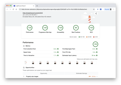
Finally, let’s see how our app scores by running the Lighthouse accessibility test on it. Mind you, this test is based on the Axe user impact assessment. Below is a screencast of the test. You can also run the test yourself by following these steps.
From the screencast above you can see that our Chakra UI app has a score of 85 on the lighthouse accessibility test.
Conclusion
In this article, we have touched on the need for building accessible interfaces and we have also seen how to use Chakra UI to build accessible applications from the ground up by building an explorer (Chakra-ui explorer) for the Chakra UI components.
 (ra, yk, il)
Articles on Smashing Magazine — For Web Designers And Developers


