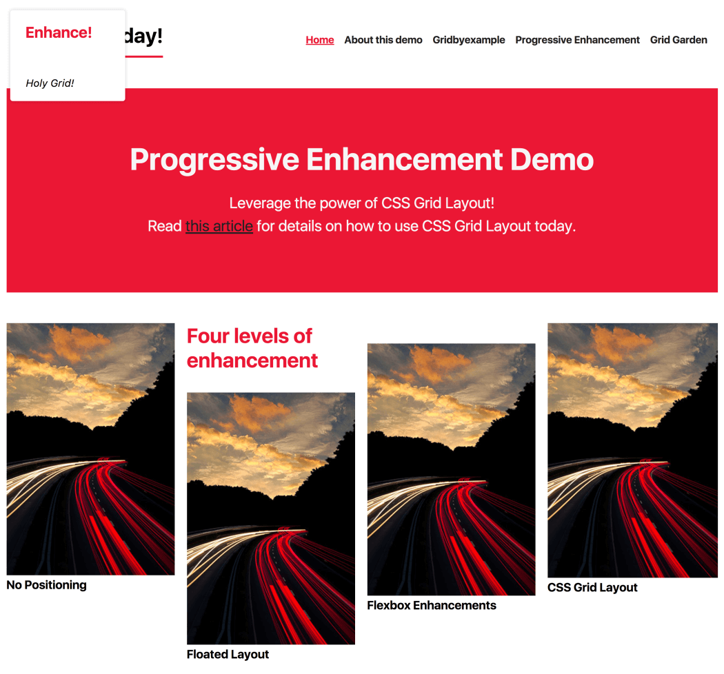
Enhancing CSS Layout: From Floats To Flexbox To Grid
Earlier this year, support for CSS grid layout landed in most major desktop browsers. Naturally, the specification is one of the hot topics at meet-ups and conferences. After having some conversations about grid and progressive enhancement, I believe that there’s a good amount of uncertainty about using it. I heard some quite interesting questions and statements, which I want to address in this post.

“When can I start using CSS grid layout?” “Too bad that it’ll take some more years before we can use grid in production.” “Do I need Modernizr in order to make websites with CSS grid layout?” “If I wanted to use grid today, I’d have to build two to three versions of my website.” The CSS grid layout module is one of the most exciting developments since responsive design. We should try to get the best out of it as soon as possible, if it makes sense for us and our projects.
The post Enhancing CSS Layout: From Floats To Flexbox To Grid appeared first on Smashing Magazine.

