A Guide To New And Experimental CSS DevTools In Firefox
A Guide To New And Experimental CSS DevTools In Firefox
Victoria Wang
Over the last few years, our team at Firefox has been working on new CSS tools that address both cutting-edge techniques and age-old frustrations. We’re the Layout Tools team, a subset of Firefox Developer Tools, and our quest is to improve the modern web design workflow.
The web has seen an incredible evolution in the last decade: new HTML/CSS features, browser improvements, and design techniques. Our team is devoted to building tools that match that innovation so that designers and developers can harness more of the efficiency and creativity that’s now possible.
In this guide, we’ll share an overview of our seven new tools, with stories from the design process and practical steps for trying out each tool.
Editorial Design Patterns
By naming lines when setting up our CSS Grid layouts, we can tap into some interesting and useful features of Grid — features that become even more powerful when we introduce subgrids. Read related article →
1. Grid Inspector
It all started three years ago when our CSS layout expert and dev advocate, Jen Simmons, worked with members of Firefox DevTools to build a tool that would aid users in examining CSS Grid layouts.
As one of the most powerful new features of the modern web, CSS Grid had quickly gained decent browser adoption, but it still had low website adoption. There’s a steep learning curve, and you still need fallbacks for certain browsers. Thus, part of our goal was to help popularize Grid by giving developers a more hands-on way to learn it.

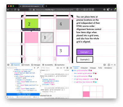
The core of the tool is a grid outline, overlaid on the page, which helps devs visualize how the grid is positioning their elements, and how the layout changes when they tweak their styles. We added numbered labels to identify each grid line, the ability to view up to three grids at once, and color customization for the overlays. Recently, we also added support for subgrid, a brand new CSS specification implemented in Firefox and hopefully in more browsers soon.
Grid Inspector was an inspiration for all the tools that followed. It was even an inspiration for a new team: Layout Tools! Formed in late 2017, we’re spread across four time zones and collaborate with many others in Mozilla, like our rendering engine developers and the good folks at MDN.
Try Out The Grid Inspector
- In Firefox, visit our Grid example site.
- Open the Inspector with Cmd + Shift + C.
- Turn on Grid overlay via one of three ways:
- Layout Panel:
In the Grid section, check the checkbox next to.content.grid-content; - Markup View:
Toggle the “grid” badge next to<div class="content grid-content">; - Rules View:
Click the button next to
 display:grid;inside#page-intro .grid-content; - Experiment with the Grid Inspector:
- Change the purple overlay color to red;
- Toggle “Line numbers” or “Extend lines infinitely”;
- Turn on more grid overlays;
- See what happens when you disable
grid-gap: 15pxin Rules.
Since Grid, we’ve been seeking to expand on the possibilities of what a browser CSS tool can be.
“
2. Shape Path Editor
The next project we worked on was the Shape Path Editor: our first visual editing tool.
CSS Shapes allows you to define shapes for text to flow around: a circle, a triangle, or a many-sided polygon. It can be used with the clip-path property which allows you to trim elements to any of those same shapes. These two techniques together open the possibility for some very unique graphic design-inspired layouts.
However, creating these sometimes complex shapes can be difficult. Typing all of the coordinates manually and using the right CSS units is error-prone and far removed from the creative mindset that Shapes allows. Therefore, we made a tool that allows you to edit your code by directly clicking and dragging shapes on the page.
This type of feature—visual editing—was new for us and browser tools in general. It’s an example of how we can go beyond inspecting and debugging and into the realm of design.
Try Out The Shape Path Editor
- In Firefox, visit this page on the An Event Apart website.
- Open the Inspector with Cmd + Shift + C and select the first circular image.
- In Rules, click on the
 icon next to the
 shape-outsideproperty. - On the page, click on the points of the shape and see what happens when you drag to make the shape huge or tiny. Change it to a size that looks good to you.
“
3. Fonts Editor
For years, we’ve had a Fonts panel in Firefox that shows an informative list of all the fonts used in a website. In continuing our theme of designing in the browser, we decided to turn this into a Font Editor for fine-tuning a font’s properties.
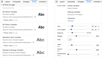
A driving force behind this project was our goal to support Variable Fonts at the same time that the Firefox rendering engine team was adding support for it. Variable Fonts gives font designers a way to offer fine-grained variations along axes, like weight, within one font file. It also supports custom axes, which give both font creators and web designers an amazing amount of flexibility. Our tool automatically detects these custom axes and gives you a way to adjust and visualize them. This would otherwise require specialized websites like Axis-Praxis.
Additionally, we added a feature that provides the ability to hover over a font name to highlight where that particular font is being used on the page. This is helpful because the way browsers select the font used to render a piece of text can be complex and depend on one’s computer. Some characters may be unexpectedly swapped out for a different font due to font subsetting.
Try Out The Fonts Editor
- In Firefox, visit this variable fonts demo site.
- Open the Inspector with Cmd + Shift + C and select the word “variable” in the title (the element’s selector is
.title__variable-web__variable). - In the third pane of the Inspector, navigate to the Fonts panel:
- Hover over the font name Output Sans Regular to see what gets highlighted;
- Try out the weight and slant sliders;
- Take a look at the preset font variations in the Instances dropdown menu.
4. Flexbox Inspector
Our Grid, Shapes, and Variable Fonts tools can together power some very advanced graphic design on the web, but they’re still somewhat cutting-edge based on browser support. (They’re almost there, but still require fallbacks.) We didn’t want to work only on new features—we were drawn to the problems that most web developers face on a daily basis.
So we started work on the Flexbox Inspector. Design-wise, this has been our most ambitious project, and it sprouted some new user research strategies for our team.
Like Grid, CSS Flexbox has a fairly steep learning curve when you first get started. It takes time to really understand it, and many of us resort to trial and error to achieve the layouts we want. At the beginning of the project, our team wasn’t even sure if we understood Flexbox ourselves, and we didn’t know what the main challenges were. So we leveled up our understanding, and we ran a survey to discover what people needed the most when it came to Flexbox.
The results had a big effect on our plans, making the case for complicated visualizations like grow/shrink and min/max. We continued working with the community throughout the project by incorporating feedback into evolving visual prototypes and Nightly builds.
The tool includes two major parts: a highlighter that works much like the Grid Inspector’s, and a detailed Flexbox tool inside the Inspector. The core of the tool is a flex item diagram with sizing info.
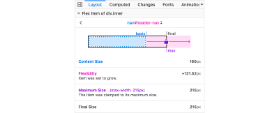
With help from Gecko layout engineers, we were able to show the step-by-step size decisions of the rendering engine to give users a full picture of why and how a flex item ended up with a certain size.
Note: Learn the full story of our design process in “Designing the Flexbox Inspector”.
Try Out The Flexbox Inspector
- In Firefox, visit Mozilla’s Bugzilla.
- Open the Inspector with Cmd + Shift + C and select the element
div.inner(just inside the header bar). - Turn on the Flexbox overlay via one of three ways:
- Layout Panel:
In the Flex Container section, turn on the switch; - Markup View:
Toggle the “flex” badge next to<div class="inner">; - Rules View:
Click the button next to
 display:flex. - Use the Flex Container panel to navigate to a Flex Item called
nav#header-nav. - Note the sizes shown in the diagram and size chart;
- Increase and decrease your browser’s width and see how the diagram changes.
Interlude: Doubling Down on Research
As a small team with no formal user research support, we’ve often resorted to design-by-dogfooding: basing our opinions on our own experiences in using the tools. But after our success with the Flexbox survey, we knew we wanted to be better at collecting data to guide us. We ran a new survey to help inform our next steps.
We crowdsourced a list of the 20 biggest challenges faced by web devs and asked our community to rank them using a max-diff format.
When we found that the big winner of the challenges was CSS Layout Debugging, we ran a follow-up survey on specific CSS bugs to discover the biggest pain points. We supplemented these surveys with user interviews and user testing.
We also asked folks to rank their frustrations with browser developer tools. The clear top issue was moving CSS changes back to the editor. This became our next project.
5. Changes Panel
The difficulty in transferring one’s work from a browser developer tool to the editor is one of those age-old issues that we all just got used to. We were excited to make a simple and immediately usable solution.
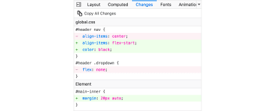
Edge and Chrome DevTools came out with variants of this tool first. Ours is focused on assisting a wide range of CSS workflows: Launch DevTools, change any styles you want, and then export your changes by either copying the full set of changes (for collaboration) or just one changed rule (for pasting into code).
This improves the robustness of the entire workflow, including our other layout tools. And this is just a start: We know accidental refreshing and navigation from the page is a big source of data loss, so a way to bring persistence to the tool will be an important next step.
Try Out The Changes Panel
- In Firefox, navigate to any website.
- Open the Inspector with Cmd + Shift + C and select an element.
- Make some changes to the CSS:
- Modify styles in the Rules pane;
- Adjust fonts in the Fonts pane.
- In the right pane of the Inspector, navigate to the Changes tab and do the following:
- Click Copy All Changes, then paste it in a text editor to view the output;
- Hover over the selector name and click Copy Rule, then paste it to view the output.
6. Inactive CSS
Our Inactive CSS feature solves one of the top issues from our layout debugging survey on specific CSS bugs:
“Why is this CSS property not doing anything?”
Design-wise, this feature is very simple—it grays out CSS that doesn’t affect the page, and shows a tooltip to explain why the property doesn’t have an effect. But we know this can boost efficiency and cut down on frustration. We were bolstered by research from Sarah Lim and her colleagues who built a similar tool. In their studies, they found that novice developers were 50% faster at building with CSS when they used a tool that allowed them to ignore irrelevant code.

In a way, this is our favorite kind of feature: A low-hanging UX fruit that barely registers as a feature, but improves the whole workflow without really needing to be discovered or learned.
Inactive CSS launches in Firefox 70 but can be used now in prerelease versions of Firefox, including Developer Edition, Beta, and Nightly.
Try Out Inactive CSS
- Download Firefox Developer Edition;
- Open Firefox and navigate to wikipedia.org;
- Open the Inspector with Cmd + Shift + C and select the center content area, called
central-featured; - Note the grayed out
vertical-aligndeclaration; - Hover over the info icon, and click “Learn more” if you’re interested.
7. Accessibility Panel
Along the way we’ve had accessibility features developed by a separate team that’s mostly one person — Yura Zenevich, this year with his intern Maliha Islam.
Together they’ve turned the new Accessibility panel in Firefox into a powerful inspection and auditing tool. Besides displaying the accessibility tree and properties, you can now run different types of checks on a page. So far the checks include color contrast, text labels, and keyboard focus styling.
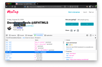
Now in Nightly, you can try the new color blindness simulator which harnesses our upcoming WebRender tech.
Try Out The Accessibility Panel
- Download Firefox Developer Edition;
- Navigate to meetup.com;
- In the developer tools, navigate to the Accessibility tab, and click the “Turn on Accessibility Features” button;
- Click the drop-down menu next to “Check for issues” and select “All Issues”;
- Take a look at the various contrast, keyboard, and text label issues, and click the “Learn more” links if you’re interested.
Next Up
We’re currently hard at work on a browser compatibility tool that uses information from MDN to show browser-specific issues for a selected element. You can follow along on GitHub to learn more.
The Future
We’re committed to supporting the modern web, and that means continuously changing and growing.
New specifications get implemented by browser vendors all the time. Guidelines and best practices around progressive enhancement, responsiveness, and accessibility evolve constantly. Us tool makers need to keep evolving too.
And what of the long-lived, ever-present problems in creating the web? What everyday user interfaces need to be rethought? These are some of the questions that keep us going!
What about a better way to navigate the DOM tree of a page? That part of DevTools has gone essentially unchanged since the Firebug days.
We’ve been experimenting with features like back and forward buttons that would ease navigation between recently visited elements.
A more dramatic change we’re discussing is adding a compact DOM view that uses a syntax similar to HTML templating engines. The focus would be on the most common use case—navigating to CSS—rather than viewing/editing the source.
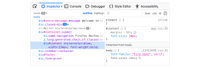
We’ve also been thinking about a better element selector. We know how it can be more productive to work inside the page, with less jumping back and forth into DevTools. We could make the element selector more powerful and more persistent. Perhaps it could select whitespace on a page and tell you what causes that space, or it could shed light on the relationships between different elements.
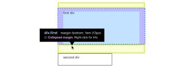
These are just two of the many ideas we hope to explore further with the help of the community.
We Need Your Input!
We want to keep making awesome tools that make your life easier as a developer or designer.
Here’s an easy way to help: Download Firefox Developer Edition and try using it for some of your work next week.
Then, tell us what you think by taking our 1-page survey.
We’re always interested in hearing ideas for improvements, particularly any low-hanging fruit that could save us all from some regular frustration. We do our work in the open, so you can follow along and chime in. We’ll keep you updated at @FirefoxDevTools.
Thanks to Patrick Brosset for his contributions to this article.
 (dm, il)
Articles on Smashing Magazine — For Web Designers And Developers
