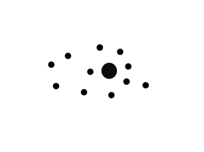
Grabbing Visual Attention With The Visual Cortex
Grabbing Visual Attention With The Visual Cortex
Susan Weinschenk
(This is a sponsored post.) You are designing a landing page. The goal of the page is to get people to notice, and hopefully click on a button on the screen to subscribe to a monthly newsletter. “Make sure the button captures people’s attention” is the goal you’ve been given.
So how, exactly, do you do that?
Research on the visual cortex in the brain can give you some ideas. The visual cortex is the part of the brain that processes visual information. Each of the senses has an area of the brain where the signals for that sensory perception are usually sent and processed. The visual cortex is the largest of the sensory cortices because we are very visual animals.
Recommended reading: What Is The Role Of Creativity In UX Design?
The Pre-Attention Areas Of The Visual Cortex
There are special areas of the visual cortex that process visual information very quickly. These are called the “pre-attention” areas because they process information faster than someone may realize they’ve even noticed something visually.
Within the visual cortex are four areas called V1, V2, V3 and V4. These are the “pre-attention” areas of the visual cortex, and they are dedicated to very small and specific visual elements.
Let’s take a look at each one:
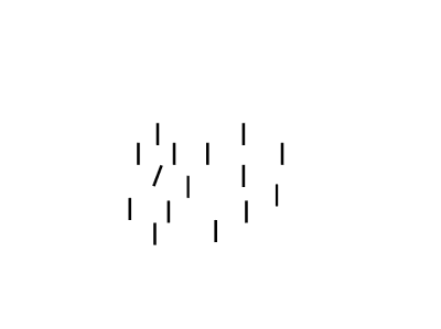
Orientation
If one item is oriented differently than others, then it is noticed right away:
Size And Shape
If one item is either a different size or shape than others then it is noticed right away:

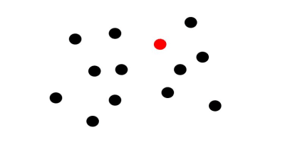
Color
If one item is a different color than others around it then it is noticed right away:
Movement
If one item moves in quickly, especially if it zooms in from starting at a small size and then becoming larger quickly (think tiger running quickly towards you), that grabs attention.
But Only One At A Time
The interesting, not immediately obvious factor here is that if you use these factors together at the same time then nothing really attracts attention.
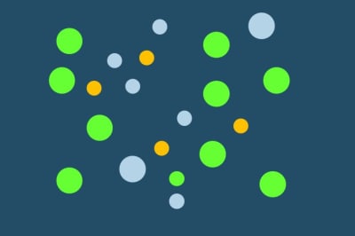
If you want to capture attention then, pick one of the methods and use it only.
Take a look at the two designs presented below. Which one draws your attention to the idea that you should enroll?


Obviously, the image that has just one color area draws your attention more, rather than the one area that is color.
The Fusiform Facial Area
The pre-attention areas of the visual cortex are not the only visual/brain connection to use. Another area of the brain you can tap to grab attention on a page could be the Fusiform Facial Area (or FFA).
The FFA is a special part of the brain that is sensitive to human faces. The FFA is located in the mid/social part of the brain near the amygdala which processes emotions. Faces grab attention because of the FFA.

The FFA identifies:
- Is this a face?
- Someone I know?
- Someone I know personally?
- What are they feeling?
What stimulates the FFA?
- Faces that look straight out stimulate the FFA.
- Faces that are in profile may eventually stimulate the FFA, but not as quickly. In the example below the face is in profile and obscured by hair. It may not stimulate the FFA at all.
- Even inanimate objects like the picture of the car below may stimulate the FFA area if they have things that look like facial parts such as eyes and a mouth.


Looking Where The Face Looks?
You may have seen the heat maps that show that if you show a face and the face is looking at an object (for example, a button or a product) on the screen then the person looking at the page will also look at the same object. Here’s an example:

The red areas show where people looked most. When the model looks at the shampoo bottle then people tend to look there too.
But be careful about drawing too many conclusions from this. Although the research shows that people’s eye gaze will follow the eye gaze of the photo, that doesn’t necessarily mean that people will take action. Highly emotional facial expressions lead to more action taking than just eye gaze.
Recommended reading: The Importance Of Macro And Micro-Moment Design
Takeaways
If you want to grab someone’s visual attention:
- Use the pre-attention areas of the visual cortex: make everything on the page plain except for one element.
or
- Show a large face, facing forward;
- If you want to spur action have the face show a strong emotion;
- Resist the urge to use many methods at once, such as a face, and color, and size, and shape, and orientation.
This article is part of the UX design series sponsored by Adobe. Adobe XD tool is made for a fast and fluid UX design process, as it lets you go from idea to prototype faster. Design, prototype and share — all in one app. You can check out more inspiring projects created with Adobe XD on Behance, and also sign up for the Adobe experience design newsletter to stay updated and informed on the latest trends and insights for UX/UI design.
 (cm, ms, yk, il)
Articles on Smashing Magazine — For Web Designers And Developers
