Design A Lead Gen Landing Page For Mobile That Converts
Design A Lead Gen Landing Page For Mobile That Converts
Suzanne Scacca
There is a huge difference between a website (which can generate leads) and a lead capture page (which is only supposed to generate leads).
Websites tell visitors:
This is all of the stuff we can do for you. Have a look around and let us know when you’re ready to spend some money!
Lead capture pages, instead, tell visitors:
We have this one super valuable thing we want to give you for free. Share your name, email address and maybe a couple of other details and we’ll hand it straight over!
There’s also a significant difference in how the two are designed.
Unbounce has a nice side-by-side comparison that shows this difference in design between the two:
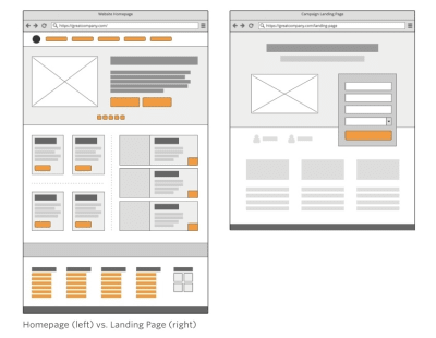
The only problem with this is that it depicts the design from a traditional desktop perspective. Just as you would consider the differences in conversion between a desktop and mobile website, you have to do the same for their landing pages.
In the following post, I’m going to give you some points to think about as you design lead capture pages for mobile audiences. I’ve also analyzed a number of landing pages on mobile so you can see how the design criteria may change based on what you’re promoting and who you’re trying to promote it to.
The Difference Between A Website And Lead Capture Page
This is the SnackFever website:

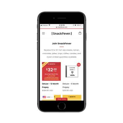
It takes a few scrolls to get through all of the content:
And some more scrolling…
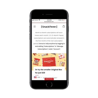
This is a content-packed home page, even for mobile. A page like this must mean that they’re prepared to have visitors wade through all of the options and opportunities available on the website. As you know, this can be a gamble on mobile what with conversion rates historically lower on those devices.
Then, compare this to SnackFever’s free gift lead capture page:
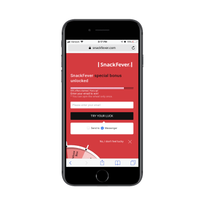
Only one swipe of the screen is needed to see the full page:
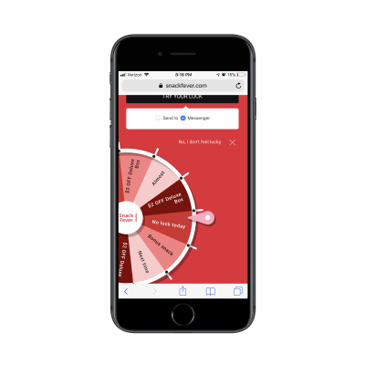
Technically, this is a lead capture pop-up. However, on mobile, SnackFever has turned this into a full page design (which is a much better choice).
This is a pretty awesome example of why you should be designing different experiences for different devices.
You can see that this is much more succinct and easy to stay engaged with as it has a singular purpose. The goal here is to capture that lead ASAP. This is not designed to give them room to walk around the site and ponder other decisions.
This is exactly why you should be building lead capture pages away from the website. It doesn’t matter what kind of lead generation you’re using to lure visitors there:
- eBooks, white papers and other custom reports
- Courses or webinars
- Checklists
- Calculator or quiz results
- Discounts or coupons
- Demos or consultations
- Free trials
By moving potential leads over to a distraction-free landing page full of highly targeted messaging and visuals, you can improve your chances of converting them into leads. It might not be a purchase, but you’ve helped them take that first step.
Design Tips For Lead Capture Pages On Mobile
Before you do anything else, I’d urge you to take a look at your website’s Google Analytics data. Specifically, go to Audience > Mobile > Overview and look for this:
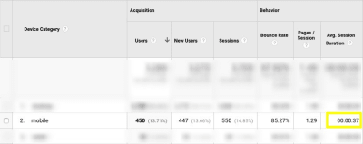
This is the average amount of time your mobile visitors spend on your website.
This data point will be helpful in determining, realistically, how long you have to capture and hold the attention of your mobile visitors.
An even better way of doing this is to go to Behavior > Site Content > All Pages. Then, set the Secondary Dimension to Mobile (including Tablet) and click on the new dimension filter so that the “Yes” values go to the top:

This lets you see how individual pages perform in terms of time on page with mobile visitors.
Look closely at any pages that have a strong and singular CTA, like a dedicated service or product page. You can use those times as an average benchmark for how long mobile visitors will stay engaged with a page that’s similarly structured (like your lead capture page).
Now that you have an idea of what your mobile visitors’ threshold is, you’ll be better prepared to design a lead capture page for mobile. The only thing is, though, it’s not that cut-and-dried.
I wish it were as easy to say:
- Write a headline under 10 words.
- Write a memorable description under 100 words.
- Add a form.
- Design an eye-catching button.
- You’re done.
Instead, you’ll have to think dynamically about how your lead capture page will best convert visitors to it.
Here are the various things to consider as you design each part of your mobile landing page:
#1: Navigation
The navigation menu is a critical part of any website. It allows visitors to move around the site with ease while also gaining a better understanding of all that’s available within the walls of it.
But lead capture pages don’t exist within a website’s navigation. Visitors, instead, encounter promotional links or buttons on web pages, in emails, on social media and via paid ads in search. Upon clicking, they’re taken to a landing page that’s reminiscent of the website, but has a unique style of its own.
Now, the question is:
Should your lead capture page include the main website’s navigation atop it?
If the goal of a lead capture page is to capture leads, then it should have just one clickable call-to-action, right? Wouldn’t logic dictate that a navigation menu with links to other pages would serve as too much of a distraction? And what about the brand logo? After all, any other links will send the signal:
“Hey, it’s okay if you want to abandon this page.”
Instead of saying:
“We weren’t kidding. Look at how amazing this offer is. Scroll down and claim yours now.”
I’d say that the navigation should only be included when the website is already successfully converting visitors into paying customers/subscribers/members/readers. If the lead gen is merely there as a bonus element, then it’s not a big deal if visitors want to backtrack to the site.
The logo should be fine to keep as it’s more of a branding element than a competing link in this context though. Take, for instance, this sweepstakes giveaway on the Martha Stewart website:

This clickable promotional element takes visitors to the lead capture page where the navigation element has disappeared and only the logo remains:
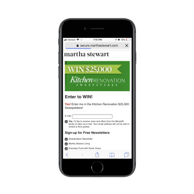
In general, if you need this lead gen offer to truly be a vehicle to grow your email list, the navigation should not be there. Nor should other competing links that draw them away from conversion.
#2: Copy
All of the usual rules for typography in mobile web design apply here — that includes size, spacing, color and font face. All of the rules you’d adhere to in terms of formatting a page for mobile apply as well. For example:
- Very succinct headlines;
- Short and punchy paragraphs;
- Bulleted or numbered lists to describe points quickly;
- Header tags to break up large swaths of text;
- Bolding, italics, hyperlinks and other stylized text to call attention to key areas.
What about the amount of copy on the page though? Typically, the answer for mobile is:
Write only as much copy as you need to.
That is indeed the case with mobile lead capture pages… but there’s a catch.
Some lead gens are easier to “sell”, which means you shouldn’t need much more than the following to get people to convert:
- A short and descriptive headline;
- A paragraph explaining why the lead gen is so valuable;
- Three to five bullets breaking out the benefits;
- A short form asking for the basics: name, email and maybe a phone number.
- A brightly colored and personally worded call-to-action button.
There are other cases where the lead gen offer requires more convincing. Or when the brand behind it decides to use the page’s copy as a way to qualify leads. You’ll see this a lot if the lead gen is something that requires an investment of time on the part of the brand. For instance:
- Product demos
- Consultations or audits
- Webinars (sometimes)
In these cases, it makes more sense to write a lengthy lead capture page. Even then, I go back and forth on this because I’m just not sure that’s the smartest move for mobile visitors. So, what I’m going to suggest is this:
If you’re building a lead capture page for a well-established brand that’s known for overly-long pages and whose leads are valued at over $ 1,000 each, a super lengthy lead capture page is fine.
If you’re building a lead capture page for a newish brand that simply wants to grow their email list fast, don’t make visitors wait to convert.
Get a look at this landing page from Nauto for a free eBook:
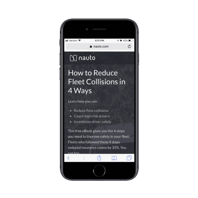
It does a great job summarizing the lead gen offer above the fold. Scroll down one screenful and you’ll find this eye-catching form:
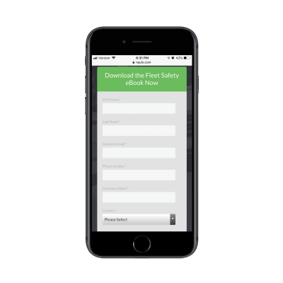
It could’ve been as simple as that. However, Nauto continues on with more copy after the CTA:
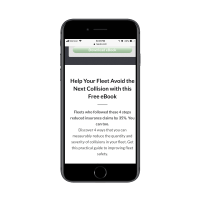
What’s interesting here is that this part of the page essentially rewrites the intro at the top of the page. My guess is that they did this to strengthen the SEO of the page with a longer word count and a reiteration of the main keywords.
Either that or they found that visitors weren’t immediately filling out the form and needed a little more encouragement. That would explain why a couple more scrolls down take you through a closer look at the content of the eBook as well as another link to download it (which just returns you to the form):
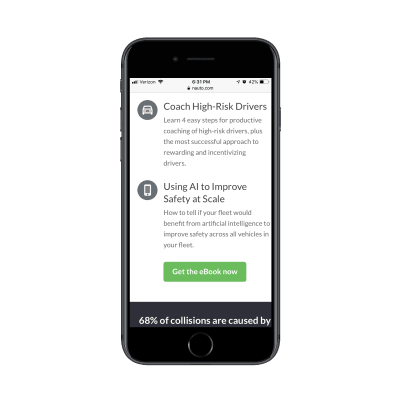
Clearly, you can still write a whole bunch of copy after the lead gen form, so long as there’s a good reason for it.
#3: Lead Capture Form
Nick Babich has a great piece on how to design forms for mobile. Although the guide pertains more to e-commerce checkout forms, the same basic principles apply here, too.
There are a number of other factors you should consider when designing forms to capture leads on a dedicated landing page.
Where should you place the form?
I’ve mostly answered that question in the above point about copy. But, if we want to be more specific, the lead capture form should always appear within no more than three swipes on mobile.
Realistically, the initial glance at a lead capture page should be an engaging visual element and headline. The next swipe down (if needed) should be an explainer paragraph and short list of benefits. Then, you should take them right to the form.
This is an example from GoToMeeting’s eBook lead capture page:
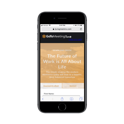
They’ve truncated all of those key intro elements into the top header design.
Can you write the labels differently?
No, labels should never be tampered with, especially on mobile. Keep them clear and to the point. Name. Email. Business. # of employees. Etc.
What you can and should do differently, though, is to create more engaging form titles and CTAs. Or you can encapsulate the form within brightly-colored borders.
The whole point of this page is to convert visitors on a single element. While you can’t play with the field labels, you can increase their engagement with the outlier text and design.
How many fields should you include?
The answer to this is always “only the ones that are necessary”. However, you don’t want to go too far towards the simple side if the purpose of the lead gen is to qualify leads.
If all you’re doing is growing an email list, sure, Name and Email will suffice. If your goal is to provide something of value to the people who really need it and, later, follow up and start them on the sales journey, the lead capture form needs to be longer.
Here’s another look at the GoToMeeting landing page:
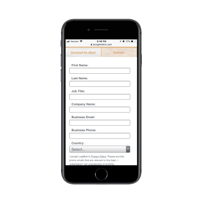
You can tell right away they’re not trying to give this eBook out to any and everyone. This is for a specific kind of business and they’re likely going to filter the leads they receive from it based on job title and country, too.
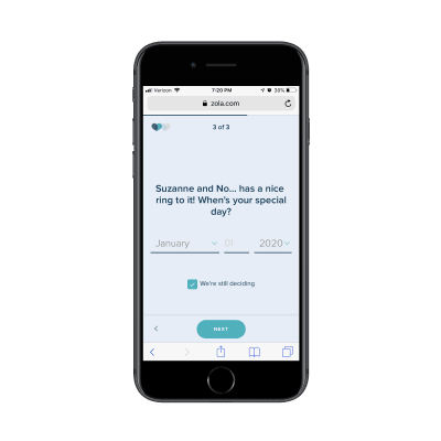
Don’t feel as though this is only something you can use for B2B websites either. Get a look at this custom wedding checklist lead capture form from Zola:
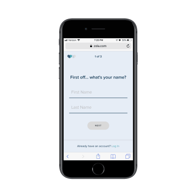
The first page of the form asks for your name. The second page of the form asks for your spouse-to-be’s name:
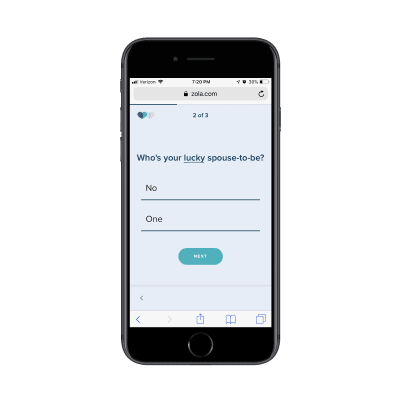
The final question then asks for your scheduled or tentative wedding day:
On the final page, Zola let’s you know that you can receive your custom wedding checklist if you’re willing to create an account:
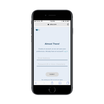
It’s a simple enough series of questions, but also not the kind you would find on most lead capture forms. So, don’t be afraid to break outside the norm if it improves the value of the lead gen offer for the visitor and helps your client collect better data on their leads.
#4: Trust Marks
Trust marks are often used around mobile e-commerce checkout forms. That makes a lot of sense since the goal is to make mobile visitors comfortable enough to buy something from their smartphones.
But are trust marks necessary for lead capture pages?
I think this boils down to what kind of lead gen you’re giving away and what kind of communication you intend to have with the lead after they’ve filled out the form.
Take the SnackFever example above. It’s a fun little game they’ve put on their site that exchanges a discount for an email address. There’s no reason for SnackFever to put a Norton Security or SSL trust mark next to the form. It’s very low stakes.
But when the lead gen’s value is dependent on the knowledge and skills of the company behind it, it’s very important to include trust marks on the page.
In this case, you want to demonstrate that there are satisfied customers (not leads) who are willing to vouch for the capabilities and prowess of the company. If you can leverage well-known brand logos and flattering testimonials from individuals, your landing page will more effectively capture the right kinds of leads (i.e. the ones willing to enter the sales funnel after they get their lead gen).
It’s no surprise that someone like Neil Patel would leverage these kinds of trust marks — he has a lot of high-profile and satisfied customers. It would be silly not to include them on his lead capture page.
This is the top of his “Yes, I Want More Traffic” lead capture page:
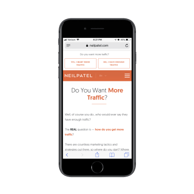
It goes on and on like this for about a dozen scrolls. (As I mentioned before, if you’re known for writing overly long content on your site, you can get away with this.)
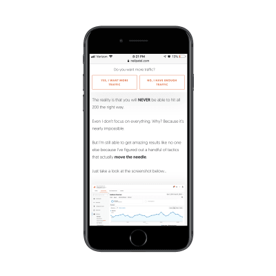
Eventually, he gets to a point where he lets others tell the visitor why they should pursue this offer. The first block of trust marks come in the form of short quotes and logos from well-known companies:
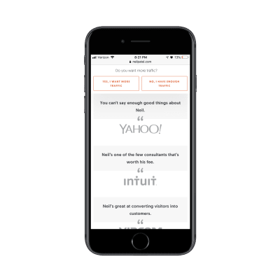
The next section puts the spotlight on “smaller” clients that are willing to divulge what kinds of impressive results Neil has gotten for them:
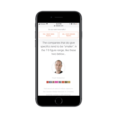
While I wouldn’t suggest the length or style of this page for your clients, I do think there’s a great lesson to be taken away here in terms of leveraging the words and reputations of a satisfied client base to build trust.
#5: Footer
While I have a hard time justifying the use of a navigation on a lead capture page, I actually do think a footer is a good idea. That said, I don’t think it should be the same as your website’s footer. Again, we want to avoid any design element stuffed full of links that can distract from the goal of the page.
Instead, you should use the footer to further establish trust with leads. Terms of Use, Privacy Policy, and other data management policy pages belong here.
I’m including this final example from Drift because, well, it’s the most unique lead capture “page” I’ve encountered thus far — and because the footer is as simple as they come.
This page promotes Drift’s upcoming and previous webinars:
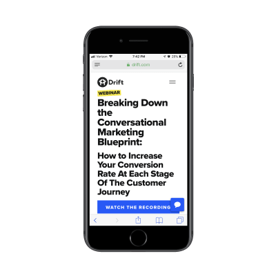
If you attempt to “Watch the Recording” of an old webinar, it’s fair to assume that Drift is going to want to capture your email address. However, Drift is in the business of developing conversational marketing tools for business. While they could’ve created a conversational landing page (sort of like what Zola did with its form above), it went a different route:
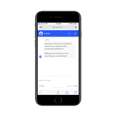
Visitors interested in the webinar lead gen are taken to a DriftBot page. It’s very simple in design (as any chat interface should be) and includes the simplest of footers. While Drift’s link is there, the only other competition for attention is the “Privacy Policy” and it’s clear that Drift wants that to be an afterthought based on the font color choice.
One more thing I want to note about this example is that if you were to go through these same steps on the desktop website, DriftBot doesn’t ask you for an email address. It simply gives you a link:
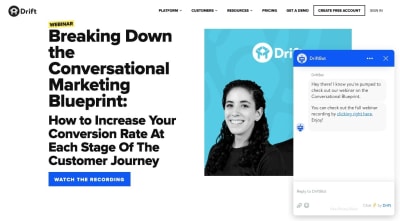
This is further proof that you should be designing different experiences based on the expected outcomes on each device. In this case, they probably have data that shows that desktop visitors watch the webinar right away while mobile visitors wait until they’re on a larger-screened device.
Wrapping Up
While adhering to basic mobile design principles is the best thing to do when designing something new for your clients, be mindful of the purpose of the new element or page too.
As you can see in many of the examples above, there’s a stark difference between the kinds of lead gen offers your clients may want to share with visitors.
The simpler exchanges (e.g. give me your email/get this checklist) don’t require much deviation from the designs of other mobile web pages. More high stakes exchanges (e.g. give me your information/get a custom quote, consult or demo) may require some non-mobile-friendly design techniques.
I would suggest you do your research, see how long you can realistically hold your visitors’ attention on mobile and design it. Then, start A/B testing your design to experiment with form construction, page length, and so on. You may be surprised at what your mobile visitors will go for if the lead gen offer is juicy enough.
 (ra, yk, il)
Articles on Smashing Magazine — For Web Designers And Developers
