
Staying Connected And Learning From Each Other
Staying Connected And Learning From Each Other
Iris Lješnjanin
Digital space obviously has its challenges, but it also provides incredible opportunities for us to connect and learn in ways we just wouldn’t be able to do otherwise. The situation with COVID-19 has challenged us to consider ways in which we could offer a similar SmashingConf experience and access to experts just as in an in-person workshop — without needing to leave your desk.
With insightful takeaways, exercises, access to slides, recordings and friendly Q&As, it has been such an incredible experience already! We’ve had literally people from all over the world collaborating together on group exercises — something we’d never be able to achieve with an in-person event.

And we’re just getting started! We already have a schedule of online workshops ready for you so you can start marking your calendars and join us anytime you like. What better way is there to boost your skills online and learn practical, actionable insights from experts in the industry — live!
| Name | Topic | Date | Time |
|---|---|---|---|
| Brad Frost | Creating and Maintaining Successful Design Systems | April 22–May 6 | 09:00–11:30 AM PDT |
| Joe Leech | Psychology For UX and Product Design | April 27–May 5 | 09:00–11:30 AM PDT |
| Miriam Suzanne | Resilient Web Systems with CSS & Sass | May 7–22 | 09:00–11:30 AM PDT |
| Vitaly Friedman | Smart Interface Design Patterns, 2020 Edition | May 12–26 | 09:00–11:30 AM PDT |
| Rachel Andrew | The CSS Layout Masterclass | June 11–12 | 01:00–03:30 AM PDT |
| Marcy Sutton | Front-End Accessibility Masterclass | June 16–30 | 09:00–11:30 AM PDT |
Do you like what you see, but are worried about getting some time off from work? Well, you surely didn’t think we would leave your hanging? We know how difficult it can sometimes be, and so we’ve prepared a neat lil’ Convince-Your-Boss template to help you out. Good luck!
- Follow @smashingconf on Twitter
- Subscribe to the SmashingConf Newsletter
- Watch previous SmashingConf videos
Ready For The Next Smashing Book?
 That’s right! Paul Boag’s Click! Encourage Clicks Without Shady Tricks is currently in its final production stage and the pre-release starts on May 5. This practical guide has 11 chapters full of advice that can help you start improving your conversion rate in just a matter of simple steps. You can subscribe for a pre-order discount and be one of the first to get your hands on the book. Stay tuned!
Live UX Review With The Author
Next week, we’ll be hosting a Smashing TV webinar with Paul Boag who’ll be reviewing your websites and sharing some techniques you can use to improve conversion rates — without having to resort to any shady tricks. Tell me more →
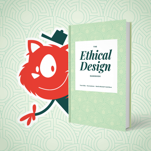 As for the previous book, printed copies of The Ethical Design Handbook have made their way around the world, and we got to see some happy responses and thoughtful reviews. If you’d also like a copy, you can download a free PDF excerpt (5 MB) to get a first impression of the book — we’re sure you won’t be disappointed!
Also, in case you missed it, there is a Smashing Podcast episode featuring two of the authors of the book: Trine Falbe and Martin Michael Frederiksen. They discuss what it means for a design to be ethical, and how we can make improvements in our own projects.
Drew has also interviewed Laura Kalbag, Eduardo Bouças, Stéphanie Walter, and many more. You can subscribe and tune in anytime with any of your favorite apps!
- Previous Smashing Podcast episodes (including transcripts)
- Follow @SmashingPod on Twitter
Trending Topics On SmashingMag
We publish a new article every day on various topics that are current in the web industry. Here are some that our readers seemed to enjoy the most and have recommended further:
- “Best Practices With React Hooks”
by Adeneye David Abiodun
This article covers the rules of React Hooks and how to effectively start using them in your projects. Please note that in order to follow this article in detail, you will need to know how to use React Hooks. - “Inspired Design Decisions With Herb Lubalin”
by Andy Clarke
How can we combine elements to develop powerful headers and calls to action? How do we use pre-formatted HTML text, and the text element in SVG for precise control over type? How can we optimise SVGs and make SVG text accessible? In this article, we’ll explore just that. - “Baking Structured Data Into The Design Process”
by Frederick O’Brien
Retrofitting search engine optimization only gets you so far. As metadata gets smarter, it’s more important than ever to build it into the design process from the start. - “How To Make Life Easier When Using Git”
by Shane Hudson
You don’t need to know your trees from your dangling blobs. If you use Git every day and feel like it’s a juggling act, then here are some tricks and tips to help make your life a bit easier.
Best Picks From Our Newsletter
We’ll be honest: Every second week, we struggle with keeping the Smashing Newsletter issues at a moderate length — there are just so many talented folks out there working on brilliant projects! Kudos to everyone involved!
Interested in sponsoring? Feel free to check out our partnership options and get in touch with the team anytime — they’ll be sure to get back to you right away.
Tips For Leading A Remote Team
Leading a remote design team can feel a bit daunting, especially if it’s your first time. Luckily, other people out there have found themselves in the same situation before and developed strategies to keep the team productive and effective, no matter where everyone might be located. Mark Boulton is one of them.

In light of recent events when many teams need to switch to remote work, Mark summarized some simple but useful approaches that have helped him leading remote teams for years. From continuing your team’s rituals to dealing with expectations on availability and coaching people through the ups and downs that working remotely brings along, Mark’s tips aren’t hard to adopt but they can make a real difference. (cm)
Getting To Grips With CSS Viewport Units
CSS Viewport units provide us with a way to size things in a fluid and dynamic way, without the need for JavaScript. If you haven’t gotten around to dive deeper into the topic yet, Ahmad Shadeed wrote a useful guide to CSS Viewport units.
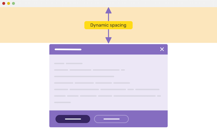
Starting with a general overview of the viewport units vw, vh, vmin, and vmax, the guide covers how viewport units differ from percentages and explores practical use cases for viewport units and how to implement them in your projects. Just the push you might have needed to make the switch. (cm)
A Better File Uploader For The Web
Building a better file uploader for the web. That was the idea behind the JavaScript image uploader Uppload. Created by Anand Chowdhary, the image uploader is open-source and can be used with any file uploading backend. And with more than 30 plugins, it’s highly customizable, too.
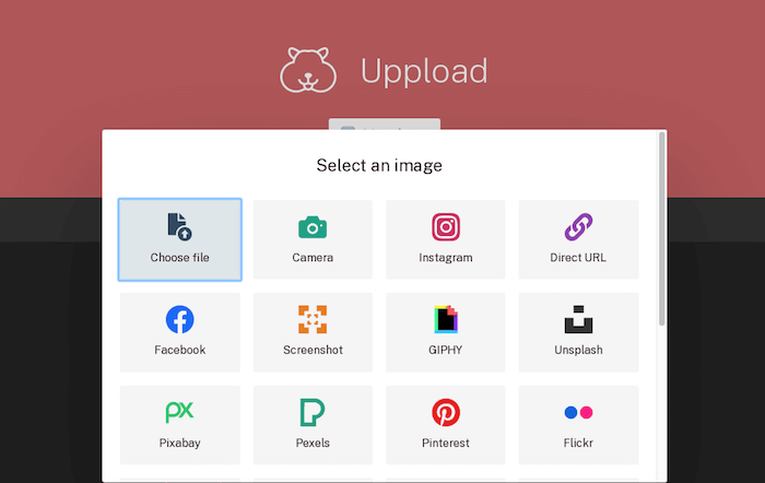
Users can drag and drop their files to upload them or import from a camera, URL, or social media and a several other services (there’s even an option to take and upload a screenshot just by entering a URL). During the uploading process, users can apply effects to the images and adjust filters like brightness, contrast, and saturation. If that’s overkill for your project, you can select only what you need and treeshake the rest, of course. Uppload supports browsers down to IE10. Handy! (cm)
Open-Source Flip Counter Plugin
Do you want to count down to an event, visualize a fundraising campaign, or show a clock or sales counter? Then Rik Schennink’s Flip Counter might be for you. The plugin is open-source, mobile-friendly, easy to set up, and it gets by without any dependencies.

Apart from its ease of use and flexibility, Flip shines with the beautifully smooth animation that is used to flip the numbers on the cards. Depending on your use case, there are several presets that you can use as a starting point to build your flip counter. The visual style can be customized with CSS. A lovely little detail. (cm)
How To Write Good Email Code
Maybe you’ve been in that situation before where you had to code an HTML email but struggled with email code best practices. To help you master the challenge, Mark Robbins set up a library for good email code. You can simply copy and paste the code and use it in your emails or you can learn more about the theory behind it.

Priority lies in making sure the code is semantic, functional, accessible, and meeting user expectations, as Mark points out. Consistency between email clients and pixel perfect design are important, too, but always secondary. One for the bookmarks. (cm)
A Complete Solution For Tooltips, Popovers, And Dropdowns
If you’re looking for a quick and easy solution for tooltips, popovers, dropdowns, and menus, you might want to take a look at Tippy.js. The library provides the logic and styling involved in all types of elements that pop out from the flow of your document and get overlaid on top of the UI.
Tippy.js is optimized to prevent flipping and overflow, it’s WAI-Aria compliant, works in all modern browsers, and, so the promise, it even delivers high performance on low-end devices. You can style the elements with custom CSS and TypeScript is supported out of the box, too. Handy! (cm)
Open-Source Tool To Make Animated Product Mockups
What do you do when you’re missing a tool for a specific purpose? You build it yourself. That’s what Alyssa X did when she was looking for a tool to make animated GIFs and videos to showcase a product. Her take on the subject: Animockup.
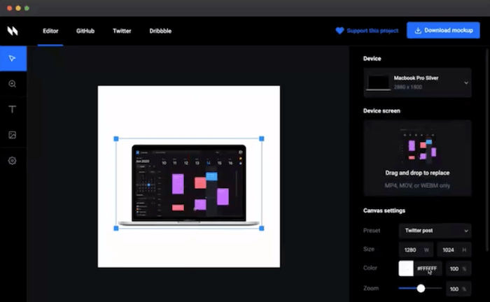
With Animockup, you can showcase your product in action within a device mockup. Just drag some screen footage into the browser-based tool, and Animockup automatically places it into your desired mockup. You can add text, images, and adjust the styling, and choose from a selection of presets to optimize your mockup for sharing on Twitter, Dribble, Instagram and the like. A useful little helper. (cm)
Create CSS Color Gradients With Ease
Hand-picking colors to make a color gradient requires design experience and a good understanding of color harmony. If you need a gradient for a background or for UI elements but don’t feel confident enough to tackle the task yourself (or if you’re in a hurry), the color gradient generator which the folks at My Brand New Logo have created has got your back.
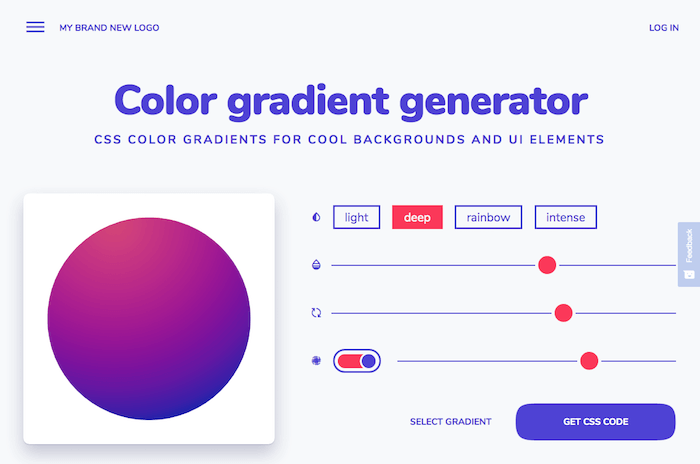
Powered by color gradient algorithms, the generator creates well-balanced gradients based on a color you select. There are four different styles of gradients that go from subtle to a mother-of-pearl effect and an intense, deep color gradient. You can adjust the gradient with sliders and, once you’re happy with the result, copy-paste the generated CSS code to use it in your project. Nice! (cm)
Collaborative Diagrams
Pen and paper are often hard to beat when you want to visualize an idea with a quick diagram. If you’re looking for a digital alternative that is just as straightforward and easy to use as your analog tools, you might want to check out Excalidraw.
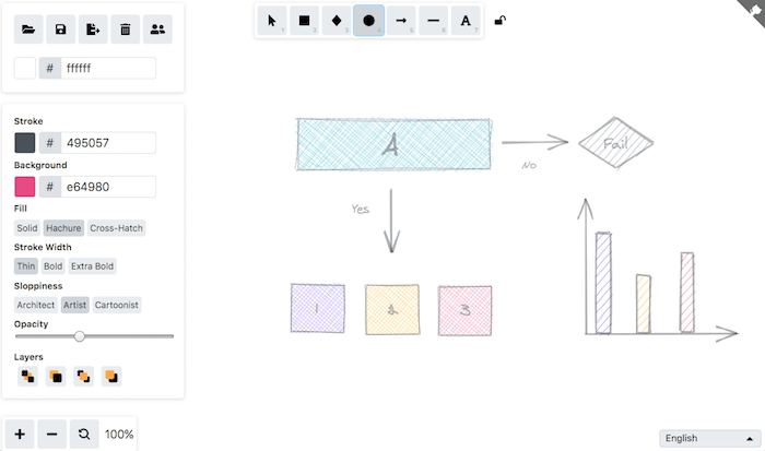
Excalidraw is a virtual whiteboard that you can draw on. You can choose from a set of shapes, connect them with arrows or lines, add text, and color. There are some other styling options, too, but the tool is kept rather simple so that you can focus on what’s really important: visualizing your idea. A great feature that comes in especially handy now that a lot of teams work remotely: You can share a live-collaboration session with your team members or your clients. Export and save options are included, too, of course. (cm)
Mastering BEM Naming Conventions
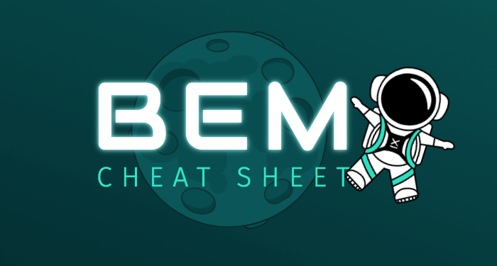
BEM makes your code scalable and reusable, prevents it from becoming messy, and facilitates teamwork. However, even experienced CSS developers struggle with the naming conventions sometimes. To prevent you from getting lost in the BEM cosmos, the folks at 9elements put together the BEM Cheat Sheet with naming suggestions for some of the most common web components: breadcrumb navigation, buttons, cards, lists, tabs, form checkboxes, sidebars, and more.
If you want to dive in even deeper into the BEM methodology, Luke Whitehouse shares tips to tackle an ever-present issue in BEM: grandchildren, i.e. elements that are tied to another element, rather than to the block itself. Luke explores three different approaches to master the challenge: flattening the grandchildren and treating them as if they have no relation with their parent element, by creating new blocks, and by extending the BEM naming convention. A good read. (cm)
A Preserve For Classic Games
Do you feel nostalgic when you think of the video games you played back in the 80s and 90s? Well, why not take a little trip back to those days when games were just as much fun without the fancy effects they shine with today?

ClassicReload preserves more than 6,000 old retro games and abandoned OD/interfaces that you can play right in your browser. You can search for your favorite or browse the games by name, year, genre, and platform to discover something new. No matter if it’s The Oregon Trail, Prince of Persia, or Dangerous Dave you’ve been longing for for so long, if you’ve got a sweet spot for games, the site will keep you entertained for quite a while. (cm)
Managing HTML DOM And jQuery Alternatives
How do you manage HTML DOM with vanilla JavaScript only? Phuoc Nguyen collected 100 native DOM scripting snippets along with explanations on how to use them. The snippets are labeled by difficulty and range from basic (e.g. detecting if an element is focused) to more intermediate tasks like exporting a table to CSV and, finally, advanced use cases like creating a range slider.
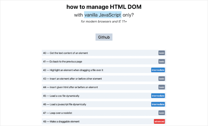
Speaking of going vanilla: If you’re using jQuery in your projects, it might be a good idea to check if you actually need the additional dependency or if a few lines of utility code could do the trick. “You might not need jQuery” lists useful alternative code snippets that help you forgo jQuery. (cm)
Overly Descriptive Color Palettes
Have you ever considered combining snail-paced soft pink with unsealed mahogany and lousy watermelon as a color scheme for your next project? Well, what might sound a bit weird at first, is the concept behind colors.lol, a color inspiration site with “overly descriptive color palettes”, as its creator Adam Fuhrer describes it.
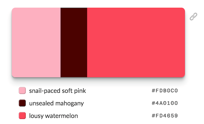
Created as a fun way to discover interesting color combinations, the palettes are hand-selected from the Twitter bot @colorschemez. The feed randomly generates color combinations and matches each color with an adjective from a list of over 20,000 words. Hiding behind the unusual names are of course real hex color values that you can use right away — #FDB0C0, #4A0100, and #FD4659 in the case of snail-paced soft pink and its fellas, for example. A fun take on color. (cm)
Flexible Repeating SVG Masks
Sometimes it’s a small idea, a little detail in a project that you tinker with and that you can’t let go off until you come up with a tailor-made solution to make it happen. Nothing that seems like a big deal at first glance, but that requires you to think outside the box. In Tyler Gaw’s case, this little detail was a flexible header with a little squiggle at the bottom instead of a straight line. The twist: to make the component future-proof, Tyler wanted to use a seamless, horizontal repeating pattern that he could color with CSS in any color he liked.
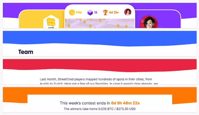
To get the job done, Tyler settled on flexible repeating SVG masks. SVG provides the shape, CSS handles the color, and mask-image does the heavy lifting by hiding anything in the underlying div that doesn’t intersect with the shape. A clever approach that can be used as the base for some fun experiments. (cm)
As a token of appreciation, Vitaly Friedman released his very own “Smart Interface Design Checklists”, a PDF deck with 150+ questions to ask when designing and building anything from hamburgers to carousels and tables. Subscribe to the newsletter below and get it in your inbox right away!
 (cm, vf, ra, il)
Articles on Smashing Magazine — For Web Designers And Developers

