
New CSS Features That Are Changing Web Design
New CSS Features That Are Changing Web Design
Zell Liew
There was a time when web design got monotonous. Designers and developers built the same kinds of websites over and over again, so much so that we were mocked by people in our own industry for creating only two kinds of websites:
which one of the two possible websites are you currently designing? pic.twitter.com/ZD0uRGTqqm
— Jon Gold (@jongold) February 2, 2016
Is this the limit of what our “creative” minds can achieve? This thought sent an incontrollable pang of sadness into my heart.
I don’t want to admit it, but maybe that was the best we could accomplish back then. Maybe we didn’t have suitable tools to make creative designs. The demands of the web were evolving quickly, but we were stuck with ancient techniques like floats and tables.
Today, the design landscape has changed completely. We’re equipped with new and powerful tools — CSS Grid, CSS custom properties, CSS shapes and CSS writing-mode, to name a few — that we can use to exercise our creativity.
How CSS Grid Changed Everything
Grids are essential for web design; you already knew that. But have you stopped to asked yourself how you designed the grid you mainly use?
Most of us haven’t. We use the 12-column grid that has became a standard in our industry.
- But why do we use the same grid?
- Why are grids made of 12 columns?
- Why are our grids sized equally?
Here’s one possible answer to why we use the same grid: We don’t want to do the math.
In the past, with float-based grids, to create a three-column grid, you needed to calculate the width of each column, the size of each gutter, and how to position each grid item. Then, you needed to create classes in the HTML to style them appropriately. It was quite complicated.
To make things easier, we adopted grid frameworks. In the beginning, frameworks such as 960gs and 1440px allowed us to choose between 8-, 9-, 12- and even 16-column grids. Later, Bootstrap won the frameworks war. Because Bootstrap allowed only 12 columns, and changing that was a pain, we eventually settled on 12 columns as the standard.
But we shouldn’t blame Bootstrap. It was the best approach back then. Who wouldn’t want a good solution that works with minimal effort? With the grid problem settled, we turned our attention to other aspects of design, such as typography, color and accessibility.
Now, with the advent of CSS Grid, grids have become much simpler. We no longer have to fear grid math. It’s become so simple that I would argue that creating a grid is easier with CSS than in a design tool such as Sketch!
Why?
Let’s say you want to make a 4-column grid, each column sized at 100 pixels. With CSS Grid, you can write 100px four times in the grid-template-columns declaration, and a 4-column grid will be created.
.grid { display: grid; grid-template-columns: 100px 100px 100px 100px; grid-column-gap: 20px; } 
grid-template-columns If you want a 12-column grid, you just have to repeat 100px 12 times.
.grid { display: grid; grid-template-columns: 100px 100px 100px 100px 100px 100px 100px 100px 100px 100px 100px 100px; grid-column-gap: 20px; } 
Yes, the code isn’t beautiful, but we’re not concerned with optimizing for code quality (yet) — we’re still thinking about design. CSS Grid makes it so easy for anyone — even a designer without coding knowledge — to create a grid on the web.
If you want to create grid columns with different widths, you just have to specify the desired width in your grid-template-columns declaration, and you’re set.
.grid { display: grid; grid-template-columns: 100px 162px 262px; grid-column-gap: 20px; } 
Making Grids Responsive
No discussion about CSS Grid is complete without talking about the responsive aspect. There are several ways to make CSS Grid responsive. One way (probably the most popular way) is to use the fr unit. Another way is to change the number of columns with media queries.
fr is a flexible length that represents a fraction. When you use the fr unit, browsers divide up the open space and allocate the areas to columns based on the fr multiple. This means that to create four columns of equal size, you would write 1fr four times.
.grid { display: grid; grid-template-columns: 1fr 1fr 1fr 1fr; grid-column-gap: 20px; } 
fr unit respect the maximum width of the grid. (Large preview)Let’s do some calculations to understand why four equal-sized columns are created.
First, let’s assume the total space available for the grid is 1260px.
Before allocating width to each column, CSS Grid needs to know how much space is available (or leftover). Here, it subtracts grip-gap declarations from 1260px. Since each gap 20px, we’re left with 1200px for the available space. (1260 - (20 * 3) = 1200).
Next, it adds up the fr multiples. In this case, we have four 1fr multiples, so browsers divide 1200px by four. Each column is thus 300px. This is why we get four equal columns.
However, grids created with the fr unit aren’t always equal!
When you use fr, you need to be aware that each fr unit is a fraction of the available (or leftover) space.
If you have an element that is wider than any of the columns created with the fr unit, the calculation needs to be done differently.
For example, the grid below has one large column and three small (but equal) columns even though it’s created with grid-template-columns: 1fr 1fr 1fr 1fr.
See the Pen CSS Grid `fr` unit demo 1 by Zell Liew (@zellwk) on CodePen.
After splitting 1200px into four and allocating 300px to each of the 1fr columns, browsers realize that the first grid item contains an image that is 1000px. Since 1000px is larger than 300px, browsers choose to allocate 1000px to the first column instead.
That means, we need to recalculate leftover space.
The new leftover space is 1260px - 1000px - 20px * 3 = 200px; this 200px is then divided by three according to the amount of leftover fractions. Each fraction is then 66px. Hopefully that explains why fr units do not always create equal-width columns.
If you want the fr unit to create equal-width columns everytime, you need to force it with minmax(0, 1fr). For this specific example, you’ll also want to set the image’s max-width property to 100%.
See the Pen CSS Grid `fr` unit demo 2 by Zell Liew (@zellwk) on CodePen.
Note: Rachel Andrew has written an amazing article on how different CSS values (min-content, max-content, fr, etc.) affect content sizes. It’s worth a read!
Unequal-Width Grids
To create grids with unequal widths, you simply vary the fr multiple. Below is a grid that follows the golden ratio, where the second column is 1.618 times of the first column, and the third column is 1.618 times of the second column.
.grid { display: grid; grid-template-columns: 1fr 1.618fr 2.618fr; grid-column-gap: 1em; } 
Changing Grids At Different Breakpoints
If you want to change the grid at different breakpoints, you can declare a new grid within a media query.
.grid { display: grid; grid-template-columns: 1fr 1fr; grid-column-gap: 1em; } @media (min-width: 30em) { .grid { grid-template-columns: 1fr 1fr 1fr 1fr; } } Isn’t it easy to create grids with CSS Grid? Earlier designers and developers would have killed for such a possibility.
Height-Based Grids
It was impossible to make grids based on the height of a website previously because there wasn’t a way for us to tell how tall the viewport was. Now, with viewport units, CSS Calc, and CSS Grid, we can even make grids based on viewport height.
In the demo below, I created grid squares based on the height of the browser.
See the Pen Height based grid example by Zell Liew (@zellwk) on CodePen.
Jen Simmons has a great video that talks about desgining for the fourth edge — with CSS Grid. I highly recommend you watch it.
Grid Item Placement
Positioning grid items was a big pain in the past because you had to calculate the margin-left property.
Now, with CSS Grid, you can place grid items directly with CSS without the extra calculations.
.grid-item { grid-column: 2; /* Put on the second column */ } 
You can even tell a grid item how many columns it should take up with the span keyword.
.grid-item { /* Put in the second column, span 2 columns */ grid-column: 2 / span 2; } 
span keyword Inspirations
CSS Grid enables you to lay things out so easily that you can create a lot of variations of the same website quickly. One prime example is Lynn Fisher’s personal home page.
If you’d like to find out more about what CSS Grid can do, check out Jen Simmon’s lab, where she explores how to create different kinds of layouts with CSS Grid and other tools.
To learn more about CSS Grid, check out the following resources:
- Master CSS Grid, Rachel Andrew and Jen Simmons
Video tutorials - Layout Land, Jen Simmons
A series of videos about layout - CSS layout workshop, Rachel Andrew
A CSS layout course - Learn CSS Grid, Jonathan Suh
A free course on CSS Grid. - Grid critters, Dave Geddes
A fun way to learn CSS Grid
Designing With Irregular Shapes
We are used to creating rectangular layouts on the web because the CSS box model is a rectangle. Besides rectangles, we’ve also found ways to create simple shapes, such as triangles and circles.
Today, we don’t need to stop there. With CSS shapes and clip-path at our disposal, we can create irregular shapes without much effort.
For example, Aysha Anggraini experimented with a comic-strip-inspired layout with CSS Grid and clip path.
See the Pen Comic-book-style layout with CSS Grid by Aysha Anggraini (@rrenula) on CodePen.
Hui Jing explains how to use CSS shapes in a way that allows text to flow along the Beyoncé curve.
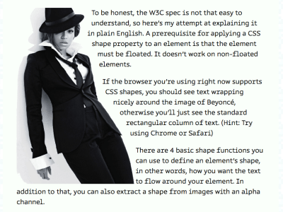
If you’d like to dig deeper, Sara Soueidan has an article to help you create non-rectangular layouts.
CSS shapes and clip-path give you infinite possibilities to create custom shapes unique to your designs. Unfortunately, syntax-wise, CSS shapes and clip-path aren’t as intuitive as CSS Grid. Luckily, we have tools such as Clippy and Firefox’s Shape Path Editor to help us create the shapes we want.
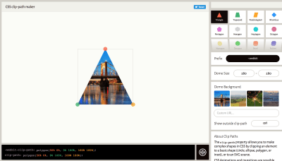
clip-path. Switching Text Flow With CSS’ writing-mode
We’re used to seeing words flow from left to right on the web because the web is predominantly made for English-speaking folks (at least that’s how it started).
But some languages don’t flow in that direction. For example, Chinese words can read top down and right to left.
CSS’ writing-mode makes text flow in the direction native to each language. Hui Jing experimented with a Chinese-based layout that flows top down and right to left on a website called Penang Hokkien. You can read more about her experiment in her article, “The One About Home”.
Besides articles, Hui Jing has a great talk on typography and writing-mode, “When East Meets West: Web Typography and How It Can Inspire Modern Layouts”. I highly encourage you to watch it.

Even if you don’t design for languages like Chinese, it doesn’t mean you can’t apply CSS’ writing-mode to English. Back in 2016, when I created Devfest.asia, I flexed a small creative muscle and opted to rotate text with writing-mode.
Jen Simmons’s lab contains many experiments with writing-mode, too. I highly recommend checking it out, too.
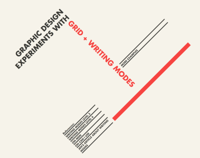
Effort And Ingenuity Go A Long Way
Even though the new CSS tools are helpful, you don’t need any of them to create unique websites. A little ingenuity and some effort go a long way.
For example, in Super Silly Hackathon, Cheeaun rotates the entire website by -15 degrees and makes you look silly when reading the website.

Darin Senneff made an animated login avatar with some trigonometry and GSAP. Look at how cute the ape is and how it covers its eyes when you focus on the password field. Lovely!
When I created the sales page for my course, Learn JavaScript, I added elements that make the JavaScript learner feel at home.
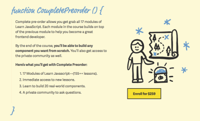
function syntax to create course packages instead of writing about course packages Wrapping Up
A unique web design isn’t just about layout. It’s about how the design integrates with the content. With a little effort and ingenuity, all of us can create unique designs that speak to our audiences. The tools at our disposal today make our jobs easier.
The question is, do you care enough to make a unique design? I hope you do.
 (ra, il, al)
Articles on Smashing Magazine — For Web Designers And Developers


