When Is A Button Not A Button?
When Is A Button Not A Button?
Vadim Makeev
Let’s say you have a part of an interface that the user clicks and something happens. Sounds like a button to me, but let’s call it a “clicky thing” for now. I know, you’re confident that it’s a button too: It’s rounded and stands out with a nice tomato color, asking to be interacted with. But let’s think about it for a moment. It’ll save time in the long run, I promise.

What if the text in this clicky thing was “Read more”, and clicking it led the user to an article on another page? Hmm. And what if there was a blue underlined word, “Close”, that closes the popup dialog? Is it a link just because it’s blue and underlined? Of course not.
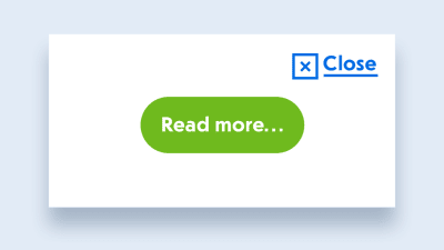
Whoa! It seems like there’s no way to tell if it’s a link or a button just by looking at it. That’s crazy! We need to understand what this thing does before choosing the right element. But what if we don’t know what it does just yet or are simply confused? Well, there’s a handy flow chart for us:
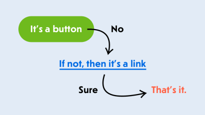
- It’s a button.
- If not, then it’s a link.
- That’s it.
So, is everything a button? No, but you can always start with a button for almost any element that can be clicked or interacted with in a similar way. And if it’s lacking something, like navigation to another page, use a link instead. And no, a pointer is not a reason to make it <a href>. We have cursor: pointer for that.
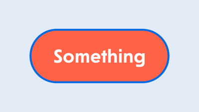
All right, it’s a <button> button — we agree on that. Let’s put it in our template and style it according to the design: some padding, rounding, a tomato fill, white text, and even some focus styles. Oh, that’s so nice of you.
<button type="button" class="button"> Something </button> <style> .button { display: inline-block; padding: 10px 20px; border-radius: 20px; background-color: tomato; color: white; } .button:focus { outline: none; box-shadow: 0 0 0 5px #006AE3; } </style> That didn’t take long. You wanted to build it quickly and grab some lunch because you’re hungry. Ok, let’s see how it looks and get going.
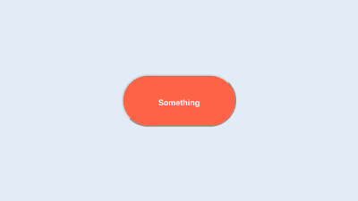
Oh my god! Something is wrong with the browser. Why is this button so ugly? The text is tiny, even though we have explicitly set the body to 16px, and even the font-family is wrong. The rounded border with a silly pseudo-shadow is so retro that it’s not even a trend yet.
Ahh, it’s the browser’s default styling. You need to carefully undo it or even add Normalize.css or Reset.css… or you could just use a <div> and forget about it. Isn’t solving problems quickly what they pay you for? You’re hungry and this isn’t helping at all. But you’re a professional: Pull yourself together and think.
What’s the difference between a <button> and a <div> anyway? A built-in <button> is an interactive element, meaning that it can be interacted with. That’s deep. You can click it, you can focus on it using a keyboard, and it also conveys an accessible button role to screen readers, making it possible for users to understand that it’s a button.
Impressive! You’re not only aware of HTML’s <button> element, but you also know a thing or two about ARIA and screen-reader support. You might have even tried VoiceOver or NVDA to test how accessible your interfaces are.
So, you’ve decided to do a trick. You won’t mess with the browser’s styling, and you’ll make the element look like a proper interactive button for users who might need it. That’s smart!
<div class="button" tabindex="0" role="button"> Something </div> Now it not only looks right, but it’s focusable via the keyboard thanks to the tabindex="0" attribute, and screen readers will treat it as a proper button because you have wisely added role="button" to it. Git commit && push then! There are some additional tasks for this thing, but we’re done with the styling. What could possibly go wrong? Time for lunch. Great, let’s go!
An hour later…
That was a nice lunch! Let’s get back to our clicky thing. We need to complete some tasks before moving on. Let’s see… We need to call a doSomething function once the button is clicked, and there should be a way to disable the button so that it’s not clickable. Sounds easy. Let’s add an event listener to this button:
<script> const buttons = document.querySelectorAll('.button'); [...buttons].forEach(button => { button.addEventListener('click', doSomething); }); function doSomething() { console.log('Something!'); } </script> Done. The user can now click it with a mouse on the desktop and tap it with a finger on a touchscreen. A click event will fire reliably, and you’ll see a lot of Something! in your console. What’s the next task?
Hold on! We need to make sure it works the same for keyboard users. Because we have this tabindex="0" on the button, it can be focused, and once it’s focused, users should be able to press the space bar or “Enter” key to trigger whatever we have attached.
So, we need to attach another event listener to catch all keyups, and we’ll trigger our function only for certain keys. Thank God that touch devices are smart enough to convert all taps into clicks; otherwise, we’d have to attach a bunch of touch events, too.
<script> const buttons = document.querySelectorAll('.button'); [...buttons].forEach(button => { button.addEventListener('click', doSomething); button.addEventListener('keyup', (event) => { if (event.key == 'Enter' || event.key == ' ') { doSomething(); } }); }); function doSomething() { console.log('Something!'); } </script> Phew! Now our clicky thing is fully accessible from the keyboard. I’m so proud of you! And JavaScript is truly magical — what would we do without it?
All right, what’s the last task: “The button should have a disabled state that changes its look and behavior to something numb.” Numb? I guess that means something gray and not responsive to interaction. OK, let’s add a state in the style sheet using BEM naming.
<div class="button button--disabled" tabindex="0" role="button"> Something </div> <style> .button--disabled { background-color: #9B9B9B; } </style> 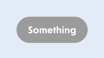
That looks comfortably numb to me. Whenever the button needs to be disabled, we’ll add the button--disabled modifier to make it gray. But it’s not numb enough yet: It can still be focused and triggered both by a pointer and from the keyboard.
Darn, this is getting tricky.
Not only that, but the button shouldn’t be accessible in the tab order, meaning that the tabindex attribute should not be there. And we need to check whether the button has the disabled state and then stop triggering our function. Also, this modifier could be applied dynamically. While it’s not a problem for CSS to match elements with selectors on the fly and apply styles, we might need some sort of mutation observer to trigger other changes for this button.
I know, right? We thought this would be a simple little button that triggers a function and has a disabled state. We’ve tried to make it right with accessibility and all that stuff, and now we’re deep in this rabbit hole.
Let’s grab some takeaway food. We won’t be home for dinner by the time we finish and properly test this. Bloody W3C! Why don’t they try to make our lives easier? As if they care about us!
As the matter of fact, they do…
Let’s take a few steps back before jumping into this mess. Why don’t we try to do these things using the <button> element? It’s got some useful tricks up its sleeve, not just the browser’s ugly styles. Oh, and don’t forget type="button" — you don’t want the popup’s “Close” button to accidentally submit the form, because type="submit" is the default value.
Apparently, when the <button> is focused and the space bar or “Enter” key is pressed, it will trigger the click event, just as mobile devices do when they get taps, pats, licks or whatever else they’re capable of receiving today. One event listener fewer in our code! Nice.
// A click is enough! button.addEventListener('click', doSomething); As for the disabled state, the disabled attribute is available for the <button> element, as well as for all form elements, including <fieldset>. No kidding. Did you know that you can disable a whole bunch of inputs grouped together just by applying a single attribute to the parent <fieldset>?
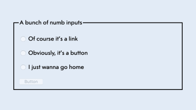
<fieldset disabled> <legend>A bunch of numb inputs</legend> <p> <label> <input type="radio" name="option"> Of course it’s a link </label> </p> <p> <label> <input type="radio" name="option"> Obviously, it’s a button </label> </p> <p> <label> <input type="radio" name="option"> I just wanna go home </label> </p> <button type="button">Button</button> </fieldset> Now you know! This attribute does not just disable all events on form elements, but also removes them from the tab order. Problem solved!
<button disabled type="button" class="button"> Something </button> But wait, there’s more! It also triggers the :disabled pseudo-class in CSS, meaning that we can get rid of the BEM modifier to declare styles and use the built-in dynamic modifier instead.
.button:disabled { background-color: #9B9B9B; } As for the browser’s ugly styles, we don’t have to use all of Normalize.css to fix a single button. Use it as a source of wisdom: The three extra lines below will fix most of the annoying differences from the <div>. If you ever need more, you can copy the relevant parts from it.
.button { font-size: 100%; font-family: inherit; border: none; } Done. HTML is not so bad after all!
But if it surprises you now and then, make sure to check the HTML specification for answers. It’s gotten much friendlier over the years, and it’s full of good usage and accessibility examples. And, of course, good ol’ HTML5 Doctor is still a reliable place to figure out the difference between the <section> and <article> elements and to check whether the document outline is a thing yet (not really). There’s a good chance you’ll also end up reading the HTML documentation by Mozilla, and you won’t regret it either.
This task is now done! What’s next? A dropdown carousel calendar with a search field? Oh my! Good luck with that. But remember: the <button> is your friend!
Further Reading on SmashingMag:
- How To Design Better Buttons
- Building Inclusive Toggle Buttons
- Ghost Button Design: Is This Really Still A Thing (And Why)?
- Design Patterns: When Breaking The Rules Is OK
 (dm, ra, il)
Articles on Smashing Magazine — For Web Designers And Developers

