A Bundle of Abstract Shapes is a New Way to Decorate the Homepage
It is no secret that the ‘welcome’ area plays a significant role in establishing good relationships between the owner and the online audience at the outset. It is responsible for creating the first impression that we all know is critical. It is like the packaging of a product that sells the goods to the buyers. The more unique and eye-catching it is the better.
Standing out from the crowd – is a time-proven way to force the homepage work for you and bring benefits. You can use a picturesque panoramic photo shot, spectacular image, lavish illustration, surreal rendering, traditional clip, interactive video or even minimalistic solid color canvas to brush up its appearance; however, that all sounds a bit banal.
These are trivial methods that have been adopted by millions of people. Though it is hard to say that they do not work, they have their own advantages. However, how about a relatively fresh solution that will give your landing page piquancy that is so necessary to excel from the others? Today we are going to introduce you to a tiny trend in decorating front pages that implies a bundle of abstract shapes.
It can be a mess of squares, circles, triangles either solid or outline, or it can be a symbiosis of irregular geometric shapes chaotically scattered throughout the browser window. They can be static, dynamic and even granted with interactivity.
They can be placed against a clean monochrome background or on the contrary against a fancy image. Want to see it in action? Dive into our collection that has 20 examples of this new trend.
The Use of Shapes to Spice Up Web Design
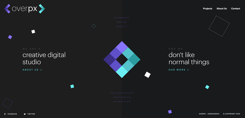
Overpx
Overpx utilizes squares in its brand identity so that a bundle of quadrates of various size, color, and style chaotically arranged across the ‘welcome’ screen ideally fit the theme and help to strengthen the aesthetics.
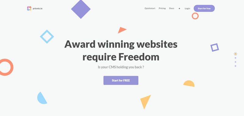
Prismic
Much like in the previous example, Prismic’s logotype has a powerful geometric vibe that sets the tone for the whole design. As a result, a pack of geometric shapes that are soaring in the page catches the mood and finishes off the theme.
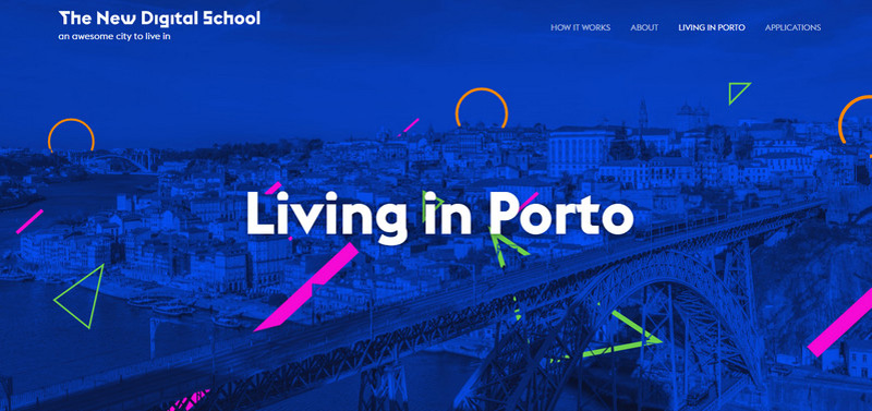
The New Digital School
The homepage of The New Digital School is an excellent example of utilizing abstract shapes in tandem with the image backdrop. The solution looks pretty original and showy.
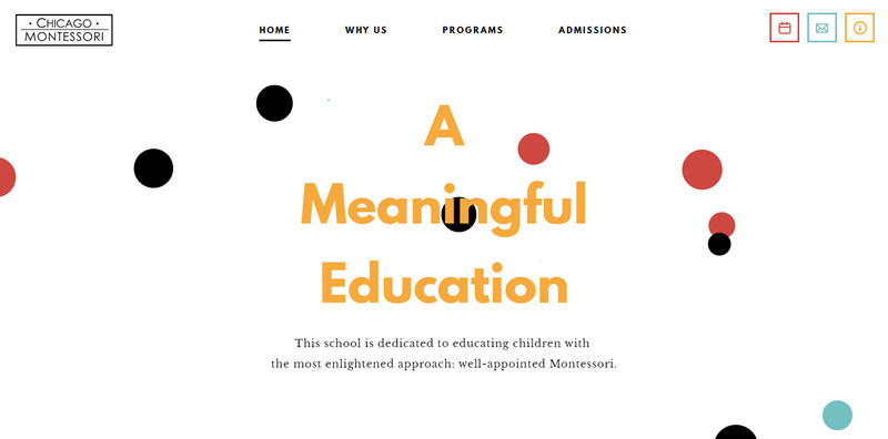
Montessori in Chicago
The ‘welcome’ section breathes with cleanness and neatness due to its spacious feeling and predominant white color, yet it does not look boring. A pack of flat circles that are set in motion saves the day and brightens up the atmosphere.
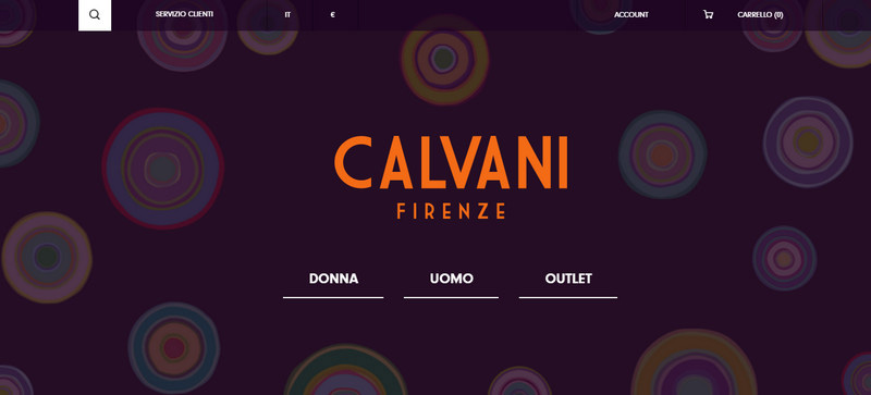
Calvani Firenze
Calvani Firenze has a static patterned background with a subtle retro feeling. It looks extravagant, fancy and at the same time elegant and exquisite.
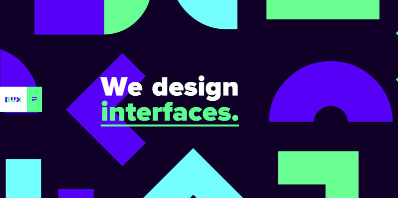
DUX
DUX is marked not only by a gorgeous color scheme that certainly steals the show here, but also by an impressive take on a background that is somewhat reminiscent of the era of art deco. It looks original and innovative.
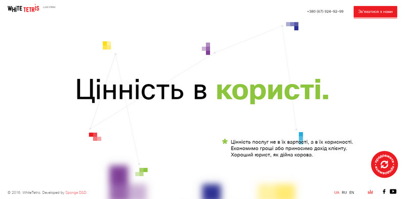
White Tetris
The website is called ‘White Tetris’ for a reason. Not only the tile-matching puzzle game that made a big furor in the late 80s is a part of brand identity, but it is also the main theme line that transforms the homepage into some kind of a playground.
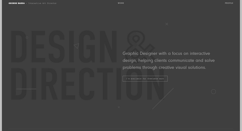
George Badea
While in the previous examples abstract shapes occupy a dominant position, here they play second fiddle and are used in the best traditions of the background. They just give a dark monochrome canvas a nice zest.
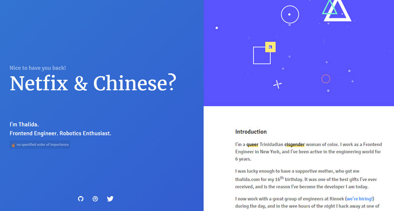
Thalida
Thalida is a minimal personal portfolio. Being based on a primitive modular system, it manages to strike the eye. It has beautiful design traits like an iFrame with a bunch of geometric shapes within it that are enriched with the mouse hover parallax to entertain visitors.
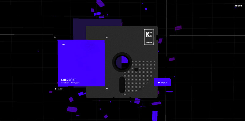
Arkade London
Arkade London is a music-related WebGL experiment with an intricate home screen that instantly grabs the attention. The composition is a mixture of automatically generated 3D geometric shapes, floppy disk and content area that are pulled by the parallax effect.
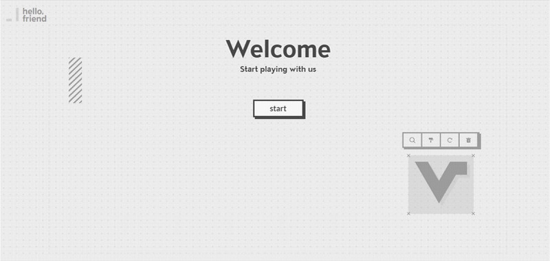
Friendly Projects
The front page portrays the tagline of the company’s portfolio, that is ‘Start playing with us’, imitating the environment of an image editor. This small abstract animation includes lots of interesting stuff to contemplate.
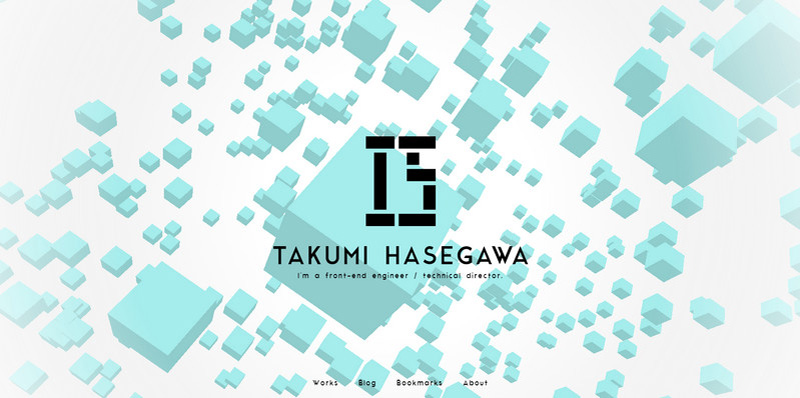
Takumi Hasegawa
Personal portfolio of Takumi Hasegawa starts to marvel visitors from the get-go. It is defined by a small WebGL experiment that demonstrates skillful metamorphosis of various geometric shapes.
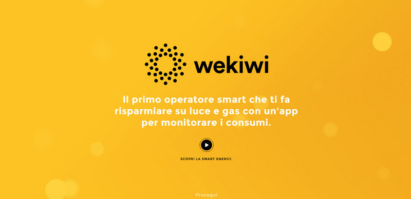
Wekiwi
Wekiwi’s homepage is populated with interactive circles that are dispersed along the hero section. They are made in a matching coloring that lets them serve as a subtle finishing touch to the design.
EXT Creative
Unlike the previously listed examples, the team behind EXT Creative adopts this solution pretty modestly. There is a bundle of hexagons both presented in solid and outlined styles that are placed in the top right corner and act as a focal point for visitors.
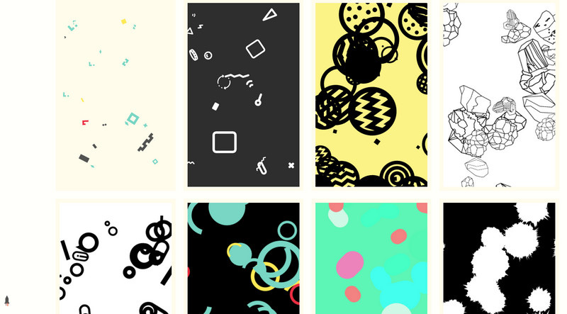
Doub
Doub employs numerous abstract illustrations with a strong agglomerated feeling as some kind of ‘curtains.’ When you hover the mouse cursor over the drawing, it quickly divides into two parts and shifts away revealing a title of the work. This is an interesting twist.
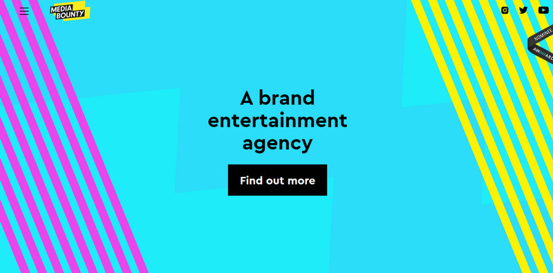
Media Bounty
Beautiful coloring where blue is the core tone goes nicely with a set of relatively wide diagonal stripes on the sides and zigzag-style background. The website has a magnificent aura of the abstract.
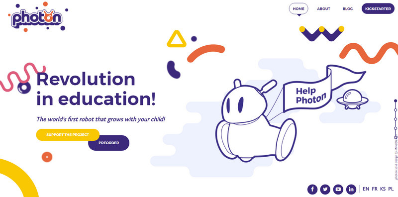
Photon Robot
The website looks playful and friendly. The cartoonish theme paired with a bright color scheme greatly benefits from the bunch of smooth and fluid geometric shapes that are scattered throughout the page.
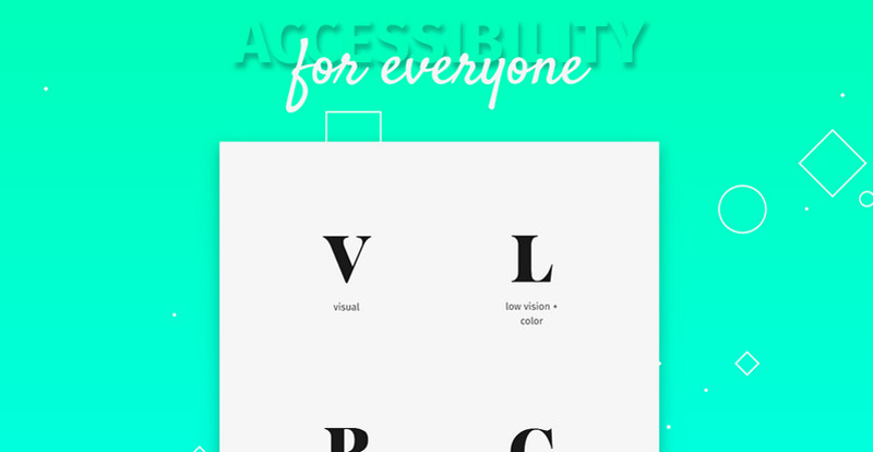
Learn Accessibility
The website radiates elegance and refinement. The sublime gradient used as a canvas in collaboration with a sprinkle of sleek line style shapes gives the page an exclusive outward.
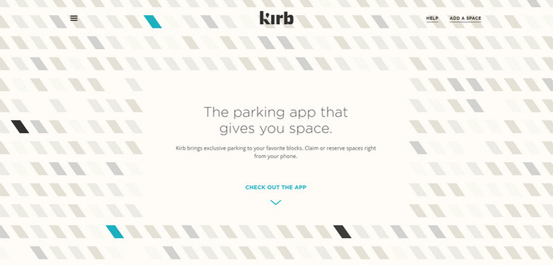
Kirb
Kirb has a smoothly animated background that skillfully illustrates parking spots. Use of the selection of tightly placed together parallelograms that vary in the shade was an excellent idea.
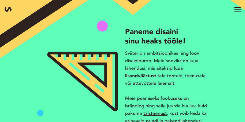
Loovburoo Sviiter
The website is a harmonious union of images, content and an illustrative theme. The latter gives the design a cutting-edge feel separating the portfolio from the others without hustle and bustle. Geometry and a subtle touch of Mexican style rule the roost here.
Conclusion
Using abstract shapes as a decorative tool has the potential of transforming into a viable solution. Of course, it is not a unique phenomenon; it is just a pack of plane figures that take off in all directions and sometimes set in motion, however as any art it can easily find its niche.
Do you find this growing trend to be steady in length of time or not lasting like any other craze? What example grabs your attention?

