Block Kit: Slack’s Contribution To Building A Better Collaboration UI
Block Kit: Slack’s Contribution To Building A Better Collaboration UI
Suzanne Scacca
(This is a sponsored article.) Over the last few years, there’s been a major shift in terms of the way companies work. As more businesses become location independent, collaboration tools have become the standard way in which teams meet and get work done.
That said, just because we have collaboration apps that integrate our connected business processes and tools, that doesn’t mean the experience always leads to optimum efficiency or productivity. Why? Well, sometimes an unfriendly UI gets in the way.
That’s why, today, I’m going to talk about Block Kit, Slack’s contribution to building a better collaboration UI.
For those of you who have built a custom Slack app (for the app directory or for internal purposes), this will be your introduction to the new design tool. For those of you who haven’t, that’s okay. There are some valuable lessons to take away from this in terms of what makes for an engaging workspace that will improve collaboration.
Developers, Do You Know What Slack Has Been Working On?
Slack has made huge strides since its launch in 2013. What originally began as a messaging app has now blossomed into a powerful collaboration platform.
As of writing this: Slack has over 10 million active users daily — and they live all over the world (over 150 countries, to be exact).
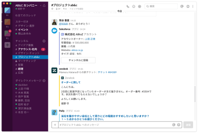
It’s not just individuals using Slack either — nearly 585,000 teams of three persons or more collaborate within the platform. 65 of the Fortune 100 companies also happen to be on Slack.

This is all thanks to the Slack API which has opened the door for developers to create and publish publicly available apps that extend the functionality of Slack workspaces.
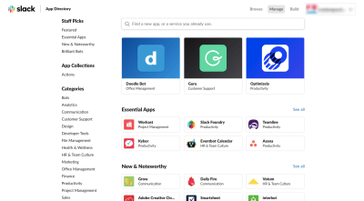
This way, Slack users don’t have to bounce between their most commonly used business tools. Related processes may take place all from within Slack.
Sometimes, though, what’s available in the Slack App Directory just isn’t enough for what your organization needs internally. You may be able to bridge some of the divides between your business tools with what’s there, but you might also find a reason to build your own custom Slack apps.
Introducing Block Kit From Slack
Here’s the thing: while Slack has succeeded in allowing developers to craft their own apps to enhance collaboration within the platform, how are developers supposed to know how to create a good experience with it?
Until recently, Slack’s API and app directory provided limited flexibility and control. As Brian Elliott, the General Manager of the Platform, explained:
“Today, all apps are forced into a limited set of ways to display rich information. If you’ve looked at and seen and used all of the different apps in Slack, many of them end up with the same layout regardless of which functionality they’re trying to deploy. When in reality what you need is a set of components that let you build rich interactive displays that are easier for people to comprehend, digest and act on.”
So, Slack developed Block Kit.
Block Kit is a UI framework that enables developers, designers and front-end builders to display their messaging apps through a rich, interactive and intuitive UI. Further, by providing a set of stackable UI elements or blocks, Block Kit now provides developers with more control and flexibility over their app designs and layouts.
Note: If you’d like to see Block Kit in action, join the upcoming Slack session, “Building with Block Kit”, where you’ll get a live product demonstration and see how easy it is to customize the design of your app.
Block Kit comes with two key components:
1. Block Kit Builder
Notice the similarity between this builder tool and many of the other tools we use to create websites and apps for clients:
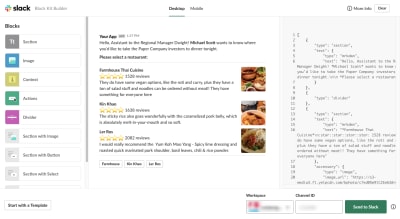
The building components are on the left. Simply click on the one you want to include and watch it get added to the preview of your app in the center.
Want further customization? Check out the text editor on the right. While Block Kit provides pre-made elements that follow best practices for designing messaging apps, you have the ability to make them your own if you prefer.
2. Block Kit Templates
While you can certainly craft a messaging interface from the Builder on your own, I’d suggest exploring the Templates provided as well:
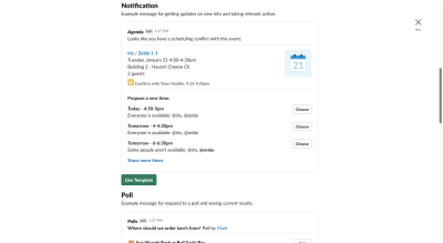
The Slack Team has already seen really useful cases of Slack apps in action. Needless to say, they know what kinds of things your organization might want to leverage for the sake of improved collaboration.
That’s why you’ll find common actions like the following already built out for you:
- Reviewing requests for approval;
- Taking action on new notifications;
- Running polls and monitoring results;
- Conducting a search.
Guru is one such tool that’s leveraged Block Kit to improve its Slack app:
Guru provides a database search function within Slack. Results are now quickly retrieved and more clearly displayed on the frontend of Slack.
The Keys To Building A Better Collaboration UI
Now that we’ve seen what’s coming down the line with Block Kit, we need to talk about how it’s going to help you create apps that lead to more productive collaboration.
Blocks
I recently spoke on the subject of Gutenberg and how designers can use it to their advantage. Although the new WordPress editor clearly has its flaws, there’s no questioning why the team at WordPress made the change:
Block builders are the future of web design.
“
I get that block builders tend to be the preferred tool for web designers and DIY users. Builders allow for visual frontend design and often include abundant customization options.
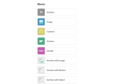
But Block Kit does much more than that, which means both designers and developers can build custom apps with ease.
Code
The key differentiator between something like a website builder and the Block Kit builder is the coding aspect.
In most cases, designers use page builders so they don’t have to bother with code. They might add some custom CSS classes or add HTML to their text, but that’s generally it. Developers don’t work like that though.
Block Kit includes a panel with pre-written JSON that developers can copy-and-paste into their own Slack app once it’s ready to go. Rather than leave developers to write their own code, Slack provides code that utilizes best practices for speed and design.
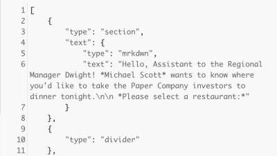
This enables developers to focus on making customizations instead of on having to build their apps from the ground up.
Consistency
When Slack users step inside the platform, they know what to expect. Every interface is the same from workspace to workspace.
However, when an API allows developers to build apps to integrate with those spaces, there’s a risk of introducing elements that just don’t jibe well. When that happens, the unpredictability of the interface can create confusion and hesitation for the end user. Ill-fitting layout choices can also harm the experience.
Block Kit enables developers to build apps with stackable UI components that have been tried and tested. When customizing an experience within an already established platform, it can be difficult to know how far you can take it — or if it’ll even work. Slack has taken those questions out of the equation.
Spacing
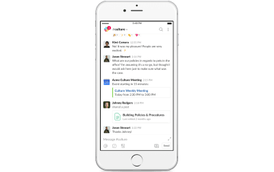
This is what the traditional Slack exchange looks like:
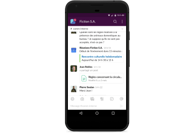
It tends to be a single-column, back-and-forth exchange. And this works perfectly well for Slack channels where collaboration is simple. Employees message about the status of a task. A client uploads a missing asset. The CEO shares a link to a press release mentioning the company. But not all workspaces are that simple.
Block Kit helps you maximize and enhance the space that your app’s features occupy. For instance, Block Kit enables companies like Optimizely to display pertinent information in two-column formats for better readability.
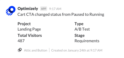
This is indeed a better way to share pertinent details in your team’s Slack app.
Rich Interactions
Another way to elevate your app is by turning the integration into one that’s rich with interactions.
Blocks have been specially developed to enhance the most commonly used elements in Slack collaboration. For example:
- Use the Sectional block for better organization.
- Use the Text block to customize how messages display.
- Use properly sized Image blocks so you can stop worrying about whether or not they’ll display correctly.
- Use Context blocks to show bylines or additional context about messages (like author, comments, changes, etc.)
- Use Divider blocks to improve the look of the app.
- Use Action blocks like menu selection, button selection and calendar dates to bring better features into your app and make them display more intuitively.
- Use 2-section blocks for cleaner layouts.
Doodle has a beautiful example of what can be done with rich interactions using Block Kit:
As you can see, users can work together to schedule meetings just as effectively as if they were using a third-party calendar. The only difference is that they can now do all of that within their Slack workspace.
Wrapping Up
Collaboration is an essential part of any organization’s success, and it doesn’t matter if it’s a team of 3 or a team of 300. But there’s a big difference between working together and productively collaborating.
Thanks to Slack’s API, developers have created some awesome ways to integrate related processes and tools into the platform. And thanks to Block Kit, those external contributions won’t disrupt the experience if the design of the elements falls short.
With intuitive block-building capabilities, developer-friendly coding options and more, Block Kit is going to help developers bring richer experiences and better collaboration to the Slack platform.
One last thing to mention:
Slack’s Frontiers conference is coming up soon. It’s going to be in San Francisco on April 24 and 25. If you’re planning to attend, note that the Developers track will include a full day’s training on Block Kit, including workshops, new feature demos, tutorials, as well as one-on-one mentoring. If you’re thinking about Block Kit, this is an opportunity you won’t want to miss.
 (ms, ra, il)
Articles on Smashing Magazine — For Web Designers And Developers

