Compact and Sleek Seamlessly Integrated Streamlined Nav Bars
Classic never gets old. Although the hamburger menu button is listed in website design trends of this year and other dynamic, multimedia-powered solutions are gaining more and more popularity, a time-proven way of arranging menu options in a horizontal line and compactly placing it on the top of the page is still a favorite choice for designers.
As well as its compact size, it has another great advantage over others: everyone knows how to use it. It is simple, straightforward, transparent and obvious. Although it is deprived of unexpected behavior or the wow factor, it is a viable and feasible way to make visitors feel that they are in control. The more so, you can also add some icing on the cake by transforming it into an integral element of a theme.
Take a look at our twenty fresh and outstanding examples of website designs that opted for compact, streamlined navigation bars and did not go wrong. Maybe you will find a spur for your next project.
Compact Streamlined Navigation Bars
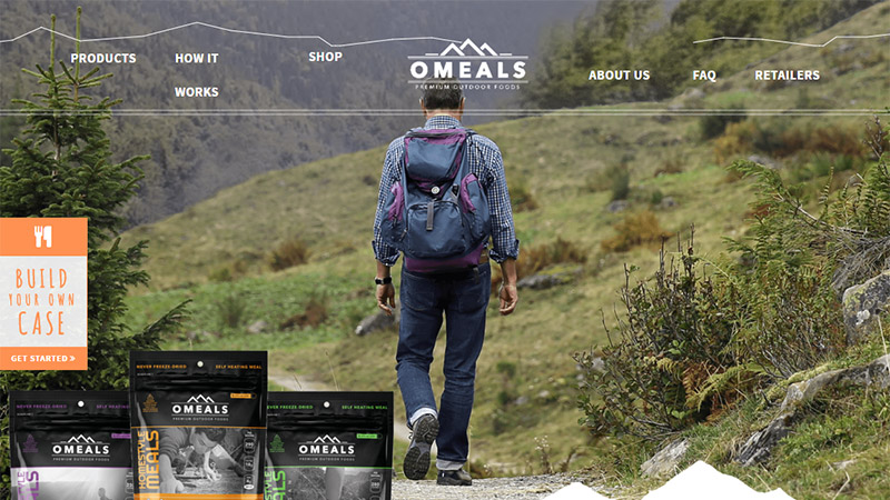
Omeals
The homepage of Omeals is enriched with landscape photos, so it is not surprising that the design of the main menu also has some subtle hints of the natural theme. The top part is marked by a thin zigzag line that imitates mountains. The trick helps the component to blend into the composition.
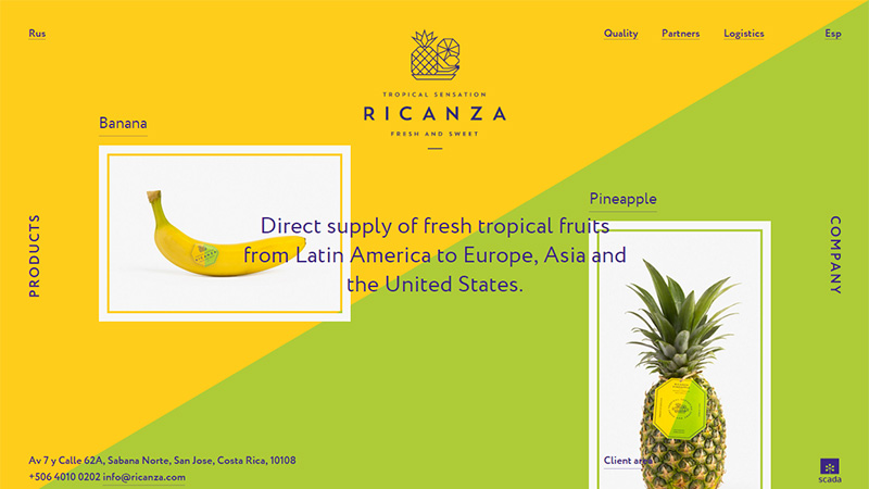
Ricanza
Ricanza has a vibrant and energetic landing page. Not only does the coloring play a vital role here, but also asymmetrical organization puts its two cents in by instilling a sense of motion. In such a complex environment, the compact, sleek and primitive navbar seems to be a wise decision that does not distract attention from the scene and at the same time offers visitors an intuitive way to move around.
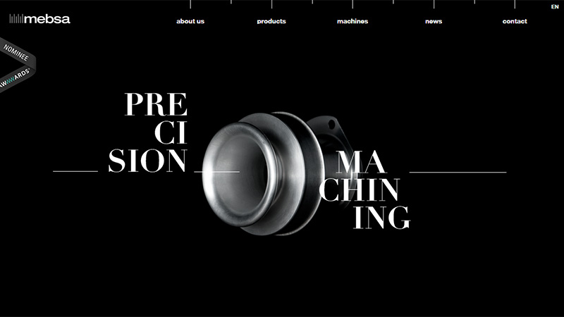
Mebsa
Mebsa bets on a generous amount of fresh air that naturally directs the attention towards the central image and title. Much like the logotype, the navigation occupies just a small strip on the top of the screen yet thanks to startling contrast it stays in focus.
Colicons
The team takes the traditional route regarding its relatively small menu that includes just four items. It has been placed in the middle of the header section, along with the logotype, shopping cart, and several extra buttons. Although it is pretty compact, it strikes the eye.
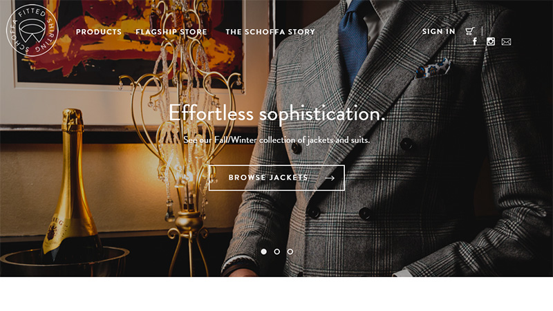
Schoffa
Schoffa exudes an image of luxury and refinement; so does the navigation. It is sleek, delicate and is set in an elegant yet sharp typeface. Unlike the majority listed above, it is located on the left side, right near the logotype.
Schwarzhaupt
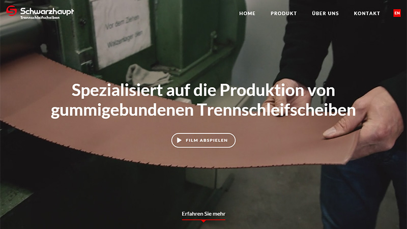
Schwarzhaupt utilizes a splendid high-quality image background that aims to grab the biggest piece of the pie. However, content, as well as the brand identity and navigation naturally stand out. The menu is situated in the upper right corner and frees the space for other vital things.
Quiver
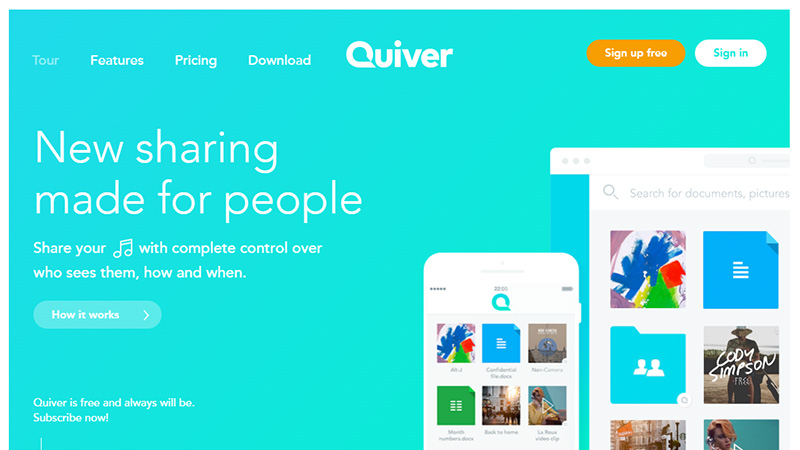
Quiver has a clean, tidy and minimalistic design that, thanks to a gorgeous bluish gradient, excels from the others. As befits, the header section is reserved for a sleek, streamlined nav bar that takes up the upper left corner and nicely complements the rest of the scene.
Le 28 Lille
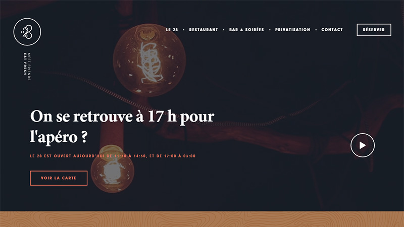
Le 28 Lille has a big navigation bar that seizes almost the whole width of the browser screen. It is traditionally placed on the upper part of the page and stands in sharp contrast to the background. Although each option is set in a small font size, this fact does not impair its readability.
Ray Creations
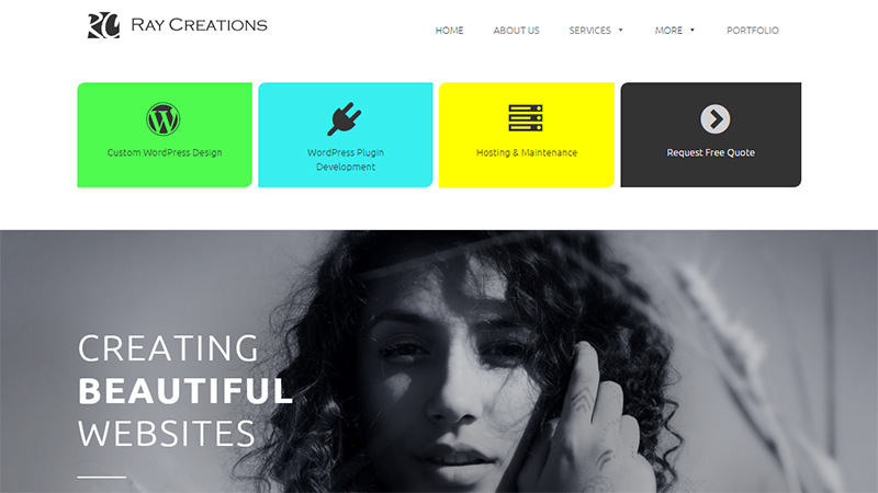
Ray Creations gives preferences to its range of services rather than a primary menu. The latter is seamlessly integrated into the design and does not draw extra attention. Menu options are tightly placed together and arranged in one line at the top.
HKG
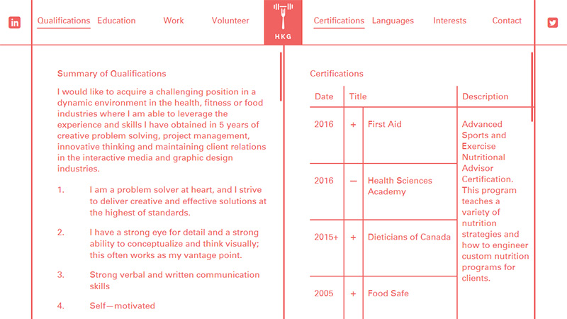
HKG is marked by consistency of style. Every detail contributes to the general feeling; and the main menu is no exception. It supports the theme, looks elegant yet formal and serves as an integral part of the composition.
Citizen
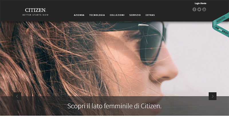
With such an impressive image background, it is quite difficult to give priority to other details, such as navigation. However, the team has managed to overcome this obstacle and make the menu excel from the flow by equipping it with a firm, solid background. A delicate and exquisite typeface that is used for displaying links goes perfectly well with the luxurious atmosphere of the website.
Liechtenecker
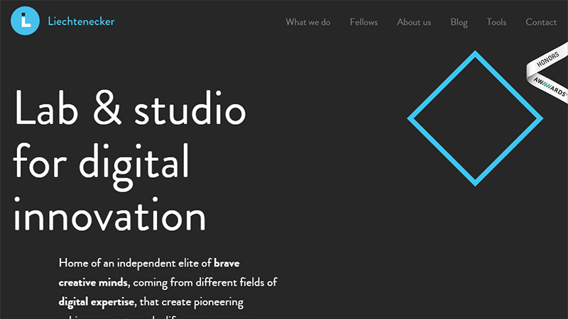
Liechtenecker radiates a subtle geometric vibe. The page feels spacious and accessible. The compact nav bar that is located in the upper right corner meets the theme and fits here like a glove.
Luks Vier
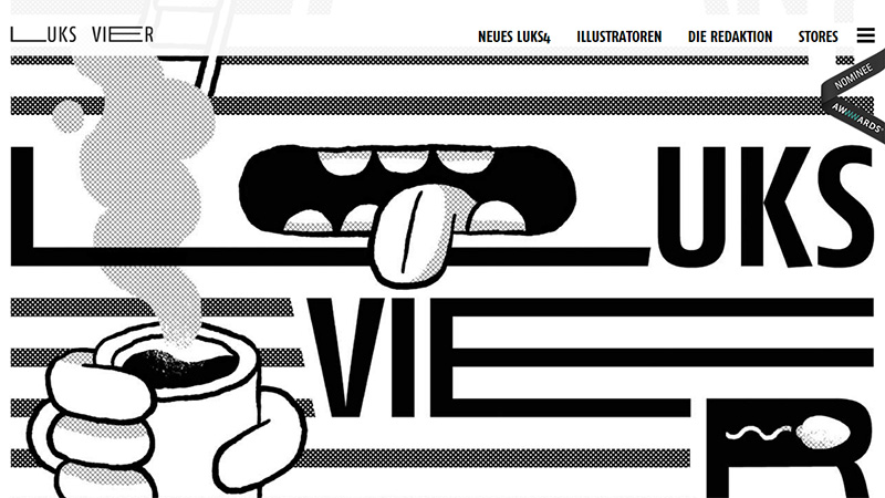
Luks Vier is a pretty original website that leaves no one indifferent. The homepage includes several navigation menus: the first one is a classic inline presentation of links while the second one is a trendy hamburger menu button. Together they cover all the structure.
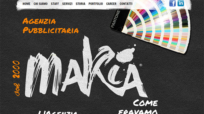
Makia
Makia has a complex environment that delivers artistic aesthetics. There are realistic renderings that are scattered throughout the scene, impressive yet soft and elegant brush script that is used to show titles and content, glossy social media buttons and some others. Nevertheless, the navigation holds its particular place. Not only does it strengthen the general atmosphere but it also looks prominent and robust.
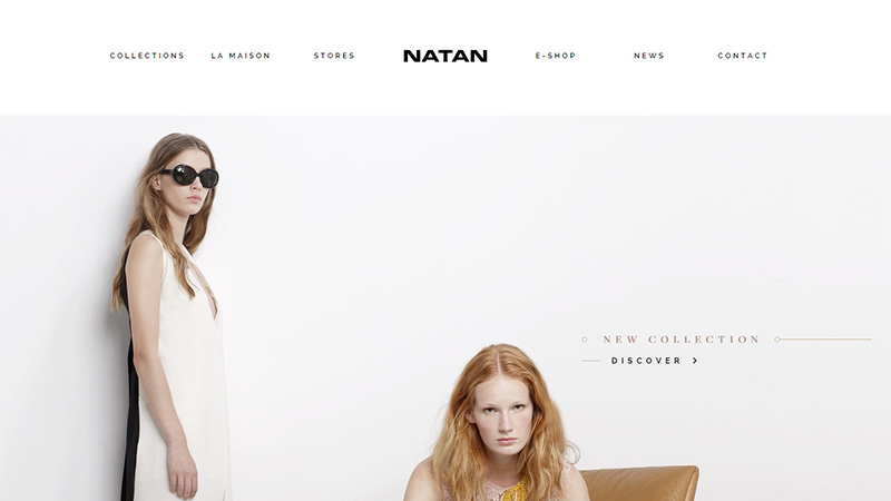
Natan
Natan tries to establish a casual language, and the primary menu helps to achieve this task. It is refined, polished and crisp. It is broken into two parts to form with the logotype a single space. Although it is super light and tiny, yet it is exactly what is needed for this interface.
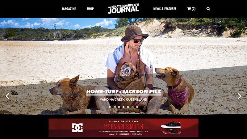
The Skateboarder’s Journal
The team has provided the navigation with plenty of space. The component takes up a relatively wide strip on the top that is based on a clean solid dark backdrop. As a result, links have got more visual weight and importance.
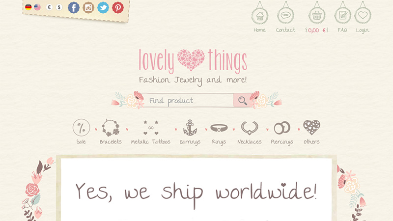
Lovely Things
The project has a powerful artistic nature. Nothing has been left behind: every detail makes its significant contribution. Even the relatively compact navigation menu is spiced up with a lovely doodle appeal and sketchy appearance. Each option is presented as an icon with its accompanying title.
Habanero
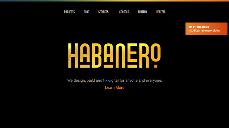
The team has visually stretched the primary menu and set it in a contrasting color and graceful type. In such a way, it feels more important and weighty, grabbing as much attention as the content on the bottom.
PeopleFirm
PeopleFirm has a properly-aligned, streamlined navigation bar. It completes the tone of the project and looks tidy and neat. Although it lacks in contrast and sharpness, however, it is still readable.
David Bastian
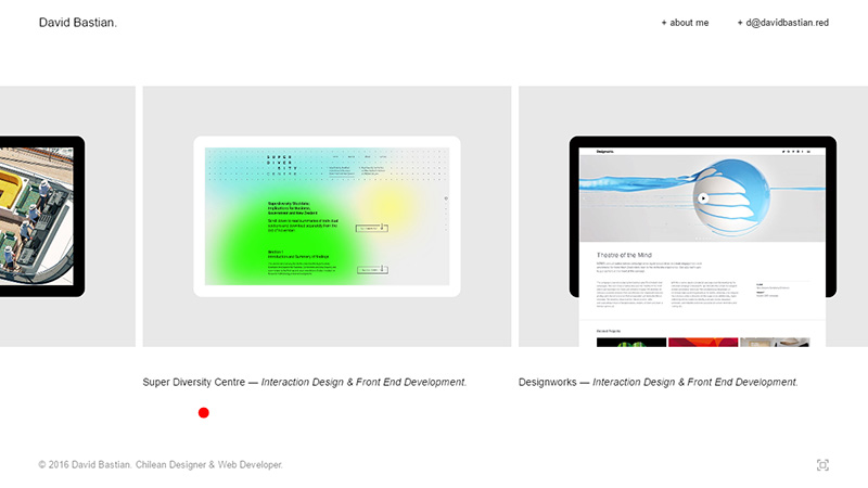
David Bastian gets straight down to business and bombards the online audience with his incredible portfolio pieces. Since everything is centered around the work exhibition, it is predictable that the navigation performs a secondary role, occupying little room in the upper right corner. However, in this case, such sacrifices are justified.
Conclusion
It may just seem that a streamlined navigation bar is a relic of the past. As its continued use shows, this ‘one-size-fits-all’ solution goes perfectly well with numerous projects and finds its rightful place in various compositions. Maybe it is a bit boring, however, it provides visitors with a handy and natural way to move around and this feature is worth a lot.
What do you think about this type of navigation? Is it cool? Is it friendly? Is it lifeless and stale? Share with us your opinion.

