
Web Quality Assurance: From User Requirements To Web Risk Management
As a chemist by trade, I received a Master’s degree in Quality Management and Quality Control from Bordeaux University. My initial career was in the wine industry, ensuring the quality of the laboratory’s operations and the analyses that came out of it. As a side note, the last question of my job interview as quality assurance manager of the laboratory was “Do you like wine?, I said I didn’t. They said, “you’re hired”.
In 1999, I decided to apply my quality management insights to the web. I quit my job in the wine laboratory. I immediately started work on answering the question, “What does quality mean for a web user?” That also means answering this other question: “How can one evaluate, manage and guarantee the quality of a website?”
Quality assurance (QA) is defined as:
“A program for the systematic monitoring and evaluation of the various aspects of a project, service, or facility to ensure that standards of quality are being met.”
— “Quality assurance,” Merriam-Webster
QA is a central part of any quality management approach and all quality management is very closely linked to risk management. In most sectors where risks are understood and perceived as critical, quality assurance inevitably develops. This is why quality assurance is a pillar of the aeronautics, automotive, health, and even video game industries, and not many would dream of questioning it.
The search for the answers to questions related to quality assurance led me to create my company and to produce a few documented checklists and standards about open data, performance and web accessibility, including the two firsts versions of the French national standard on accessibility (“RGAA” which stands for Référentiel Général d’Amélioration de l’Accessibilité). It also led me to write a book about web quality assurance and the forewords of eight more books about UX, ecodesign, CSS, frontend development, amongst others. Answering these questions is also the reason why I am still passionate about web quality assurance years later. And, it is these same questions that lead me to you and your web projects. By the way, now I like wine, from everywhere.
What Does Quality Mean For The Users?
When delving into the concept of website quality assurance back in 2001, we started with a simple question: “What does quality mean for the users?”
According to the ISO (International Organization for Standardization), the term quality is:
“…the degree to which a set of inherent characteristics of an object fulfills requirements.”
Asking this initial question about a website involves analyzing the user requirements. During our research, we created a model which is comprised of five fundamental user requirements:
- Visibility is the ability of a site to be encountered by its potential users.
- Perception represents its ability to be usable and positively perceived by its users.
- Technical concerns its ability to function correctly.
- Content covers the ability to deliver quality information.
- Services determine its ability to offer, accompany, and/or generate quality services.
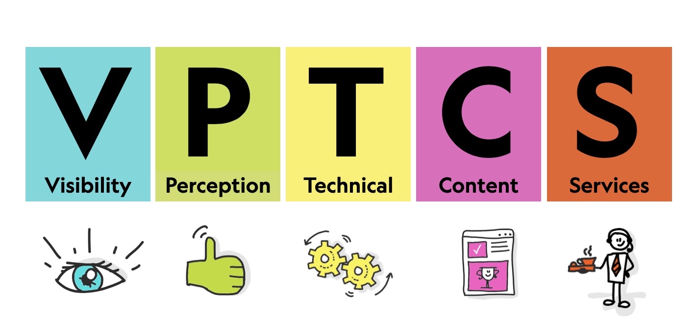
There are many user requirements that are important for the users. For instance, these five requirements don’t focus on emotions (pleasure, attachment, gratitude, and so on) but only on the success of fundamental requirements. The model doesn’t aim to identify exhaustively all user requirements. However, it can be used to classify and order them. We called it the VPTCS model.
It tells us that no matter what the product or service is, or who the users are:
Users need to be able to find the website. They need to be able to use and perceive it correctly, they need the website to function correctly, they need high-quality content, and they also need to have a good experience after their visit.
How Does Web Quality Assurance Relate To UX And UI?
To work on web quality assurance, we also had to work on another part of the quality definition: the inherent characteristics of an object. That means describing what a website is. That led us to work on the structure of the UX (user experience) and how it’s related to the UI (user interface). To do that, we also used the VPTCS model (Visibility, Perception, Technical, Content, Services).
The model reads in chronological order relating to the user’s visit to the site and the three major phases: before, during and after.
- V: before the visit
- PTC: during
- S: after the visit
As you’ll see below, we’ve decided to use the VPTCS model to distinguish the total user experience (UX) from the user interface (UI). UI is covered by the three central sections of the model: Perception, Technical and Content, and is only one part of the journey.
UX starts before, and ends after, UI.
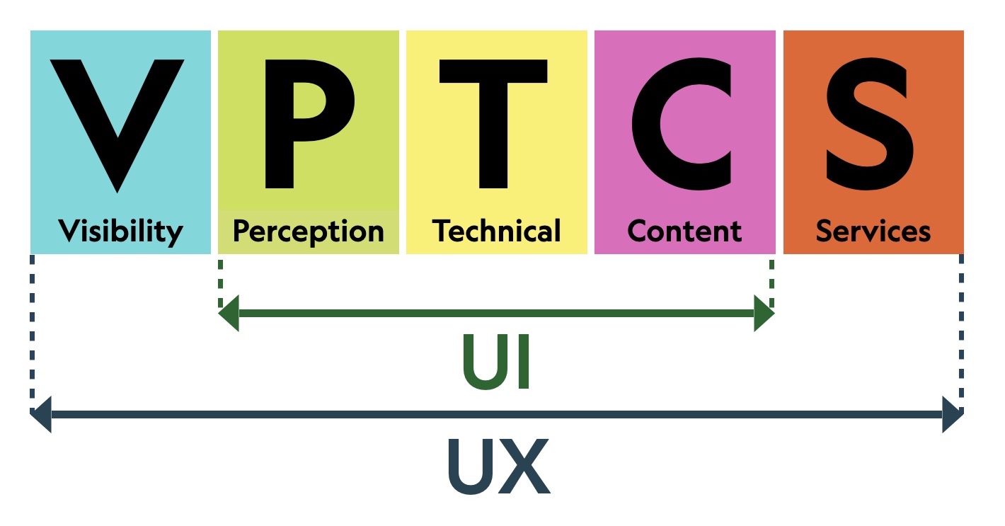
Visibility leads us to take an interest in why and how the user arrived. Visibility starts before the user encounters the interface. For instance, the way the website is described in search engine result pages or the way people talk about the website on social media; it is all part of the user experience.
On the other end of the model, the Services section leads us to have a look at what happens after the user has left the interface. For example, on an e-commerce site, your experience doesn’t end the moment you leave the site, it continues. For instance, when you can’t reach customer support or you have to wait 20 minutes to talk to a live person, when your package is delivered damaged or partially opened, or when you realize that the product description on the website wasn’t accurate. In these instances, you’re no longer using the interface itself, but interacting in a real-world user experience.
Though the VPTCS model provided us a point of view on what a website is and what the requirements of the user are, we also wanted to determine the consequences for the stakeholders of the web project i.e. those designing, producing, developing, commercializing, or marketing the website.
Which Trades Are Involved In Web Quality Assurance?
“In order to achieve high-quality user experience in a company’s offerings there must be a seamless merging of the services of multiple disciplines, including engineering, marketing, graphical and industrial design, and interface design.”
— “The Definition Of User Experience (UX),” Don Norman and Jakob Nielsen
When we started working on web quality assurance, we found that identifying user requirements (Visibility — Perception — Technical — Content — Services) wasn’t enough. To gain professional buy-in to the quality assurance approach we had to identify the different disciplines that are involved in a web project and relate them to the requirements. In mapping the different trades, you can see each and every trade is necessary and they all have at least one point in common: the user.
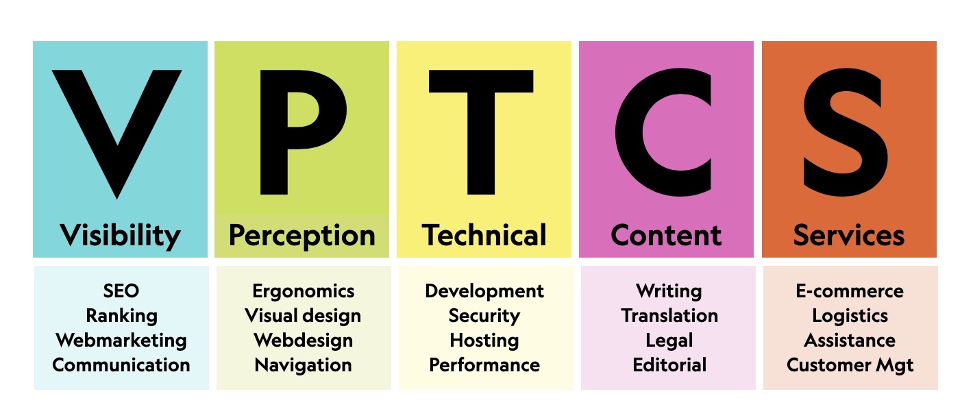
At this point, we had a set of tools to understand a set of requirements on the user side, and the way web trades were related to these user requirements.
Working on the concept of quality is always a multidisciplinary approach. Each user has their own subjective view about the quality of a product. Some of the users are more sensitive to technical problems, others are more preoccupied with the quality of the content, some are deeply impacted by the quality of the services. Evaluating the quality can’t be fully objective, but it’s always possible to convert general user requirements into more actionable tools. To do so, one of the simplest tools one can create is a checklist, and we did just that.
Converting User Requirements Into An Actionable Checklist
“We need a different strategy for overcoming failure, one that builds on experience and takes advantage of the knowledge people have but somehow also makes up for our inevitable human inadequacies. And there is such a strategy — though it will seem almost ridiculous in its simplicity, maybe even crazy to those of us who haven’t spent years carefully developing ever more advanced skills and technologies.
It’s a checklist.”
— Atul Gawand, The Checklist Manifesto
We decided to translate the VPTCS model into individual rules by applying the following checks:
“Are there rules that are universal, realistic, sustainable, directly verifiable by end-users that have the consensus and added value for users?”
In 2004, we submitted a set of rules to the Opquast community of web professionals in public online workshops. We gave them the following criteria for submitting rules: each rule must have a described impact on users, must be realistic, must have consensus, must be universal and verifiable by the end-user. This set of “rules to create rules” is a sanity test to keep only the rules that can be accepted and used by the community.
Since then, we have produced 4 versions of our checklist — in 2004, 2010, 2015, and 2020. In total, we have collected more than 10,000 comments, discarded more than a thousand quality rules, and kept only 240 which passed the sanity test. This checklist isn’t intended to replace other privacy, security, accessibility, SEO, or ecodesign checklists or standards. It’s only meant to list the main checkable, realistic, useful and universal, non-numeric rules that apply to a web project.
The key was and remains acceptance by all web professions and that’s also the reason why we decided to work under an open license1. We created cards that list the objectives (added value for users), how to implement the rule (implementability), and how to verify it (verifiability). As a side note, the rules can’t contain numeric figures. We learned this the hard way: after releasing the first version, one of the rules stated that the images and the homepage together couldn’t exceed 150ko. It looked realistic in 2004 but the rule was already irrelevant by 2005. We need the rules to stay relevant for at least five years, and determining numerical limits seriously hurts the consensus we aim to reach. So we added this constraint to our sanity check.
1 The rules are under an open license CC-BY-SA (Creative Commons Attribution–ShareAlike License).
The 240 rules have an impact on each and every role in a web team, from developers to customer support, from management to operations, and from UX designers to content producers. For instance, we have 35 rules out of 240 that relate to ecodesign, 23 to security, 37 to SEO, 126 to accessibility, 38 to e-commerce.
The most logical and obvious approach is to use checklists (this one or others) as conception or pre-launch tools. In our case, that means this full checklist can be used for audits, with the help of the control section of each rule. It also can be used during the conception and design process using excerpts of the checklist.
However, we found the audit or pre-launch was probably not the first thing needed to efficiently start a web quality assurance process. Before you try to comply with the rules, you need to ensure that the whole team involved in a web project understands them, even when the rules don’t seem directly related to their role on the project.
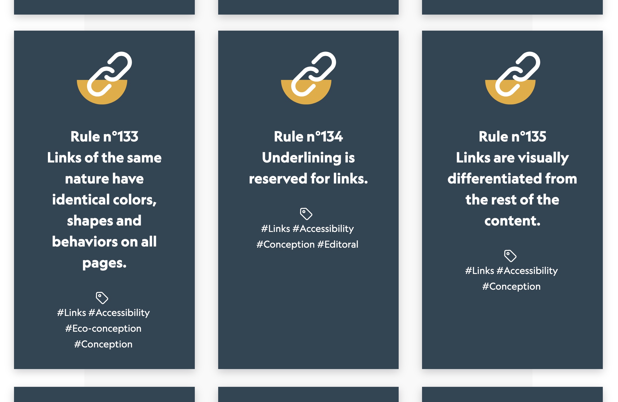
The latest version of the checklist (240 cards — 2020) in French, English and Spanish: https://checklists.opquast.com/en/web-quality-assurance/.
How To Use Web Quality Assurance Checklists?
At a first glance, the most important thing to understand in a rule is the rule itself. But maybe the reason why a rule exists is more interesting and insightful. Let’s look at an example with our Rule n°233: “The text of internal PDF documents can be selected.”
Let’s list the user contexts where compliance to this rule can be useful :
- The content of the PDF file can be vocalized with a screen reader;
- The content of the PDF file can be indexed on search engines;
- The content of the PDF file can be searched;
- The content of the PDF file can be translated;
- The content of the PDF file can be copy-pasted.
These user cases can concern five different users:
- A blind user using a screen reader;
- A user who searches for content on a search engine;
- A user who searches a determined piece of content in the document;
- A user who doesn’t speak the language of the document and needs a translation;
- A user who wants to reuse a part of the content of the document.
Alternatively, it can also concern the same user who will experience the five cases above. For example, let’s imagine a Bulgarian scientist who’s blind, searching for where he is cited on the web, finds a PDF in English, then searches her/his name in the pdf file, translates it automatically to Bulgarian and finishes by copying and pasting a part of the content in his/her portfolio.
That means that with only one rule out of 240, one can identify five contexts where the rule will be useful for the users. It means that it’s a way to trigger empathy for the users who are on the other side of the screen in the diversity of their contexts.
Therefore, the first thing for a professional considering a quality rule is not how to apply the rule itself, but to understand what it is, who it is for, and why it exists. All the rules have a benefit for the users, but the reality of the web project is that professionals don’t have unlimited means. They, therefore, need to make decisions and finally, the professionals need to be able to make informed decisions on whether to apply a rule or not.
As a web professional, and despite any limited means of the web projects in which you participate, you must be able to objectively evaluate the quality of a site, to argue and explain the basis of that evaluation, to identify the risks, and arbitrate in full knowledge of the known facts.
Quality assurance needs to become a primary reflex for integrated organization-wide teams — web designers, management, sales, developers, marketing, after-sales, delivery drivers — all the people involved in the user experience.
At this point of our reflection, we have an initial set of tools to deploy web quality assurance, but that doesn’t mean we have everything that’s necessary to integrate web quality assurance and web quality management into our processes.
To go further, we need to look at the major risks of the web project.
Where Are The Major Risks Of A Web Project?
“A risk assessment is the combined effort of identifying and analyzing potential (future) events that may negatively impact individuals, assets, and/or the environment (i.e. hazard analysis); and making judgments “on the tolerability of the risk on the basis of a risk analysis” while considering influencing factors (i.e. risk evaluation).”
— “Risk assessment,” Wikipedia
Our entire industry has learned the hard way that, yes, web activities do carry abundant risks. Likewise in other industries like aeronautics, automotive or health; each risk must be classified, taking into consideration whether it’s critical or not (hazard analysis).
Appreciating a risk as critical is always partly subjective. Therefore, in the case of the web industry, I found four subjects where the risks are particularly critical. Three of these subjects (accessibility, security and privacy) have potential major consequences for the users. These consequences can also negatively affect your brand image and business. They can lead to insurmontable issues for the users, revenue losses and litigations.
The last subject I chose (ecodesign) is also critical from a systemic point of view with major potential consequences on our personal and professional lives.
There are plenty of issues that may really harm your business (poor performance, bad UX design, insufficient SEO, and so on), but in general, they won’t do as much harm as the four I identify below. The four listed subjects are by far the most critical for you, the companies and clients you work with, and, first and foremost, the users.
These four subjects and their associated risks are present in all web projects. Let’s have a look at them:
- Accessibility
Is my site accessible to people with disabilities? Am I discriminating against certain people? If so, what are the risks?
In a report published by Accessibility.com, it was estimated that 265,000 website accessibility demand letters were sent to businesses last year, resulting in U.S. companies spending perhaps billions of dollars in legal costs as a direct result of inaccessible websites in 2020 alone (Source: BOIA). - Security
Is my project endangering my organization, my colleagues, or the users? If so, what are the risks?
In 2020, according to govtech.com, there was a 141% increase in compromised records from data breaches compared to 2019. By far the most records exposed in a single year since they have been reporting on data breach activity (www.govtech.com). They also reported that the average cost of a data breach is $ 3.86 million as of 2020. (Source: IBM). - Privacy
Am I putting my company’s data, my users or my employee data at risk? What are the potential consequences?
The General Data Protection Regulation (GDPR) came into effect in May 2018. The GDPR allows the EU’s Data Protection Authorities to issue fines of up to €20 million ($ 24.1 million) or 4% of annual global turnover (whichever is higher). […] Penalties under the GDPR totaled €158.5 million ($ 191.5 million). (Source: Tessian). - Ecodesign
What is the environmental impact of my project? To what extent does my project contribute to climate change?
The non-profit organisation The Shift Project looked at nearly 170 international studies on the environmental impact of digital technologies. According to the experts, their share of global CO2 emissions increased from 2.5 to 3.7 percent between 2013 and 2018 […] The Borderstep Institute compares various studies and comes to the conclusion that the greenhouse gas emissions caused by the production, operation and disposal of digital end devices and infrastructures are between 1.8 and 3.2 percent of global emissions (as of 2020). (Source: RESET).
We cannot afford to ignore any of the risks mentioned. Over the last ten years, these risks and their consequences have increased, causing spiraling costs, failed redesigns, lawsuits, cyber attacks, staff burnout, high turnover, environmental impact, and more. As we can see in the previous examples, all these have financial, human, social and environmental costs, all of which need to be avoided in our industry.
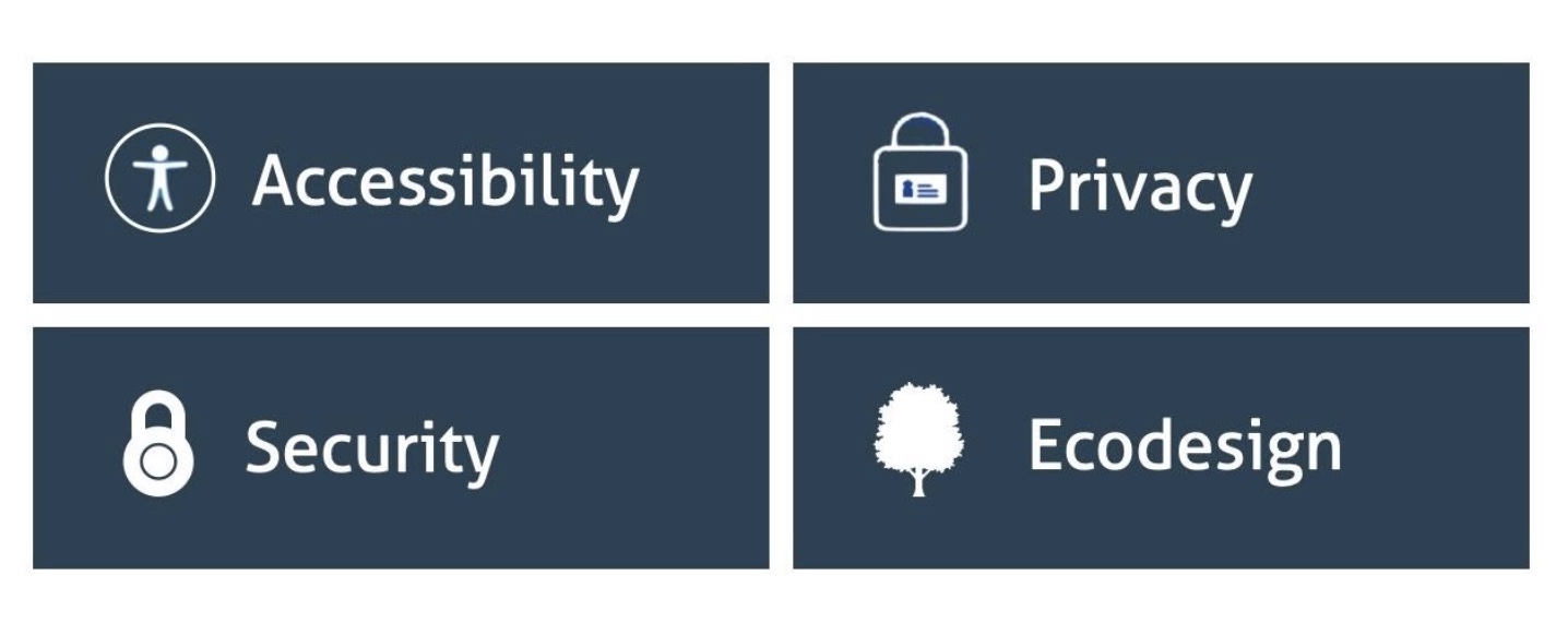
What we are seeing now with the web is just a very classic maturation phase of a young industry where, gradually, standards, methods, and frameworks unfold as the customers demand higher quality and providers set quality goals in order to achieve it. Disparate risks and domains like accessibility, ecodesign, performance, security, and privacy are becoming more and more structured, standardized, and subjected to national laws and regulations.
Let’s have a look at what emerged in established industries confronted with similar quality management equations to solve.
Toward Cross-Disciplinary Web Quality Management
At the turn of the ’80s, quality management professionals were mostly working on quality issues, using mainly the ISO9000 standard. Quality control, quality assurance, and quality management were the only matters I was taught around 1990. However, there were other people working on a different set of risks with standards: ISO14000 was the reference for the environment and ISO 27000 for IT security.
Compliance and deployment of these management standards were driven by distinct departments of industrial companies. At some point, because all standards were linked and probably because there were a lot of tasks and tools to mutualize, companies created HQSE (Heath Quality Security Environment) services. This kind of approach is called “integrated management systems”:
“Once upon a time, there was an H&S (health and safety) manager whose role expanded to an HSE (health, safety and environment) manager. At that same time, there was a quality manager whose roles were completely separate from the HSE supervisor. But as technology got more and more integrated into the workflow and as demand for speedy quality service and products increased, the roles have merged into one QHSE manager.”
— “Let’s Build,” Houdayfa Cherkaoui
There’s something really important to know about quality management or integrated management systems, and that is that they don’t “produce” quality, they don’t provide environmental or security compliance. They simply help the rest of the organization to control and improve these subjects. None of the people in these departments replace the experts, they just provide them with the tools, the standards, machine automation, and so on. They help everybody stay up to date and interface with the clients when a company has to prove it’ll be able to deliver a certain level of quality.
Now it’s time for me to take a bet on the future. As has happened in already established industries like aeronautics, automotive, and medicine, quality assurance has been introduced as a direct consequence of risk perception. The web teams already manage the risks separately, but while the users are concerned by all of them, we will need a cross-disciplinary approach that assembles all the subjects we have to deal with when building or maintaining a web project.
It’s too early to say exactly what will happen in detail, but what I envisage is the integration of a new layer of web QA which will assemble, sustain, and bring closer together the different web trades and realms.
What To Take Away With This Article
Along my journey (which I hope isn’t finished 🙂), I have learned quite a few things.
In order for us to deploy web quality assurance, we need to understand the user requirements and the consequences for web trades that are involved in a web project. Coming back to the VPTCS model, one of the most important things we’ve observed is that the Visibility and Services part are frequently underestimated by web teams — especially by website owners.
We have also observed that the two requirements that bring the highest value to the users are the content and services. However, it is frequently perceived that the Web professionals working in roles that fall under the Visibility, Perception and Technical categories are the most important in the web project. They can’t work without high-quality content and services (support, logistics, delivery, and so on.) which are seamlessly integrated within the web project team.
Another thing we learned is that UI is frequently perceived as a purely visual and ergonomic job. Showing that the UI is a mix of perception, technical and content helps create fewer misunderstandings between different teams working remotely. That leads us to the need for unified teams involving and making all trades work together.
There are many forms of quality assurance already in the web industry standards: regulations, unit testing, functional testing, automatic tools, manual audits, checklists, and so on. The web is seeing quality assurance increase gradually, but as far as I’m concerned, we are only at the very beginning of the road. As a start, checklists are very simple tools that can be used to reach compliance, but also to share a common culture and vocabulary.
Web teams can use checklists for compliance, but in my own experience, if you want to improve compliance and if you want web quality assurance to be sustainably deployed in your organization, it’s more efficient to first create a web quality culture with a common vocabulary and foundational framework to bootstrap from.
“63% of people who are in a digital transformation process say that culture is the number one barrier….56% stated cross-department collaboration as their 3rd largest challenge.”
The goal is to create a cultural foundation of sharing risks — like the one I mentioned and all the others — and responsibilities orientated to the users. A global set of rules is one of the solutions you can use to empower web teams and to create a global culture and vocabulary, but It also needs to be accompanied by a global mutualized risk management system for the web projects. This management system needs to take care of a global set of rules, standards and tools being able to call specialized experts for complex problems.
Web quality assurance can contribute towards there being more responsible professionals, trained and empowered as quality custodians to represent the users, the customers, and the citizens’ best interests.
The journey goes on.
Further Reading
- “Quality Management,” Wikipedia
- “VPTCS: A UX And Web QA Model (2001),” Elie Sloïm, Medium
- “The Web Quality Assurance Checklist,” Opquast
- “Integrated Management Systems,” ISO
Articles on Smashing Magazine — For Web Designers And Developers
