20 Responsive Grids to Master Adaptive Layouts
Everything begins with responsive design nowadays. It is hard to imagine a website owner who does not care about the audience that comes from tablets and mobiles. It is so enormous, and neglecting its presence means inflicting damage on your business and brand.
No one wants that. So as a web developer you are likely to get a job of not just thoughtlessly converting PSD to HTML/CSS but also granting the layout with thorough, fully adaptive behavior. Design that will make the interface look consistent regardless of browser dimension, platform or device.
The great thing is that such a complex transformation, in fact, is not a big deal. There are a fair amount of ready solutions – all you need is to find the appropriate one and adapt it to your project.
While there are so many big players in the arena such as Bootstrap or Foundation that may provide you with a trustworthy and reliable skeleton, which adapts to various screen devices and offer a bulk of extra features, we are going to direct your attention to smaller solutions that may be more productive, faster and certainly less heavy in some cases.
We also do not pay attention to grids powered by flexbox, since it is a brand-new pattern and requires some approbation before hitting the ground running. We have included just boilerplates that make the most out of time-proven methods such as media query.
Boilerplate Grids for Adaptive Layouts
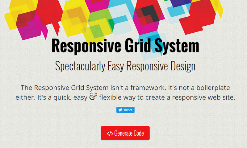
Responsive Grid System
Responsive Grid System claims to be one of the easiest solutions in its sphere. Though it is not a traditional framework; it is just a composite toolset that lets you kickstart your project quickly and efficiently.
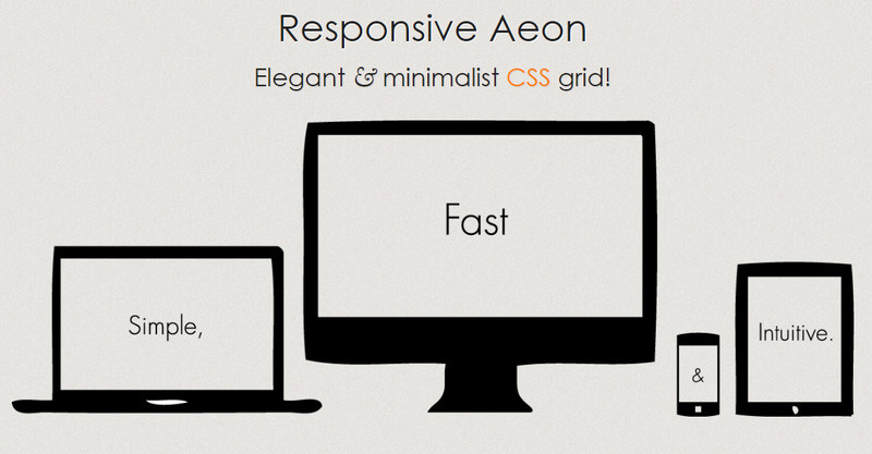
Responsive Aeon
The team behind Responsive Aeon prefers a minimalistic approach so that they have come up with this lightweight pure CSS grid system that gracefully reacts to various changes in the browser’s dimension. Simple, fast and intuitive – is its main slogan, to which it fully corresponds.
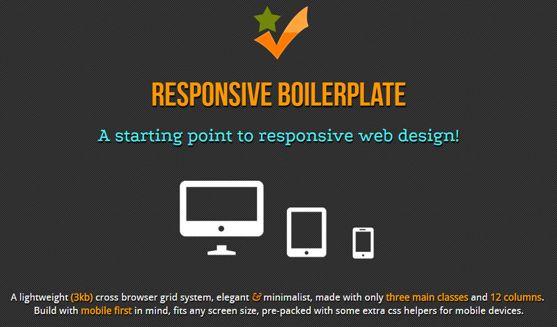
Responsive Boilerplate
Unlike the previous examples, this product is an intuitive and well-structured framework that supplies your design with a solid, reliable and flexible foundation. It is compatible with all the modern browsers and has an extra set of tools for integration with the mobile devices.
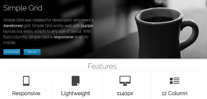
Simple Grid
Simple Grid leverages a pretty wide grid structure, 1140 px, skillfully adjusting layouts to monitors of various scale. It is exactly what’s needed since it provides room for maneuver.
Gridle
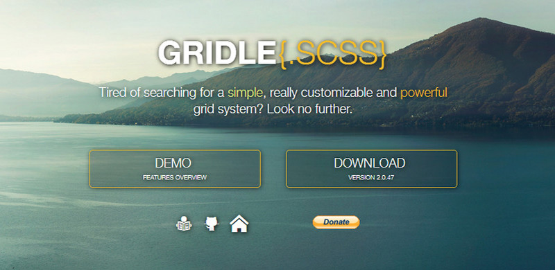
Gridle will please you with its lightness and rather considerable potential. It is mighty in what it can do, yet it still does not occupy much space and resources.
Cute Grids
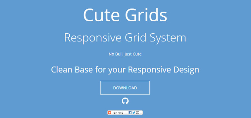
Cute Grids is all about simple, neat and clean skeletons and hassle-free markups. Being built with the help of 5 media queries, it is able to cover numerous browser sizes with ease.
RWDGrid
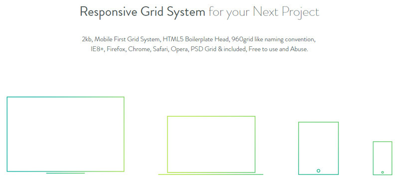
RWDGrid is a mobile-first grid that is built upon the 960gs-inspired conventions and HTML5. It works well in IE8, Firefox, Chrome, Safari and Opera. You can also grab a fully layered PSD file.
Pure.CSS
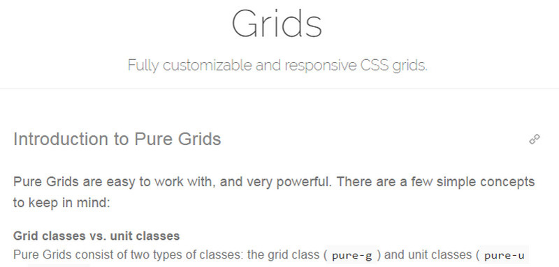
Pure.CSS is a collection of reusable carefully-crafted modules that are intended to streamline your workflow. Here, you can find a range of grids that are fully responsive and quite reliable.
Gridism
Gridism is a highly adaptive structure that varies from 978px to 1140px wide, depending on your preferences. It has a bunch of fundamental classes that let you employ nested grids and arrange the content as you need.
Gridiculous
The key feature of the Gridiculous is that it works well on various monitors, from large PCs to tiny mobile phones. It starts off at 1200px and gracefully degrades to 320px. You are also welcome to stretch it to the entire screen, without losing its capabilities.
CSSWizadry Grids
The system is made with the mobile first approach in mind. It is versatile and enables you to:
- create nested grids;
- use or ditch gutters;
- reorder and reverse everything without destroying the harmony and foundation itself.
Sass grid using inline-block instead of float by David Conner
The central principle of the product is that the author has gotten rid of floats and implemented inline blocks trying to save the structure from the mess and clutter that can be caused by the movable elements. It has a traditional structure of 12 columns and employs SASS.
Profound Grid
Much like the previous example, the author turns SASS to its advantage, so that the grid has got a pretty nifty responsive behavior that is applicable for both fluid and fixed layouts. Thanks to a trick with negative margins it can boast of consistency in style across numerous browsers.
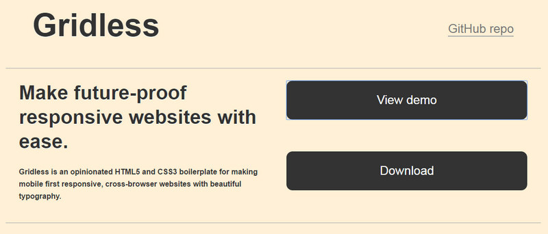
Gridless
Gridless focuses on several important aspects of good website design: responsiveness, mobile friendliness, cross-browser compatibility, and typography. It has numerous I.E. bug fixes and several tiny yet vital tricks that allow it to cope with different tasks like a pro.
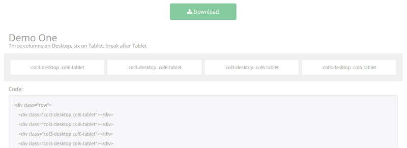
Fluid Grid Layout
Together with the author you are going to recreate a sterling, fully working fluid grid system that adapts to various dimensions. The tutorial takes nearly one hour to achieve the desired result, yet it is certainly worth it.
LightGrid
The main advantage of the system is displayed in its name: it is supposed to be lightweight. And it certainly is. It is constructed with SCSS and collaborates with all the modern devices: desktops, tablets and cell phones.
Grid of Hexagons
This unique solution may not be as universal and pragmatic as the above listed examples, however, when it comes to giving a particular spice to a layout it should come in handy. It transforms any boring boxy structure into an original hexagonal mess.
Gridifier
The product implies two types of license. If your intentions are non-commercial and non-profit, then you are allowed to use it freely, whereas commercial projects demand a paid version. So it is a great starting point for your own websites and experiments.
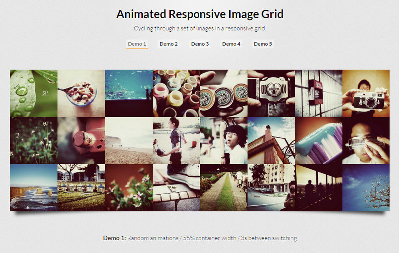
Animated Responsive Grid
This small, responsive grid that is populated with images will please you with its fancy dynamic behavior enriched by subtle animations.
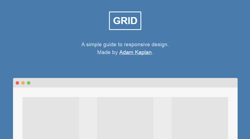
Grid
Although the project is not supported any longer, it still bears a lot of helpful and valuable educational material concerning responsive design. It helps you to get to grips with the concept, clarifying all the issues. It comprises some hints and code snippets for better understanding.
Conclusion
There are both pros and cons of using small local not-so-widely-approved solutions. Sometimes, they can bring difficulties in customization, adaptation, and intuitive realization, while in other cases they can drastically improve your project without stealing so much time, resources and effort.
Tell us, what responsive grid systems you prefer to utilize. Are you a fan of Bootstrap or tiny exquisite solutions?

