Smashing Monthly Roundup: Community Resources And Favorite Posts
Smashing Monthly Roundup: Community Resources And Favorite Posts
Iris Lješnjanin
On behalf of the Smashing team, welcome to another monthly update to keep you all in the loop about all things smashing. Join us as we share the latest news and highlight the things we have enjoyed reading over the past month.
Many of the included posts are sourced from the most popular links from our Smashing Newsletter. If you don’t get our newsletter yet, then sign up here to receive useful techniques and goodies (including a free eBook on accessibility)!
What’s New At Smashing?
The last SmashingConf of this year took place in New York, an event that got sold out a long way in advance and another one we’re all quite proud of. In case you missed out, our editor-in-chief Rachel Andrew summed up everything in a post with videos and photos of SmashingConf NY. You can find the slides of the talks over here, and even already grab your super early-bird ticket if you like!
Next, there’s a ’lil project that we’ve been meaning to launch for a quite a while, and it’s finally happening! We’re proud to have kicked off the Smashing Podcast, a bi-weekly podcast that is moderated by our dear friend Drew McLellan — make sure to subscribe and tune into any podcast player of your choice.
Last but not least, we’re excited and looking very much forward to the release of the upcoming Smashing book “Inclusive Components” written by Heydon Pickering on the whys and the hows, making accessibility more approachable and friendly for developers. Stay tuned!
Recommended Reading on Smashing Magazine
We publish a new article every day, and so if you’re not subscribed to our RSS feed or follow us on social media, you may miss out on some brilliant articles! Here are some that our readers seemed to enjoy and recommend further:
- “How To Stop Analysis Paralysis With Design” by Suzanne Scacca
When it comes to putting our visitors on the spot, giving them too many options hurts their decision-making ability along with how they feel about the experience as a whole. - “What Newspapers Can Teach Us About Web Design” by Frederick O’Brien
Before the home page, there was the front page. From the Gutenberg Principle to grid systems to above the fold, newspapers teach us much about the foundations of web design. - “Creating Online Environments That Work Well For Older Users” by Barry Rueger
A significant part of the Internet-using population is aged 50 or older — including the people who invented it. Designers need to understand what older users need and why it’s not enough to just say, “I can read it, so what’s the problem?” - “Writing A Multiplayer Text Adventure Engine In Node.js” by Fernando Doglio
A 4-part series that takes you through step by step to help you create a text-adventure engine with Node.js.
Best Picks From Our Newsletter
We’ll be honest: Every second week, we struggle with keeping the Smashing Newsletter issues at a moderate length — there are just so many talented folks out there working on brilliant projects! So, without wanting to make this monthly update too long either, we’re shining the spotlight on the following projects:
Note: A thank you to Cosima Mielke for writing and preparing these posts!
Free Services For Developers
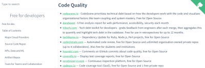
So many services out there offer free tiers, but they can be hard to find. Free For Developers wants to change that and lists software and other services that have free tiers for developers.

The services included in the list are particularly interesting for System Administrators, DevOps Practitioners, and other infrastructure developers and cover everything from cloud providers and source code repos to testing, log management, payment integration, and a lot more. More than 500 people have contributed to this community project and you are welcome to submit your findings, too, of course. A handy resource for the bookmarks.
Git Command Cheatsheet
Do you know your git commands? While you probably know the most common ones by heart, there are always those commands that are easily forgotten because you don’t need them often. A concise refresher now comes from Rainer Selvet.
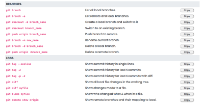
Described as a “dead simple git cheatsheet” by its creator, GitSheet lists git commands and what they do by topic. A nifty little feature: You can copy a command to your clipboard with just a click. Simple yet effective.
A Playground For Tinkering With Design Systems
You’re about to build a design system but don’t really know where or how to begin? Well, the Design System Playground might be a great place to get started.
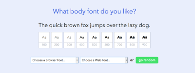
The playground offers a lot of room to tinker with different font and color combinations and, once you’re happy with your choices, it generates a design system that you can export and use in your projects right away. If the visual direction of your design isn’t clear yet, there’s also the option to use a preset theme or random choices to build upon.
Freebie: Mix-And-Match Illustrations
Illustrations are a fantastic way to breathe some life into a project. But not all of us have the skills to create them ourselves or the time or the budget to hire an illustrator. For these occasions, the mix-and-match illustration library which Leni Kauffman created, might come in handy.

Fresh Folk lets you combine poses, outfits, and skin tones into different characters. The library also includes background elements (e.g., tables, seating, lamps, plants) to create different settings — from office spaces to nature scenes. Free for personal and commercial projects.
Real-Time Visualization Of Tokyo’s Public Transport
A stunning 3D data visualization project comes from Akihiko Kusanagi: Mini Tokyo 3D displays Tokyo’s public transport system on a map in realtime.

You can follow along Tokyo’s trains moving through the city, with information on the train line, train number, next and previous stops, and possible delays. The data for this mammoth project is sourced from Open Data Challenge for Public Transportation in Tokyo which promotes the openness of public transportation data. Their aim is to make public transportation (which is considered to be the world’s most complicated) easier to navigate. Inspiring!
Vintage Science And Tech Ads
If you’ve got a sweet spot for vintage graphic design, here’s a very special goodie for you: a Flickr album with more than 1,400 science and tech ads from the 1950s and 60s.

The ads come from various science and tech magazines and are great examples of the modernist mid-century aesthetic — and a fascinating journey back to the times when the foundations of the technologies we take for granted today were being laid. Eye candy!
JavaScript Frameworks Security Report 2019
The folks at Snyk published their state of JavaScript frameworks security report for 2019. It investigates the state of security for the Angular and React ecosystems as well as security practices for the popular JavaScript frameworks Vue.js, Bootstrap, and jQuery.
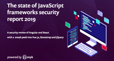
Given the fact that Angular and React both have their proponents with ongoing discussions whether one or the other is a true framework, the report doesn’t intend to venture into rivalries but reviews each of them as viable front-end ecosystem alternatives, while focusing on security risks and best practices and the differences between them. A must-read.
Designing Accessible Color Systems
Getting color contrast right is an essential part of making sure that not only people with visual impairments can easily use your product but also everyone else when they are in low-light environments or using older screens. However, if you’ve ever tried to create an accessible color system yourself, you probably know that this can be quite a challenge.

The team at Stripe recently decided to tackle the challenge and redesign their existing color system. The benefits it should provide out of the box: pass accessibility guidelines, use clear and vibrant hues that users can easily distinguish from one another, and have a consistent visual weight without a color appearing to take priority over another. If you’re curious to find out more about their approach, their blog post will give you valuable insights.
Digital Wellbeing Experiments
Everyone has a different relationship with their phones, but we all have something in common: There are always those moments when it feels that phones distract from life rather than improve it — when having dinner with friends and everyone checks their incoming notifications, for example.

With their Digital Wellbeing Experiments, Google now showcases ideas and tools that help people find a better balance with technology and inspire designers and developers to consider digital wellbeing in everything they design and build. There are experiments that let you switch off from technology as a group, for example, stay focused by getting the right apps at the right times, or take the most important things with you on a printed “paper phone”. The code for the experiments is open-source, and if you have an idea for a digital wellbeing experiment, the Hack Pack will help you bring it to life.
Recursive: A Free Highly-Flexible Variable Font
A font that gives you typographic control over five stylistic axes and can go from Sans to Mono? The variable font Recursive makes it possible, offering an entirely new level of flexibility.
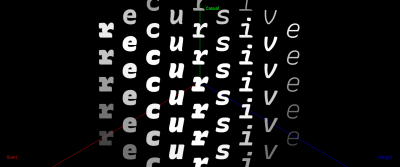
Taking full advantage of variable font technology, Recursive enables you to choose from a wide range of predefined styles or dial in exactly what you want for each of its axes. Inspiration came from single-stroke casual signpainting to give the font a flexible and energetic look, making it a great fit for data-rich-apps, technical documentation, code editors, and much more. Please note that Recursive is still under active development and will soon be available through Google Fonts. A beta version is already available.
Open-Source Tutorials For Learning GraphQL
GraphQL enables a client to specify exactly what data it needs from an API, so instead of multiple endpoints that return fixed data structures, a GraphQL server exposes a single endpoint and responds with precisely the data a client asked for. If you want to wrap your head around GraphQL, here are two great resources to get you started.

How to GraphQL is a free open-source tutorial to take your GraphQL skills from zero to production. Divided up into two parts, part one covers the core concepts of GraphQL while part two gives you a broader understanding of the GraphQL ecosystem. The other learning resource comes from the makers of the GraphQL engine Hasura: three open-source community-maintained tutorials (front-end, mobile, and back-end tutorials) teach you GraphQL to get you ready to build a real-time application in two hours.
Fixing Image Orientation
Image orientation on the web is, well, complicated. When Michael Scharnagl worked on a side project, he noticed that the images he uploaded to his server were shown in the wrong orientation. Now he wrote a blog post in which he dives deeper into the issue and how to fix it.

The reason for portrait images being displayed in landscape mode when they are embedded using <img> or background-image is the EXIF data for the image. How a browser deals with EXIF orientation depends on the browser, and there’s no cross-browser way to easily correct it either. Michael’s Node.js fix helps you correct the orientation. A handy little tip.
From Smashing With Love
A month can be a long time to stay on top of things, so please do subscribe to our bi-weekly newsletter and our podcast if you still haven’t. Each and every issue is written and edited with love and care. No third-party mailings or hidden advertising — promise!
You can also tune into our very own Smashing TV, and follow us on Twitter, Facebook as well as LinkedIn. Please do always feel free to reach out and share your projects with us! We love hearing from you!
Keep up the brilliant work, everyone! You’re smashing!
 (cm, vf, ra, il)
Articles on Smashing Magazine — For Web Designers And Developers

