Setting Height And Width On Images Is Important Again
Setting Height And Width On Images Is Important Again
Barry Pollard
Web performance advocates have often advised to add dimensions to your images for best performance to allow the page to be laid out with the appropriate space for the image, before the image itself has been downloaded. This avoids a layout shift as the image is downloaded — something Chrome has recently started measuring in the new Cumulative Layout Shift metric.
Well, a dirty, little, secret — not that well-known outside the hard-core web performance advocates — is that, until recently, this actually didn’t make a difference in a lot of cases, as we’ll see below. However, adding width and height attributes to your <img> markup have become useful again after some recent changes in the CSS world, and the quick adoption of these changes by the most popular web browsers.
Recommended Reading
The CSS contain property gives you a way to explain your layout to the browser, so performance optimizations can be made. However, it does come with some side effects in terms of your layout. Read more →
Why Adding Width And Height Were Good Advice
Take for example this simple page:
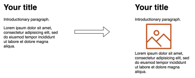
<h1>Your title</h1> <p>Introductory paragraph.</p> <img src="hero_image.jpg" alt="" width="400" height="400"> <p>Lorem ipsum dolor sit amet, consectetur…</p> This might render in two stages, first as the HTML is downloaded, and then second once the image is downloaded. With the above code, this would cause the main content to jump down after the image is downloaded and the space needed to display it can be calculated:

Layout shifts are very disrupting to the user, especially if you have already started reading the article and suddenly you are thrown off by a jolt of movement, and you have to find your place again. This also puts extra work on the browser to recalculate the page layout as each image arrives across the internet. On a complex page with a lot of images this can place a considerable load on the device at a time when it’s probably got a lot of better things to deal with!
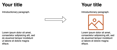
The traditional way to avoid this was to provide width and height attributes in the <img> markup so even when the browser has just the HTML, it is still able to allocate the appropriate amount of space. So, if we change above example to the following:
<h1>Your title</h1> <p>Introductory paragraph.</p> <img src="hero_image.jpg" alt="" width="400" height="400"> <p>Lorem ipsum dolor sit amet, consectetur…</p> Then the render happens like below, where the appropriate amount of space is set aside for the image when it arrives, and there is no jarring shift of the text as the image is downloaded:
Even ignoring the annoying impact to the user in content jumping around (which you shouldn’t!), the impact on the CPU can also be quite substantial. The below screenshot shows the performance calculations performed by Chrome on a site I work on which has a gallery of about 100 images. The left-hand side shows the calculations when width and height are provided, and on the right when they are not.

As you can see, the impact is considerable — especially on lower-end devices and slow network speed, where images are coming in separately. This increases load time by a noticeable amount.
How CSS Interacts With Element Widths And Heights
Widths and heights on an image can cause issues when you try to alter them using CSS. For example, if you want to limit your images to a certain width you might use the following CSS:
img { max-width: 100%; }This will override the width of the image and constrain it when necessary, but if you have explicitly set the height on the image tag, then we are not overriding that (only the width) and you will end up with a stretched or squashed image, as we have no longer maintained the aspect ratio of the image:

This is actually very easily fixed by adding a height: auto line to the CSS so the height attribute from the HTML is overridden too:
img { max-width: 100%; height: auto; }However, I find it still catches people by surprise and sometimes leads to them not specifying image dimensions in the HTML instead. With no image dimensions, you can get away with just specifying max-width: 200px in the CSS without having to specify height: auto and the browser will automatically figure out the height itself — once it has the image.
So, once we add the dimensions and that the height: auto trick, we get the best of both worlds, right? No layout shifts, but also the ability to resize images using CSS? Well until very recently you might have been surprised to find out the answer was in fact: no (I was — hence why I decided to write this article).
For example, take the code below:
<style> img { max-width: 100%; height: auto; } </style> <h1>Your title</h1> <p>Introductory paragraph.</p> <img src="hero_image.jpg" alt="" height="500" width="500"> <p>Lorem ipsum dolor sit amet, consectetur…</p>This would have resulted in this load:
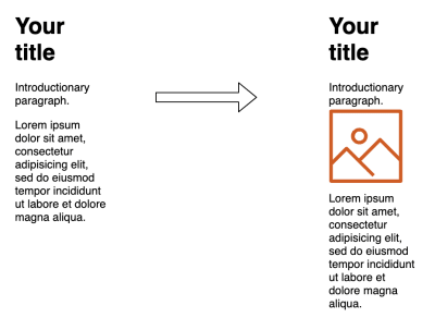
height: auto is used in CSS. (Large preview) Wait, what’s going on here? We’re back to the first problem. I thought I said that by specifying the image dimensions in the HTML you could avoid this layout shift problem? Well, this is where it gets interesting and will lead on to the main point of this article.
The problem is that, unless you were giving explicit width and height CSS values to your images — and who wants to limit themselves like that in a responsive world where you want the image to expand or shrink to fill up the available space — then CSS will need the dimensions from the image file itself to figure out the auto part of the dimensions. It ignored any width and height attributes set in the HTML.
The implication of all this is that specifying width and height attributes on images often wasn’t actually that useful in a lot of cases. Yes, when an image is being shown at full size, without any CSS changing any dimensions, it is useful to resolve the layout shifting problem. However, when you use CSS like below to ensure images do not overflow their available space, then you run into problems as soon as the available width becomes smaller than the actual image size.
img { max-width: 100%; height: auto; }This affects any page where we constrain the image size in a responsive manner — i.e. small screen mobile devices. These are likely to be the very users suffering with network constraints and limited processing power that will suffer most from layout shifts! Of course, we ideally should be delivering appropriately sized images for the screen size, but you cannot cover every device size, so often images will need some resizing by the browser, particularly on mobile.
Many websites may not bother to specify widths and heights on their <img> tags. That could be because they weren’t aware this was useful, or because they were all too aware of what we talked about here and knew it actually wasn’t that useful in a lot of cases. Whatever the reason is beside the point, they are frequently not provided. (How can we even evangelize putting the effort into using them given what I’ve just described?) Even the popular Lighthouse auditing tool doesn’t flag when you don’t do this (though in light of some of the things we’re about to talk about, that is under discussion again).
Working Around The Problem
The limitations for responsive images have been known for a long time and many workarounds, including the so-called padding-bottom hack, have been created to work around the issue. This uses the fact that padding percentages (including padding-bottom ) are always based on the container width (to ensure a consistent padding even if height and width differ). This fact can therefore be used to create a container with where the height is set based on a ratio of the width. For example for, let’s say we have an image with an aspect-ratio of 16:9, then the following CSS code will create the appropriately sized space for the image:
.img-container { position: relative; padding-bottom: 56.25%; /* 16:9 ratio */ height: 0; overflow: hidden; } .img-container img { position: absolute; top: 0; left: 0; width: 100%; height: 100%; }The three main downsides of this technique are the following:
- It requires a hard-coded ratio to be calculated (
56.25%— 9÷16 — in this example), so it potentially requires custom CSS for each different image. - The CSS code is not exactly easy to remember — forgetting or removing a single line of the above CSS code will break the whole thing. Not to mention this technique requires all images to be wrapped in an extra container element.
- This is a more advanced technique that not all web developers know about or use.
And, let’s be honest — it’s a bit of a hack! So, we really should fix this properly, shouldn’t we?
Fixing The Resizing Problem
The issue has been tackled from a few different directions by a number of different standards organizations.
The CSS Working Group (CSS WG) proposed the aspect-ratio property that Rachel wrote about previously. This would tackle the complexity problem (issue 2) once it becomes available, and simplify the above code to just this:
img { width: 100%; height: auto; aspect-ratio: 16/9; }Much nicer! This is particularly useful for video where we usually have a set number of commonly used aspect-ratios, so we could create a few classes like above for each size. It’s perhaps less useful for images where dimensions are much less standardized, as it doesn’t solve issue 1 (custom CSS code required per image), nor issue 3 (website developers will need to remember to set this). So, it’s a step forward, but not a full solution.
Separate to this, the Web Incubator Community Group (WICG) — a group of browser developers and other interested parties that can experiment on technologies to see if they work before formal standardisation — also created a proposal to fix this. They proposed the intrinsicsize attribute, that would look like this:
<img intrinsicsize="400x400" style="width: 100%">As this is an HTML attribute, it can be set per image (solving issue 1), and is relatively easy to code (solving issue 2), but was still likely to suffer from adoption issues (issue 3) unless it became very well-known with a big push from the whole community.
We already have a common, well-known method of setting the width and height on <img> elements (even if they are not used as much as they should be!) so anything new, other than that, is going to suffer from the adoption issue. And that is where the (now seemingly obvious!) answer presented itself.
Jen Simmons proposed this elegant, and simple solution, that she had come up with, along with fantasai:
<style> img { width: 100%; height: auto; aspect-ratio: attr(width) / attr(height); } </style> <img src="hero_image.jpg" alt="" width="500" height="500">Rather than hard-coding the aspect-ratio, this uses the attr CSS function to create the appropriate aspect-ratio based on the image width and height attributes provided by the HTML. The attr function has been around for a while, but has been very limited in scope — it’s supported for content by all browsers, but not for the wider use case of any other attribute like width and height, which is what is needed here.
If attr was able to be used for the well-known width and height attributes from img elements, then it could use be used to automatically calculate the aspect-ratio as per above. This would solve issue 1 (no hard-coded aspect ratio needs to be set in the HTML nor the CSS), issue 2 (very simple to add) and, as we shall see, there is a very simple answer to issue 3 (adoption).
Basically, this solution means if the following four conditions are true, then the correct image dimensions could be calculated without needing to wait for the images to download, and so without the need of a content layout shift:
heightis set on the element in HTMLwidthis set on the element in HTMLheight(orwidth) is set in the CSS — including using percentage values likemax-width: 100%;width(orheight) is set toautoin the CSS.
If any one of these were not set, then the calculation would not be possible, and so would fail and be ignored and have to wait for the image to be downloaded.
So once browsers support using the HTML width and height to calculate the aspect-ratio we can solve our problem very simply with no change in practice to HTML and one line of CSS code! As mentioned above, this is also something many web developers may have already assumed was happening anyway.
Driving Adoption Of This Solution
Because this is just a CSS attribute, the proposal contained a further twist — it could be added to the user-agent stylesheet used by browsers so would not even require any changes from web developers to benefit from this.
The user-agent stylesheet is where default CSS definitions are set (e.g. what font-size the h1 element uses), which can be overridden by your own CSS if you want. By adding the above aspect-ratio one-liner to this we don’t need to drive adoption — we basically turn it on automatically for all sites that meet the above four conditions!
However, this does depend on the attr function having access to the width and height HTML attributes, and also the upcoming aspect-ratio CSS property to be completed — neither of which has happened yet. So instead, as an easier fix, the browsers could implement the equivalent logic deep in rendering code rather than exposing it via the user-agent stylesheet, but the effect is the same. This alternative implementation approach was even suggested as part of the proposal.
Firefox went ahead and did this as an experiment and then turned it on by default for Firefox 71. Once that was released, then your site may well have just got faster for free — thanks Mozilla! Maybe in future, they will move this to the user-agent stylesheet method, but for now, this is sufficient (and perhaps more performant?).
Backwards Compatibility
When introducing a change in behavior, there is always a concern about backwards compatibility and this feature was no different. In theory, as long as the four attributes were appropriately set, there should be no breakage with this.
However, when Firefox initially experimented with it, they discovered problems for those setting the width and height incorrectly in their HTML. Whereas previously these incorrect values would be ignored if the CSS overrode them, now they were being used when auto was set and the images were not displayed correctly and led to squished or stretched images. Now you could argue that web developers shouldn’t set these values incorrectly, and in some cases, it would be already broken even without this change (the case above when you didn’t set height: auto), but still, breaking sites is never a good thing. That is also something the web tries very hard to avoid — and is mostly very good at avoiding that (it’s one of my favorite things about the web as a platform).
The solution to that problem, however, was relatively simple: have the actual image aspect-ratio of the image override any CSS calculated aspect-ratio. This way the (incorrectly) calculated aspect-ratio can be used for initial layout, but then can be recalculated when the image is downloaded, so the image is displayed as it was before. This does cause a layout shift (since the incorrect space was allocated initially) but that was happening before anyway, so it’s no worse. In fact, it’s often a lot better as an incorrect aspect ratio will often be closer to the truth than a zero aspect-ratio.
Rollout To Other Browsers
After Firefox’s successful experimentation, Chrome also decided to implement this (again using the layout coded method for now rather than default user-agent stylesheet), and rolled it out by default in Chrome 79. This also took care of the other chromium-based browsers (Edge, Opera and Brave, for example). More recently, in January 2020, Apple added it to their Tech Preview edition of Safari, meaning it should hopefully be coming to the production version of Safari soon, and with that, the last of the major browsers will have implemented this and the web will become better and less jolty for a huge number of sites.
Limitations
There are a few limitations to be aware of with this feature, including issues with:
- Art Direction
- Lazy Loading
- Non-Images
Art Direction
The fix works great to calculate the aspect-ratio based on a fixed width and height, but what about when those change? This is known as art direction and an example is shown below:
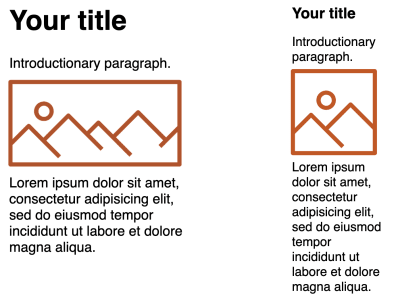
In this case we are using a wide image for desktop, and then a square, cropped image for mobile. Responsive images can be implemented using srcset attributes on an <img> element:
<img srcset="hero_800x400.jpg 800w, hero_400x400.jpg 400w" sizes="(min-width: 327px)" 800px 400px src="hero_800x400.jpg" alt="" width="800" height="400"> or with the <picture> element like this:
<picture> <source media="(min-width: 327px)" type="image/jpeg" srcset="hero_800x400.jpg"> <source type="image/jpeg" srcset="hero_400x400.jpg"> <img src="hero_800x400.jpg" alt="" width="800" height="400"> </picture> Currently, both these elements only allow the width and height to be set once on the main, fallback <img> element and not on the individual <srcset> alternatives. Adding these has been proposed but until then, this is currently a limitation of the solution, and using images with different dimensions will still experience a layout shift.
Lazy Loading
This feature would be perfectly suited for use with lazy-loading. Ideally, all lazy-loaded images are loaded off-screen as you scroll down the page before the lazy-loaded image enters the viewport, but often this is not the case depending on how fast the user scrolls and the network, so having the image area correctly set would at least avoid the layout shift after loading does occur. Additionally, even when loading is happening off-screen, layout shifts can be costly in terms of CPU time, as we have shown above.
However, lazy loading techniques may involve not using an <img> element, or at least one without a src (to prevent the browser from downloading the image by default). Therefore, it may not be able to benefit from this recent change depending on how your browser handles the element used or src-less <img> elements. Though if the CSS version of this solution becomes available, then website developers will have greater control over specifying aspect-ratio themselves.
Native lazy loading was recently released by the Chrome team and it has since been added to the HTML spec. Other browsers are also looking to support this with Firefox also getting this soon, and Safari hopefully not too much later. That does make use of the <img> element with a src with syntax like the following (including when used as part of the <picture> element):
<img src="hero_800x400.jpg" alt="" width="800" height="400" loading="lazy"> Perfect! Well, unfortunately, I discovered this height and width solution is not compatible with the recently released native lazy-loading functionality as can be seen on this test page. I’ve raised a bug for this issue and hopefully the Chrome team will fix this soon.
Non-Images
Currently, the browsers that have implemented this, have only done for the <img> element, but it would also be useful for <video>, <iframe> and <object> elements to name a few, and this under discussion. Again, if the CSS version of this technique becomes available through the attr functions and aspect-ratio property, then that puts the power in the website developer to implement this for whatever elements they want!
Conclusion
I love improvements that just work without any effort required of website owners. That is not to ignore the hard work required by the browser developers and standardization teams, of course, but it’s often rolling out to websites that is the real difficulty. The less friction we can add to introduce these improvements, the more likely they will be adopted, and there’s no better friction than none at all! Fixing the impact of layout shifts on users for responsive images seems to be one such improvement and the web is all the better for it.
The one change that is required of us web developers is to ensure we are providing width and height attributes in our markup. It’s a habit we shouldn’t really have gotten out of, and many CMS and publishing tools make this relatively easy. I queried the HTTPArchive and it looks like 62% of <img> tags have width or heights, which is way higher than I expected to be honest — but let’s try to increase that statistic even more now we have a reason to again. So, I implore you to check that you are doing this on your sites and, if not, start to. It will improve the experience for your users and ultimately make them happier, and who doesn’t want that?
 (jw, yk, il)
Articles on Smashing Magazine — For Web Designers And Developers
