Prototyping An App’s Design From Photoshop To Adobe XD
(This is a sponsored article.) Designing mobile apps means going through different stages: pre-planning, visual concepts, designing, prototyping, development. After defining your project, you need to test how it will work before you begin to develop it.
This stage is captured by prototyping. Prototyping allows designers to get a feel for the functionality and flow of an app, and to preview screens and interactions. Testing with prototypes provides valuable insights into user behavior and can be used to validate the interaction model. It is possible to represent the interactivity of an app before its development, and this gives developers a global vision of an app’s functioning, user behavior and steps to afford.
Prototyping is the simulation of the final result of an app’s development. Through this step, it’s possible to show a workflow of an app and consider problems and solutions. The two fundamental roles who will work in this phase are the user interface (UI) designer, who creates the look and feel, and the user experience (UX) designer, who creates the interaction structure between elements.
There are many ways to design and create an app’s look. As a loving user of Adobe products, I work most of the time in Illustrator and Photoshop. Illustrator helps me when I create and draw UI elements, which I can simply save and use later with Adobe XD. The process is the same as I’ve done for icons and that I showed you in my previous article “Designing for User Interfaces: Icons as Visual Elements for Screen Design.”
Photoshop comes in handy when I have to work with images in UI. But that’s not all: With the latest Adobe XD release, we can bring Photoshop design files into XD very quickly, and continue prototyping our app.
Today, I’ll offer a tutorial in which we discover how to transfer our app’s design from Photoshop to XD, continuing to work on it and having fun while prototyping. Please note that I’ve used images from Pexels.com in order to provide examples for this article.
We will cover the following steps:
- Simple hand sketch,
- Designing In Photoshop,
- Importing PSD files to XD,
- Developing a prototype,
- Tips.
For Adobe tools, I will use Photoshop CC, Illustrator CC and XD CC — all in the 2018 versions.
- Download the files for this tutorial (ZIP, 141.3 MB)
Let’s get started!
1. Simple Hand Sketch
Before we start designing our app, we need a plan for how to go about it. There are some questions we have to answer:
- What is the app for?
- What problem does it solve?
- How easy is it to use?
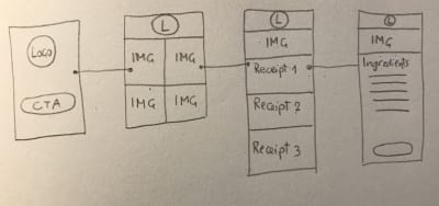
Let’s assume we want to create an app for recipes. We want something simple: a space for pictures with ingredients and recipes.
I sketched by hand what I have in mind :

Then, I grabbed Photoshop and created my layouts.
2. Designing In Photoshop
Before we create layouts for our app, we can take advantage of a very useful resource by Adobe: free UI design resources. Because we will be designing an iOS app, I downloaded the iOS interface for Photoshop.
Feel free to experiment with the layouts you’ve downloaded.
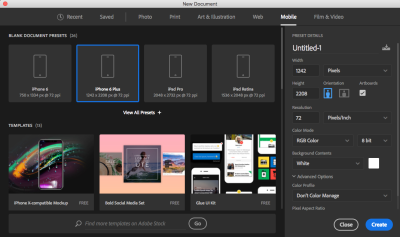
In Photoshop, I created a new blank document from a preset for the iPhone 6 Plus:
Below is our layout, as I designed it in Photoshop. I tried to reproduce what I drew by hand earlier.



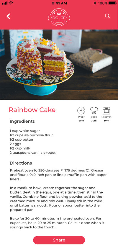
The PSD file contains four artboards. Each has its own layers.
Note: The images used in this prototype are from Pexels.com.
Let’s see how to import this PSD file into Adobe XD.
3. Importing PSD Files To Adobe XD
Let’s run Adobe XD and click on “Open.” Select our PSD file, and click “Open.”
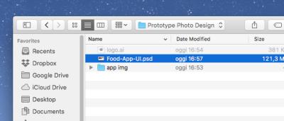
Ta-dah! In a few seconds, you’ll see all of your PSD elements open in XD.
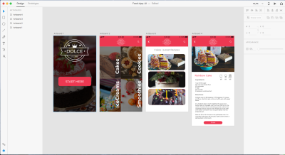
More importantly, all of the elements you just imported will be organized exactly as they were in Photoshop. You can see your artboards on the left:
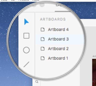
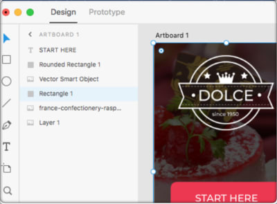
When you select an artboard, you will see its layers on the left — exactly the way it was in Photoshop before exporting.
Let’s do something in XD to improve our layout.
Go to Artboard 3. In this artboard, I want to add some more images. I just created three spaces in Photoshop to get an idea of what I want. Now, I can add more with some very simple steps.
First, delete the second and third image. From the first rectangle, delete the image, too, by double-clicking on it. You’ll have just one rectangle.
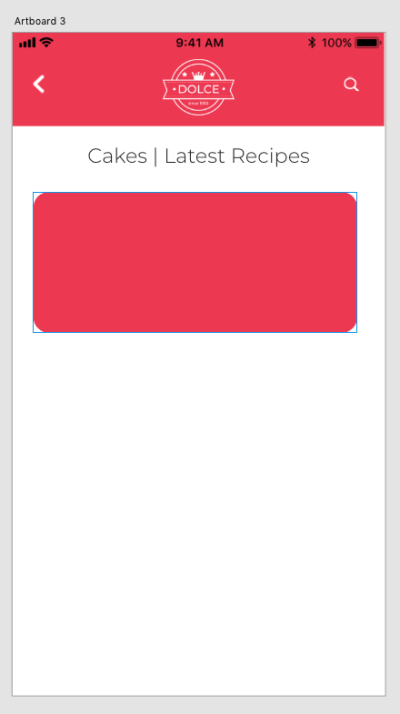
With this rectangle selected, go to “Repeat Grid” on the right and click it. Then, grab the handle and pull it downward. The grid will replicate your rectangle, inserting as many as you want. Create six rectangles, and adjust your artboard’s height by double-clicking on it and pulling its handle downwards.
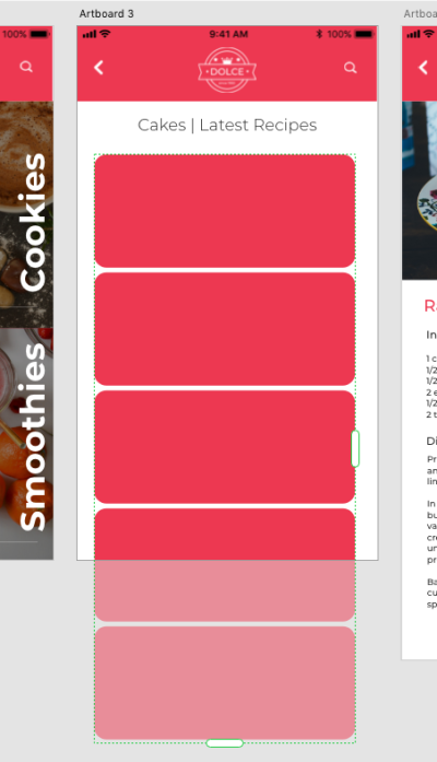
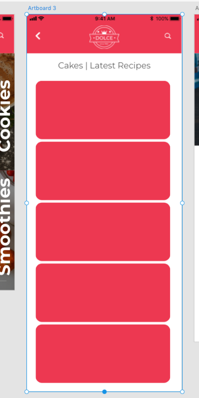
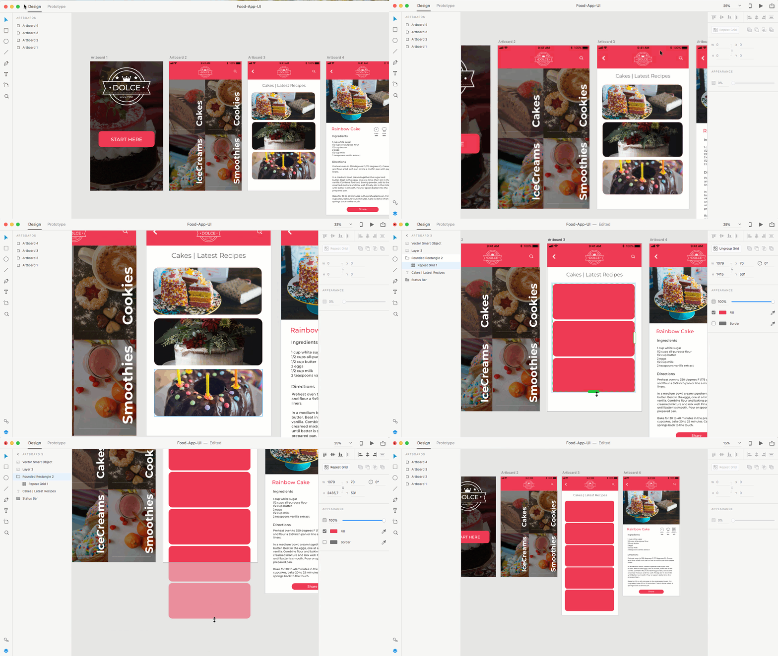
Now, select all of the images you want to put in rectangles, and drag them all together onto the grid you just created:
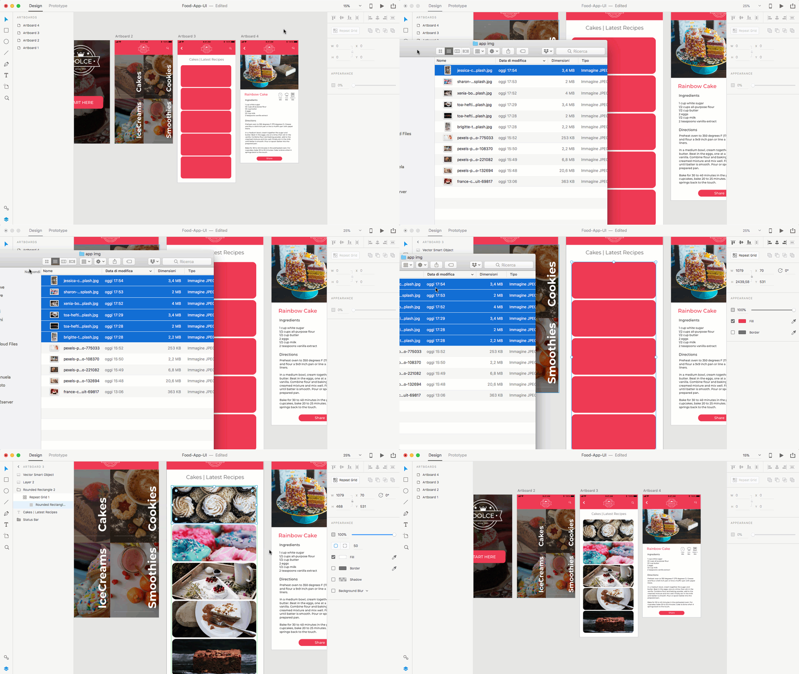
Et voilà! All of your pictures are in place.
Now that all of the layouts are ready, let’s play with prototyping!
4. Developing A Prototype
Let’s begin the fun part!
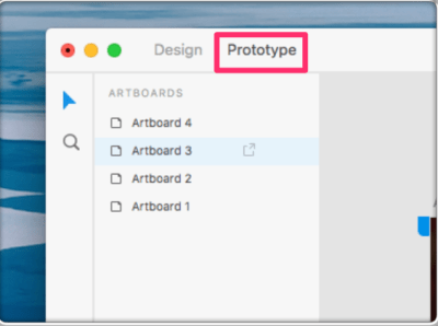
We have to create interactions between our artboards and elements. Click on “Prototype” in the top left, as shown in the image below.
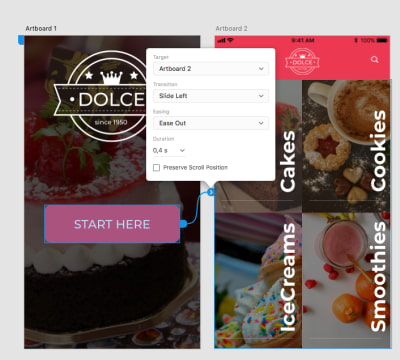
Click on the “Start here” button. When the little blue arrow appears, click and drag it to the second artboard. We are connecting these two artboards and creating interaction by clicking the intro button. Then, you can decide which kind of interaction to use (slide, fading, time, etc.).
See how I’ve set it in the image below:
Scrolling tip: Before viewing our prototype preview, we need to do another important thing. We have to make our artboards scrollable, giving them the same effect as when pushing a screen up and down with a finger on the phone.
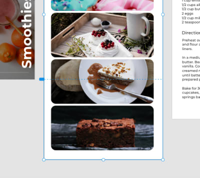
Let’s go back a step and click on “Design” in the top left. Check which artboards are higher — in this case, the third and fourth. Select the third artboard from the left, and you’ll see the section “Scrolling” on the right. Set it to “Vertical.”
Then, you’ll see that your “Viewport Height” is set to a number, higher than the original artboard’s size. That’s normal, because we made it higher by adding some elements. But to make our artboard scrollable, we need to set that value to the original artboard’s size — in this case, 2208 pixels, the height of the iPhone 6 Plus, which we set in Photoshop and then imported to XD.
After setting that, you’ll see a dotted line where your artboard ends. That means it is now scrollable.
To see our first interactions in action, click on “Prototype” in the top left, and then click the little arrow in the top right. See them in action below:

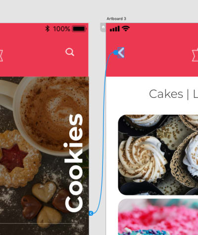
Let’s finish up by connecting all of our artboards, as we’ve seen before, and check our final prototype. Don’t forget to connect them “back” to the previous artboard when clicking on the little arrow to go back:
And here is the final demo:
In this tutorial, you have learned:
- that you can design your app in Photoshop,
- how you can bring it into Adobe XD,
- how to create a simple prototype.
Tips
- Decide on one primary action per screen, and highlight its containing element through visual design (e.g. a big CTA).
- White space is very important on small screens. It prevents confusion and gives the user more clickable space. And here comes that rule again: One primary action works well with more white space.
- If you are not on a desktop, avoid all unnecessary elements.
- Always test your prototypes with regular users. They will help you to understand whether the flow is easy to follow.
This article is part of a UX design series sponsored by Adobe. Adobe XD is made for a fast and fluid UX design process, as it lets you go from idea to prototype faster. Design, prototype, and share — all in one app. You can check out more inspiring projects created with Adobe XD on Behance, and also sign up for the Adobe experience design newsletter to stay updated and informed on the latest trends and insights for UX/UI design.
 (ra, al, il)
 Articles on Smashing Magazine — For Web Designers And Developers
