New Web Design Trend: Typography Sharing Space With Other Elements
The upcoming trend of typography in a shared space is something you have quite possibly seen, but not really noticed. The idea is that (usually) large typographic text occupies some of its own space and some shared space with an image, video or other text element.
This style of design is not necessarily the easiest to achieve, but done well, it is, at the same time, both eye-catching and not terribly outstanding.
Readability is the most important factor to be taken into account when designing to include shared spaces, but there are other difficulties to be considered – such as one of the elements being animated or a slide show, and the sharing element being static, or even animated differently.
Here is a selection of some website designs that have adopted this style.
Elements Sharing Space in Web Design
Authentic Form & Function
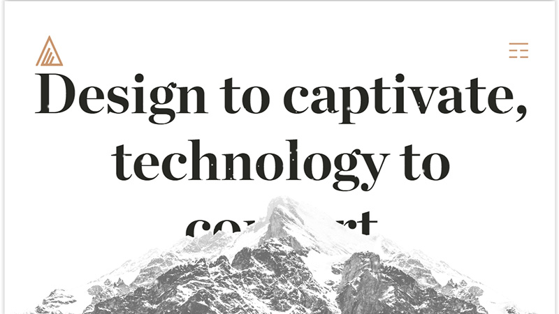
We start off with a somewhat different take on the shared space of typography and image. Here the typography has not been allowed to take over, instead, the image dominates and the type sits behind the mountain.
Pen Catala
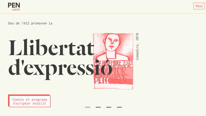
This example is the more usual effect of typography impinging on the space of another element. A series of headlines appear on this page in a ticker-tape style, most of which overlap the accompanying image.
Doxa
This Swiss watch manufacturer has white typography labels that cut into the images as you scroll down.
Budi Dio Doji Nedostaje
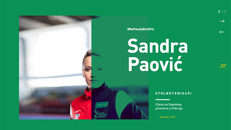
A number of current trends are used on this site – the image is presented as split screen, with a colored transparency which produces a duotone effect, and the typography shares the space with the colored side of the image.
adidas climazone
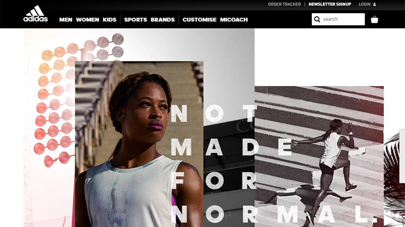
adidas use no capital letters in their brand name and technologies such as climazone, however, just about all other text on their page is in block caps! This example has made this round up because the typographic text is sharing the space with 3 layered images. It is a cross between the large text on images trend and the sharing space trend.
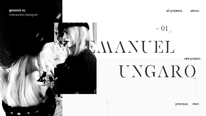
Giovanni Xu
On first glance this example of typography sharing space is similar to many others, however, there is a slight mouse-over animation on the smaller image that the headline is sharing space with.
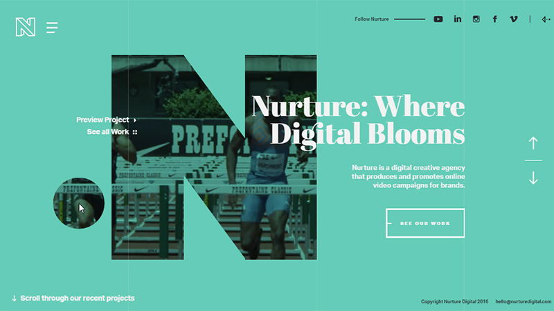
Nurture Digital
A large N takes center stage on this landing page. Through that N, video clips play, and the foreground color of the page changes from time to time. As you move your mouse around the screen, you drag a large circle that gives you more peeps at the videos playing in the background. The 2-category menu on the left and scrolling client information on the right both share the space inhabited by the N.
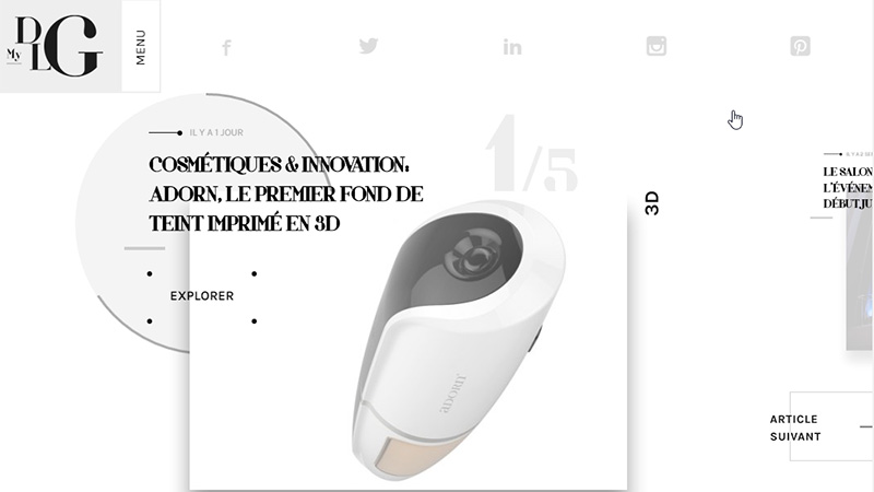
My Digital Luxury Galaxy
This site is actually very busy although manages to give the impression of minimalism. The landing page has a slideshow where an image with a headline sharing the space slides in, and a circle placed behind each image has a loading bar that runs round its circumference.
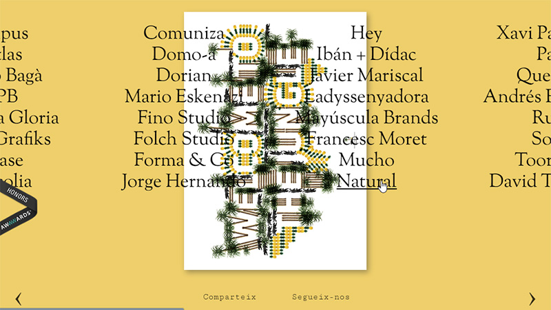
Bisgrafic
This Spanish graphic design company have 4 lists of people/company names (perhaps clients), that share the space with the center poster – when you hover the mouse over any of the names, the poster and background color change.
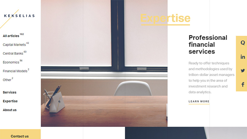
Kekselias
This site uses a pastel color scheme in its design, and as you scroll down the page, each piece of text slides onto the screen, and the headline shares the space with the accompanying image.
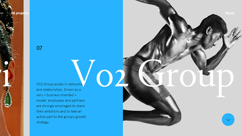
Benjamin Geudj
With horizontal scrolling, this site presents images and text on the projects the designer has dealt with. The headline text shares the space with the solid colored panel, and sometimes with the descriptive text too.
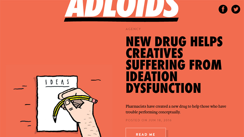
Adloids
This is a completely different take on this trend – in fact, it is questionable whether is should even have made this list! The typography here shares out-of-bounds rather than space.
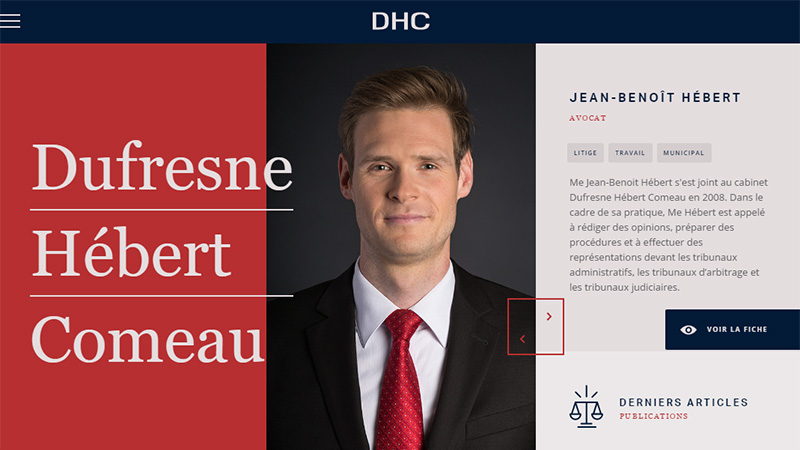
Dufresne Hebert Comeau
This Canadian site uses a slideshow that presents the members of staff with a short bio about them. The left-hand panel with the company name is static, and slightly impinges on the sliding images.
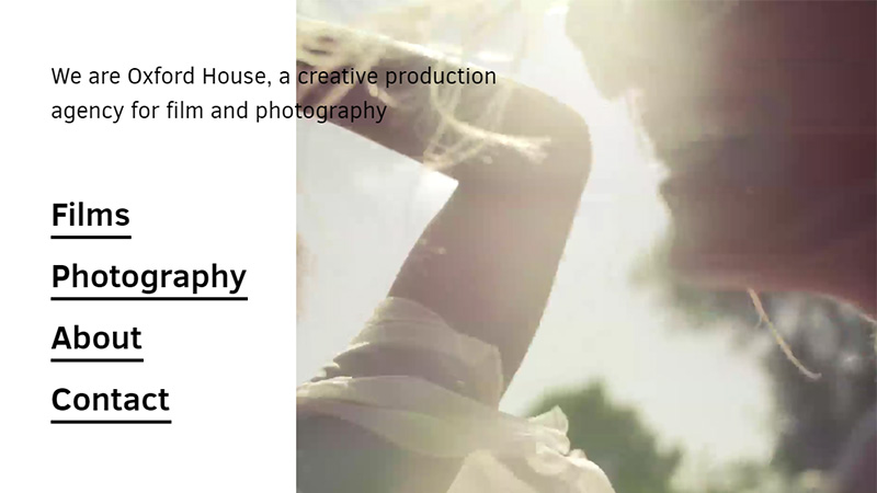
Oxford House
This agency uses, in a similar manner to the above example, a static left hand panel where the text shares space with the slideshow. There is one slight problem with this effect – some of the images are too dark and cause unreadability.
Chase Lenfest
This is a nice example of typography sharing space with the image. The name appears to be behind the portrait photo, while the line ‘Entrepeneur & Philanthropist’ is in front of him.
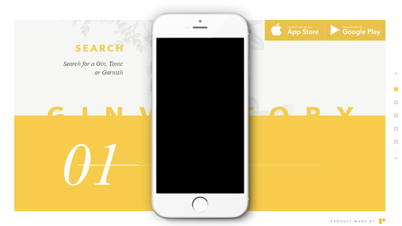
Ginventory
This site has scrolling animations where the solid yellow panel rotates to be either at the top or the bottom of the page, and the name is always half covered by it.
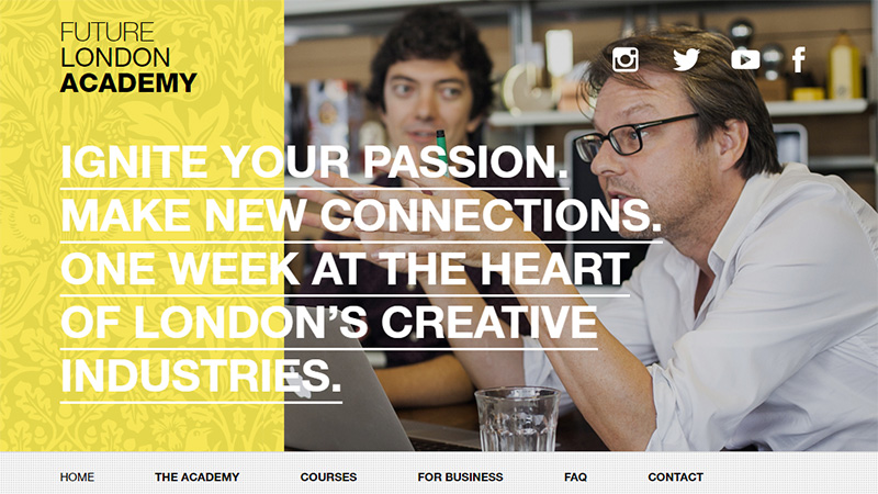
Future London Academy
A patterned panel on the left and a static image taking up 2 thirds of the screen make you wonder which of the panels the typography is sharing space with here!
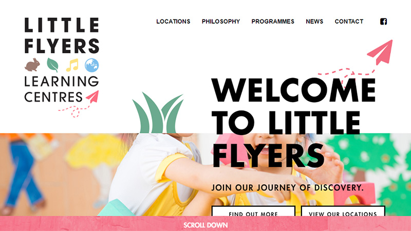
Little Flyers Learning Centres
A simple example of large headline text sharing space with a colorful image.
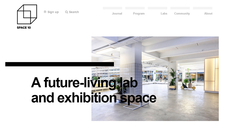
Space 10
Another simple example of this trend. It is very obvious here that the designers have not run out of space, the space-sharing has been purposely done for effect.
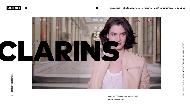
Onirim
On this site, the slideshow of videos is in a static position, and the headline text naming the featured projects slides in, and places itself over the video area.
Conclusion
Sometimes it seems we are at the end of possibilities for new trends, however, designers and developers will always conjure up something new and add some extra spice or a different twist on an existing trend. Space sharing elements is one such addition to the large headline text trend.
Have you designed or developed a project in this style? Do you like the idea of it, or do the associated and possible problems keep you away from such design? Please share your thoughts and links with us in the comments section below.

