New Web Design Trend: Exciting Websites with Split Layouts
As is often the case, some trends need time to take a run and make its presence felt. The split layout is one of those representatives. Being listed in a majority of articles dedicated to web design tendencies of 2015, only now it hits its stride.
The technique is pretty simple to reproduce since it is just a structure with two columns. Nevertheless, despite the apparent primitiveness it owns some significant advantages. For example, it lets you endow things with equal importance or promote several things simultaneously.
You can give a twist to sliders or inject some life into boring static structures by using individually scrollable parts. There are so many ways of deriving benefits from it, and today we are going to examine some of them.
Web Design Using Split Layout
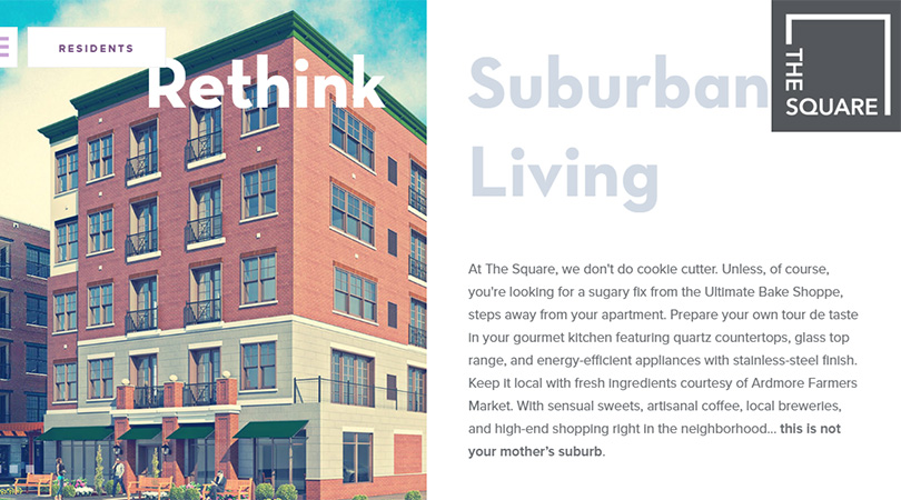
The Square
The Square’s ‘welcome’ screen is broken into two equal parts. The left one features a slider with images whereas the right one shows an opening speech. The solution nicely plays with the square shaped logotype and boxy vibe that is prevalent on the website.
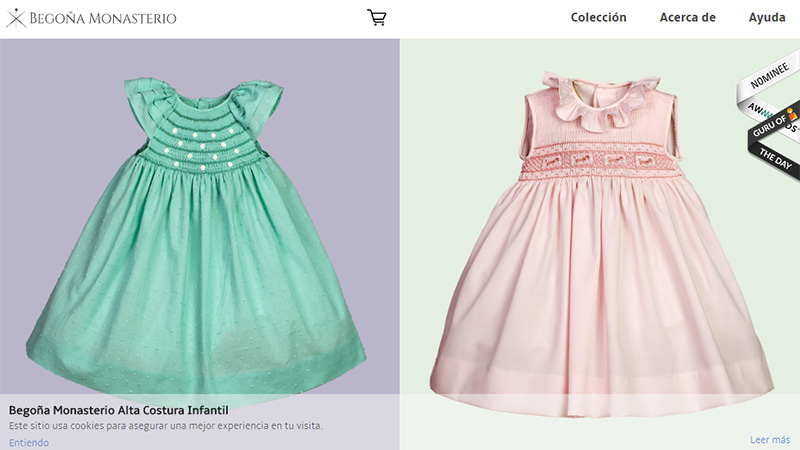
Begona Monasterio
This e-commerce website looks modern and stylish. The one screen homepage is created on top of a split layout that allows demonstrating two products at the same time and giving them the same degree of priority. What’s more, the inner product page has an identical organization.
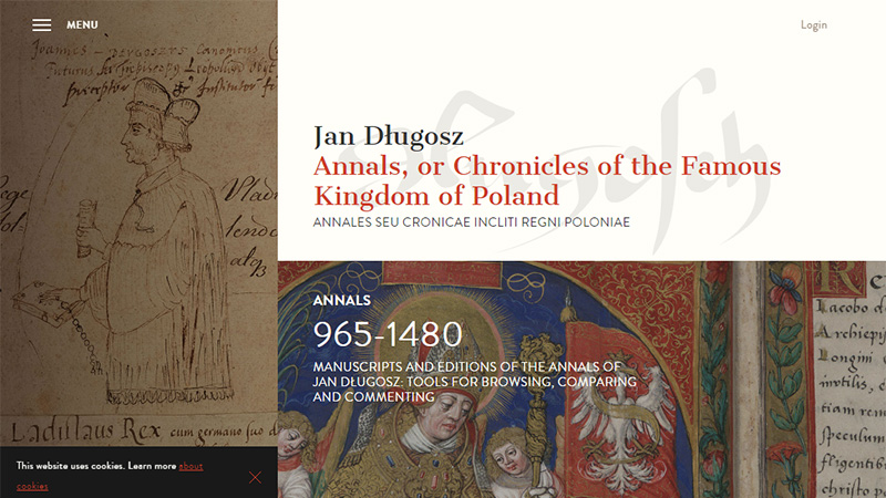
Jan Dlugosz
The design owes its outstanding look to unbalanced structure and an asymmetrical layout. The page is broken into two pieces, yet they are uneven, and that adds some piquancy.
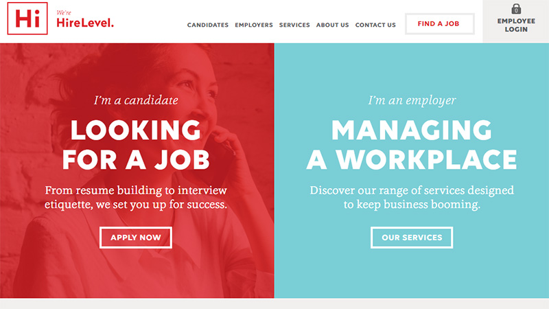
HireLevel
HireLevel meets the online audience with a visually separated ‘hero’ section. In such a way the team tries to pinpoint company’s two main areas: one is for the candidate and another one is for the employer. Each segment has its image background and primary color that do not compete.
Tanweer
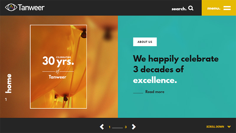
Tanweer has a full screen multimedia slider that consists of two boxes. The author adopts a refreshing take on the component, giving it a modern facelift. Thus, one of the parts displays an excerpt and link for further reading, and the second one houses an accompanying image.
Bump
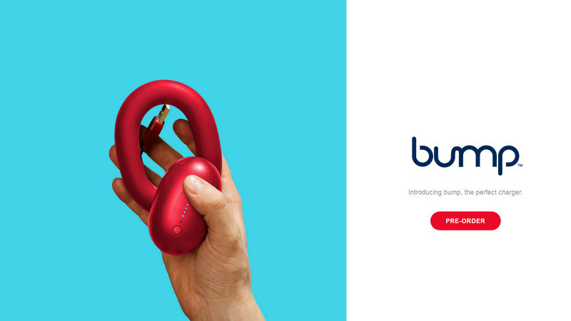
The desktop version of Bump features a slider that much like the previous example arranges the content into two carefully delineated unequal areas. As usual, the left one is reserved for an image and the right one is for text. The solution looks visually interesting and eye-catching.
Ana Vicente
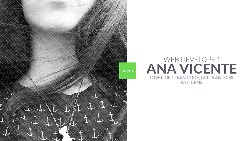
The personal portfolio of Ana Vicente feels spacious and well-balanced. The artist embraces minimalism and instills a sense of personality and charisma to the home screen. The split layout creates a harmonious symbiosis of personal touch and an informative piece.
Brux
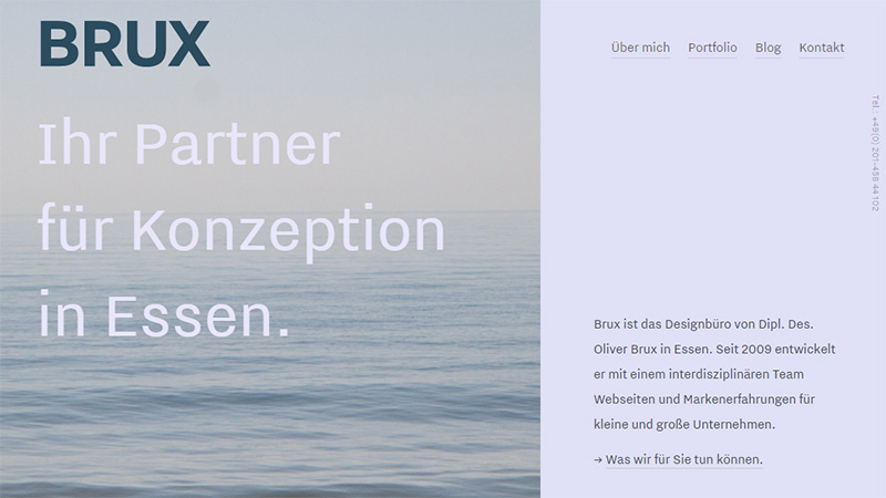
The team opts for an asymmetrical two-column ‘welcome’ screen that puts the image and title with logotype on the center stage. The solid area on the right looks like a relatively big sidebar that houses extra information. The rest of the design is merely typical: it is based on a traditional single column structure that professionally deals with all the content.
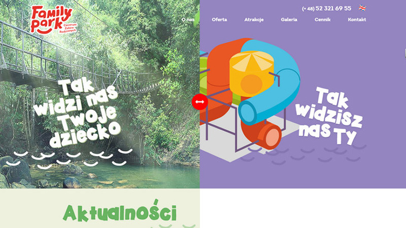
Family Park
The website needs to cover lots of graphical and multimedia stuff, and in this case, a modular approach paired with the split layout is a win-win solution. It enables avoiding a cluttered interface and provides readers with a comfortable environment full of bright and energetic visuals.
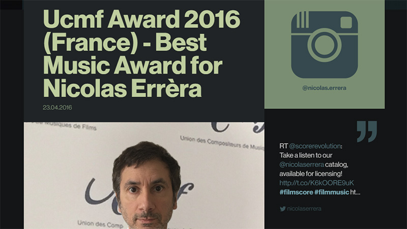
Nicolas Errera
The desktop version of the website is neatly torn into two columns. Each one houses an individual type of information. Thus, the one that is on the left occupies the bigger part and demonstrates images and posts dedicated to artist’s awards and achievements, whereas the right sidebar includes tweets.
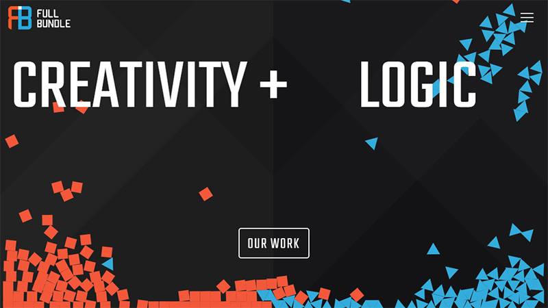
FullBundle
To add some artistic touch and charisma to the interface the team behind FullBundle has come up with an original idea. They have divided the front page into two parts that form a single playground. In such a way, initially the ‘creativity’ is set apart from the ‘logic’ but visitors have a chance to mix them together with the help of the cursor.
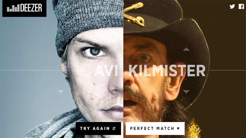
Deezer Love Roulette
The portal’s amusement is constructed on the basis of a slot machine that creates the whole buzz. There are two reels. Each one features a half portrait of a famous music artist. Keep spinning in order to find a perfect match.
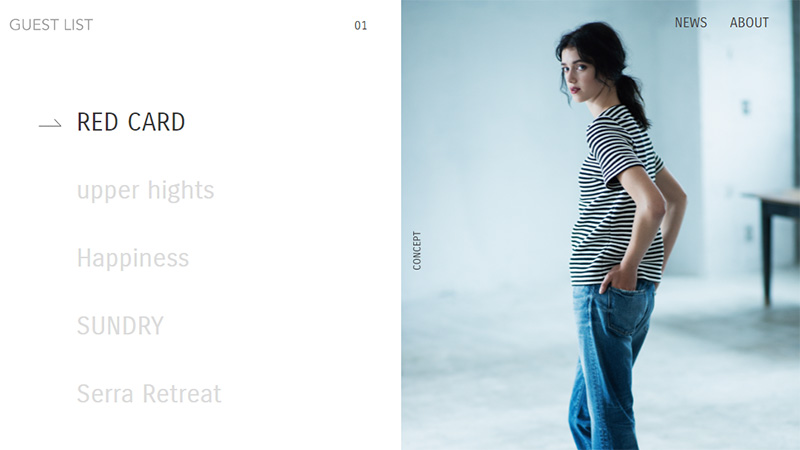
Guest List
Guest List is a microsite that maintains users’ focus on the page all the time. It consists of two blocks. One that features navigation is static and used as an anchor; and one that displays the image is dynamic and scrollable and used to reveal the content of the menu options. Thanks to such realization, users are able to get access to necessary information without leaving the homepage.
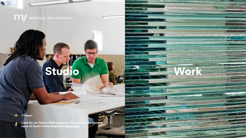
McKinney York Architects
The team places emphasis on the things that many potential clients find valuable when they are looking for an agency, namely works and staff. As a result, the landing page is constructed of two images that portray these two factors.
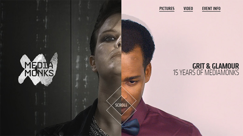
Media Monks
This is another example in our collection that gets its wow factor from a skillfully reimagined ‘slot machine’. There are also two reels that can be scrolled. As usual, try various combinations before proceeding further.
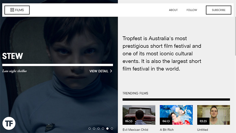
TropFest Watch
TropFest Watch is a content-intensive website that requires a reliable grid system to operate successfully. The data is organized into the two-column structure that has managed to cover a slider and a bulk of videos and images without upsetting the harmony. Everything looks clean, neat and systematized.
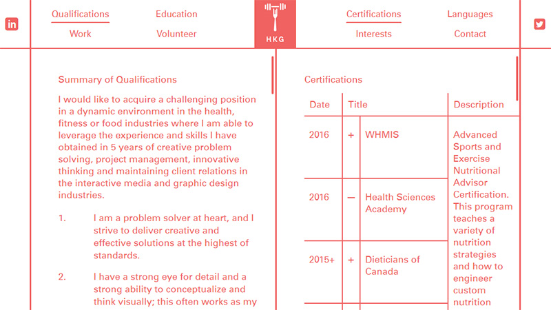
HKG
This website stands out from the crowd. Its wireframe-esque design bursts with originality. Each page has two scrollable parts that you can examine individually. Here split layout fits like a glove, finishing off the theme.
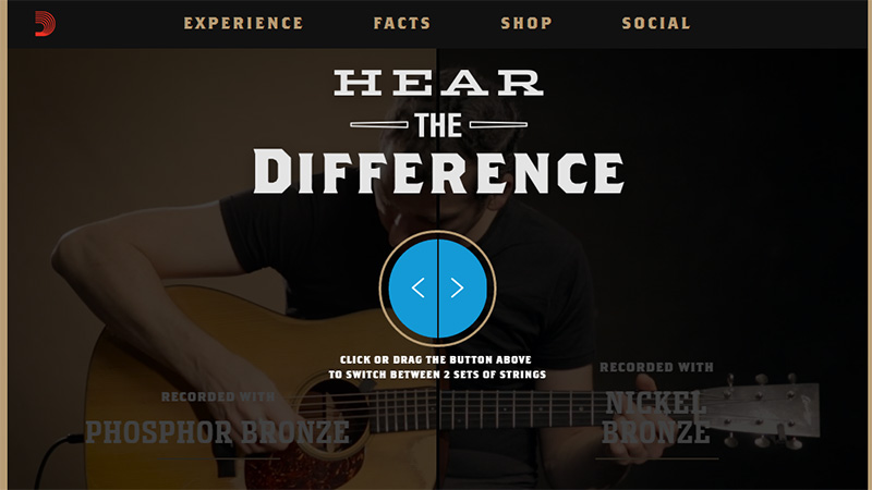
D’Addario Nickel Bronze
The team leverages the two fold arrangement of videos in order to indicate differences between their two main products. The solution is interactive; you can quickly switch between the strings just by dragging the button.
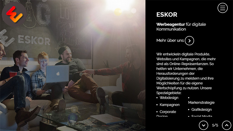
Eskor
Eskor employs a slider with a split layout that presents data in an engaging way. Thus, the accompanying text that as a rule is lost against a lavish background gets some visual weight becoming more prominent to the audience.
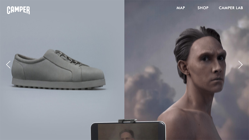
Camper SS 16
Camper SS 16 has an interactive campaign with an immersive experience. The split layout is used in inner pages as an instrument that combines product display and its corresponding storytelling.
Conclusion
The split layout is a special case of a modular approach. It looks fresh, interesting and original. As we have seen, it is capable of improving various projects. It enriches ‘welcome’ sections, gives equal priority to important things or goods, or serves as a medium to bring entertainments into life.
Tell us which example do you find the most impressive? Do you prefer such type of an arrangement?

