Moving From Sketch To Figma: A Case Study Of Migrating Design Systems
Moving From Sketch To Figma: A Case Study Of Migrating Design Systems
Buzz Usborne
For the past year, every time I got frustrated with Sketch, a colleague of mine suggested I try Figma. Then, when I wrote an article about building our design system in Sketch, I got a bunch of feedback from people telling me to try Figma. And recently, Linda, our Head of Design at Help Scout, asked me, “Hey Buzz, shouldn’t we be using Figma?”
I couldn’t fight it anymore… I just had to try Figma!
This isn’t a love letter to Figma or a harsh review of Sketch. Instead, it’s a cautionary tale for anyone who is thinking of moving tools. This is the story of how everything panned out, and the specifics of migrating a design system from one platform to another.
Understanding The Cost
The first thing to consider is that there’s a cost involved in switching tools — a consideration not usually factored into the conversation whenever there’s a #designtwitter pile-on. Only one-person teams can afford to change design tools at will; for busy teams, it’s not so easy.
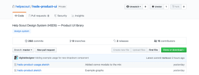
The difficulty for us at Help Scout was the fact that our design system is built as multiple, interdependent Sketch Libraries managed with GitHub. We also have multiple in-flight projects, processes and vast documentation that all depend on Sketch files. And don’t forget the monumental effort involved in training and moving an entire team onto a new tool whilst simultaneously doing actual work!
There’s also a financial cost involved in someone (in this case, that’d be me) taking the time away from business-as-usual work to research and document all this good stuff. Point is, if you work in an established design team, you’ll know that changing tools is about as easy as moving offices.
But that’s how this works. Tools are “sticky” just by virtue of being hard to leave. Suffice to say, this wasn’t going to be a decision we made lightly.
Kicking The Tires
With the understanding that my decision would have an impact on the whole team and organization, I started by spending two full days exploring Figma. I watched videos, I spoke to other designers who use it often and I played with the tool… a lot! Essentially, I explored how easy it would be to move our Sketch components over. A question that came to mind was whether it would be as easy as opening a .sketch file in Figma?
Unsurprisingly, no.
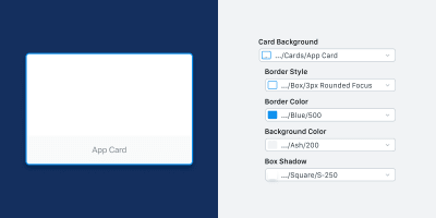
It turns out that Figma and Sketch — while similar in layout and functionality — have some key differences in how they allow components to be overridden. This was the kicker. Figma allows for color, type and effects (shadows, etc.) to be customized by the user, whereas Sketch will only allow pre-determined overrides. Because of the limitations Sketch imposes on overriding components, we’d built our original design system around that — allowing full color, border and style control using a complex system of masks and building-block components.
Over-complicated? Yes. But it worked great for us.
Here’s a simple card symbol in Sketch which was made from five nested symbols that were necessary in order for us to achieve the level of flexibility we required. This is the exact kind of thing that doesn’t import well into Figma.

While this complexity in Sketch allowed us the level of flexibility Figma offers out-the-box, it meant that almost any component imported from Sketch brought an unnecessary level of complexity along with it. In order for us to use Figma, we’d need to rebuild everything from scratch to strip each component down to the essentials.
Decision Time!
Given the above, my initial decision was that although I thought Figma was the better tool, the stronger company, and the safer long-term bet, it was going to be too difficult and costly to switch. Re-building entire libraries is a big job! It was like breaking up before we’d even given it a chance.
“It’s not you, it’s us.”
But as it happens, Figma are Help Scout’s customers. On hearing our decision to stick with Sketch, our Head of Sales set up a call with the Figma product team — not necessarily to change anyone’s minds, but to share our experiences, more like as friends do. They were understandably cool about the whole thing, but asked whether they could talk to me about my decisions. And that was an opportunity not to be missed!
In the days leading up to my conversation with the Figma team, I decided to jump back into the tool — at the very least to give myself enough understanding to be able to talk with confidence and not look like a total amateur in front of people who knew a lot more in this area than me. By the time I spoke with the team, I was a convert — in just those couple of extra days, I realized how much more productive and collaborative we’d be as a team with these kinds of features at our disposal. The cost of switching hadn’t changed, but my opinion of whether the cost was worth it had. Help Scout’s Head of Design made a compelling point to that effect too: If we feel like we’ll make the switch someday, then why not today?
So my conversation with Figma ended up being more along the lines of, “Give me some advice on how to make this work,” which they graciously did.
How To Switch
So it’s possible that you might be in the same spot I was; you want to move tools but are faced with the monumental task of rebuilding hundreds of components, styles, and a load of documentation. Well, friend, you’re going to need to take a deliberate and systematic approach to this. Your mileage may vary, but this is how I moved Help Scout’s entire design system to Figma in just a week.
- Split Your Libraries
- Lean Heavily On Styles (+ Documentation)
- Show How Components Extend
- Organize Properly
- Importing vs. Re-Building
- Get Your Team On Board
- Go All In
1. Split Your Libraries
This applies to creating Sketch libraries too, but I strongly suggest splitting design systems into separate sub-libraries that cover different parts of your ecosystem. In our case, we have Core which contains components applicable to any designer (brand assets, illustrations, icons, etc.), then domain-specific documents. This approach makes migration a bit easier to handle when you’re moving things over in organized chunks.

In our case, migrating to Figma involved beginning with the Core elements — which were then used to build out subsequent libraries.
2. Lean Heavily On Styles (+ Documentation)
Figma has “Styles” that work in the same way you’re used to seeing Type Styles working in Sketch, but with the added benefit that these also apply to color and effects. With this in mind, it’s really useful to define all your colors and shared elements in one single library, then document them.

3. Show How Components Extend
Since Figma allows much greater control over how components can be extended, you’ll probably end up with fewer components than you had in Sketch — instead of “button solid color” and “button outlined,” in Figma you’ll just need “button”. Because of this, I found that it was important to document the different ways a component can be extended directly within the library itself.
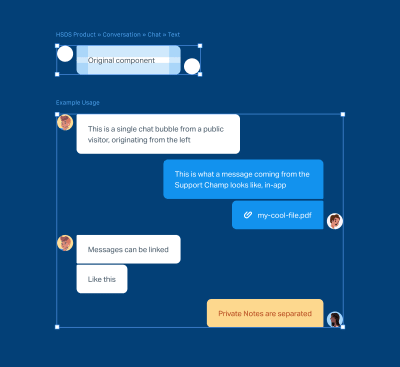
For example, only one component is required to re-create an entire two-sided chat conversation in Figma. But a new designer would never know what overrides to apply, so it’s important to visually demonstrate whenever it’s possible. Here’s the same component being used in six different ways:
4. Organize Properly
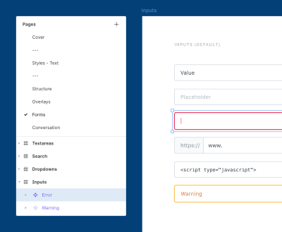
I quickly abandoned trying to replicate the naming structure I had in the original Sketch files because of subtle differences in how Figma’s file system works. Ultimately, the aim is to make sure components are in a logical place and easy to find, and the best way I found to achieve that was to carefully organize my Pages by category (e.g., Forms), Frames by group classification (e.g., Inputs) and Components by individual element (e.g., Error). Being specific about naming makes components super easy to find — especially by people who didn’t originally create them.
5. Importing vs. Re-Building
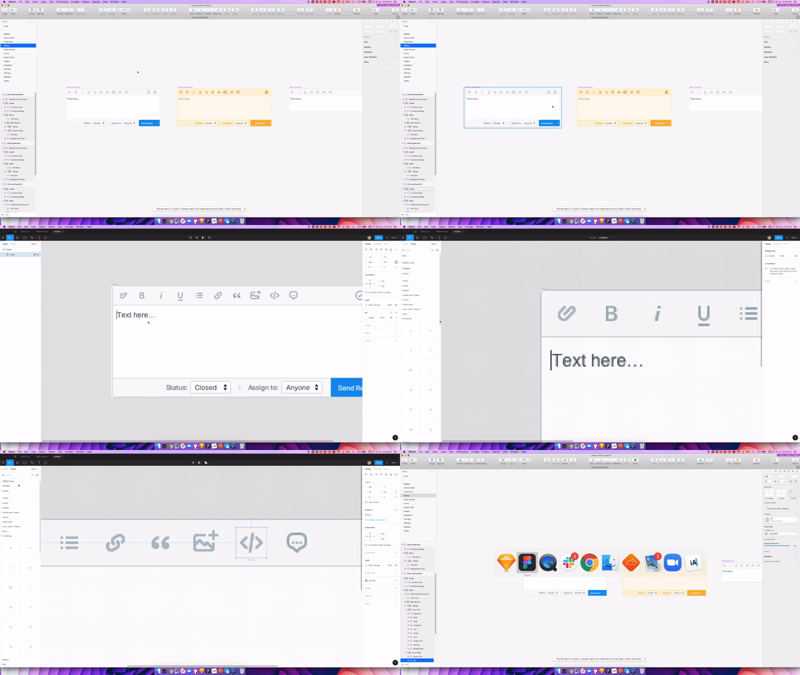
Phew, I wish I had good news here about the physical act of importing Sketch components (for a lot of things, namely individual elements like icons which you can import from Sketch and it’ll all work out great). However, for more complex components (especially ones that involve masks and nested symbols), you’re better off re-creating the components from scratch. Yes, it’s extremely painful, but on the upside, you’ll get really good at using Figma in a very short time!
My workflow in Figma for re-creating the more complex Sketch components was literally to screenshot then “trace” them in Figma. As ridiculous as this sounds, it turned out to be much faster than importing from Sketch and removing the unnecessary elements. And I’m a little bit ashamed to say that I love this kind of work, but also, turns out that this workflow was more effective.
(But of course, if you’re migrating simpler components like icons, then Figma’s importing capabilities will serve you just fine.)
6. Get Your Team On Board
As a 100% remote team, most things we do at Help Scout are well communicated — this was no different. So while the team was aware of the impending tool switch, it wasn’t until I had finished the design system that they got the nudge.
At this point, I gave a 20-minute demo video explaining Figma, some basics on how to use it, and some of the cool improvements they’ll find to their workflow when using components. This turned out to be a hit and definitely softened the blow for people who were perhaps a little hesitant about the move at first.
7. Go All In
Part of my initial research involved seeing whether we could maintain our design system in Sketch and Figma simultaneously. I’m certain it can be done, but it’s a bit of a stretch for us given our fairly small team size and the fact we have no single person or team dedicated to the upkeep of our libraries. But instead of keeping what we had in place, I decided to go all-in on Figma.
This meant creating and updating all documentation and employee onboarding to reference the new stuff which forced me to address the migration of anything that referenced the old stuff — including existing development processes and designer hand-off. Ultimately, drawing a line in the sand meant that we were all committed to making this a success.
Of course, the Sketch libraries still exist; they’re just no longer documented nor updated. And in terms of migration, in-flight projects continue to use Sketch files (although some designers have chosen to migrate their work to Figma), whereas new projects use Figma. It’s a clean break.
Conclusion: Make A Plan!
It’s hard to conclude an article like this without sounding like I have all the answers — which I most certainly do not. But my advice to anyone switching tools is to take it slow. Put in the research, make a plan of attack, figure out the cost then weigh up whether you’re prepared to pay it — this applies whether you’re moving to Figma, Sketch, InVision Studio, Adobe XD, Framer X or some other trendy new tool I haven’t heard of yet.
For us, time will tell, but I’m still pretty confident we made the right call!
Further Reading
- “Building Our Sketch Library,” Michael Fouquet, Hudl
- “(More) Tips For Building Your Sketch Library ,” Buzz Usborne, Help Scout
- “What To Expect When Moving From Sketch To Figma,” Josh Dunsterville, Figma Blog
- Spectrum Figma Community
 (mb, yk, il)
Articles on Smashing Magazine — For Web Designers And Developers
