Mouse Over Effects Web Design Trend with Fresh Examples
The success of website design depends on numerous aspects. However, when it comes to user experience, as a rule, details make the whole difference. While every element in design does count, there are some features that enhance the project more than others.
Dynamic constituents do not go unnoticed and always catch the eye. They are those that spin the project creatively, give an experience a cutting-edge feel, reinforce the general feeling and make the interface alluring and appealing. Sometimes they are garish and flashy; sometimes they are just barely noticeable; nevertheless, their impact is always tangible.
One of the fresh dynamic trends among the creative folks is implementing various mouse over effects. They are not evident and triggered only when the cursor hits the required area and begins to move yet it achieves a favourable outcome that instantly engages the visitors.
This small enhancement that brings into life parts of overall composition is a win-win solution that has a certain degree of ‘wow factor’.
Today we will explore twenty examples of website designs that use mouse over effects to produce an instant impression.
Mouse Over Effects in Web Design
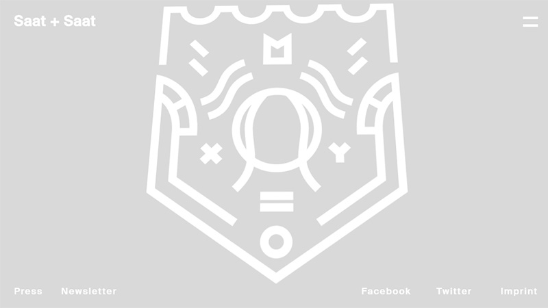
Saat + Saat
The website welcomes visitors with a pretty minimal and spacious front page. However, it has a nice twist. Relatively big logotype that is placed in the heart of the screen can be twiddled in several directions with the help of the mouse cursor.
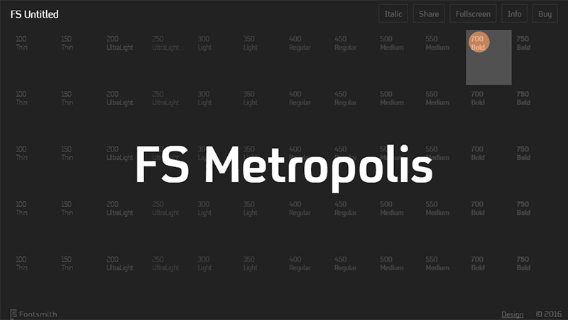
Font Smith
The team invites visitors to pick a name for the font face. The screen consists of a ton of cells, each of which can be clicked for further manipulations. While you surf through the page, not only does each unit change its color and offer you to visit it, but also the mouse leaves a lovely fading trace, when you move too fast.
Pixels by Tomer Lerner
Tomer Lerner adopts a modern solution by incorporating a vigorous abstract background that responds to visitors’ actions.
Here you will find plenty of outlined and solid geometric objects of various shapes that are chaotically scattered throughout the screen. Use the cursor to set the scene into motion.
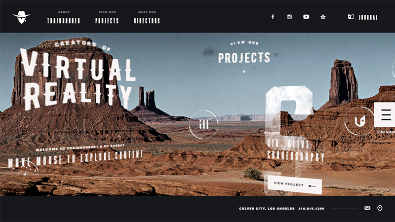
Trainrobber
The team offers users to take part in a unique and offbeat exploration. You are welcome to examine the header section that is overpopulated with various exciting features with the help of the mouse.
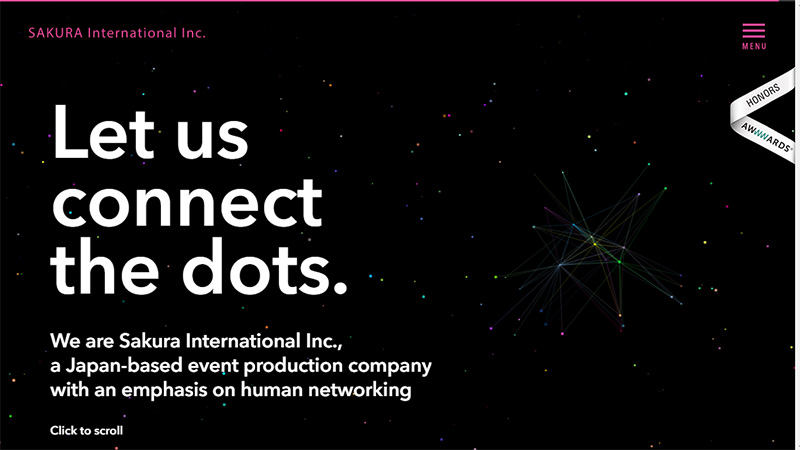
Sakura International
Sakura International is defined by another trendy kind of background these days. It exhibits a lively canvas that is enriched with a skilfully reproduced particles animation.
You can connect the dots together and form paths between them by means of the cursor.
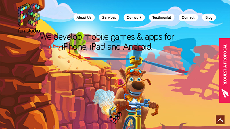
Fan Studio
Fan Studio looks juicy, cartoonish and spectacular. However, that’s not all; the backdrop that tries to convey movement with its illustration can be partially pivoted in two main planes to instill a subtle sense of motion.
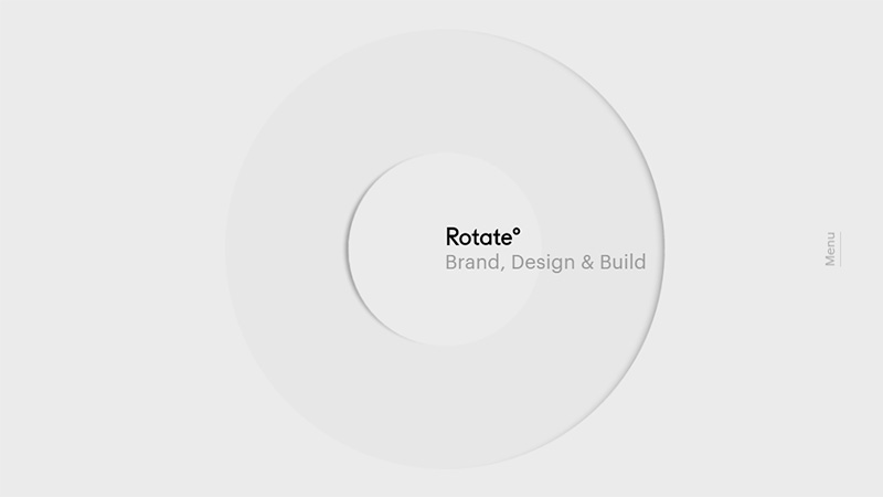
Studio Rotate
The agency embraces minimalism in terms of its homepage. The latter does not look boring nor insipid, thanks to the logotype that reacts to users’ moves. It becomes brighter when you pull the cursor farther from the center and almost disappears when you hit its area.
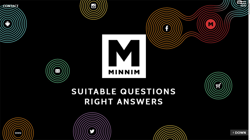
Minnim
Minnim has a dynamic front page with lots of dimensional line style circles that gently vibrate. You can easily link two elements together and form not only a bond but also generate a new item between them that will include a logotype.
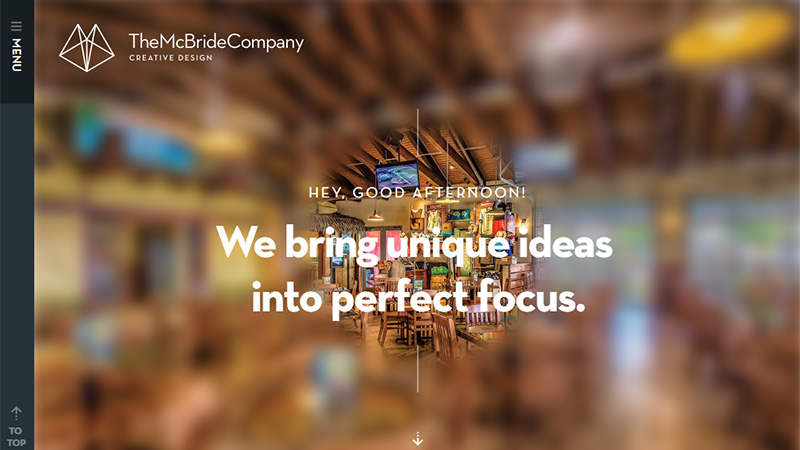
The McBride Company
The team demonstrates an interesting take on the mouse over effect. The homepage is based on a spectacular landscape image that is intentionally blurred. While you move the cursor along the page a small area beneath it becomes clear, giving you an opportunity to enjoy a high-quality, crisp version of a picture.
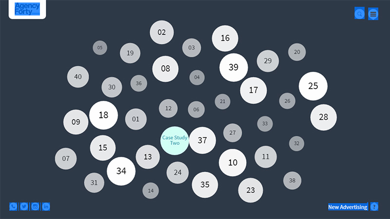
Agency Forty
Agency Forty’s online portfolio is marked by inventive navigation. Hover over any circle to find out what is hidden inside. The great thing is that the idea works both with traditional desktops and touch screen devices.
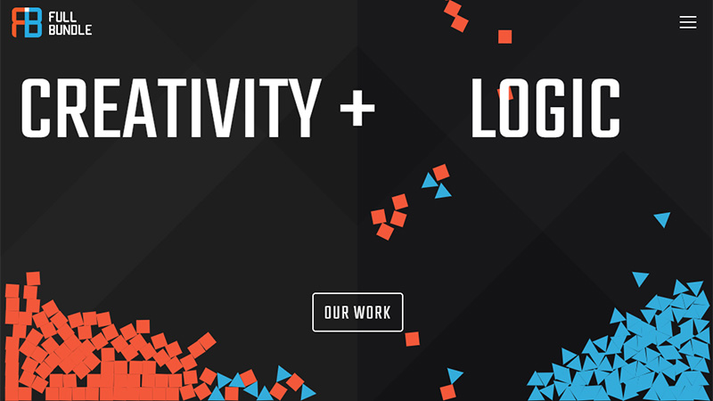
Full Bundle
Full Bundle puts the users into the driver’s seat by letting them blow away squares and triangles that are falling from the top. Use the mouse to disperse this mass of colorful geometric shapes.
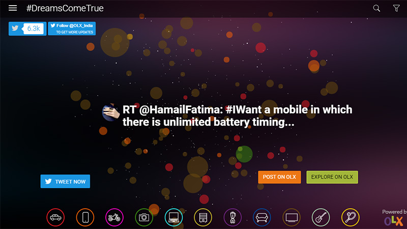
Dreams Come True
The front page has an original dynamic installation that shows a ton of flat, colorful bubbles, which are swirling and moving in one direction. Each object is linked to a Tweet with the hashtag ‘dreamscometrue’. Activate it with the help of the cursor and read through the messages.
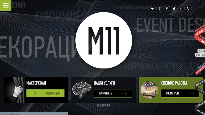
M11
The team applies mouse over effects to numerous constituents of the design. Buttons, icons and of course the logotype are supplied with another state that becomes evident when the user gets into the specified area.
JustCoded
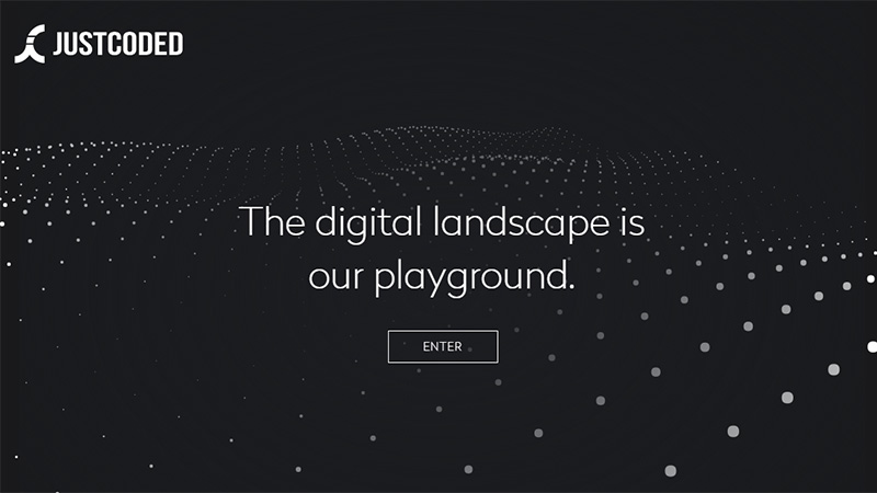
JustCoded has an incredible dark design with a marvelous aesthetic and several sophisticated traits. Here, the ‘welcome’ screen is built on the top of a dynamic abstract background. It feels alive because of a subtle yet restless behavior. It is also a some kind of playground that reacts to the mouse cursor.
Haus
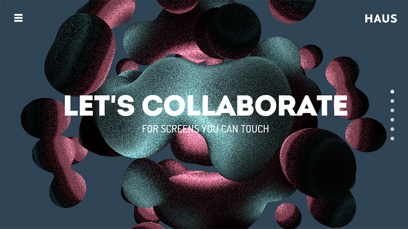
This odd 3D centerpiece that prettifies the front page is pretty manageable. When you hover over it, the color starts to change, and when you hold down the left button, you can rotate it on different axis.
Clever Franke
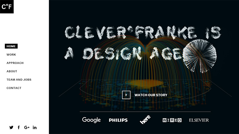
Clever Franke has a thing to marvel at, and that is its dynamically generated title. It is charged with energy that makes it act rather chaotically. Having landed on one of the characters, the mouse starts to destroy the letter, forcing it to partially blow up; but a few seconds later, everything falls back into place.
Pixel Palace
The online portfolio is spiced up with some nice twists, and the dynamic geometric background that prettifies one of the sections on the front page is one of them. Not only does it smoothly move in various directions, but it also responds to the cursor, letting users create various geometric shapes.
Message Design Center
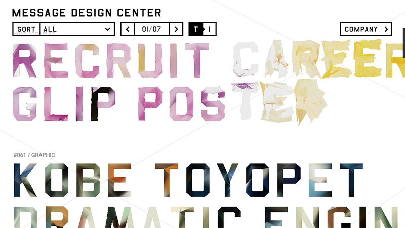
Message Design Center breaks the monotony of simple designs with its unique and a bit bizarre solution. The front page includes numerous messages that pulsate and feel alive. The cursor gives each symbol a little acceleration making it behave spontaneously and adds more energy.
Kinetic Apps
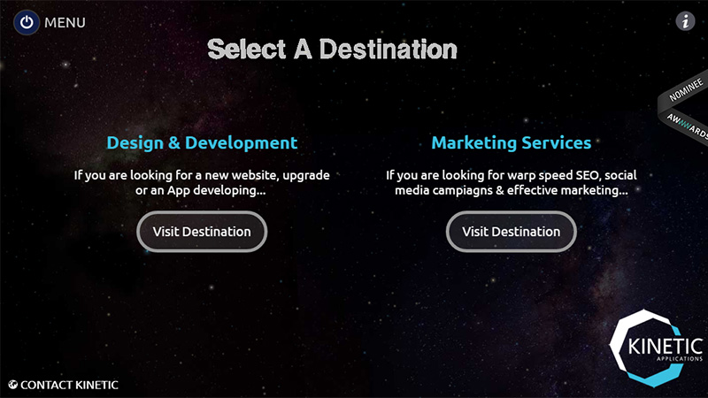
The website speaks entirely through the action. It is full of energy and emotions. Use you mouse to explore its expanses.
Studio Monocromo
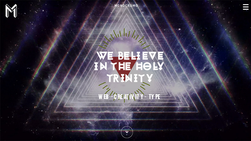
Studio Monocromo has assigned a small animation to the logotype that is triggered by the cursor when it falls into its area. The background begins to move thereby establishing a feeling that you are being drawn in. Magnificent sci-fi typography in tandem with a beautiful environment, improved by dynamic touches, separates the project from the others.
Conclusion
As you may have guessed, the only drawback of these tiny but original and eye-catching features lies in a lack of support for touch screen devices.
In the majority of cases, versions for tablets and cell phones are based on a static environment. Nevertheless, several examples in our list prove that these effects can also be triggered by a tap to ensure the consistency in user experience.
Do these tiny effects make any difference for you? What do you think about such projects?

