Mid-Century Modern Illustration: Creating A Cover Book With Illustrator And InDesign
Mid-Century Modern Illustration: Creating A Cover Book With Illustrator And InDesign
Manuela Langella
In this tutorial, I’m going to show you how to create a beautiful cover design inspired by the 1950s. Specifically, the cover will be for a children’s book, so we’re going to create a well-known character: Little Red Riding Hood.
The interesting aspect of this design is that we are going to create its purely retro character that was typical for cartoons back then. As an illustrator, I have always been fascinated by the graphics of the last half-century. I grew up watching many cartoons, books, and comics characterized by that style, although I wasn’t exactly born in the 50s.
This is the reason why I want you to soak in a little inspiration from 1950. In this article, I’ll explain why I chose this precise historical period to inspire me and where my love for this type of artwork comes from. I’ll also share some ideas which you can find online if you are looking for a little inspiration to give this a try yourself.
In order to follow along, you can download the files and practice on my self-made drawing or, if you like, you can create one of your own. The important thing is that you follow all of the steps and tips if you want to create an absolutely fascinating retro design!
You will then discover the world of retro colors and all those effects that will allow us to have retro effects: I’m talking about brushes, textures, and patterns. Once the design is finished, the cover design is ready. Finally, we will prepare our cover in InDesign to export for print.
Are you ready? Let’s have fun!
1. Why Mid-Century Art?
Growing up, I read so many comics and watched so many cartoons. But not any kind — just the ones that had been drawn in a mid-century style. I’m not sure why that particular design atttracted me that much; maybe it was because of the simple lines used in the drawings or the pastel colors that were used to create the comics and cartoons.
As an illustrator and graphic designer, I always search for inspiration and like to browser through Pinterest. (It’s a great place to discover some very special ideas!)
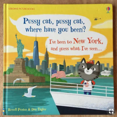
While searching for some retro inspiration for this tutorial, I found a couple of illustrations that captured my attention:
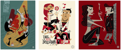
I absolutely love the hilarious way these artists have represented people and things in their artwork — the exaggeration, the details in simplicity, and the vibrant colors. Aren’t they something!
I’ve always wanted to know everything about drawings and designs created during the mid-century age, and the more I research, the more I keep rediscovering a world created with beautiful patterns, Scandinavian colors, and simple but very communicative designs.
2. Looking For Inspiration
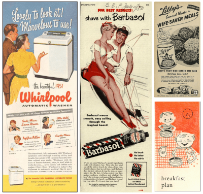
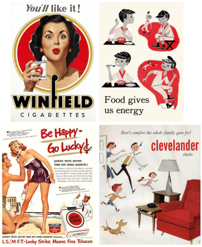
There is so much to discover about mid-century designs. Here some examples of very inspiring advertisements and illustrations.

Characteristics: few colors, simple lines, brush effects.
3. Drawing Concepts
For this tutorial, I wanted to find something to draw that is well known to everyone, so that it’s not too difficult to understand how the details can be applied to an illustration of your choice later on when you want to try out the steps on your own.
3.1. How To Import A Hand-Drawn Design
So, Little Red Riding Hood came to mind. I’m going to guess that everybody is familiar with this fairy tale, and we all have an idea of how Little Red Riding Hood looks like. As children, we have seen her at least once, i.e. in a book or a cartoon.
As with all of my designs, I begin drawing my idea by hand. Below, you’ll see the two original drawings (including the erasures and the yellow color of recycled paper):
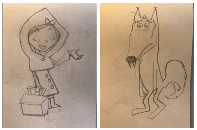
I tidied up my sketches with the help of Photoshop and so now we can easily outline the characters and use them in the illustration:
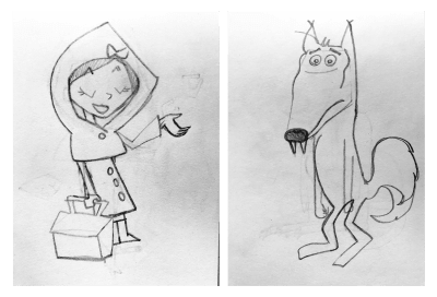
Note: You can download the start images over here.
To achieve the retro look, let’s take a look now at which elements I used for the principal characters:
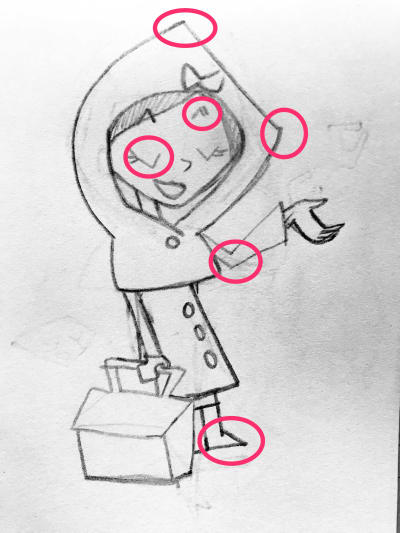
Edges are one of the most useful details used for mid-century graphics and designs. I think edges give a very funny nature to the design, making it very playful and childish.
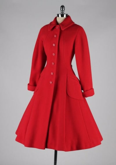
The little coat I used is also typical of 50s clothing:
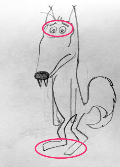
For the wolf, I also used some typical elements from the 50s, such as the cartoon-like as eyes and feet:
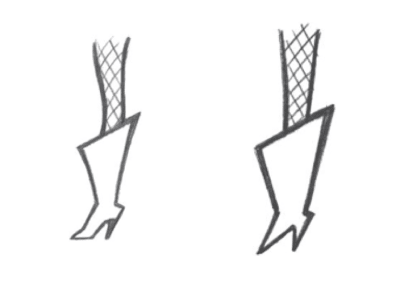
Funny note: In his book, “Modern Cartooning: Essential Techniques for Drawing Today’s Popular Cartoons”, Christopher Hart shows two ways to draw the same shoe:
“It’s funnier to draw the boots in a quirky manner. The disadvantage is that they only come in a size 7.”
I decided to give the wolf typical facial expressions that were widely used in retro cartoons. Take a look at the image below (taken once again from Christopher Hart book):
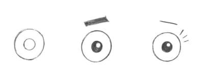
“The circle shape is the most common eye shape. It can be used for almost any character.”
For the rest of my design, everything follows the same rules. The trees, the house, and even the clouds have that particular edgy effect.
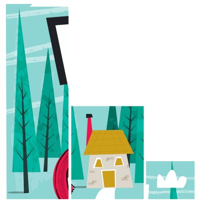
Now that you know how to get started, we can finally begin to bring our illustration to life!
Let’s fire up Adobe Illustrator.
3.2. How To Create A Basic Design
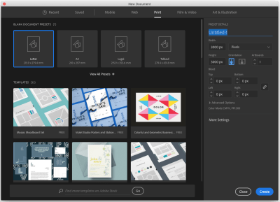
Once you open Illustrator, start with creating a new document first. I will create a square artboard for a square book cover. (Many children’s books have a square shape.)
Let’s go to File → New. In the open Window, I chose Print because I’d like to have my design printed. Then, I set 3000px × 3000px for the artboard size. Finally, I name it Little Red Riding Hood. See my setting below:
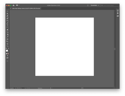
Now you have to import the drawings. (I’ve provided the files for you here.)
Go to File → Place, choose the folder where you saved the drawings, and put them onto the artboard. Since the files are bigger than our artboard, just resize them to fit in.
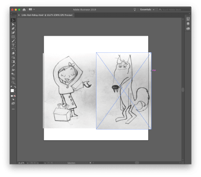
Put the drawings on two different layers, so we can have control on both of them.
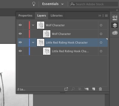
Once we have done, let’s go to the further step: create a brush to draw in Illustrator.
3.3. How To Create A Retro Brush
I have drawn some brushes myself, inventing something always based on the 50s style. As you can see in some examples below, used lines are not perfect. They always give the impression of something handmade.
So I grabbed my iPad and drawn some lines I liked in Procreate. I wanted to give the brushes a hand-drawn look, typical from 50s design, so this is my result:
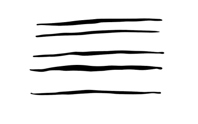
Note: For our mid-century-inspired illustration, I’ve provided the brushes for you here— feel free to download and use them.
So, let’s go back to Illustrator and see how the brushes can be installed.
Open the file you just downloaded and open it in Illustrator. Be sure your Brush Panel is open by clicking on Window → Brushes. Select the first brush from the file you just opened and drag it into the Brush Panel as shown below:
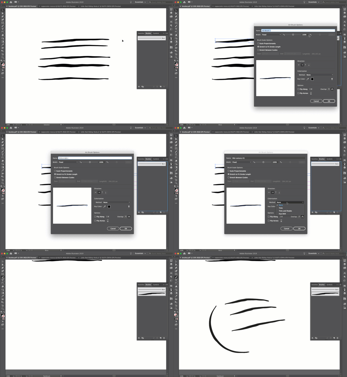
As you can see, after I dragged the brush in the Brush Panel, I selected “Art brush” from the open window and renamed the brush. I checked the “Stretch to fit stroke length” option and then selected “Tint” as Colorization Method. This way, we will be able to change our brush color as well.
Let’s go on and drag all the brushes in the Brush Panel, following the same instructions as above. At the end, you should have five brushes:
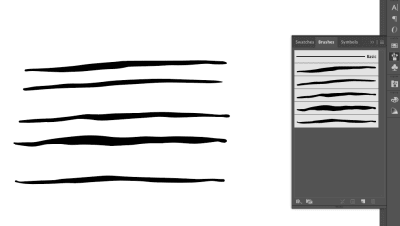
Nice! Your very own custom mid-century-inspired brushes!
Note: If you want your brushes be permanent in Illustrator, select them all and click on the first left icon at the bottom of the panel (“Brush Library Menu”). Then click on “Save Brushes”.
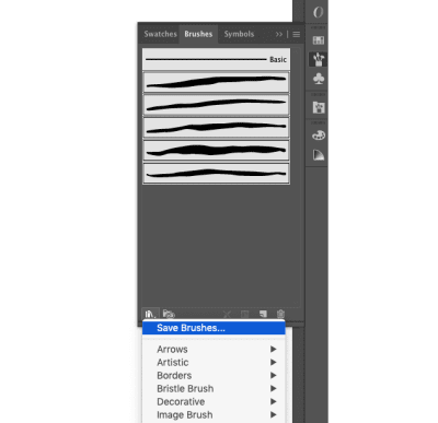
Illustrator will save them in a “Brushes” folder as the default. Then you will see your custom brushes by clicking Brush Library Menu → User Defined.
3.4. How To Outline Drawings
With our new brushes, let’s begin to outline our design. You just need to select the brush you like most and begin to draw on the design lines.
If you don’t see the brushes in your panel, go on to Brush Library Menu → User Defined and choose mid-century01 (or whatever other name you used).
Select the layers with imported files and set their opacity to 50% through the Appearance panel:
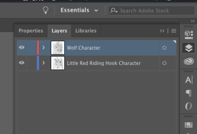
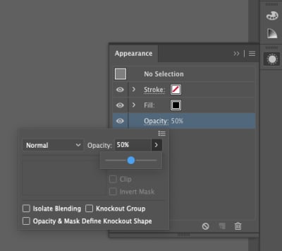
Once you’ve done that, lock them and create another layer on the top. Then, begin to trace:
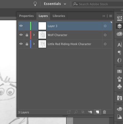
You can choose to work with just one or all of the brushes — it’s up to you. I suggest to use the first one for thinner lines, and the other ones for thicker lines. Of course, you can set the size of the brushes in any way you like.
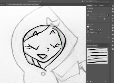
Have fun by tracing all of the lines. The thing I like the most are the trembling lines — that’s exactly the effect I desire.
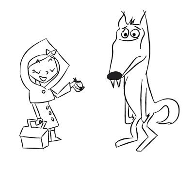
Your finally design should look something like this:
3.5. Further Details
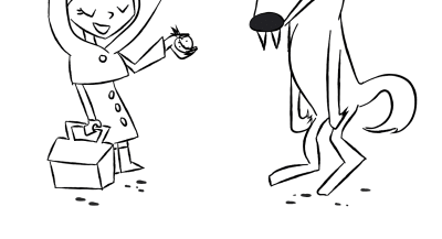
Now, let’s add some details to our characters. I drew some stains with the help of the Blob Brush tool (Shift + B):

This is the result:
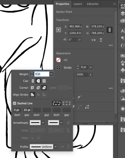
Another cute detail are the dotted lines on LRRH’s coat. They are very simple: open the Properties panel and click on Stroke. Check the Dashed Line and give 0 pt dash and 20 pt gap:
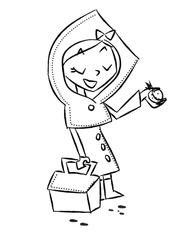
Grab the Pencil tool (N) and draw dotted lines on the edges of the coat.
This is the result:
Now that we’ve completed this step, we can now continue to the next one: adding colors, textures, and effects.
4. Colors, Textures And Patterns
4.1. Coloring Characters
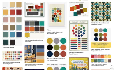
The first thing we need is a palette to color our characters. I researched some colors on Pinterest and saved many interesting palettes on my Pinterest wall:
I then created this palette for myself:
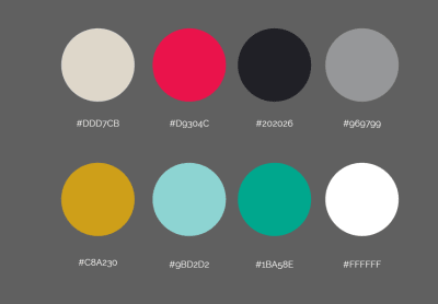
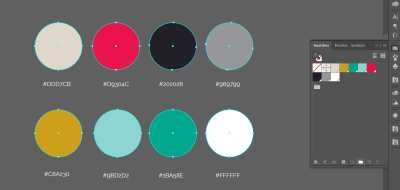
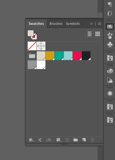
Let’s insert our palette in the Swatches. Create some circles with these colors in Illustrator, then select them and open the Swatches panel through Windows → Swatches. With color circles selected, click on New Color Group:
In the pop-up window, click on “Selected Artwork”, including “Convert Process to Global (the palette will be permanent in the Swatches panel) and “Include Swatches for Tints”.
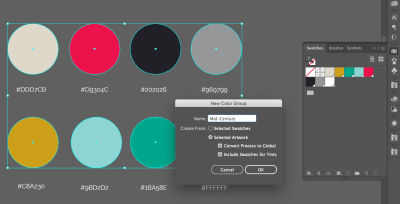
And now we have our palette in the swatches:
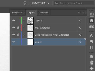
Let’s color Little Red Riding Hood and the wolf. Go into the Layers panel and create a new layer below the other two:
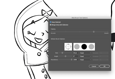
Grab the Blob Brush tool and begin to color on this layer. The lines of the characters will stay on top and colors on the bottom.
I set the Blob Brush as shown below:
Take the time you need to color everything. This is a relaxing and fun step, so enjoy it!
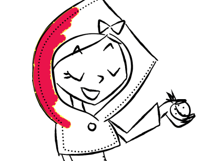
Here are my final colors:
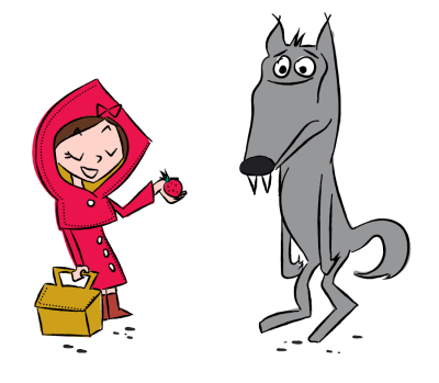
4.2. Brushes Effects
I used some other brushes to create shadow effects on the characters. The brushes are default in Illustrator; you can find them by clicking Brush Library Menu → Artistic → ChalkCharcoalPencil.
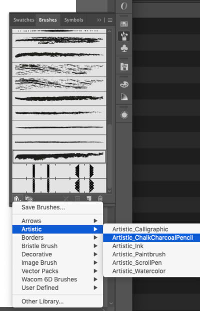
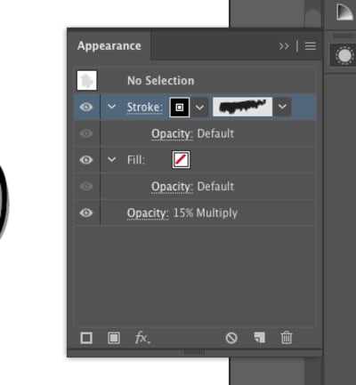
Select one of them, go to Appearance and set the opacity to 15% Multiply.
Now, draw some lines on the characters to create some shadow effects:

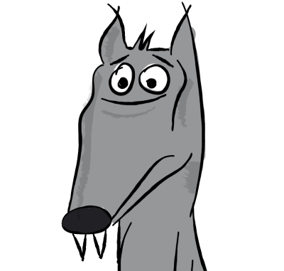
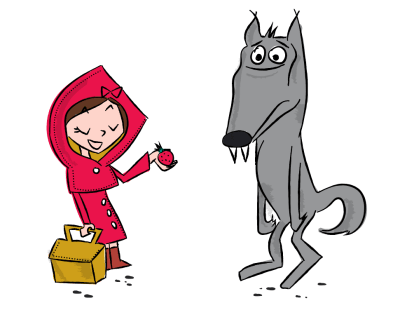
And we’re done with the characters! Let’s move on to the background.
4.3. The Background
As first thought, we probably need to start with the sky. So let’s create another layer (under the characters) and rename it as “Sky”.
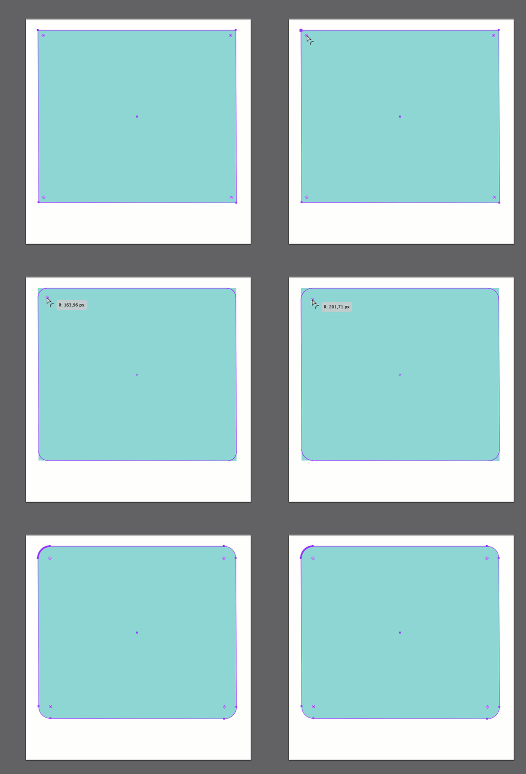
Draw a rectangle with the color #9BD2D2, then grab and drag a circle inwards to make the rectangle rounded.

Again, let’s work with the Chalk brushes see 4.2. above. With the same color applied as the background. Brush some lines at the bottom of the rectangle to give some art effects:
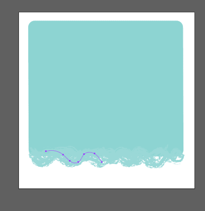
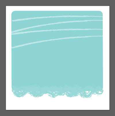
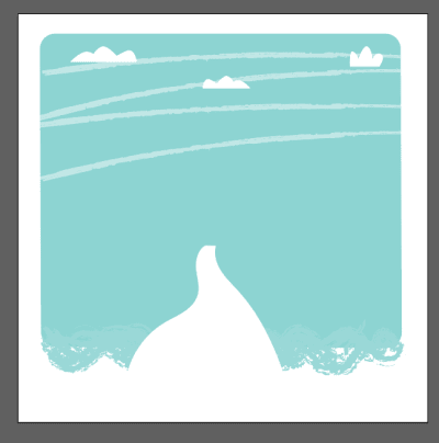
We will add some others brush effects to the sky. Create a new layer above the sky one and rename it as “Brushes effect”. With another charcoal brush (I used charcoal feather), draw some lines in the sky. The color is #FFFFFF with opacity set to 50%. See the image below.
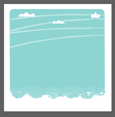
Now that wasn’t that hard, was it? Let’s draw some clouds now. You can use the Pencil tool (N) with #FFFFFF as the color and draw some simple shapes like the ones shown below:
Next, draw a country lane with the Pencil tool (N) (again, with #FFFFFF as the fill color):
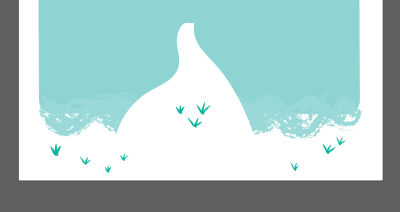
Let’s add some tufts of grass. Select a brush as we did in 4.3 and draw them as shown below. Set the brush color to #1BA58E:
By using the Rectangle tool (M), you can create simple shapes so let’s try to create a little house in the background as well. In order to make it a bit deformed, we need to use the Direct Selection tool (A), then grab and drag the angles.
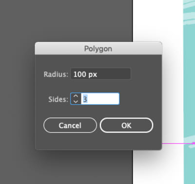
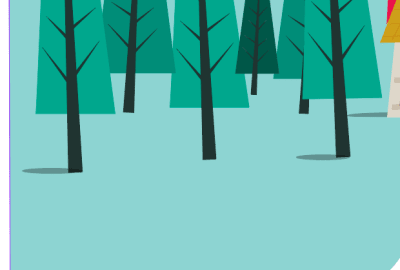
Let’s move on to the trees now. With the Polygon Tool, click just once on your artboard, so that a window appeary. Set “3 sides” and 100 px for Radius:
For the triangle you just created, set the background color on #1BA58E. To make it look a bit deformed, use the the Direct Selection tool (A), then grab and drag the angles like we did when we created the house earlier.
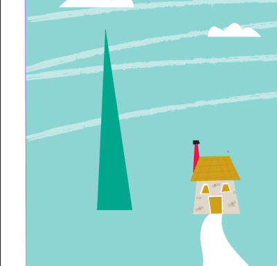
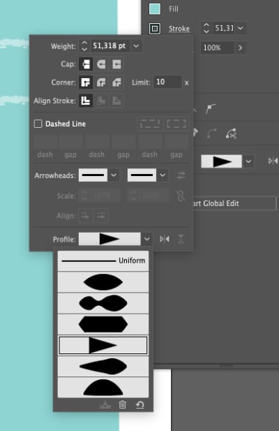
With the Pen tool (P), make a simple line in the center of the tree. Open Window → Stroke and set the stroke profile as shown below:
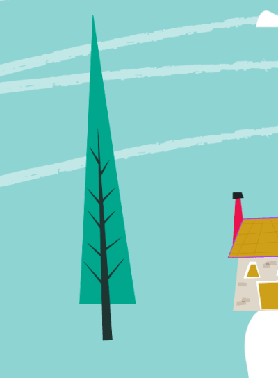
The result should be something like this:

Keep the same settings and draw some little lines with the Pen tool (P) to create a couple of branches:
Let’s now group all tree elements, duplicate it or create some other trees to fill the scene. Put every tree on a different layer and play with layers to give depth to the scene.
Be brave. Try different shades of green for the trees:
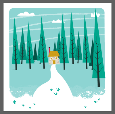
With the Ellipse tool (L), create some circles under the trees to simulate a shadow. Set the background to #000 and the opacity to 50%.
4.4. Texture Effects
Let’s now add some effect to the trees, to make them more “retro”. I applied this effects just to the trees, but you are free to apply it to the entire design.
First of all, we need a texture. Since we work in vectors, we should apply a vector texture. You can download one for free (just googling “vector textures”. Anyway, I provided a vector texture for you here.
Download the texture and open it in Illustrator. Create a new layer and rename it as “Texture”.
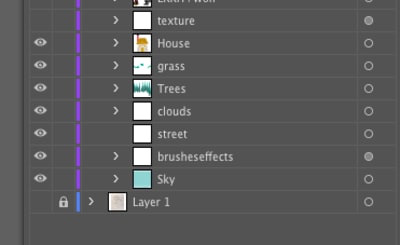
Put the texture on the new layer. Your illustration should look like this:
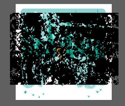
Don’t be scared, we won’t ruin our design. We just need to make some changes.
Go to Windows > Appearance and set the Opacity on 15% and Blending Mode on Overlay. Then go to Object > Expand.
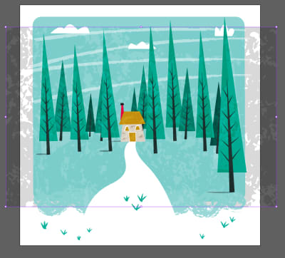
In order to apply the texture just on trees, I deleted the superfluous parts of the texture with the Eraser tool (Shift + E). See my example below:

Here my final result:
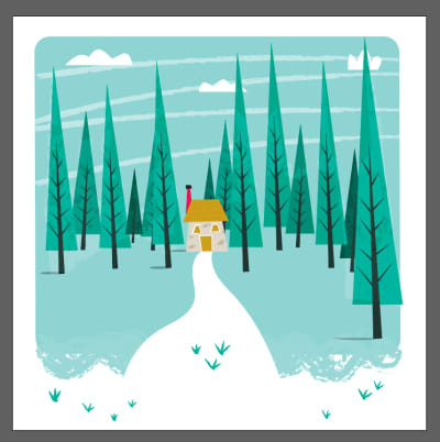
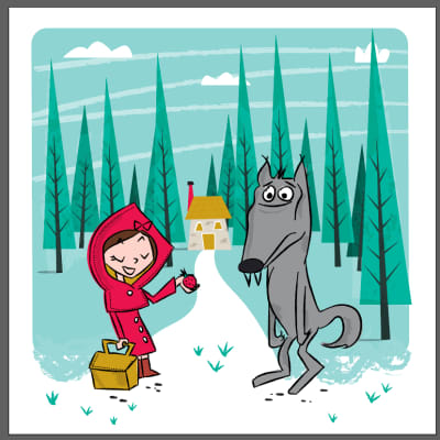
All that remains is to make visible the layer with our characters and put them in the centre of the scene:
As the very last thing, let’s create the title. Draw two simple black and white rectangles using the Rectangle tool (M) and write the title ad I show you in the image below. The fonts I used are Fontdiner Swanky and Fontdiner Sparkly (both free to download).
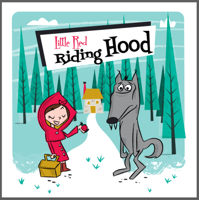
Congratulations! You just finished your first Mid-Century Cover!
Next step is to complete our cover in InDesign. Ready?
5. How To Organize A Cover Into InDesign
Now I need to work in InDesign to prepare my cover for the print. Consider that we will need the front and back cover and must calculate a space for the spine.
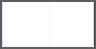
I want my front cover size be 18 x 18 cm (7.00 × 7.00 in). Since I need to create everything in a single artboard, I need to put the pages side by side, plus a space more for the spine.
So, let’s set 37 cm width (18 cm front + 18 cm back + 1 cm spine) and 18 cm height. Other settings are 0,3 cm Margins and 0,3 cm Bleed.
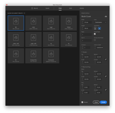
Create two guides, respectively on 18 and 19 cm.
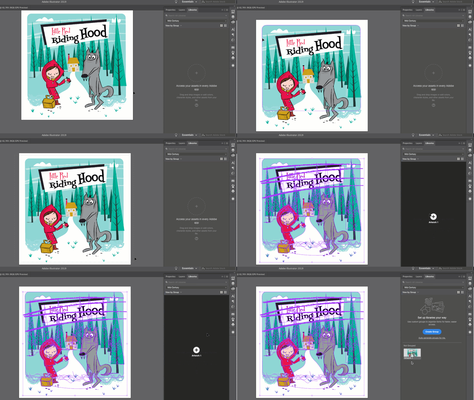
A quick back to Illustrator to save our cover design. If you have Adobe CC, you can use the Library to save your design. Open Window > Libraries, select everything on your artboard and drag to the library:
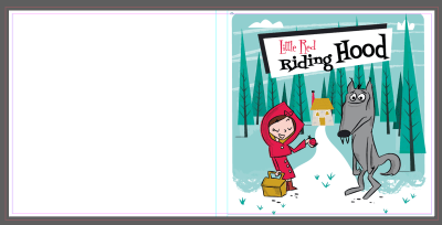
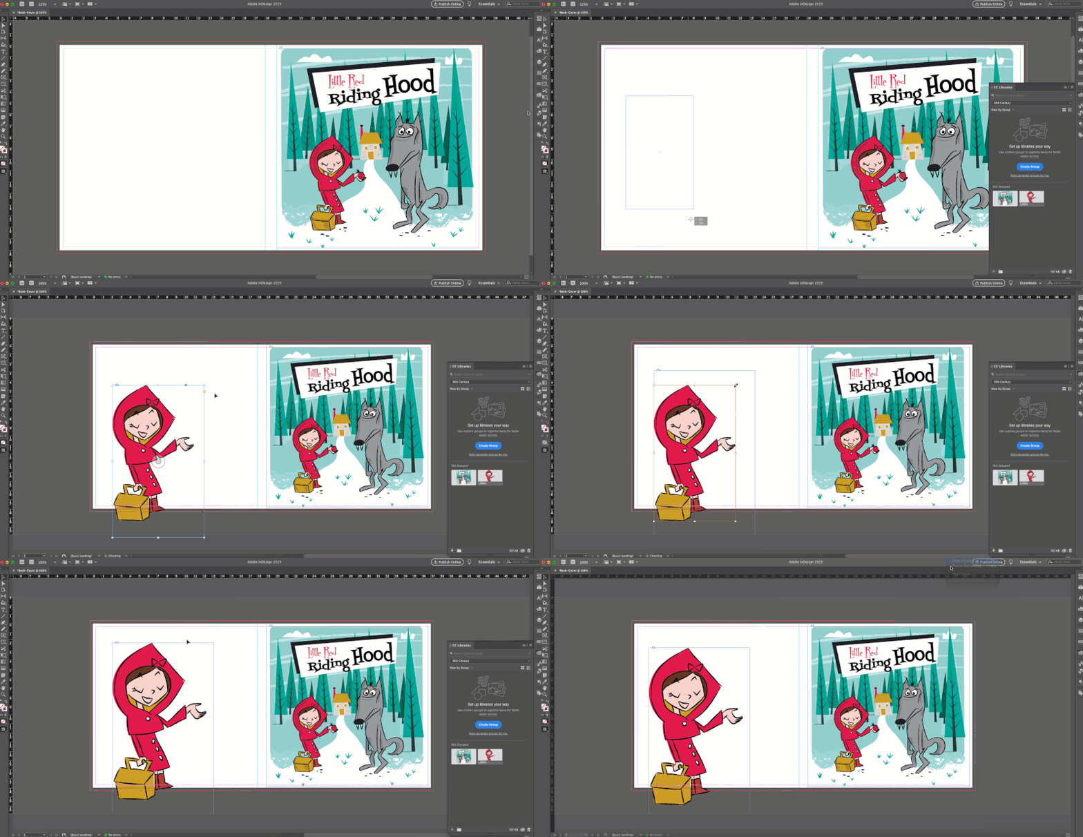
By opening the Library in Indesign, you will find your cover. Drag it and drop into the page. Put it on the right side of it.
For the back side i’d like to use just the Little Red Riding Hood Character. Go back to illustrator and drag it in the Library.
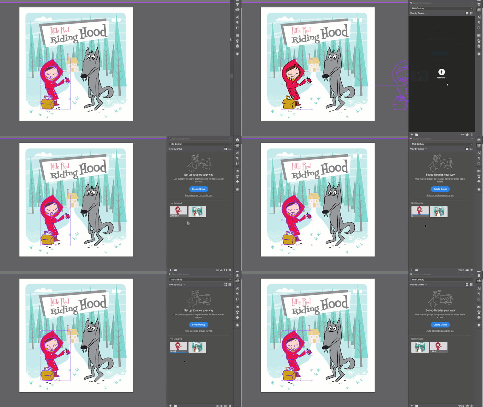
Again, come back to InDesign and import the character into the page from Library the way I show you:
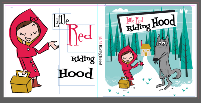
Then write the title again, this time directly into InDesign. Feel free to play with the size and position of the words! Here my result:

Let’s write the title on the spine too:
And we’re done! Let’s export our file for the print.
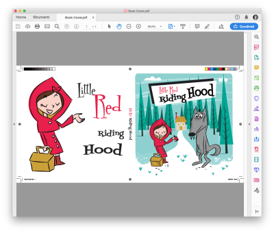
Click on File > Export and choose Adobe PDF (Print).
In the General panel choose Adobe PDF Preset: High Quality Print. Leave the rest as it is.
In the Mark and Bleeds select All Printer’s Marks. Clic OK.
Here your result:
Nice job! Bravo! You have finished this (quite long) tutorial!
6. The Final Result
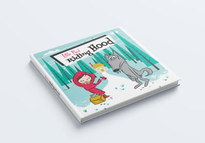
Here some mockups to simulate the real book:
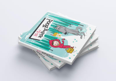
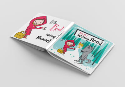
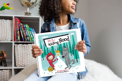
I hope you enjoyed this tutorial, and — most of all — I hope I was able to convey to you my passion for mid-century design!
Try it out, and please share your own illustrations and thoughts in the comments below.
 (yk, il)
Articles on Smashing Magazine — For Web Designers And Developers
