Meet “Form Design Patterns,” Our New Book On Accessible Web Forms — Now Shipping!
Meet “Form Design Patterns,” Our New Book On Accessible Web Forms — Now Shipping!
Markus Seyfferth
Forms. It’s no coincidence that the word rhymes with “yawns” — web forms are dull to code and even duller for your visitors to fill in. But without forms, the web would just be a library. They let us comment, collect, book, buy, share, and a host of other verbs. And mostly they enable us to do these things in an awkward, opaque, confusing, odd, frustrating, alarming, or alienating way. Forms are such an important part of the web, but we design them poorly all the time. When they’re not over-engineered they’re usually not engineered at all.
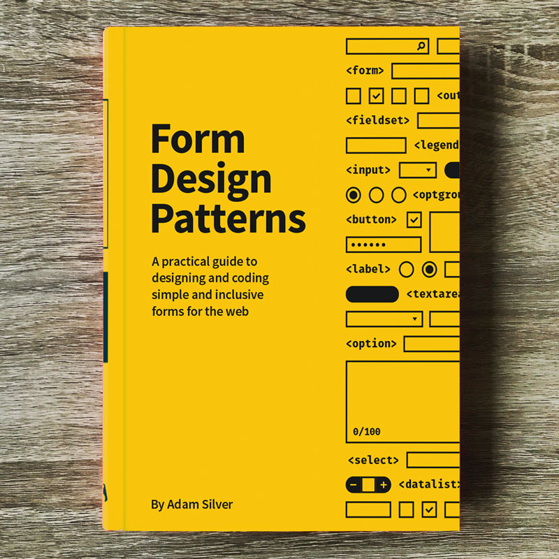
With the new Form Design Patterns book we want to tackle this problem. By going through common real-world problems step by step, you’ll learn how to design simple, robust, lightweight, responsive, accessible, progressively enhanced, interoperable and intuitive forms that let users get stuff done no matter what. And by the end of the book you’ll have a close-to exhaustive list of components delivered as a design system that you can use immediately in your own projects. (Jump to table of contents.)

Hardcover
$ 29 $ 39Get the Print (incl. eBook)
Printed, quality hardcover. Free airmail shipping worldwide.
Table Of Contents
Each chapter revolves around a specific problem — after all, that’s how we solve problems in real life. But don’t be concerned, many of the styles, components and patterns born out of each chapter are reusable and applicable well beyond the specifics and you’ll see examples of this as we move through the book.
Download the PDF excerpt for free (0.7 MB) to get a feeling what the book is like inside.
- A Registration Form
We’ll start looking at the foundational qualities of a well-designed form and how to think about them. By applying something called a question protocol, we’ll look at how to reduce friction without even touching the interface. Then we’ll look at some crucial patterns, including validation, that we’ll want to use for every form. - A Checkout Form
We’ll consider checkout flows and look at several input types and how they affect the user experience on mobile and desktop browsers, all the while looking at ways to help both first-time and returning customers order quickly and simply. - A Flight Booking Form
We’ll dive into the world of progressively enhanced, custom form components using ARIA. We’ll do this by exploring the best way to let users select destinations, pick dates, add passengers, and choose seats. We’ll analyze native form controls, and look at breaking away from convention when it becomes necessary. - A Login Form
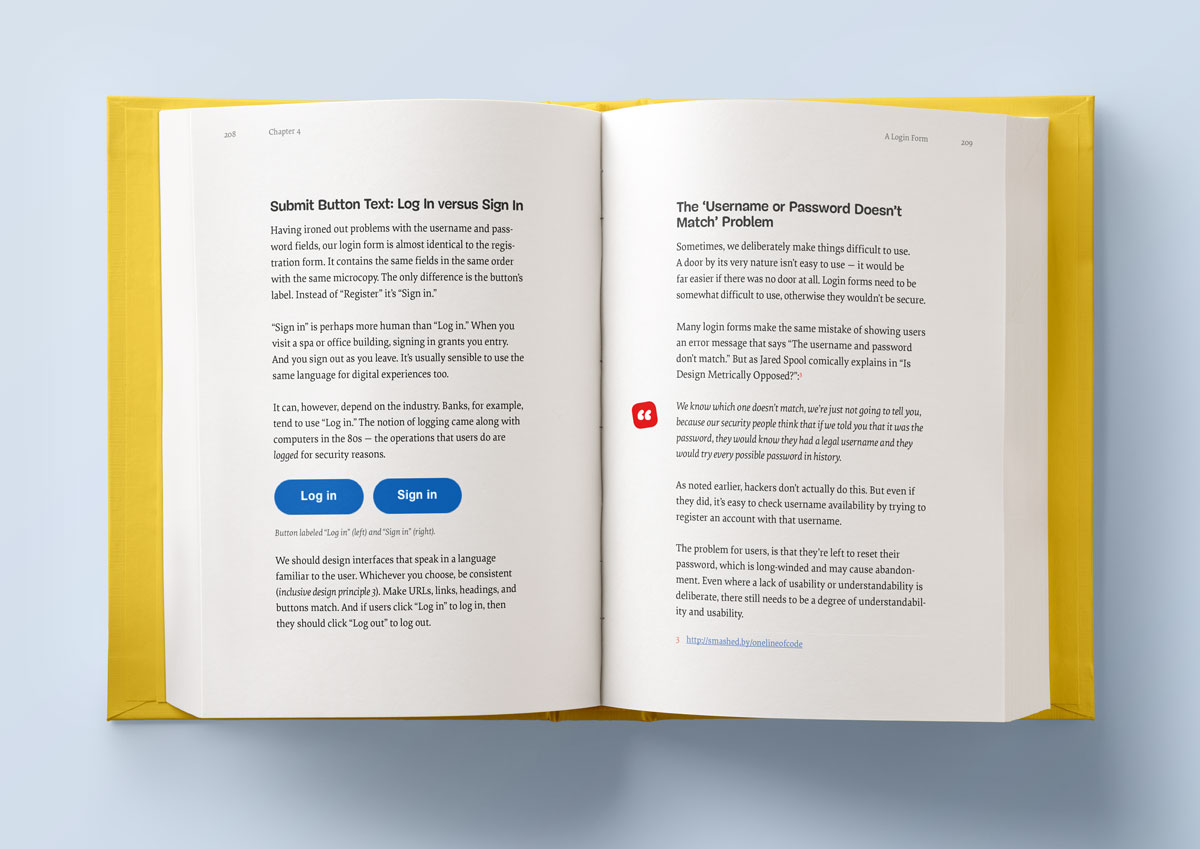
We’ll look at the ubiquitous login form. Despite its simple appearance, there’s a bunch of usability failures that so many sites suffer from. - An Inbox
We’ll design ways to manage email in bulk, our first look at administrative interfaces. As such, this comes with its own set of challenges and patterns, including a responsive ARIA-described action menu, multiple selection, and same-page messaging. - A Search Form
We’ll create a responsive search form that is readily available to users on all pages, and we’ll also consider the importance of the search mechanism that powers it. - A Filter Form
Users often need to filter a large set of unwieldy search results. Without a well-designed filter, users are bound to give up. Filters pose a number of interesting and unique design problems that may force us to challenge best practice to give users a better experience. - An Upload Form
Many services, like photo sharing, messaging, and many back-office applications, let users upload images and documents. We’ll study the file input and how we can use it to upload multiple files at once. Then we’ll look at the intricacies of a drag-and-drop, Ajax-enhanced interface that is inclusive of keyboard and screen reader users. - An Expense Form
We’ll investigate the special problem of needing to create and add lots of expenses (or anything else) into a system. This is really an excuse to cover the add another pattern, which is often useful in administrative interfaces. - A Really Long and Complicated Form
Some forms are very long and take hours to complete. We’ll look at some of the patterns we can use to make long forms easier to manage.
About The Author
 Adam Silver is an interaction designer with over 15 years experience working on the web for a range of companies including Tesco, BBC, Just Eat, Financial Times, the Department for Work and Pensions and others.
He’s particularly interested in inclusive design and design systems and writes about this on his blog and popular design publications such as A List Apart. This isn’t his first book either: he previously wrote Maintainable CSS, a book about crafting maintainable UIs with CSS.
Technical Details
- 384 pages, 14 × 21 cm (5.5 × 8.25 inches),
- ISBN: 978-3-945749-73-9 (print),
- Quality hardcover with stitched binding and a ribbon page marker,
- The eBook is available in PDF, EPUB, and Amazon Kindle.
- Free worldwide airmail shipping from Germany. Delivery times.
- Available as printed, quality hardcover and eBook.
Testimonials
It has been our goal to make the book as practical and useful as possible. We’ve been honored to receive very positive reviews from people making websites on small and large scale.
- “I have been writing forms in HTML for over 20 years. This book captures the essence of what it is to embrace standards, progressively enhance and deliver simple, accessible forms. By formalising design patterns we can all use and implement, developers and designers can focus on their website and product. I wish this was available 20 years ago!”
— Paul Duncan, Design Technologists and Accessibility Teacher - “Forms. It’s no coincidence that the word rhymes with “yawns” – forms are dull to code and even duller for your visitors to fill in. So make them work better for everyone, using the concrete tips, code and microcopy in this book. And take away your own yawns, as Adam Silver has done all the research and coding for you.”
— Bruce Lawson, Web standards Advocate - “Form Design Patterns is setting out common sense and inclusive solutions for forms both simple and potentially complex. It’s your companion as you strive to create a simpler and easier interactive web.”
— Heydon Pickering, UX and accessibility consultant
Why This Book Is For You
This book is a practical guide for anyone who needs to design, prototype and build all sorts of forms for digital services, products and websites. You’ll learn:
- Available native form elements and their powers, limitations and constraints.
- When and how to create accessible custom form components that can give users a better experience in comparison to their native equivalents.
- How to significantly reduce friction in forms with careful use of language, flow and order.
- Ways (and ways not) to help users fix form errors easily.
- How to deal with complex interfaces that let users upload files and add multiple items of any sort.
- Ways to let users search and filter a large set of results according to their own mental model.
- How to help customers fill out especially long and complex forms that may take weeks to fill out.

Hardcover
$ 29 $ 39Get the Print (incl. eBook)
Printed, quality hardcover. Free airmail shipping worldwide.
We can’t wait to hear your thoughts about the book! Happy reading, and we hope that you’ll find the book as useful as we do. Just have a cup of coffee (or tea) ready before you start reading, of course. Stay smashing and… meow!
 (bl, hp)
Articles on Smashing Magazine — For Web Designers And Developers
