Line Style Iconography in Website Design
While line iconography is certainly a privilege of mobile UIs, since you can easily stumble upon numerous control centers of mobile applications where line style icons rule the roost. However, it has eventually reached grounds of website design.
Having a delicate and subtle nature, this type of graphic material is not a universal tool that fits every interface. It requires a proper environment, where it won’t be lost among the content and multimedia, and a solid background that will provide it with an optimal contrast.
It bears gentle traits so that the composition should meet its architecture and elegant appearance. There are so many factors that should be taken into account, however creative folk have managed to derive benefits from it and enrich designs with subtlety and sophistication.
Today we have gathered 20 splendid examples of website designs that demonstrate excellent use of line iconography.
Websites Using Line Style Icons
Flyt Verden
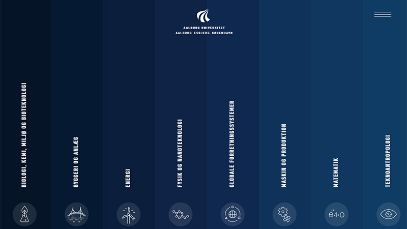
Flyt Verden is defined by original aid navigation that takes up the whole browser screen. It feels spacious, fresh and accessible. Each link has an accompanying line style icon that is smart and sophisticated.
Penn Ar Box
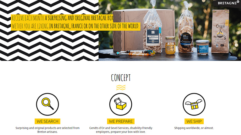
Penn Ar Box has an artistic website design so that a bunch of hand-drawn two-tone icons look like an ideal match here. They strengthen the theme, give aesthetics a cutting-edge appeal and liven up the project with a playful mood.
Neuralab
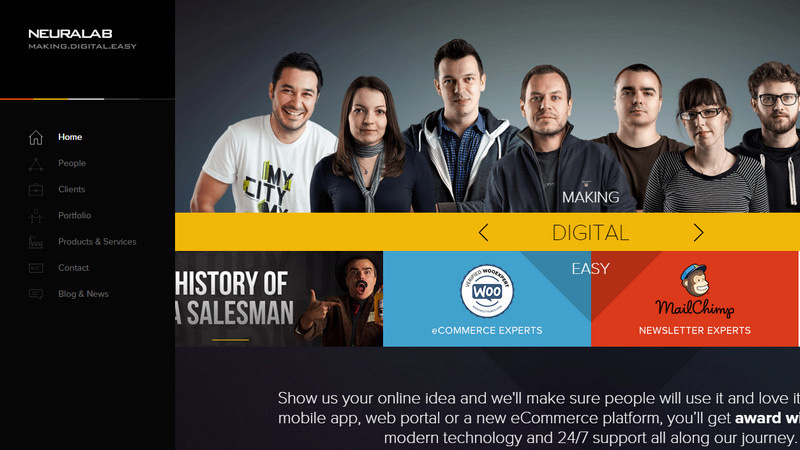
Neuralab utilizes small, tidy contour icons for the main menu that is located on the left sidebar. Each option is supported by its corresponding symbol that ideally blends into the businesslike atmosphere and crisp design.
Visually
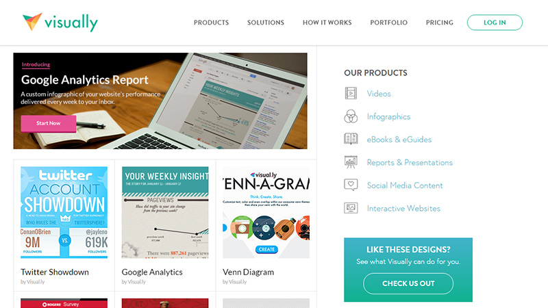
The team equips the secondary navigation with a graphical constituent. Thus, each directory not only is described in writing but is also skillfully illustrated. The solution strengthens intuitive surfing through the gallery.
Lovely Things
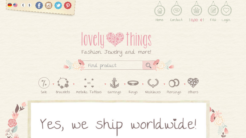
Lovely Things is a gorgeous website design with an ornamental nature and charismatic aura. It is overpopulated with delicate and subtle graphical details that are made in a line style. Primary navigation, a list of products and even search icon: everything has a sketchy look and contour shape.
Livx
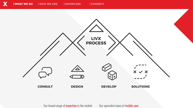
Livx gets the most out of classic line art, utilizing both stroke illustrations and icons that wonderfully play together. The team employs them for traditional purposes, skillfully visualizing the service section. What’s more, they also set them in motion in order to smarten up the interface.
UIcons
UIcons is a premium pack of crisp and sleek contour icons. So it is not surprising that the team leverages the same kind of graphics in a promotional page thereby preserving consistency in style. They laconically enhance the design and make advantages of a product clearer for the potential customers.
Fiverr: Year in Review
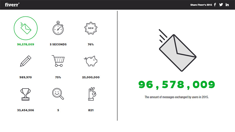
The interface is enriched with clean and neat contour pictograms that portray the achievements of the agency in an enjoyable manner. Monochrome realization with a well-thought-out amount of whitespace reinforces the fresh and tidy look of the design.
Smart’n’Clean
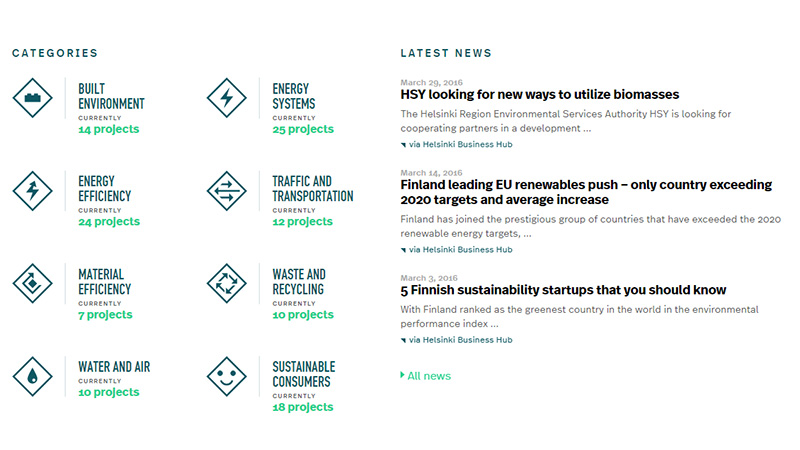
Smart’n’Clean demonstrates a list of categories with the help of two elements: lettering and accompanying symbol. The latter is a pretty simple yet intuitive and legible icon, and is reminiscent of a typical road sign.
KPMG
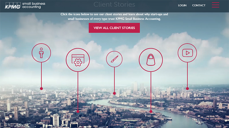
Here relatively big outline icons fit like a glove. They go pretty well with a magnificent cityscape on the backdrop and instantly catch the eye, placing focal points for visitors. They add a note of refinement to the aesthetics.
Viaprinto
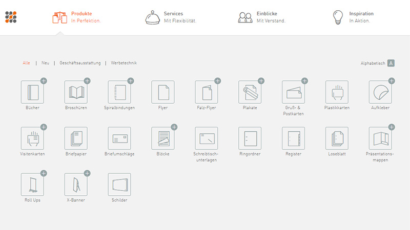
Viaprinto is overpopulated with line style graphics. However, it does not overwhelm visitors. The team leverages a ton of icons without sacrificing user experience and readability. Everything seems so natural and understandable, so that it is a really pleasure to explore.
SGD
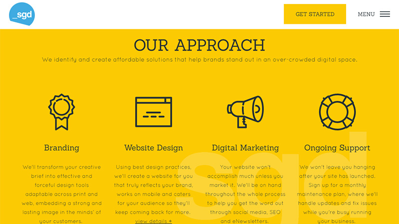
SGD has a modest website design with a robust structure, neutral coloring and formal air. Utilization of clean and sleek icons that are straightforward to readers is an excellent way to break the monotonous content flow and set some focal anchors.
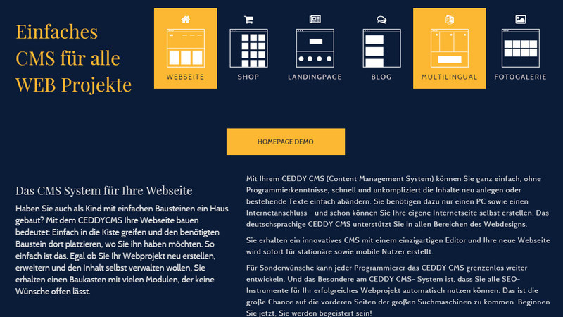
Ceddy CMS
The way the team showcases the possibilities of the product is fresh and inventive. Just with a quick glance, you can understand that the product is sufficient to create structures of various complexities so that you do not even need to go into detail: everything is on the surface.
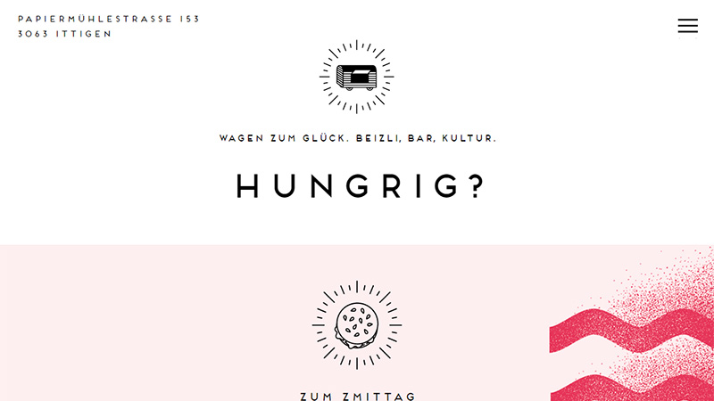
Wagen Zum Glueck
The front page of Wagen Zum Glueck includes several quirky doodle-like outline icons that are saturated with a human touch. They perfectly illustrate its cause, contribute to the theme and help to develop a friendly atmosphere.
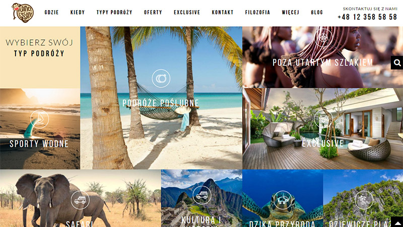
Planet Escape
Planet Escape is rich in multimedia content; it is pretty content-heavy so that weighty graphics can be excessive here. That is why delicate and slim stroke icons that mark several sections are ideal for such a case. They do not overpower visitors and do not overload the project.
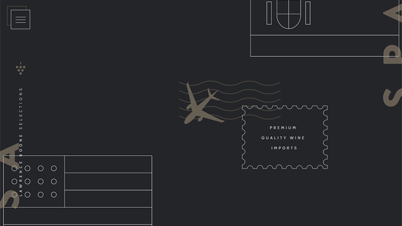
Lawrence Boone Selections
Lawrence Boone Selections owes its beauty to the line art. The team leverages small illustrations, signs, and icons made in one theme in order to craft an exquisite and harmonious aesthetic. Some elements are animated in order to gently guide visitors throughout the page.
Nova
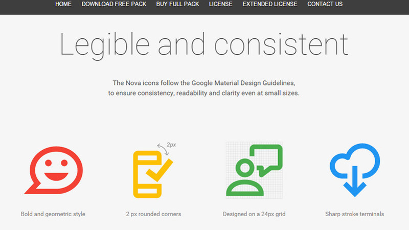
While the website boasts a businesslike atmosphere with serious mood and casual language, this set of bright, huge, wild and a bit primitive icons looks like a splash of personality that supplies the project with a playful and whimsical note.
Di Giusto
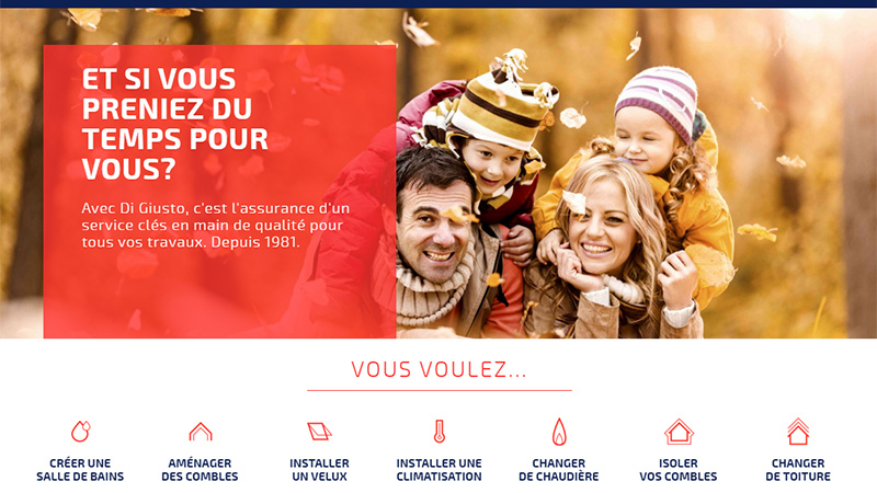
Here tiny line icons work nicely with a classic layout and lots of fresh air. They reinforce visual identity and make links to the inner structure more prominent and significant. The team has also used this type of graphic to enhance buttons and some other components.
Moving Waldo
There are just three icons; however, they certainly take the central stage on the site. In comparison with the rest of the design they look robust and prominent, even placed over the beautiful picture. Red color used for background reinforces their impact.
Sons of Gallipoli
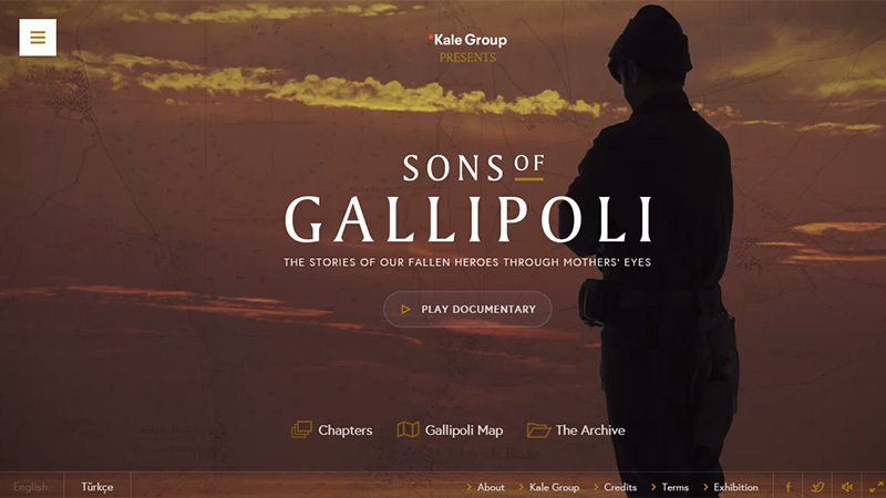
Sons of Gallipoli is marked by elegant graphics. You will find in here delicate and slick semi-transparent buttons, classy typography, and microscopic yet chic contour icons that finish off the composition and add gentle traits to the aesthetics.
Conclusion
Line style is always associated with something fragile and elegant, however, when used wisely, it is able to become a focal point of the design, stand out from the content flow and even look eye-catching against an impressive background. It is a stylish way to improve the project regarding natural and intuitive surfing as well as enrich aesthetics.
What type of iconography do you prefer to implement in your projects? What example, in your opinion, shows the greatest use of contour graphics?
