Interview with Logo Lounge’s Founder, Bill Gardner

Long time followers of Just Creative will know just how passionate I am about logo design, so it comes with great pleasure to interview Bill Gardner, the founder of Logo Lounge and Gardner Design, and most recently, an AIGA ‘Fellow’ award winner.
For those unfamiliar with LogoLounge, it is a logo inspiration book series and the leading online logo inspiration gallery. LogoLounge (Bill) also publishes a well-respected annual logo design trend report that gives a trajectory of where logo design is heading.
I’ve been fortunate enough to have my work featured in 6 of their books, including an in-depth case study, so for me it was a real pleasure to video-chat to Bill to learn about the process of discovering & reporting on the trends, as well as learn how the logos are picked for their best-selling books, and a glimpse inside their design studio in Kansas.
I recorded our informal video chat and have transcribed Bill’s answers into a digestible format below. Enjoy!
The process of discovering logo design trends
Bill has been reporting on logo trends since 2003, so he obviously has a lot of stored knowledge but with that many logos to remember, it’s essential to cover his office walls with all of the past year’s trends so he can easily recall if he has covered something in the past.
Below is his process of discovering the latest logo design trends.
1. Sort through 25,000 submitted logos
Based on his accumulated knowledge and prior reports, Bill chronologically sorts through all 25,000-35,000 submitted logos from the year, and selects certain logos. He doesn’t look for anything in particular, but rather sees if he can “notice any nuances” from the submitted logos, “anything new, different or evolved from the years before”. This part of the process generally “takes a full weekend”.
2. Arrange logos into groups & play match.
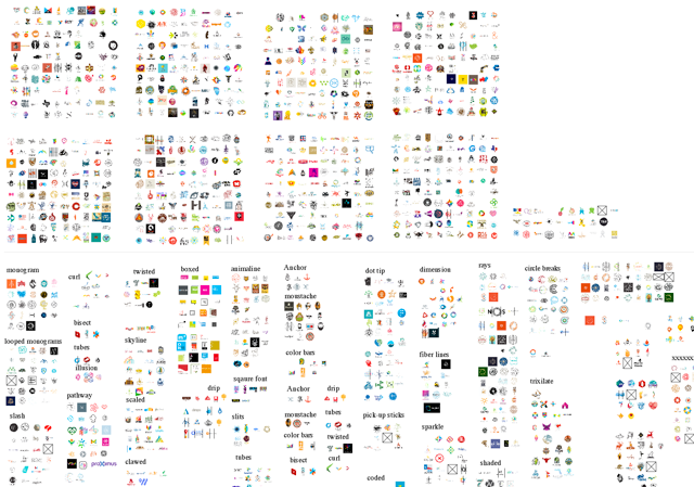
After going through the entire year’s worth of logo submissions, Bill sorts through his selected logos, “generally about 2000 of them”, and starts putting them into matching groups.
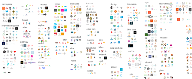
From here, Bill “starts to play the world’s largest game of match”. He goes through the groups of logos and makes sub groups and then repeats this “until they are all organized and have a rhythm. This generally takes 2 full weeks”.
3. Filter based on relevance & value.
By the end of this process, there are “generally about 100 grouped trends”, however, each year there are only 15 reported trends, so these 100 groups have to be dwindled down to what is “most relevant and most valuable, based on the time that it is being looked at”.
At this point, Bill shares the 100 logo groups with other designers and asks them “what they think” and a discussion is had to filter the groups. Finally, what’s left, are 15 core trend groups that are published in the trends report, and some runner-ups.
Logo Design Trends Trajectory Forecast
“Trend can be such an ugly damned word” states Bill, which is why he always proclaims at the start of his trend reports, that he is “not suggesting that you follow these trends”, he is just reporting what he is seeing out there so that you can use this information to stand on their shoulders and to push the envelope, to evolve designs to a new direction… and start your own trend.
Bill also proclaims: “You can’t start a trend. No body can actually start a trend. The first design that is the foundation for a trend only became a trend because somebody else found value in it, and then emulated it. The designs that emulate a design are what start the trend.”
On this note, “Any designer that says they do not look at other peoples work is pure bullshit. The public is looking and we have to relate to their mindset, so we have to look at each other’s work.”
The ‘Why’ Matters
On the topic of designing, “It’s more important to know how you got there, than to know where you are. It’s not about creating pretty things, it’s about the ‘why’. The meaning. We must be able to communicate what we are creating is for a reason and why it meets business objectives. Why it will make them money.”
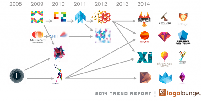
Bill continues, “To put trajectory into perspective, if I gave you a map of Australia and there was an individual right in the middle of Australia, and you were asked ‘where are they going to go next’? In reality, they could go any which way, but if you knew where they had been in previous days, such as Perth & Melbourne, you have enough information there to make an educated guess in which way they are going… quite possibly to Sydney. You can see where something is going by having more than one piece of information.”
“So if you take this same idea and apply it to design, you can only look at a design so far, however if you see how it got there, by seeing designs from the years before, then you can project where things will be going in the future, so you can get ahead of everyone else.”
A good example of seeing logo trajectory in action, is the faceted logo trend, which can be traced back to the 2012 design as shown above. This design has evolved into many more faceted spin offs over the years.
The LogoLounge Book Series
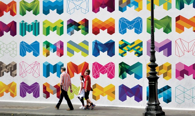
Each year, LogoLouge publishes a book showcasing the best 2000 selected logos from the year. I was curious to see how the logos were selected, what role the judges played and how they selected the logos, and the behind the scenes of making the book a continued best-seller.
LogoLounge Origins
“LogoLounge opened in 2001, just after 9/11 so it was an awful time to launch, however, the website and idea was immediately embraced by designers, especially brand name designers who had so much work that had not yet been seen. They uploaded their work and this was the foundation of LogoLounge.”
The book and exposure aside, the main reason for the site was to have a “searchable database of logos for people to use, with filters, to make research easy”.
LogoLounge Book Selection Criteria
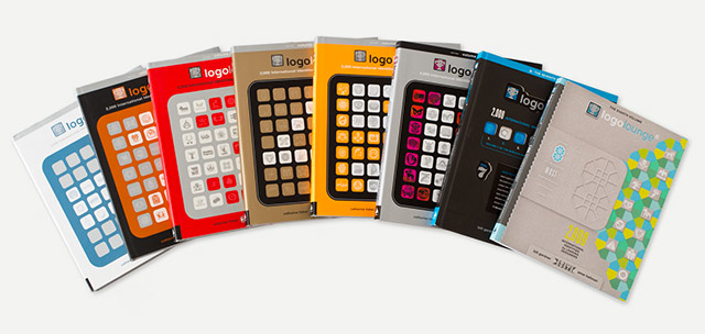
“Each year, eight brand-name judges choose all the logos selected in the books. All of the logos are randomly divided between these judges, and using our online platform, every logo is viewed three times and ranked.
Each page has twenty logos on it, with the name of the logo and the industry underneath and that’s all. Every logo is ranked 0 to start with, and then the judge ranks the logo from 0 to 3. Once the judges have gone through everything, and each logo has been ranked three times, all the results are aggregated to find their final score.”
The highest possible score could be 9 (3+3+3). “Generally, there are only a few that ever score a 9… out of 25,000 submissions.”
“Anything that has scored from 4-9 automatically goes into the book, but anything that has scored under 4 is looked at again, and generally half of them are discarded.” Then Bill’s personal selection comes into play.
Time spent on LogoLounge VS other clients
“About a month is spent working on LogoLounge and then more speaking at conferences”. The rest is on Gardner Design, and about 65% of our work is done on rebranding. It’s more challenging, as it forces you think about things objectively”.
On Great Identities
“What really makes a great identity, is not the logo, it’s the way that it is integrated with the other elements that send the message.”
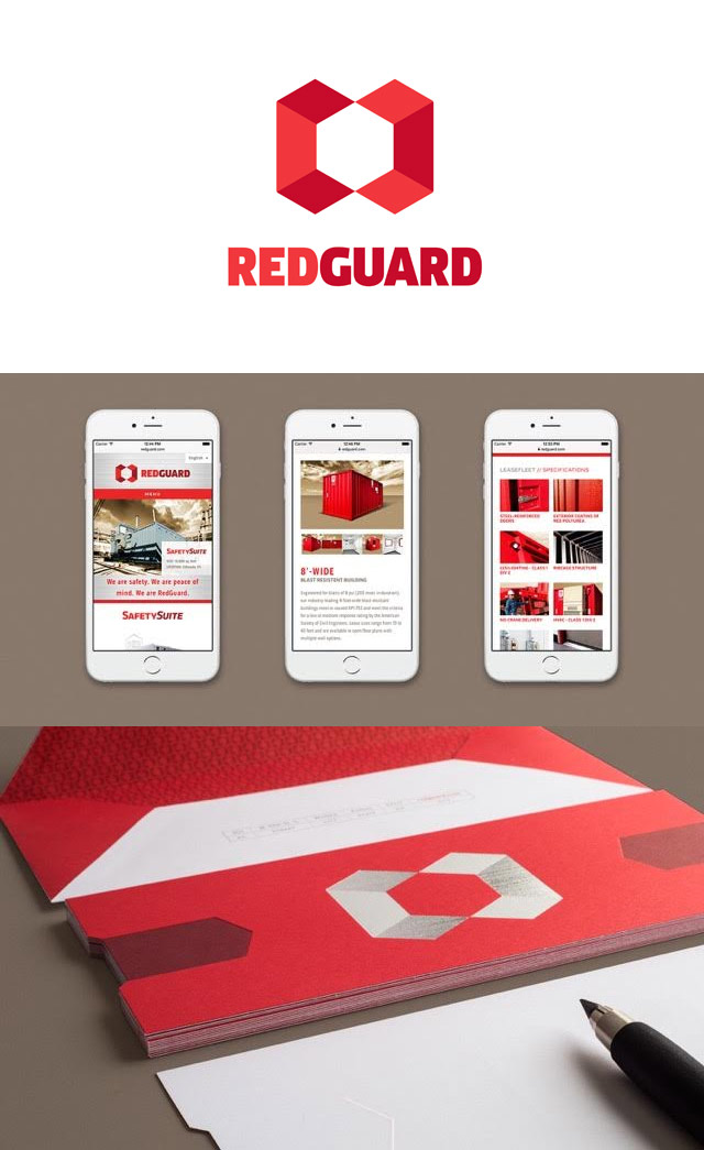
Apart from his daughter, Bill’s favorite project was done for RedGuard, the leader in blast resistant buildings.
Future plans for LogoLounge
As for the future plans for LogoLounge, “We plan to put more focus on the site as books are not the research tool they used to be. We plan to do more speaking and give out more free accounts to design institutions for research and the Logo Creed curriculum.”
General advice for aspiring logo designers
Bill states that he has “never hired anyone based on where they studied, or even if they had a degree. It’s always been their book and their enthusiasm for design. The passion and the people that live for design are the ones that will really push the envelope and create the best work.”
For those interested, you can get a LogoLounge membership for US$ 100 which includes access to all the submitted logos and the possibility of being published in their upcoming book series or trends report.
